How Smooche built a foundation ad around a final-bottles claim
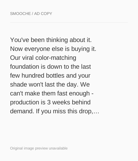
A static Smooche scarcity ad on a dark burgundy background with a large ending-it headline, claiming the Color Changing Foundation is down to its final 287 bottles. The copy adds a production backlog, a six-week waitlist and a midnight deadline, and Shop Now opens the Reverse-aging Adaptive Foundation product page.

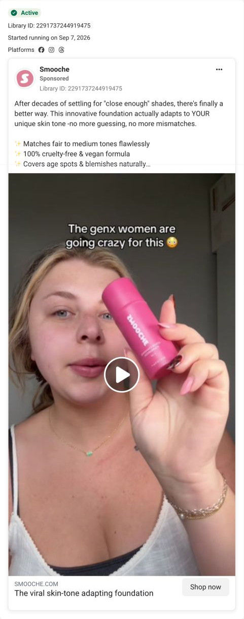
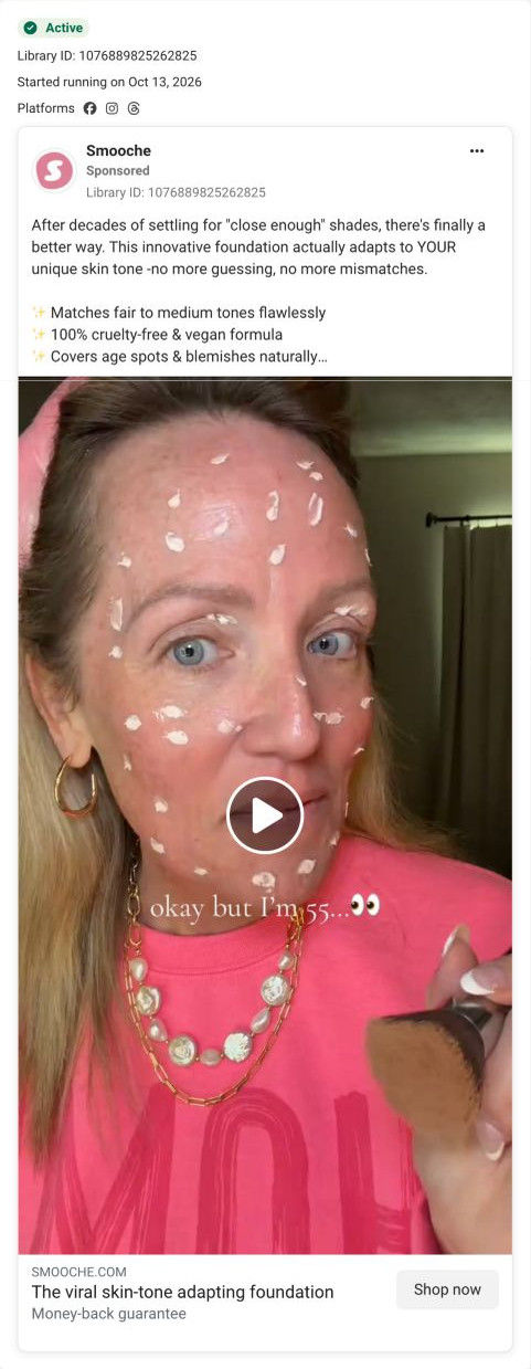
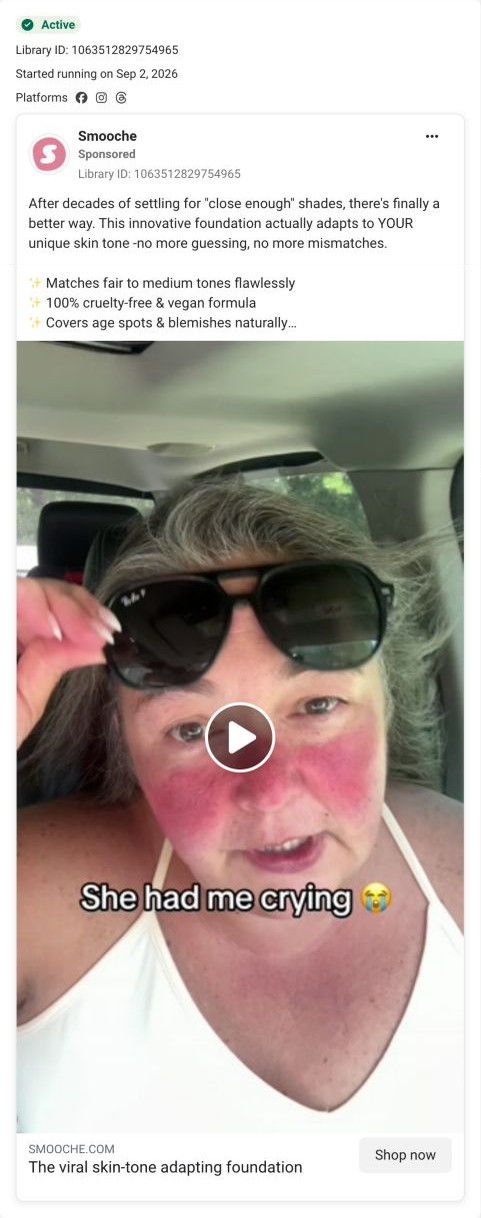
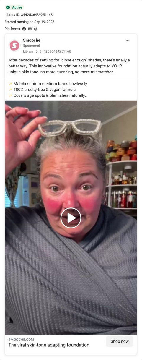
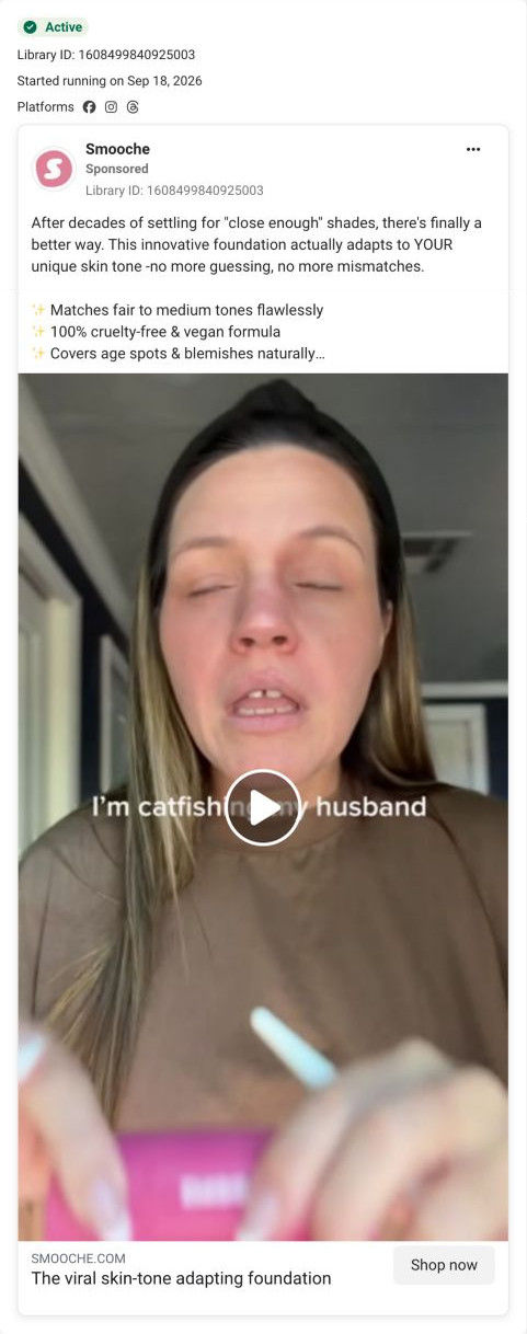
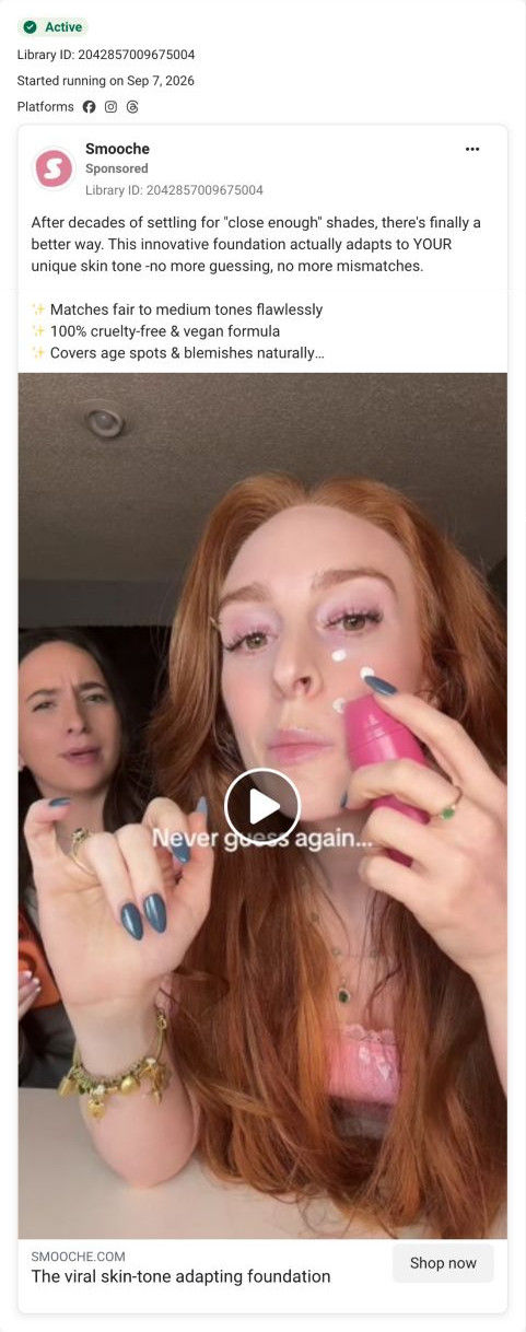
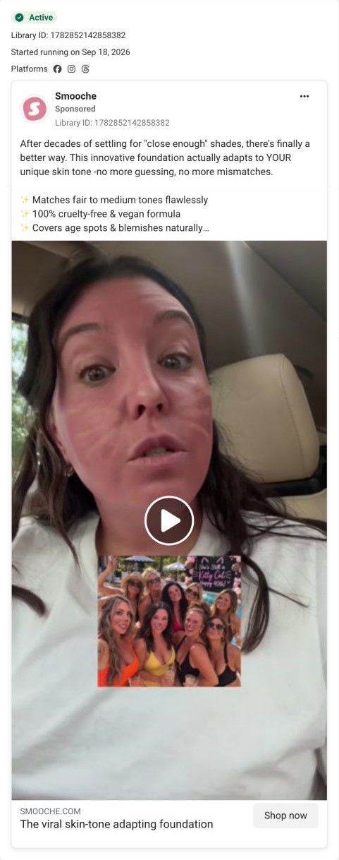
The current destination was captured on October 20, 2026. Video references show captured frames. Page offers may differ from the original ad.
FINAL 287 BOTTLES - Color Changing Foundation is almost sold out
A dark burgundy graphic and large ending-it headline emphasize the advertiser’s stock-limitation message. Compare the creative with the destination and explore the other ads sharing this route.
- Brand
- Smooche
- Observed offer
- Up to 60% off; limited bottles advertised
- Creative angle
- Scarcity
- Page type
- Product page
- Ad format
- Image
- Listed start date
- Aug 16, 2026
- Captured
- Oct 20, 2026
- Library ID
- 3039677756368104
- Destination
- smooche.com
Selected for its design and offer structure. Ad performance isn’t available in this collection.
What this ad does well
The headline puts a precise number in front of the viewer, and a specific figure reads as more concrete than limited stock. The copy turns the shade problem into a picture with one phrase, “No more orange jawlines”, which is exactly the kind of detail the persona asks for. The dark burgundy design also breaks from the brand's usual pink, so it reads as an announcement rather than another product ad. It started running on Meta on Aug 16, 2026, one of 8 ads that send people to this product page.
What's missing
The ad stacks four kinds of urgency (a bottle count, a production backlog, a waitlist and a midnight deadline) and gives no proof that the product is worth hurrying for. We can't verify the stock claims from the outside, and the persona's rule is to use urgency only when it's true, because shoppers who see the same message again next month stop believing it. If you run a scarcity ad, pick one real constraint, state it once, and spend the rest of the copy on proof such as a customer photo or the shade-change demo.
Beat by beat
- ImageA dark burgundy graphic carries a large headline saying the product is ending.
The color break from the brand's pink makes it feel like news, not a routine ad.
- HeadlineThe link headline claims the final 287 bottles and says the foundation is almost sold out.
A specific number makes the scarcity claim concrete.
- CopyThe text says everyone else is buying, production is weeks behind demand and missing out means a long waitlist.
It adds social pressure and a cost of waiting on top of the stock claim.
- CopyIt closes on one bottle adapting to your exact skin tone and the end of orange jawlines.
It reminds the reader what she's hurrying for in one vivid image.
The offer
Limited bottles and a midnight deadline, with up to 60% off listed as the offer.
Where it sends people
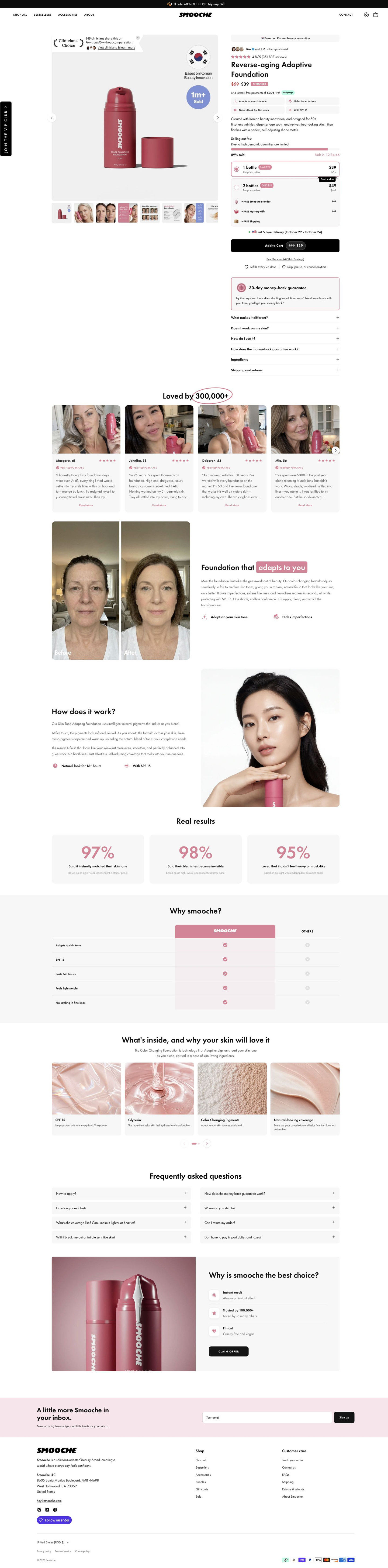
Shop Now goes to the adaptive-foundation product page, and the page is built to continue this message: a selling-out-fast line with a stock progress bar, percent sold and a countdown sits right above the quantity cards. That's a strong hand-off, because the visitor sees the scarcity claim repeated the moment they land. The struck-through price, Bestseller tag and free-gift rows carry the discount through. The gap is naming: the ad says Color Changing Foundation while the page is titled Reverse-aging Adaptive Foundation, which can make a shopper wonder whether she landed on the right product.
The page it sends people to: How Smooche's adaptive foundation page catches its creator ads
Smooche's Reverse-aging Adaptive Foundation product page: urgency, quantity tiers with free gifts and a guarantee card fill the buy box, then customer stories, a before-and-after, stats and a comparison table back it up. 8 ads in the Fluid library land here, mostly creator videos and demos, plus a humor video and a final-bottles scarcity graphic.
How the page is built
- 01Announcement bar and header
A sale-plus-mystery-gift line and a simple store header answer whether there's an offer today.
- 02Gallery
A pack shot with a clinician-choice seal, an origin badge and a units-sold circle, plus eight thumbnails of customer faces, infographics and before-and-afters, answers what results look like.
- 03Buy box top
An origin pill, an others-purchased avatar line, a star rating, a struck-through price with a Bestseller tag, an installment line and four benefit chips answer what it is and whether others trust it.
- 04Urgency and offer tiers
A stock bar with percent sold and countdown, two quantity cards, free-gift rows at struck values and a delivery date answer why now and how much to buy.
- 05CTA area
Add to cart with the sale price, a no-savings one-time link, refill and cancel terms, a money-back card and six accordions answer what I'm committing to and what if it doesn't suit my skin.
- 06Customer stories
Selfie cards with first name, age, stars and a verified label under a hand-circled customer count answer whether people like me use it.
- 07Before-and-after split
Side-by-side face crops with a highlighted headline show the change the brand claims.
- 08How it works
Three short paragraphs beside a model holding the product explain the claimed adaptive mechanism.
- 09Results stats
Three cards with large survey figures and a source note give the brand's percentage-based proof.
- 10Comparison table
A highlighted brand column against Others across five rows answers why this foundation.
- 11Ingredients and FAQ
Four ingredient texture cards and a two-column FAQ on use, wear, sensitivity, guarantee, shipping and returns answer what's inside and the last practical questions.
- 12Closing offer card and footer
A product photo with three icon reasons and a Claim Offer button gives a final way to buy, followed by the newsletter and footer.
The first fixes we would make
- The creator videos are the page's biggest traffic source in the library, and none of that creator footage appears on the page. Put a short creator clip of the color change in the gallery's first slots, so the visitor sees the same demo that made her tap.
- The page is titled Reverse-aging Adaptive Foundation while the scarcity ad calls the product Color Changing Foundation. Use one product name across ads and page so shoppers know they've landed on the right item.
Read the full breakdown of this page
Three hooks you could test
- Turn the benefit into a picture people get in a second. “No more line where your foundation stops and your neck starts.”
- Lead with the uncomfortable problem. “Caught your orange jawline in a car mirror again?”
- Make the product the whole scene. “One bottle, every shade, on the counter by Friday.”
What to borrow for your brand
- Break from your usual brand color for a time-sensitive announcement, so it reads as news in the feed.
- Use one vivid phrase for the problem (an orange jawline, a cakey forehead) instead of a general claim about shade matching.
- If you have a real stock limit, repeat it on the landing page with a live indicator above the buy buttons, so the claim is confirmed where people decide.
One of 25 Smooche ads in the Fluid Inspiration Library, captured from the Meta Ad Library on Oct 20, 2026. We record that an ad ran publicly, not how it performed.