How Smooche's foundation page stacks offers, urgency and proof
Smooche's Color Changing Foundation product page, reached through the bestsellers collection path. A compact buy box with quantity offers, free add-ons, a stock bar and a guarantee leads into age-tagged testimonials, a before-and-after, survey results, a comparison table and ingredients. 1 ad in the Fluid library lands here, a Prime Day-style 60% off sale graphic.

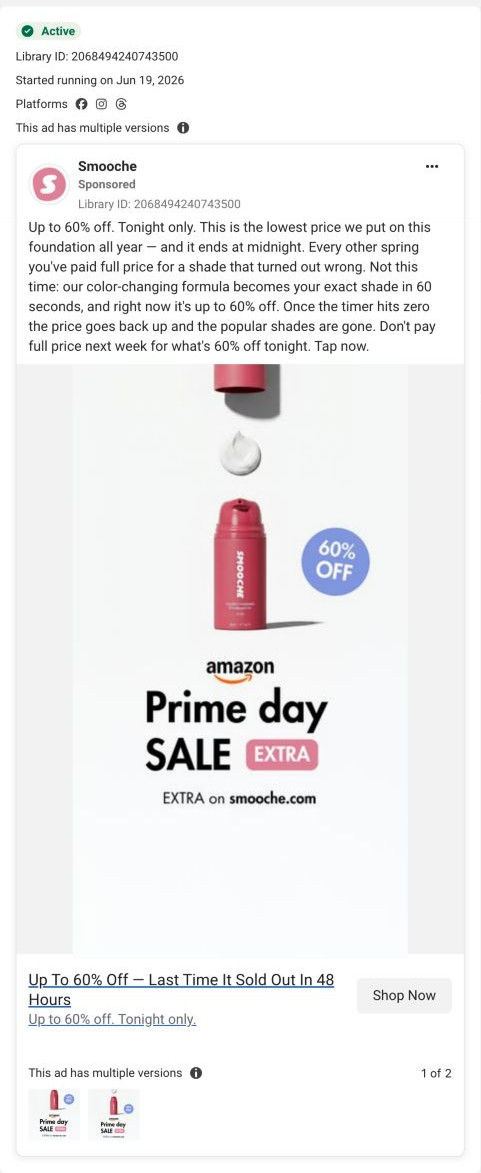
The current destination was captured on October 20, 2026. Video references show captured frames. Page offers may differ from the original ad.
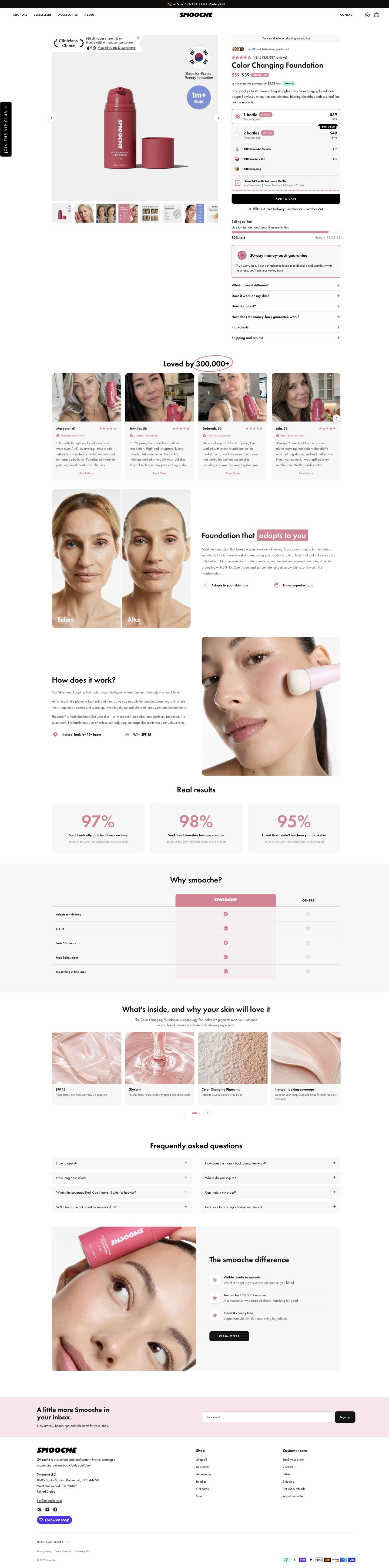
Smooche · Color Changing Foundation · collection route
Smooche's Color Changing Foundation product page, reached through the bestsellers collection path. A compact buy box with quantity offers, free add-ons, a stock bar and a guarantee leads into age-tagged testimonials, a before-and-after, survey results, a comparison table and ingredients. 1 ad in the Fluid library lands here, a Prime Day-style 60% off sale graphic.
- Brand
- Smooche
- Page type
- Product page
- Ads leading here
- 1
- Captured
- Oct 20, 2026
- Destination
- smooche.com
Selected for its design and offer structure. Ad performance isn’t available in this collection.
What this page does well
The buy box answers almost every buying question before the first scroll. The gallery mixes customer photos, a before-and-after and infographics, and a clinician badge and units-sold bubble sit on the main image. Two quantity cards list free add-ons (an applicator, a mystery gift, shipping) at struck values, so the two-unit option reads as more value, and a subscription checkbox sits right above Add to cart. Directly under the button, a selling-out-fast bar with a countdown and a bordered money-back guarantee card handle urgency and risk in one glance. Testimonial cards show each reviewer's first name and age with a selfie, which speaks straight to the older buyer the brand targets.
How the page is built
- 01Announcement bar and header
A black bar states the sale and free gift, and the header adds a vertical VIP club tab, answering whether there's a deal today.
- 02Gallery and buy column
A product shot with badges sits beside a buyer-count avatar row, star rating, struck-through sale price with a Bestseller tag and an installment line, answering what it is, what it costs and whether others buy it.
- 03Quantity offers
Two radio cards, free add-ons at struck values, a subscription checkbox and Add to cart answer how much to buy and what's included.
- 04Urgency and objections
A stock bar with countdown, a money-back guarantee card and six accordions answer why now, what if it doesn't work and whether it suits my skin.
- 05Testimonials
A carousel of selfie cards with first name, age and a verified badge answers whether people like me use it.
- 06Before-and-after explainer
A split before-and-after photo beside a headline and two icon benefits shows the result the brand claims.
- 07How it works
Three short paragraphs beside an application close-up explain the brand's claimed mechanism.
- 08Real results
Three cards of survey figures with a panel footnote give the brand's percentage-based proof.
- 09Comparison table
A pink brand column against Others across five rows answers why this instead of another foundation.
- 10Ingredients carousel
Four texture cards with an ingredient name and one line answer what's inside.
- 11FAQ and closing card
A two-column FAQ grid is followed by a card with three differentiators and a Claim offer button, giving one last way to buy.
- 12Newsletter and footer
A pink signup band and the store footer with payment icons close the page.
What's missing, in the order we'd fix it
- The ad sends people here for a 60% off event, but the page's top section reads the same as any visit to the product. A short line near the price confirming the event offer would tell the visitor she found the deal she tapped for.
- The survey results and the clinician badge carry a lot of trust, and the page's proof is easier to believe when its source is close by. Put the panel's size and date next to the figures rather than in a footnote.
- The same foundation lives at two URLs (this collection route and the standard product URL). Point ads at one canonical page so offers, reviews and tracking stay in one place.
How the ads set it up
The only ad captured for this page is the Prime Day-style sale graphic, which promises up to 60% off tonight and a 60-second shade match. The page carries the urgency well, with a stock bar and countdown right under Add to cart, and its struck-through pricing and free add-ons back up the discount. The shade-match claim is supported further down by the before-and-after and how-it-works sections, though the event framing itself doesn't appear, so the ad's biggest visual idea stops at the click.
What to borrow for your brand
- List free add-ons under the quantity cards with struck-through values, so the larger option visibly includes more.
- Put a stock bar, countdown and guarantee card directly under the buy button, so urgency and reassurance arrive together.
- Show each reviewer's first name and age on testimonial cards when your buyer is age-conscious, so she sees people like her.
Ads that send people here
Captured from smooche.com in October 2026 for the Fluid Inspiration Library. Offers and prices change; this is what the page showed when we captured it.