

SeedSponsored
Esc
How Seed sells a probiotic on its capsule design in one static image
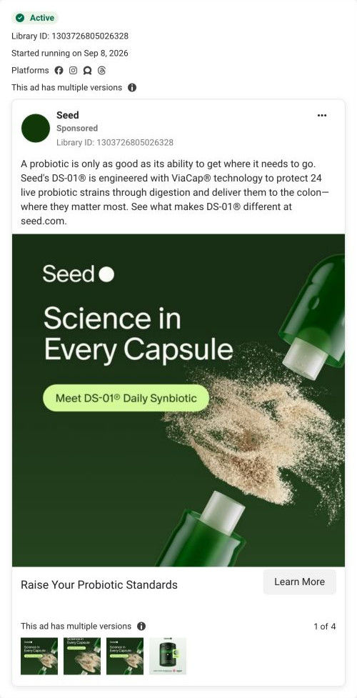
A branded static from Seed: a split green capsule spilling powder under the headline "Science in Every Capsule." The copy explains the brand's ViaCap delivery claim, that 24 live strains are protected through digestion and reach the colon. There's no price or discount in the ad, and Learn More opens Seed's homepage.
Seed
7 creatives lead here1 / 7

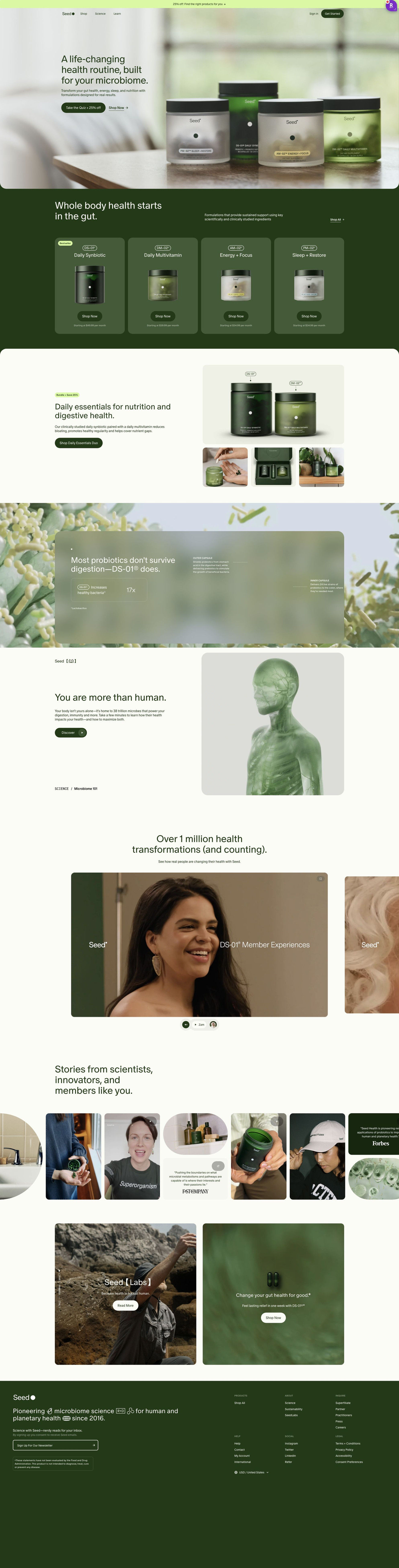
The Seed microbiome homepage
A browser shopping-extension badge appears in the upper-right margin of this capture.
Raise Your Probiotic Standards
The ad makes capsule delivery the differentiating idea, explaining how the brand says its probiotic strains reach their intended destination. The Learn More CTA uses Seed’s homepage address. Compare the creative with the destination and explore the other ads sharing this route.
- Brand
- Seed
- Observed offer
- DS-01 Daily Synbiotic; no price or discount stated
- Creative angle
- Education
- Page type
- Homepage
- Ad format
- Image
- Listed start date
- Sep 8, 2026
- Captured
- Oct 19, 2026
- Library ID
- 1303726805026328
- Destination
- seed.com
Selected for its design and offer structure. Ad performance isn’t available in this collection.
What this ad does well
Seed picks one idea and lets the picture carry it. The capsule pulled apart with powder bursting out is the product acting out what the copy describes, so you see the mechanism before you read a word. The copy opens on a line that reframes how to shop ("only as good as its ability to get where it needs to go") and then answers it with a named technology and a named destination, the colon. It's the kind of ad that gives a skeptical buyer something concrete to compare against the bottle they already own.
What's missing
The ad never connects the capsule to anything the viewer feels. There's no problem in it (bloating, irregularity, whatever sent someone looking for a probiotic), no proof beyond the brand's own description, and no reason to act today, even though Seed's homepage leads with a discounted quiz. That leaves the capsule interesting but easy to scroll past. If you make one like this, put the problem in the headline ("Your probiotic might not survive your stomach") and add a single proof line or the offer under the Meet DS-01 pill, so the curiosity has somewhere to go.
Beat by beat
- ImageA green capsule pulled apart on a dark green background, with fine powder bursting out between the halves.
It turns the capsule-in-capsule claim into a physical object, so the idea lands before anyone reads the copy.
- Headline"Science in Every Capsule" over a lime pill that reads Meet DS-01 Daily Synbiotic.
It names the product and positions it as the researched option in a category full of look-alike bottles.
- CopyThe copy says DS-01 uses ViaCap technology to protect 24 live strains through digestion and deliver them to the colon.
It gives the viewer the mechanism in one sentence, which is the reason this probiotic is supposed to be different.
- CTAA Raise Your Probiotic Standards headline with a Learn More button to seed.com.
It asks for a low-commitment click from someone who's curious but not ready to buy.
The offer
No price, discount or gift appears in the ad. The only ask is Learn More, so it's selling curiosity rather than a first order.
Where it sends people
Learn More opens Seed's homepage, which is usually the weakest place to send a single-idea ad, though Seed's homepage behaves more like a router than a catalog. The hero makes a discounted quiz the main button with Shop Now as a text link, and further down a mechanism explainer shows labeled callouts for the capsule's outer and inner layers, the exact story this ad told. The trouble is distance: someone who clicked for the capsule has to scroll past the product range and a bundle feature before they see it again. If you run a mechanism ad, send it to a page that opens on that mechanism, or straight into the quiz with the capsule visual on the first screen.
The page it sends people to: How Seed's homepage routes visitors to a quiz or its product range
Seed's homepage is a router: a hero with a quiz-plus-25%-off button and a Shop Now link, a four-product range, a bundle offer, a capsule mechanism explainer, member videos and a press-and-UGC strip. Seven ads in the Fluid library send people here, led by education and product-benefit statics and videos about Seed's probiotic standard.
How the page is built
- 01Announcement bar
One line offers 25% off for finding the right products, which answers whether there's a deal before the page even loads.
- 02Header
Shop, Science and Learn links plus a Get Started pill give returning and curious visitors their own way in.
- 03Hero
A photo of four jars on a table, a broad headline and the quiz-plus-discount button answer where a new visitor should start.
- 04Product range
Four cards with code names, jar images and starting monthly prices answer what Seed sells and what it costs.
- 05Bundle feature
The Daily Essentials Duo pairs DS-01 with the multivitamin at 25% off, which answers whether there's a better-value way to buy.
- 06Mechanism explainer
A frosted card with labeled capsule layers and a stat chip answers how the product is built, as the page describes it.
- 07Education teaser
A short science headline with a rendered human-figure illustration and a Discover button invites visitors deeper into the science content.
- 08Member videos
A carousel of member videos with a member count answers whether real people take this.
- 09Stories strip
UGC photos, video thumbnails and press quote cards share one horizontal scroll, so every type of proof sits together.
- 10Closing cards
Two photo cards point to Seed's research arm and a product, giving one last route for researchers and shoppers.
- 11Footer
A mission line, newsletter signup, disclaimer and region selector catch anyone who scrolled all the way down without choosing.
The first fixes we would make
- The ads that land here talk about one probiotic (Seed's digestive health probiotic and its standard), but the page opens on four jars and a whole-routine headline, so the visitor has to find DS-01 in the range band on their own. Send those ads to the quiz or the DS-01 product page instead, or give ad traffic a hero that names DS-01 and repeats the ad's headline.
- The hero promise is broad: it's a "life-changing health routine" with a subhead that lists gut health, energy, sleep and nutrition all at once. Name the specific problem a visitor arrives with (the bundle copy already talks about bloating and regularity), so someone recognizes themselves in the first line.
Read the full breakdown of this page
Three hooks you could test
- Make the product the whole scene. “Here's what's actually inside one [product] capsule.”
- Lead with the uncomfortable problem. “If your [product] dissolves in your stomach, it never gets where it's going.”
- Call out the habit you're replacing. “Still choosing a [category] by the biggest number on the label?”
What to borrow for your brand
- Pull your product apart on camera or in a render so the feature that makes it different is something people can see, not just read.
- Open the copy with a line that changes how people judge the whole category, then answer it with your product's named mechanism.
- Keep the static to one idea and one claim, and let a short pill label name the product so the headline stays free for the promise.
One of 50 Seed ads in the Fluid Inspiration Library, captured from the Meta Ad Library on Oct 19, 2026. We record that an ad ran publicly, not how it performed.