

RitualSponsored
Esc
How Ritual builds a collection page around one life stage
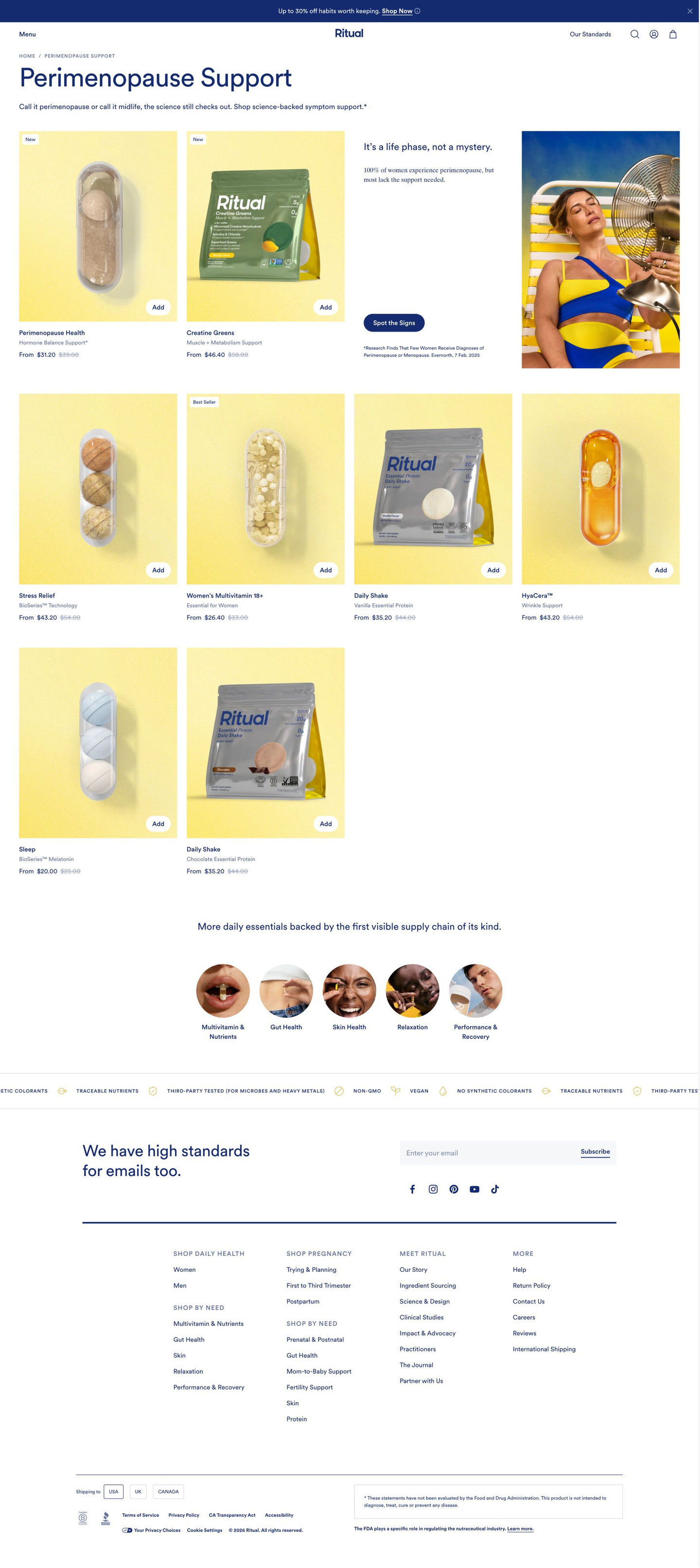
Ritual's Perimenopause Support collection page gathers products for one life stage in a grid, with an editorial tile in the first row that links to a symptom guide, then sends visitors on to other need categories. 1 ad in the library sends people here: a romanticized supplement-routine video offering up to 30% off a Perimenopause Health and Stress Relief stack.
Ritual
1 creative lead here1 / 1
Ritual · Perimenopause Support collection
Captured while scrolling the public page. The page reflects the offer visible on October 20, 2026; it may differ from the original ad.
Ritual · Perimenopause Support collection
Ritual's Perimenopause Support collection page gathers products for one life stage in a grid, with an editorial tile in the first row that links to a symptom guide, then sends visitors on to other need categories. 1 ad in the library sends people here: a romanticized supplement-routine video offering up to 30% off a Perimenopause Health and Stress Relief stack.
- Brand
- Ritual
- Page type
- Collection page
- Ads leading here
- 1
- Captured
- Oct 20, 2026
- Destination
- ritual.com
Selected for its design and offer structure. Ad performance isn’t available in this collection.
What this page does well
The page keeps education and shopping side by side. The editorial tile in the first grid row spans two columns, pairing a short headline, a one-line awareness stat and a “Spot the signs” button with a lifestyle photo, so a visitor who isn't sure what she's dealing with gets a next step without leaving the products behind. Every card has a quick Add button, a name, a subtitle and a from price with the original struck through, so she can buy straight from the grid. New and Best Seller tags make choosing easier, and the circular category links below the grid catch anyone whose need this collection doesn't cover.
How the page is built
- 01Announcement bar and header
A percent-off line with a Shop Now link sits above a centered-logo header with a standards link, answering whether there's a sale on.
- 02Collection header
A breadcrumb, a large collection title and a one-line intro answer what this collection is for.
- 03Grid, first row
Two product cards with New tags sit beside an editorial tile with a headline, an awareness stat, a Spot the signs button, a citation and a lifestyle photo, answering whether this life stage applies to the visitor.
- 04Grid, remaining rows
Four-column product cards on tinted backgrounds, with New or Best Seller tags, quick Add buttons and struck-through from prices, answer what's available and what it costs.
- 05Category links
A headline about other daily essentials and five circular photo links send visitors to other need categories.
- 06Standards marquee
A scrolling strip of icon-and-label claims answers how the products are made.
- 07Newsletter and footer
An email signup, social links, link columns, a country selector and the supplement disclaimer close the page.
What's missing, in the order we'd fix it
- The ad sells a specific two-product stack, but the page shows only individual cards, so the visitor has to find both products and add them one by one. Put a pre-built pair card (Perimenopause Health plus Stress Relief, with the stack saving shown) at the top of the grid, or send the ad to a starter-set page like Ritual's other bundles.
- The cards show names, subtitles, prices and tags but no ratings or review counts, so there's no proof on the page at all. Add a star rating and review count to each card, so a visitor comparing products has a signal beyond the badge.
- The Spot the signs button links out to a symptom guide, which takes the visitor off the page at the moment she's most engaged. Turn it into a short quiz on the page that ends with a recommended product or pair, so the education step leads back to the cart and captures an email along the way.
How the ads set it up
The ad sets up a calm, aesthetic routine and a numbered pair of products with up to 30% off for stacking them. The page picks up the life stage clearly, through the collection title, intro and editorial tile, and the announcement bar carries a percent-off line. It doesn't pick up the stack itself: there's no bundle, no pair pricing and nothing that mentions Stress Relief alongside Perimenopause Health, so the visitor arrives expecting a two-product offer and finds a catalog instead.
What to borrow for your brand
- Place an editorial tile inside the first row of your product grid that names the need and links to a short guide, so education sits next to the products.
- Add quick Add buttons to every collection card, so visitors can buy without opening each product page.
- End the collection with circular links to other need categories, which keeps visitors on the site when this collection isn't the right fit.
Ads that send people here
Captured from ritual.com in October 2026 for the Fluid Inspiration Library. Offers and prices change; this is what the page showed when we captured it.