

RitualSponsored
Esc
How Ritual's Essential Prenatal page keeps the buy box short
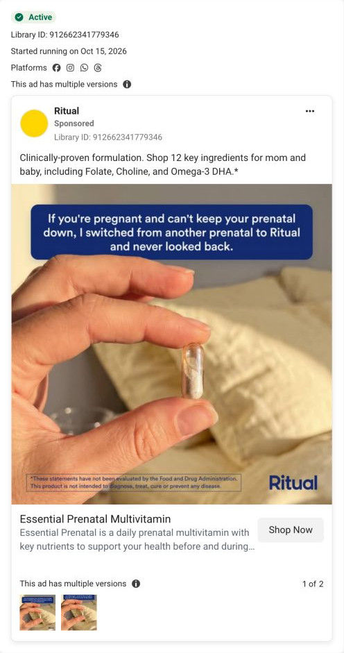
Ritual's Essential Prenatal product page is a minimal, text-led page: a compact buy box with a scent toggle and membership framing, ingredient-sourcing cards, a capsule delivery-technology explainer, FAQ, an advisory board and a full reviews widget. 3 ads in the library send people here: a capsule explainer video, a bedside nausea video and a first-person switcher quote.
Ritual
3 creatives lead here1 / 3

Ritual · Essential Prenatal Multivitamin
Page captured October 20, 2026. The current offer may differ from the original ad.

Ritual · Essential Prenatal Multivitamin
Ritual's Essential Prenatal product page is a minimal, text-led page: a compact buy box with a scent toggle and membership framing, ingredient-sourcing cards, a capsule delivery-technology explainer, FAQ, an advisory board and a full reviews widget. 3 ads in the library send people here: a capsule explainer video, a bedside nausea video and a first-person switcher quote.
- Brand
- Ritual
- Page type
- Product page
- Ads leading here
- 3
- Captured
- Oct 20, 2026
- Destination
- ritual.com
Selected for its design and offer structure. Ad performance isn’t available in this collection.
What this page does well
The buy box asks for only one choice before Add to cart: a two-option scent toggle shown as outlined buttons, which keeps the decision short and quietly picks up the citrus-or-mint detail from the explainer ad. A Best Seller label and a Supports list of four benefit lines with bold lead-ins give the general case, and a guarantee and shipping line sits under the button. Further down, the delivery-technology band explains the capsule in three numbered features beside a large capsule photo, which is the page's answer to the gentle-on-the-stomach ads. The reviews widget is thorough, with an average rating, distribution bars, a would-recommend figure, topic chips and verified badges.
How the page is built
- 01Announcement bar and header
A site-wide sale line with a Shop Now link sits above a centered-logo header, answering whether there's a deal on.
- 02Buy box
A Best Seller label, the product name, four Supports lines, a two-option scent toggle, sale and struck-through price, Add to cart, a guarantee and shipping line and an HSA/FSA note answer what it is, which scent and what it costs.
- 03Membership and details
A bundle-savings banner, a club card, a small one-time price link and accordions for supplement facts, how to use, traceability and the clinical study answer how to pay less and what's inside.
- 04Image carousel
A scent-badged bottle on yellow, certification seals and a capsule close-up show the product and its credentials.
- 05Standards ticker
A scrolling strip of icon-plus-label standards answers how it's made.
- 06Traceable ingredients
A grid of small cards with each nutrient's name, form and sourcing location, plus a See All expander, answers where the ingredients come from.
- 07Delivery technology
A grey band with three numbered features and a large capsule photo explains the capsule design, answering whether it will sit well.
- 08Cross-sell
A You May Also Like row of four product cards offers a next product.
- 09FAQ
Eight accordion questions with a See all FAQs link handle practical concerns.
- 10Advisory board
Four portrait cards with names and credentials answer who stands behind the formula.
- 11Reviews widget
An average rating, distribution bars, a would-recommend figure, topic chips, filters and a review list with verified badges answer what other buyers think.
- 12Newsletter and footer
An email field, link columns, a country selector and the supplement disclaimer close the page.
What's missing, in the order we'd fix it
- The capsule explanation that two of the ads are built on sits below the ingredient grid, so a visitor who clicked for it has to scroll past sourcing cards first. Add a one-line version to the Supports list in the buy box (with the same attribution the ads use) and move the delivery-technology band up, right after the standards ticker.
- The reviews widget is strong but sits at the very bottom, and the first-person switcher ad needs that proof most. Show the average rating and review count under the product name, and surface one verified review near Add to cart.
- The one-time price is demoted to a small link under the membership offers, and none of the ads that land here mention a discount. Show the one-time and member prices side by side in the buy box, so a visitor from a no-offer ad sees both options without hunting.
How the ads set it up
Three very different ads converge here, and the page keeps its first screen general (benefit list, scent toggle and pack shot) while the specific angles are answered lower down. The capsule explainer is paid off by the delivery-technology band and the scent toggle, the bedside nausea video by the same band, and the switcher quote by the verified reviews at the bottom. The match is real but delayed: none of the ads' opening problems, such as dreading a prenatal or struggling to keep it down, appears near the buy box, so each visitor has to scroll to find her reason for clicking.
What to borrow for your brand
- Limit the buy box to one choice before Add to cart (here, a two-option scent toggle as outlined buttons), so the decision stays quick.
- Show ingredient sourcing as a grid of small cards with a See All expander, which keeps a long list compact.
- Add topic chips to your reviews widget, so visitors with a specific concern can jump to reviews that mention it.
Ads that send people here
- How Ritual explains its prenatal capsule with a simple diagram
- How Ritual opens a prenatal ad on pregnancy nausea at the bedside
- How Ritual uses a first-person switch quote to sell its prenatal
Captured from ritual.com in October 2026 for the Fluid Inspiration Library. Offers and prices change; this is what the page showed when we captured it.