

ProseSponsored
Esc
How Prose explains lost wave bounce before pitching custom shampoo
A 41-second voiceover video for Prose that opens on a pool of pink shampoo with the question of why waves keep losing their bounce. It names brushing, heat and buildup as causes, shows a before & after and review quotes, then pitches custom formulas. The copy offers 60% off with a subscription; the link goes to Prose's custom shampoo page.
Prose
4 creatives lead here1 / 4


Prose · Custom Shampoo
Public page captured October 22, 2026. Promotional sheets, chat, extension overlays and sticky cart bars were removed from the static reference; page layout and copy were preserved. No account, personal, health or payment details were supplied. Quiz captures show the observed entry screen, not the complete consultation.
Get 60% OFF custom haircare from Prose
Visual reference: Why waves keep losing their bounce. A product gallery and subscription offer lead into personalized ingredients, benefits and review sections. The Get your formula button was followed to the same hair-length consultation entrance. Compare the creative with the destination and explore the other ads sharing this route.
- Brand
- Prose
- Observed offer
- Advertised custom haircare offer; subscription and gift conditions apply
- Creative angle
- Creator stories
- Page type
- Product page
- Ad format
- Video · 0:42
- Listed start date
- Oct 15, 2026
- Captured
- Oct 22, 2026
- Library ID
- 933013892959831
- Destination
- prose.com
Selected for its design and offer structure. Ad performance isn’t available in this collection.
What this ad does well
The hook is a question a wavy-haired viewer already asks, and the next lines answer it with three causes people recognize from their own routine: brushing, heat styling and product buildup. That explanation earns the pitch, because if waves are easy to disrupt, a formula built around how your waves behave sounds sensible. The middle stacks proof quickly: the 600,000+ five-star reviews claim with its Review & Refine source, a before & after credited to Whitney B. with a results-may-vary note, and short customer quotes on screen. The texture shot of shampoo on a mirror is pleasant to watch, which buys a second or two while the caption lands.
What's missing
The second half turns into a list of claims (support your natural pattern, balance moisture, reduce frizz without weighing hair down) and none of them are shown, so a strong opening fades into copy read aloud. There's also no person on camera, which leaves the before & after as the only human moment. Cut the benefit list to the one that matches the hook (bounce that lasts) and show it on real hair at the end, then put the 60% off and its subscription condition on screen so the video gives a reason to act now instead of leaving that to the primary text.
Beat by beat
- 0-3sCaption asking if this is why your waves keep losing their bounce, over pink shampoo pooled on a mirror.
It asks the exact question wavy-haired viewers have, over a texture shot that holds the eye.
- 3-12sBrushing, heat styling and product buildup named as causes; wavy hair described as defined in some areas and frizzier in others.
It explains the problem so the viewer feels understood before the product appears.
- 12-18sProse's customization process, the 600,000+ reviews claim, a before & after credited to Whitney B. and short review quotes.
It puts proof right after the problem so the pitch has backing.
- 18-24sCustom formulas based on hair type, environment and lifestyle, with made-to-order messaging on screen.
It shows how the product differs from one formula for everyone.
- 24-41sA list of claimed benefits for waves, then the call to start the free consultation.
It turns the explanation into a next step that costs nothing.
The offer
The primary text offers 60% off your first Prose order when you subscribe, with no commitment, and the Prose Promise as a guarantee. The video's own close points to the free consultation rather than the discount.
Where it sends people
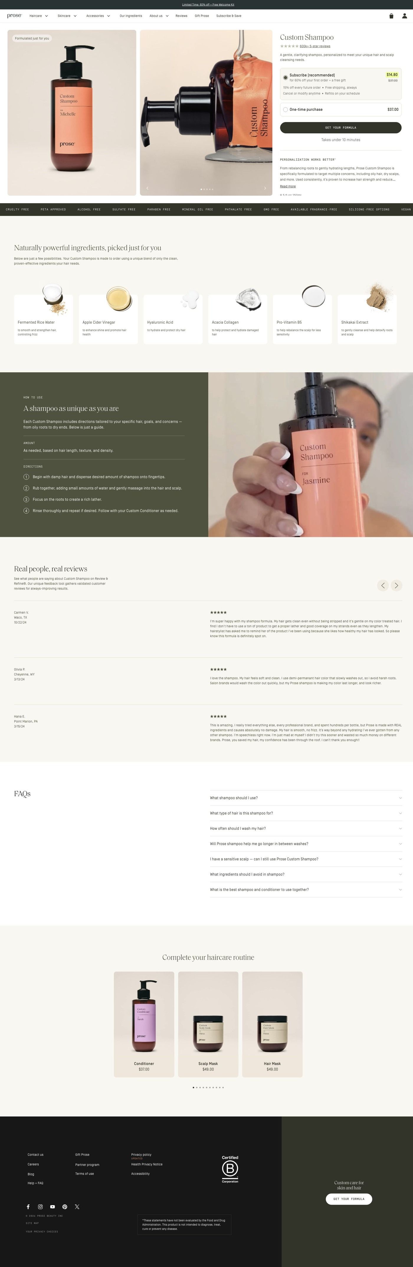
The ad goes to Prose's custom shampoo product page: a gallery beside the title, a review link, description, subscription choice and a consultation button, then personalization copy, ingredient cards with close-up photography, a split feature on the customized formula, customer reviews, routine recommendations and an FAQ. On the persona's ladder that's a product page rather than a focused landing page, but it fits this ad well, because it continues the same explanation (what goes into a custom formula) and its main button leads into the consultation the video asked people to start. What it doesn't pick up is the wave-specific problem, so a short block near the top that repeats the brushing, heat and buildup causes would carry the hook all the way through. Four of the 93 Prose ads we captured land on this page.
The page it sends people to: How Prose sells a custom shampoo before you've taken the quiz
Prose's Custom Shampoo page pairs a product gallery and subscription choice with a Get your formula button, then explains personalization, ingredients, reviews and a routine. The button leads into the same hair-length consultation the brand's other ads use. Four creator-story ads in the Fluid library send people here, including a gray-hair story and a routine angle.
How the page is built
- 01Promotion strip and navigation
The promotion strip and store navigation keep the current offer and the rest of the catalog one tap away.
- 02Product hero
A gallery beside the title, review link, description, subscription choice and Get your formula button answers "what is it, how do I buy it, and do other people like it?" in one view.
- 03Personalization explanation
Personalization and benefit copy answers "why would a custom shampoo be better than the one I have?"
- 04Ingredient cards
A horizontal rail of ingredient cards with macro photography and short descriptions answers "what's actually in it?"
- 05Custom formula feature
A lifestyle and product split explains how the formula is customized, which answers "how does Prose decide what goes in mine?"
- 06Customer reviews
Reviews with names, ratings and longer comments, alongside product imagery, answer "has this worked for someone like me?" in customers' own words.
- 07How to use it
Numbered usage instructions on an olive panel beside a creator demonstration answer "what does using it look like day to day?"
- 08Complete the routine
A product rail with consistent photography and short captions suggests the rest of the routine, which is the page's way of raising order size.
- 09FAQ
The FAQ picks up the remaining questions people have before they buy.
- 10Footer
The store footer closes the page with the usual links.
The first fixes we would make
- The ads that send people here lead with 60% off custom haircare, but apart from the promotion strip the hero doesn't put that first-order discount next to the price and subscription choice. Show the offer (and the price it comes off) right beside the Get your formula button, so the number from the ad is visible at the moment of decision.
- The page explains ingredients well, but we didn't see before & after photos. For a product sold through creator stories about specific hair concerns, a few before & afters grouped by hair type, placed near the reviews, would answer "will this work on hair like mine?" faster than text can.
Read the full breakdown of this page
Three hooks you could test
- Lead with the uncomfortable problem. “Defined on one side, frizzy on the other? Your products might be why.”
- Make the product the whole scene. “Watch this pour, then ask yourself what's actually in your bottle.”
- Sell the outcome. “Waves that still have their bounce at 5pm.”
What to borrow for your brand
- Answer your hook question with two or three causes the viewer can check against their own routine before you mention the product.
- Open on a close texture shot of the formula, which holds attention while the caption does the talking.
- Put source lines and results-may-vary notes right on the proof frames, so review counts and before & afters carry their own context.
Transcript
Is this why your waves keep losing their bounce? Wavy hair patterns can be easily disrupted by brushing, heat styling, or built up, which is why wavy hair often looks inconsistent, defined in some areas, and frizier in others. Prose has reinvented hair care for wavy hair, with this customization process, boasts over 600,5 star prose product reviews. Instead of one formula for everyone, they create custom formulas based on your hair type, environment, and lifestyle. So your formula is specifically made for how your waves behave, designed to help. Support your natural pattern, balance moisture from root to end, and reduce frizz without weighing hair down without overloading your strands or flattening your texture. Get started with the free consultation now.
Text on screen
- Is this why your waves keep
- losing their bounce?
- Wavy hair patterns can be
- easily disrupted by
- Brushing
- Heat styling
- Or product buildup
- Which is why wavy hair
- often looks inconsistent
- Frizzier in others
- Prose has reinvented
- haircare for wavy hair
- Custom
- Conditioner
- with this
- customization process
- Analyzing your consultation and
- preparing your results
- boasts 600,000 + 5-star
- Prose product reviews*
- on Review & Refine®
- se.com/reviews
- Before Prose
- After Prose
- betere and arter lusterin taken by Whitney B/after using Prose
- Pre-stipoo Hail MaskShampoo, Conditioner Curl Cream, Root Source®
- Herbal Summaments and Scalp Serum- results may vary
- *****
- ****
- "I can't get enough
- of this stuff!"
- ***
- "Thank you for making
- such an awesome product!!!"
- "My hair has never felt more
- smooth or looked shinier"
- Before and aftenitustration takerby, Whltney B. after using Prose
- Pre-Shampoo Hair Mask,Shampoo. Conditioner, Curt Cream. Root Sourced
- Herbal Supplements and Scalp Serum - results may vary
- Instead of one formula
One of 93 Prose ads in the Fluid Inspiration Library, captured from the Meta Ad Library on Oct 22, 2026. We record that an ad ran publicly, not how it performed.