

ProseSponsored
Esc
How Prose paired a 3X strength claim with a welcome kit offer
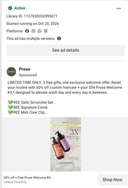
A static Prose image of two custom bottles, an amber shampoo and a lilac conditioner, on a stone-textured background next to a large 3X, which the ad uses to claim up to three times stronger hair. The copy offers 60% off and a free $54 welcome kit with a three-product subscription. It opens the haircare consultation.
Prose
64 creatives lead here1 / 64


















Prose · Haircare consultation
Public page captured October 22, 2026. Promotional sheets, chat, extension overlays and sticky cart bars were removed from the static reference; page layout and copy were preserved. No account, personal, health or payment details were supplied. Quiz captures show the observed entry screen, not the complete consultation.
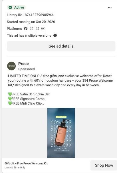
60% off + Free Prose Welcome Kit
Visual reference: Up to 3X stronger hair · product still. Most selected ads go directly into the haircare consultation. The first-question URL redirects to a hair-length choice, with visible progress stages and a visual guide. No consultation answers were entered. Compare the creative with the destination and explore the other ads sharing this route.
- Brand
- Prose
- Observed offer
- Advertised custom haircare offer; subscription and gift conditions apply
- Creative angle
- Product benefits
- Page type
- Quiz entry
- Ad format
- Image
- Listed start date
- Oct 20, 2026
- Captured
- Oct 22, 2026
- Library ID
- 1127830352995671
- Destination
- prose.com
Selected for its design and offer structure. Ad performance isn’t available in this collection.
What this ad does well
The large 3X is the kind of number that stops a scroll, and pairing it with two clean bottle shots keeps the image simple and premium. Leading with an outcome (stronger hair) gives the viewer a reason to care before they see a price, which a price-only ad can't do. The copy then stacks a strong first-order deal on top: 60% off, three named free accessories and a stated $54 kit value.
What's missing
The image and the copy tell two different stories: the picture sells strength, while the copy talks only about free gifts and never mentions the 3X claim again. A viewer who's drawn in by 3X stronger has no explanation of what was measured or compared, and the supporting text under the number is small at feed size. If you make one like this, let the copy back up the headline claim with what the test compared, in plain words, and then present the welcome kit as the reason to start now. Keep any claim like this attributed to the brand's own testing.
Beat by beat
- ImageAn amber shampoo and a lilac conditioner stand on a stone texture beside a large 3X, which the ad uses for its up-to-three-times-stronger hair claim, with a small offer strip at the top.
A big number next to the product creates an instant reason to look closer.
- HeadlineThe headline reads 60% off plus Free Prose Welcome Kit, marked Limited Time Only.
It shifts the viewer from the strength claim to the first-order deal.
- CopyThe copy promises three free gifts and a $54 welcome kit, lists the scrunchie set, comb and claw clip, and puts the three-product subscription condition in the footnote.
Itemizing the bonus makes the offer concrete for people ready to try.
The offer
60% off custom haircare plus a free $54 welcome kit of three accessories, when you subscribe to three or more haircare products, framed as limited time.
Where it sends people
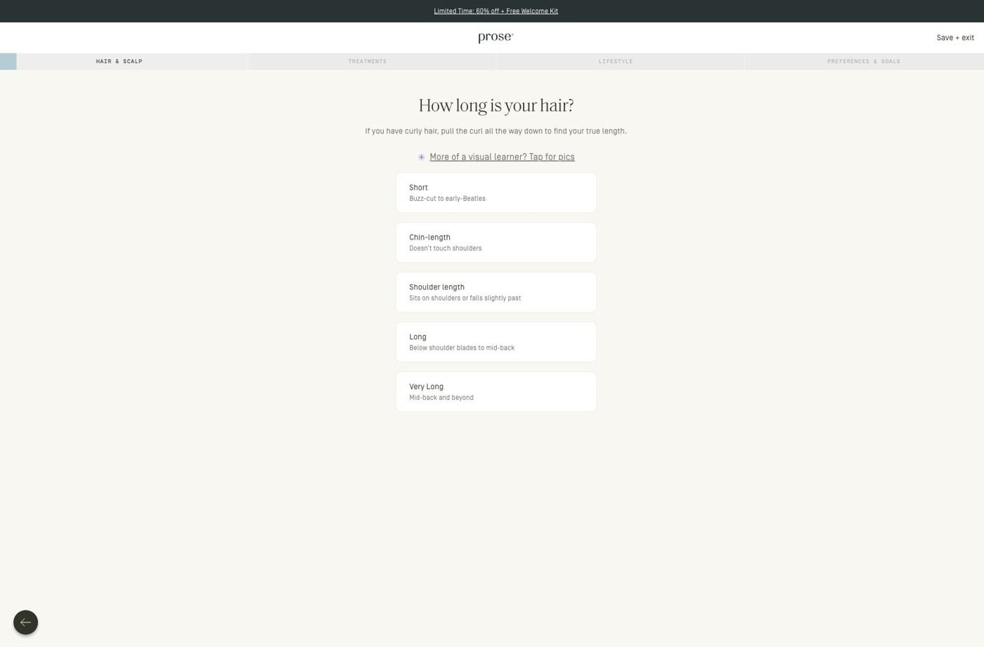
The ad sends people straight into Prose's haircare consultation, which sits on the strongest rung of the landing-page ladder: a quiz instead of a homepage or a basic product page. The entry screen we captured is compact, with a promotion strip, the logo and a save-and-exit control, then progress navigation that names the consultation stages and a single hair-length question with explanatory copy, an optional visual guide and large stacked choices. The image promises stronger hair, and the consultation's progress stages suggest it will ask about hair concerns, but the entry screen opens with length and doesn't mention strength or breakage. A line in the explanatory copy saying the consultation tailors the formula to goals like strength would carry the ad's claim onto the page.
The page it sends people to: How Prose starts its haircare quiz with one hair-length question
This is the first screen of Prose's haircare consultation: a slim promotion strip, a progress bar that names the consultation stages, and one hair-length question with large stacked choices and an optional visual guide. It's the destination for 64 ads in the Fluid library, mostly creator videos about curls and waves plus 60%-off offer ads.
How the page is built
- 01Promotion strip and header
A compact promotion strip sits above the logo and a save/exit control, so the offer stays visible and the visitor knows they can step out without losing their place.
- 02Progress stages
The consultation stages are named across the top, which answers "how much of this is there?" before the first tap.
- 03Hair-length question
One question with short explanatory copy, an optional visual guide and large stacked choices answers "what do I do here?" and makes the first answer easy to give.
- 04Back control
A back control lets people change an earlier answer, and the later consultation questions continue past what we captured.
The first fixes we would make
- Apart from the promotion strip, the entry screen doesn't restate what the visitor gets when they finish. Add one line under the progress stages that names the result (a formula built from these answers, plus the first-order offer the ads promised), so the effort of answering is tied to a reward.
- There's no proof on this screen, even though most of the ads sending people here are creator stories. A small strip with a customer quote or a still of a creator from the ads would carry that trust into the quiz without adding another step.
Read the full breakdown of this page
Three hooks you could test
- Lead with the uncomfortable problem. “Hair snapping every time you brush it?”
- Turn the benefit into a picture people get in a second. “One strand, before and after: see the difference in a pull test.”
- Make the product the whole scene. “Two bottles, made for your hair, and that's the whole routine.”
What to borrow for your brand
- Lead a static with one big outcome number from your own testing, set right beside the product, then explain the comparison in the copy.
- Keep the image and the copy on the same argument, so the claim that earns the click is the one the copy goes on to support.
- Use a minimal two-product shot on a textured background when the headline number needs to carry the attention.
One of 93 Prose ads in the Fluid Inspiration Library, captured from the Meta Ad Library on Oct 22, 2026. We record that an ad ran publicly, not how it performed.