

ProseSponsored
Esc
How Prose sells custom shampoo with an oily roots, dry ends hook
A Prose creator video that opens on a tight close-up of a greasy part under the caption when your roots are oily but your ends are dry. It lists three signs your products are wrong, shows the consultation, names apple cider vinegar for oily roots, and mentions 60% off. The click goes to the Prose Custom Shampoo product page.
Prose
4 creatives lead here1 / 4


Prose · Custom Shampoo
Public page captured October 22, 2026. Promotional sheets, chat, extension overlays and sticky cart bars were removed from the static reference; page layout and copy were preserved. No account, personal, health or payment details were supplied. Quiz captures show the observed entry screen, not the complete consultation.
Haircare for Your Unique Needs
Visual reference: Oily roots and dry ends · scalp hook. A product gallery and subscription offer lead into personalized ingredients, benefits and review sections. The Get your formula button was followed to the same hair-length consultation entrance. Compare the creative with the destination and explore the other ads sharing this route.
- Brand
- Prose
- Observed offer
- Advertised custom haircare offer; subscription and gift conditions apply
- Creative angle
- Creator stories
- Page type
- Product page
- Ad format
- Video · 0:34
- Listed start date
- Oct 15, 2026
- Captured
- Oct 22, 2026
- Library ID
- 3353588971479145
- Destination
- prose.com
Selected for its design and offer structure. Ad performance isn’t available in this collection.
What this ad does well
The close-up of an oily part is a picture anyone with this problem recognizes instantly, and it's the kind of shot people don't post of themselves, which is why it stops the scroll. The ad then turns the problem into a short numbered list (gets oily fast, limp and flat, dry ends) that the viewer can tick off. It shows the consultation section about how you live, and it names specific ingredients on screen (fermented rice water, apple cider vinegar, hyaluronic acid), which gives the claim about tackling oily roots something concrete behind it. The copy opens with raise your hand if your scalp gets greasy in 1 day, which matches the video's hook.
What's missing
The payoff is vague next to a very specific hook. The creator says the reviews don't lie, but the ad doesn't show a review or a number, and there's no clear look at the same scalp after using the product. The viewer has been promised balanced, healthy hair and has to take it on faith. Add a real after shot of the same part a day or two after washing, or put a specific review on screen at that line, so the proof matches how concrete the opening was.
Beat by beat
- 0-4sA close-up of a greasy center part fills the frame under the caption about oily roots and dry ends.
It shows the problem in a way the target viewer recognizes immediately.
- 4-15sAn on-screen list names three things about oily hair that aren't normal: gets oily fast, limp and flat, dry ends.
It turns a vague complaint into a checklist the viewer can match to their own hair.
- 15-25sConsultation screens show the hair texture question and a section about how you live while the creator says the quiz asks about hair type, lifestyle and health.
It shows the inputs behind the custom formula so personalization feels real.
- 25-34sKey ingredients appear (fermented rice water, apple cider vinegar, hyaluronic acid), followed by a line about reviews and 60% off the first order.
It ties the fix to named ingredients and adds an offer to close.
The offer
60% off your first order of Prose when you subscribe to haircare, with no commitment and cancel anytime. The video mentions it once near the end, and the copy repeats it.
Where it sends people
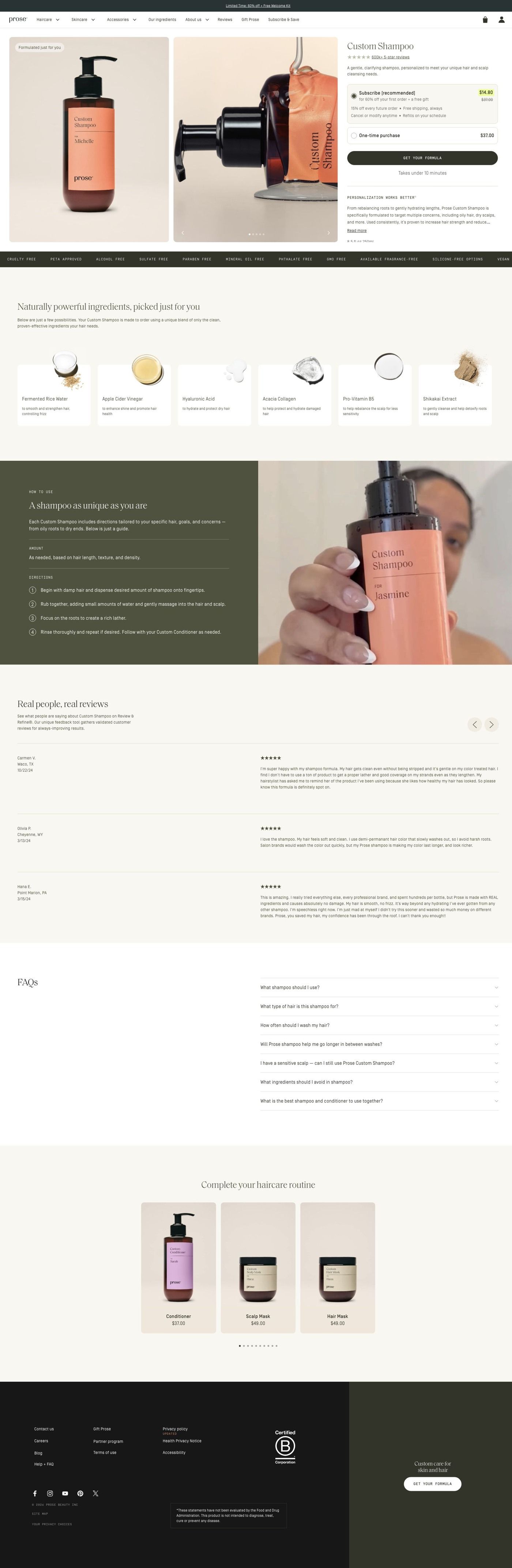
This ad sends people to the Prose Custom Shampoo product page instead of the quiz. That's a basic product page on the persona's ladder, but it's a well-built one: a gallery beside the title, a review link, a subscription choice and a consultation button up top, then a personalization explanation, ingredient cards with macro photos, a lifestyle split feature, reviews, routine recommendations and an FAQ. The ingredient cards pick up the ad's ingredient beat directly, and the review section answers the reviews don't lie line. Its Get your formula button leads to the same hair-length consultation the other ads use. It's one of 4 Prose ads in the Fluid library pointing at this page.
The page it sends people to: How Prose sells a custom shampoo before you've taken the quiz
Prose's Custom Shampoo page pairs a product gallery and subscription choice with a Get your formula button, then explains personalization, ingredients, reviews and a routine. The button leads into the same hair-length consultation the brand's other ads use. Four creator-story ads in the Fluid library send people here, including a gray-hair story and a routine angle.
How the page is built
- 01Promotion strip and navigation
The promotion strip and store navigation keep the current offer and the rest of the catalog one tap away.
- 02Product hero
A gallery beside the title, review link, description, subscription choice and Get your formula button answers "what is it, how do I buy it, and do other people like it?" in one view.
- 03Personalization explanation
Personalization and benefit copy answers "why would a custom shampoo be better than the one I have?"
- 04Ingredient cards
A horizontal rail of ingredient cards with macro photography and short descriptions answers "what's actually in it?"
- 05Custom formula feature
A lifestyle and product split explains how the formula is customized, which answers "how does Prose decide what goes in mine?"
- 06Customer reviews
Reviews with names, ratings and longer comments, alongside product imagery, answer "has this worked for someone like me?" in customers' own words.
- 07How to use it
Numbered usage instructions on an olive panel beside a creator demonstration answer "what does using it look like day to day?"
- 08Complete the routine
A product rail with consistent photography and short captions suggests the rest of the routine, which is the page's way of raising order size.
- 09FAQ
The FAQ picks up the remaining questions people have before they buy.
- 10Footer
The store footer closes the page with the usual links.
The first fixes we would make
- The ads that send people here lead with 60% off custom haircare, but apart from the promotion strip the hero doesn't put that first-order discount next to the price and subscription choice. Show the offer (and the price it comes off) right beside the Get your formula button, so the number from the ad is visible at the moment of decision.
- The page explains ingredients well, but we didn't see before & after photos. For a product sold through creator stories about specific hair concerns, a few before & afters grouped by hair type, placed near the reviews, would answer "will this work on hair like mine?" faster than text can.
Read the full breakdown of this page
Three hooks you could test
- Lead with the uncomfortable problem. “Greasy by day one but your ends feel like straw? Your shampoo is treating them the same.”
- Turn the benefit into a picture people get in a second. “Here's what your part looks like 24 hours after washing. It shouldn't.”
- Call out the habit you're replacing. “If you're washing every day to fight oil, you're probably drying out your ends.”
What to borrow for your brand
- Open on an unflattering close-up of the exact problem, which feels honest and stops the people who have it.
- Turn the symptoms into a short numbered list on screen so viewers can check themselves off as they watch.
- Name two or three specific ingredients on screen next to the problem they address, so the fix has something concrete behind it.
Transcript
When your roots are oily but your ends are dry, that means your products aren't working for your hair type. Your hair gets oily super fast, like on wash day. It's limp and flat. Your ends are dry from overwashing and the wrong products make it so much worse. That's why pros is a game changer. Their quiz asks about your hair type, your lifestyle, your health, everything to create the perfect formulas for your hair goals. So if you're oily, pros uses effective science-backed ingredients like apple cider vinegar to tackle oily roots and give you balanced healthy hair. And look at that. The reviews don't lie. And you can get 60% off your 1st order. Take the quiz and watch your hair transformed with pros.
Text on screen
- When your roots are
- oily but your ends are dry..
- Those appearing in this video were compensated for
- theit time, testimonial and use of their image
- that means your
- products
- their time, testimonial and use of their image
- X aren't working
- for your hair type. X
- 3 things about your oily hair
- that aren't normal
- oily super fast,
- 1. Gets oily fast
- like... on wash day.
- It's limp and flat.
- 2. Limp & flat
- from overwashing.
- 3. Dry ends
- make it so much worse.
- That's why Prose
- is a game-changer.
- Their quiz asks about your
- *- Back
- HAIR & SCALP
- prose
- Exit
- PREFERSMET
- untreated. air-dried hair
- texture?
- It your hair is texturally treated, think back to when it
- wasn't.
- Type 1 - Straight
- Type 2A - Soft Waves
- Almost straight with a slight
- bend
- MORE OF A VISUAL LEARNER? TAP FOR PICS
- & Hair type
- Lifestyle
- - Back
- MATe 5 SCALP
One of 93 Prose ads in the Fluid Inspiration Library, captured from the Meta Ad Library on Oct 22, 2026. We record that an ad ran publicly, not how it performed.