

ProseSponsored
Esc
How Prose turned a graying-hair question into a carousel ad
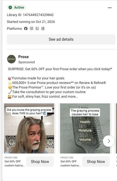
A Prose carousel ad that ran on Meta from October 21, 2026. The first card shows a man with long gray hair under a caption asking what graying does to your hair, and the second shows a brush full of shed strands. The copy leads with 60% off a first subscription order and links straight into the Prose haircare consultation.
Prose
64 creatives lead here1 / 64


















Prose · Haircare consultation
Public page captured October 22, 2026. Promotional sheets, chat, extension overlays and sticky cart bars were removed from the static reference; page layout and copy were preserved. No account, personal, health or payment details were supplied. Quiz captures show the observed entry screen, not the complete consultation.
Get 60% OFF custom haircare from Prose
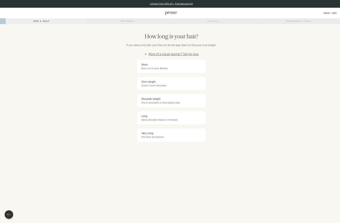
Visual reference: What graying does to your hair · male creator. Most selected ads go directly into the haircare consultation. The first-question URL redirects to a hair-length choice, with visible progress stages and a visual guide. No consultation answers were entered. Compare the creative with the destination and explore the other ads sharing this route.
- Brand
- Prose
- Observed offer
- Advertised custom haircare offer; subscription and gift conditions apply
- Creative angle
- Product benefits
- Page type
- Quiz entry
- Ad format
- Image
- Listed start date
- Oct 21, 2026
- Captured
- Oct 22, 2026
- Library ID
- 1476449274329842
- Destination
- prose.com
Selected for its design and offer structure. Ad performance isn’t available in this collection.
What this ad does well
Prose opens on a face instead of a bottle: a man with long silver hair and a beard looks at the camera under the caption “Did you know the graying process does THIS to your hair?” That question lands with anyone watching their own hair change, and the second card turns it into something you can picture, a brush full of shed strands labeled with what the ad says graying takes away (health, moisture and volume). The primary text then stacks the reasons to click in a quick list: formulas made for your hair goals, 600,000+ 5-star product reviews on Review & Refine, and the Prose Promise that your first order is on them if you don't love it. Putting a man with long hair up front also gives a viewer who rarely sees himself in haircare ads a reason to stop.
What's missing
The cards we captured name the problem and then stop, so the viewer never sees what changes after Prose. There's no after shot of the man's hair, no custom bottle, and nothing that explains how a formula answers the loss of moisture and volume the second card describes. That's the gap between noticing a problem and believing this product handles it. If you make one like this, give the final card the payoff: the same person after some time on the product (clearly labeled) or a peek at the consultation screen, so the jump to taking the consultation feels earned.
Beat by beat
- ImageFirst card: a man with long gray hair and a beard, captioned with a question about what graying does to hair.
It puts a recognizable person and a question the viewer may already be asking in the first frame.
- ImageSecond card: a hairbrush full of shed hair labeled with health, moisture and volume.
It turns an abstract claim about graying into an object people see in their own bathroom.
- HeadlineGet 60% OFF custom haircare from Prose, under each card with a Shop Now button.
It puts the offer and the word custom next to every card, so the reason to tap is never off screen.
- CopyA SURPRISE 60% off opener, then a list of custom formulas, the review count, the Prose Promise and the consultation.
It stacks proof, risk reversal and the next step in the text so the cards can stay on the problem.
The offer
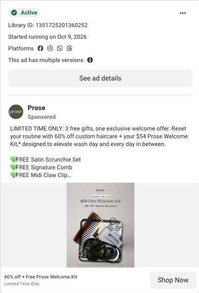
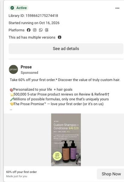
The headline and the first line of copy promise 60% off a first Prose order, with the condition in a footnote: when you subscribe, no commitment, cancel anytime. The Prose Promise (love your first order or it's on us) sits in the same list as a risk reversal.
Where it sends people
The ad sends people straight into the Prose haircare consultation, a quiz, which sits at the top of the landing-page ladder for a personalized product because it learns what the visitor is dealing with before recommending anything. The captured entry screen is compact: a promotion strip with the logo and a save/exit control, progress navigation that names the consultation stages, then one hair-length question with explanatory copy, an optional visual guide and large stacked choices. That makes the next step and the effort obvious, which suits a cold click from a carousel. What it doesn't do is pick up the graying hook: someone who tapped because of gray hair lands on a general length question, so a line on that first screen acknowledging gray hair would carry the ad's promise through. It's one of 64 ads in the Fluid library that send people to this same consultation.
The page it sends people to: How Prose starts its haircare quiz with one hair-length question
This is the first screen of Prose's haircare consultation: a slim promotion strip, a progress bar that names the consultation stages, and one hair-length question with large stacked choices and an optional visual guide. It's the destination for 64 ads in the Fluid library, mostly creator videos about curls and waves plus 60%-off offer ads.
How the page is built
- 01Promotion strip and header
A compact promotion strip sits above the logo and a save/exit control, so the offer stays visible and the visitor knows they can step out without losing their place.
- 02Progress stages
The consultation stages are named across the top, which answers "how much of this is there?" before the first tap.
- 03Hair-length question
One question with short explanatory copy, an optional visual guide and large stacked choices answers "what do I do here?" and makes the first answer easy to give.
- 04Back control
A back control lets people change an earlier answer, and the later consultation questions continue past what we captured.
The first fixes we would make
- Apart from the promotion strip, the entry screen doesn't restate what the visitor gets when they finish. Add one line under the progress stages that names the result (a formula built from these answers, plus the first-order offer the ads promised), so the effort of answering is tied to a reward.
- There's no proof on this screen, even though most of the ads sending people here are creator stories. A small strip with a customer quote or a still of a creator from the ads would carry that trust into the quiz without adding another step.
Read the full breakdown of this page
Three hooks you could test
- Lead with the uncomfortable problem. “Noticed your hair feels thinner and drier since it started going gray?”
- Call out the habit you're replacing. “Still using the shampoo you bought before your hair changed?”
- Sell the outcome. “Silver hair that still feels soft when you run your hand through it.”
What to borrow for your brand
- Put a real person with the exact problem on the first card, and write the caption as the question they'd ask themselves in the mirror.
- Use a second card to turn an abstract loss into an everyday object, like a hairbrush full of strands, with the losses written right on it.
- Stack proof, a risk reversal and the first-order offer in the primary text so the creative can stay focused on the problem.
One of 93 Prose ads in the Fluid Inspiration Library, captured from the Meta Ad Library on Oct 22, 2026. We record that an ad ran publicly, not how it performed.