OLLYSponsored
Esc
How OLLY contrasts sad capsules with colorful Mochi Bites
A 15-second OLLY video that opens on a pile of black-and-white capsules with the question "Sad supplement stack?" It cuts to colorful Mochi Bites and the Sleep jar (5 mg melatonin, magnesium, chamomile) and ends on "Raise Your Wellness Standards" with the full line. The copy says your stack just got mochi-fied. No price; Shop now opens the launch page.
Olly
12 creatives lead here1 / 12
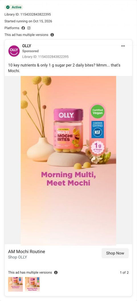
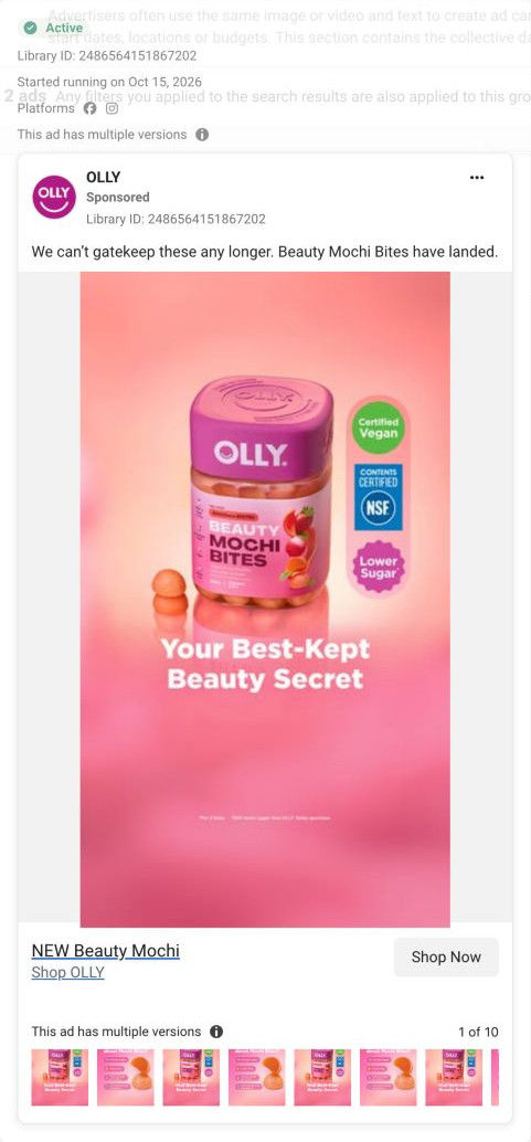
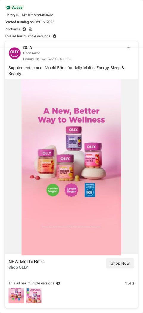
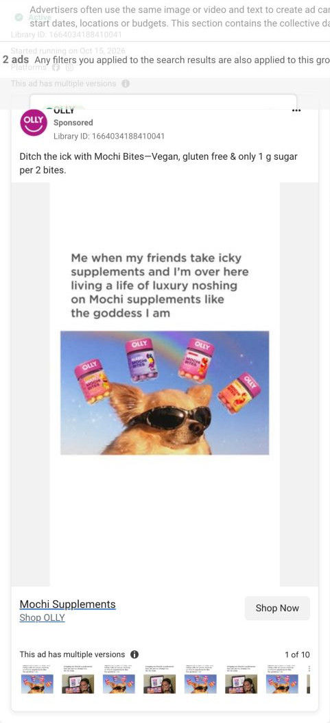
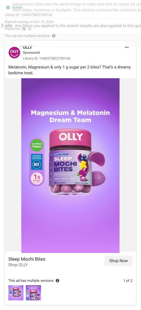
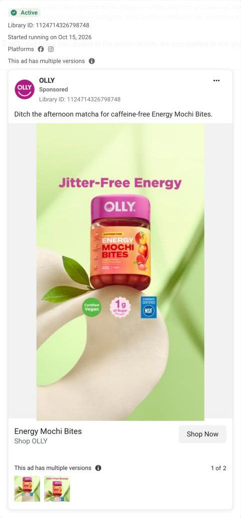
Mochi supplements · launch page
Exact Meta ad inspected October 20, 2026. CTA destination verified as OLLY-owned. Page offer may differ from original ad. No performance claim is made.
NEW Mochi Bites
Black-and-white capsules introduce a contrast with colorful Mochi products. Twelve creative concepts converge on one Mochi launch page. The hero introduces the format, a four-product chooser leads into benefits, and an anatomy section explains texture and ingredients before the footer. Compare the creative with the destination and explore the other ads sharing this route.
- Brand
- Olly
- Observed offer
- New Mochi Bites; no price or discount in the observed ad copy.
- Creative angle
- Problem / format upgrade
- Page type
- Product landing
- Ad format
- Video · 0:15
- Listed start date
- Oct 16, 2026
- Captured
- Oct 20, 2026
- Library ID
- 1456080203036478
- Destination
- olly.com
Selected for its design and offer structure. Ad performance isn’t available in this collection.
What this ad does well
The opening contrast is the clearest problem statement in OLLY's set. Gray, clinical capsules filling the frame show the old habit in one image, and "Sad supplement stack?" names a feeling regular supplement takers will recognize. The cut to color then makes the switch feel like relief rather than a lecture. The Sleep segment adds real specifics, such as the melatonin dose and the magnesium and chamomile behind it, so it isn't only mood.
What's missing
After the strong opening, the ad drifts from the stack it called sad to a single sleep product, so the viewer who takes a morning multi doesn't see their swap. There's also no taste or texture moment, which is the actual reason mochi beats a capsule. If you make one like this, follow the problem with a quick before-and-after of the whole routine (four capsules out, four jars in) and one shot of someone biting into one.
Beat by beat
- 0-3sA pile of black-and-white capsules fills the frame with the question "Sad supplement stack?"
It shows the old habit as dull and clinical, naming a feeling regular supplement takers recognize.
- 3-6sColorful Mochi Bites appear with text introducing the Multi jar and its key nutrients.
The shift from gray to color makes the switch feel like an upgrade.
- 6-12sThe Sleep jar appears with 5 mg melatonin, magnesium and chamomile extract and the label claim about falling asleep and waking refreshed.
It gives one product concrete details so the ad isn't only about mood.
- 12-15sThe video ends on "Raise Your Wellness Standards" with the Energy, Multi and Sleep jars.
It closes on a call to upgrade and shows the range.
Where it sends people
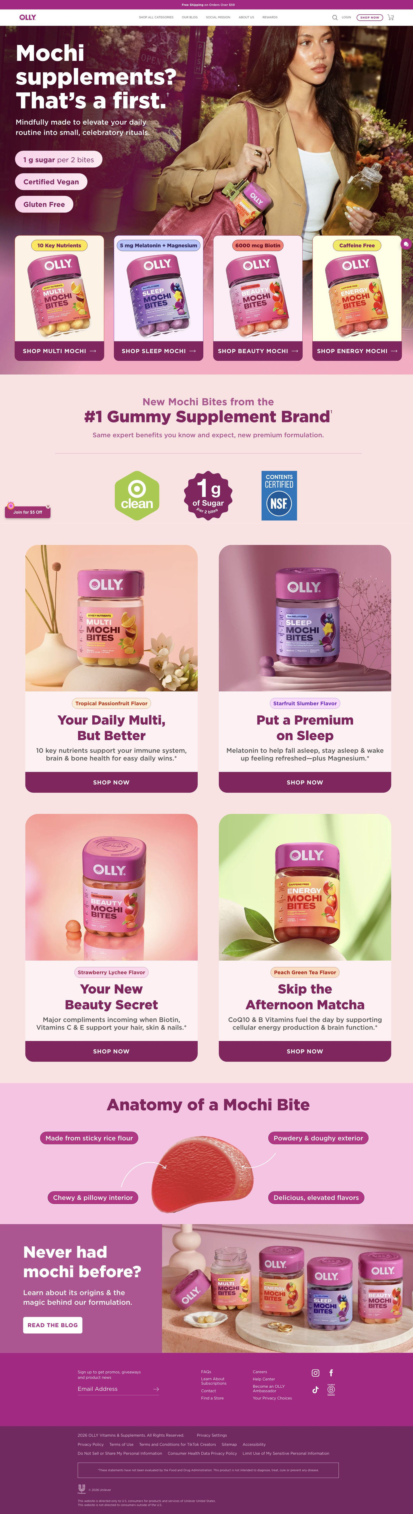
The click opens OLLY's Mochi launch page, a focused product landing page and a better rung than a homepage. The page continues the colorful side of the contrast well (pink backgrounds, four jars, playful flavor names) and its "#1 Gummy Supplement Brand" line and NSF badge add the credibility a pill taker might want. It doesn't continue the capsule comparison, though, and it has no section that says what you'd swap out. A short pills-versus-mochi row near the top would carry the ad's best idea onto the page.
The page it sends people to: How OLLY's Mochi Bites launch page introduces a new format
OLLY's Mochi supplements launch page opens with a question headline and claim pills, then a four-product chooser, a brand-trust band, one feature card per product, an anatomy of a mochi bite and a blog link. All 12 OLLY ads in the Fluid library send people here, from a Target parachute drop to creator routines and single-product statics.
How the page is built
- 01Hero
A question headline, a line about small celebratory rituals and three claim pills over a lifestyle photo answer what this new product is.
- 02Product chooser
Four product cards, each with a tag like 10 Key Nutrients or Caffeine Free and a Shop button, answer which one fits my need.
- 03Brand trust band
A line calling OLLY the #1 gummy supplement brand plus Target Clean, 1 g sugar and NSF badges answer whether to trust a new format.
- 04Feature cards
One card per product with a flavor tag, a short headline, a benefit line and a Shop Now button answer what each jar is for and how it tastes.
- 05Anatomy of a Mochi Bite
A cut-open bite with four labeled callouts on flour, exterior, interior and flavor answers what mochi is actually like.
- 06Never had mochi before?
A lineup photo and a Read the Blog button answer where to learn more about the format.
- 07Footer
An email signup for promos and giveaways, Find a Store and support links answer how to stay in touch and where else to buy.
The first fixes we would make
- There are no prices anywhere on the page in our capture, and every Shop button sends people elsewhere to find out. Put the price and pack size on each product card so a shopper knows the commitment before clicking through.
- The page has no reviews or customer voices, even though OLLY runs creator ads with Maura Higgins and Kierro Frost. Add a row of creator clips or early reviews under the product chooser so a new format has people vouching for it.
Read the full breakdown of this page
Three hooks you could test
- Call out the habit you're replacing. “Is your supplement routine this gray?”
- Lead with the uncomfortable problem. “Dreading your vitamins every morning?”
- Turn the benefit into a picture people get in a second. “From a pile of capsules to a jar you want to open.”
What to borrow for your brand
- Open on the old habit shot in black and white, then cut to your product in full color so the switch feels like relief.
- Name the feeling in a short question (sad supplement stack?) rather than a claim.
- After the contrast, show the full routine swap so every viewer sees their own product replaced.
Transcript
There's no speech in this video. The on-screen text and music carry the message.
Text on screen
- Sad
- supplement
- stack?
- LY NUTRIENTS
- MULTI
- MOCHI
- BITES
- uD feeling refreshed."
- EXCELLENT SOURCE
- OF MAGNESIUM
- A numeral that supports nome
- munch function & a healthy
- CHAMOMILE EXTRACT
- A botan Ingredient traditionaly
- SLEE
- MOC
- & Wall
- Meet Mochi
- OLLY
- 5мG MELATONIN
- SLEEP
- Helps You Fall Asleep, Stay Aslead
- & Wake Up Feeling Refreshed
- Melatooin | Magnesium |
- Chamomen
- Extract
- 60 MOCHI BITES
- DIETARY SUPPLEMENT
- OLLY.
- 5MG MELATONIN
- Helps You Fall Asleep, Stay Asleep
- & Wake Up Feeling Refreshed*
- Melatonin| Magnesium
- Chamomile
- Certified Vegan
- 5ма MELATONIN
- & Wake Up Feeling Refreshed"
- Melstonin| Magnesium
- clean
- CONTENTS
One of 12 Olly ads in the Fluid Inspiration Library, captured from the Meta Ad Library on Oct 20, 2026. We record that an ad ran publicly, not how it performed.