OLLYSponsored
Esc
How OLLY used Maura Higgins and a Target aisle to launch Mochi
An 18-second OLLY ad that follows Maura Higgins on a stylized Target trip to the Mochi Bites shelf. The copy says everyone wants to know what she's into right now, and it's Mochi Bites, only at Target and OLLY.com. She reacts to 1 g of sugar and the taste. There's no discount, and Shop now opens the launch page.
Olly
12 creatives lead here1 / 12
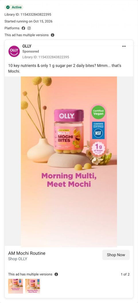
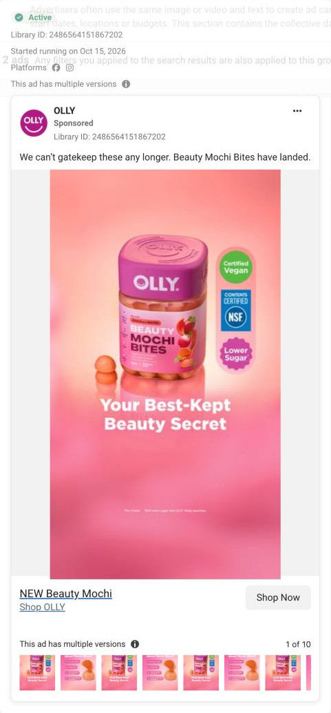
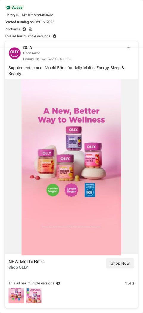
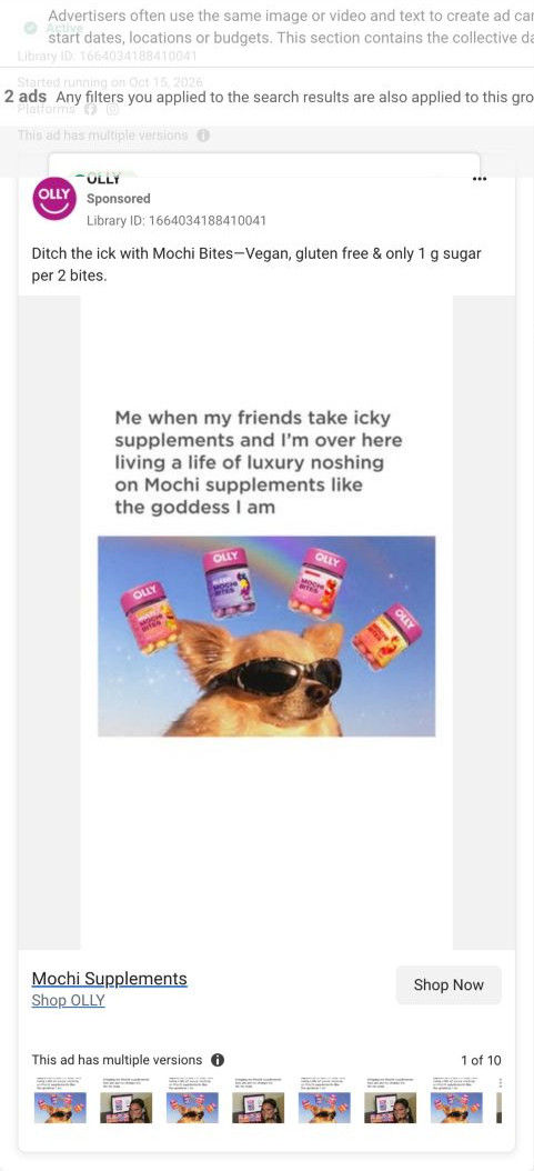
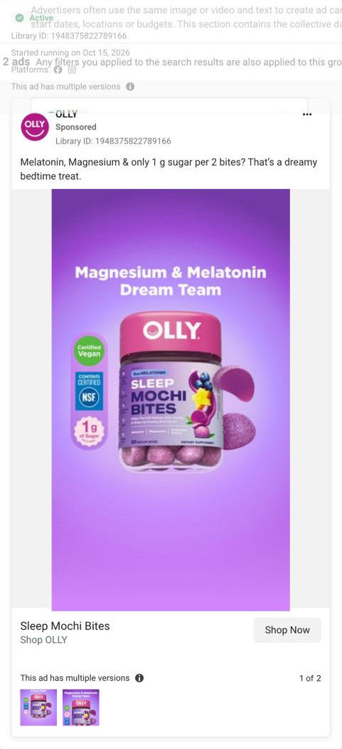
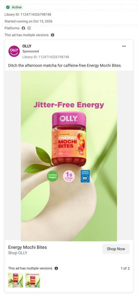
Mochi supplements · launch page
Exact Meta ad inspected October 20, 2026. CTA destination verified as OLLY-owned. Page offer may differ from original ad. No performance claim is made.
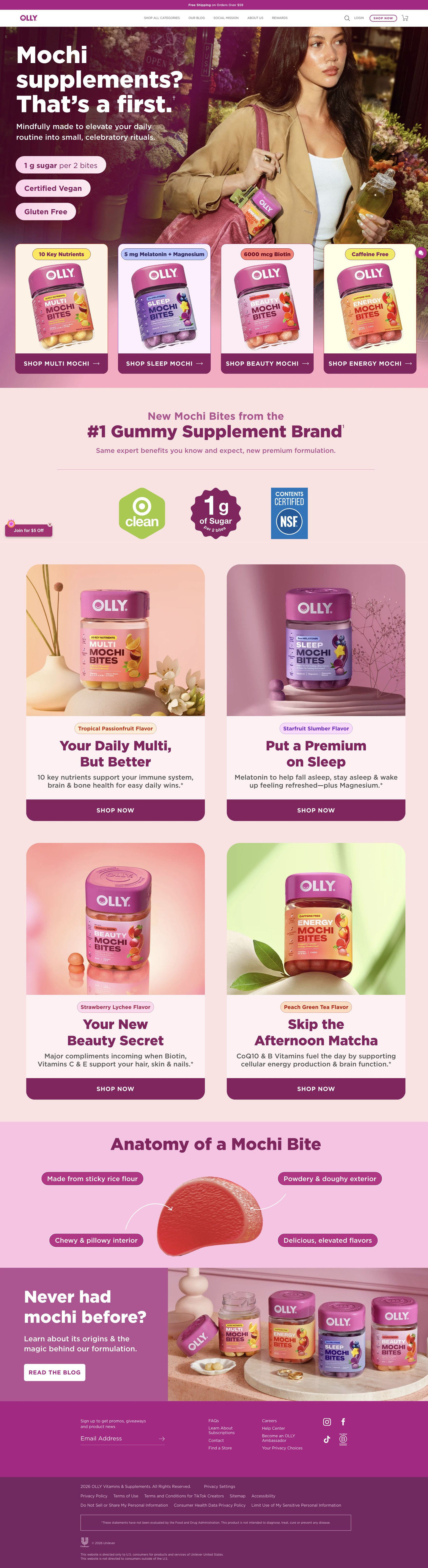
NEW Mochi Bites
The ad names Maura Higgins and shows a stylized shopping trip through Target. The observed CTA leads to OLLY.com. Twelve creative concepts converge on one Mochi launch page. The hero introduces the format, a four-product chooser leads into benefits, and an anatomy section explains texture and ingredients before the footer. Compare the creative with the destination and explore the other ads sharing this route.
- Brand
- Olly
- Observed offer
- New Mochi Bites; no price or discount in the observed ad copy.
- Creative angle
- Creator / retail discovery
- Page type
- Product landing
- Ad format
- Video · 0:18
- Listed start date
- Oct 15, 2026
- Captured
- Oct 20, 2026
- Library ID
- 2689035521527138
- Destination
- olly.com
Selected for its design and offer structure. Ad performance isn’t available in this collection.
What this ad does well
The ad borrows curiosity about a known personality and points it at a shelf. "Everyone wants to know what @maurahiggins is into" is a hook her followers would stop for, and the retro outfit and Target aisle make it feel like a moment rather than a product placement. Her lines are short and specific (one gram of sugar, "tastes unreal"), so the two main selling points come from her mouth instead of a badge. The copy also tells people exactly where to buy: Target and OLLY.com.
What's missing
The ad leans on who she is more than on what the product does for her. There's no moment of her actually using it in her day, so a viewer who doesn't know Maura Higgins gets a stylish clip with little reason to care. It also points to Target while the button goes to OLLY's page, which has no prominent way to find it in store. If you make one like this, give the personality a real moment of use (in her bag, at breakfast) and send Target-led ads to a page with a store finder near the top.
Beat by beat
- 0-4sMaura Higgins, in a retro outfit and hat, pushes a red cart down a Target aisle as she says everyone wants to know what she's into.
Her name and the curiosity hook give her followers a reason to keep watching.
- 4-10sShe reaches the Mochi Bites shelf and picks up the jars as on-screen text calls it a better way to wellness.
It shows the product in a real retail setting, which tells viewers they can find it on a shelf.
- 10-18sShe reacts to one gram of sugar and the taste while badges show 1 g of sugar and NSF Contents Certified.
Hearing the selling points from her makes them feel like an opinion rather than a label.
Where it sends people
The ad lands on OLLY's Mochi launch page, a focused product landing page and a decent rung for launch traffic. The page repeats the four jars, the 1 g sugar claim and a Target Clean badge, so the product facts match. Maura Higgins doesn't appear anywhere on the page, and the Target-first message turns into a page that sells online, with Find a Store tucked into the footer. Adding a short clip of her and a where-to-buy option near the hero would make the click feel like the same campaign.
The page it sends people to: How OLLY's Mochi Bites launch page introduces a new format
OLLY's Mochi supplements launch page opens with a question headline and claim pills, then a four-product chooser, a brand-trust band, one feature card per product, an anatomy of a mochi bite and a blog link. All 12 OLLY ads in the Fluid library send people here, from a Target parachute drop to creator routines and single-product statics.
How the page is built
- 01Hero
A question headline, a line about small celebratory rituals and three claim pills over a lifestyle photo answer what this new product is.
- 02Product chooser
Four product cards, each with a tag like 10 Key Nutrients or Caffeine Free and a Shop button, answer which one fits my need.
- 03Brand trust band
A line calling OLLY the #1 gummy supplement brand plus Target Clean, 1 g sugar and NSF badges answer whether to trust a new format.
- 04Feature cards
One card per product with a flavor tag, a short headline, a benefit line and a Shop Now button answer what each jar is for and how it tastes.
- 05Anatomy of a Mochi Bite
A cut-open bite with four labeled callouts on flour, exterior, interior and flavor answers what mochi is actually like.
- 06Never had mochi before?
A lineup photo and a Read the Blog button answer where to learn more about the format.
- 07Footer
An email signup for promos and giveaways, Find a Store and support links answer how to stay in touch and where else to buy.
The first fixes we would make
- There are no prices anywhere on the page in our capture, and every Shop button sends people elsewhere to find out. Put the price and pack size on each product card so a shopper knows the commitment before clicking through.
- The page has no reviews or customer voices, even though OLLY runs creator ads with Maura Higgins and Kierro Frost. Add a row of creator clips or early reviews under the product chooser so a new format has people vouching for it.
Read the full breakdown of this page
Three hooks you could test
- Show a specific moment of use. “What's in my bag this week? This jar.”
- Sell the outcome. “The vitamin you'll remember to take because you like it.”
- Make the product the whole scene. “Straight to the vitamin aisle for one thing.”
What to borrow for your brand
- Open with a curiosity line about the person on camera (what they're into right now) to give their audience a reason to stop.
- Let the creator say the two main selling points in their own short words instead of putting them on badges.
- Tell viewers exactly where to buy in the copy, and make sure the landing page offers that same option near the top.
Transcript
Everyone wants to know. What 10 I'm into right now. Are you joking? One gram of sugar, tastes unreal. Better for you. I genuinely tank we have a winner.
Text on screen
- OLLY
- OCH
- 19.79
- MULTI
- MOCHI
- BITES
- OLY
- MOCH
- OLLY.
- BEAUT
- bLLY.
- A Better Way
- to Wellness
- SLEEP
- ENERO
- BEAUTY
- MUL
- - MOCHI
- New & only at
- clean
- 1 g
- of Sugar
- CONTENTS
- CERTIFIED
- NSF
One of 12 Olly ads in the Fluid Inspiration Library, captured from the Meta Ad Library on Oct 20, 2026. We record that an ad ran publicly, not how it performed.