How MUDWTR answers a 'what's the difference' comment in an ad
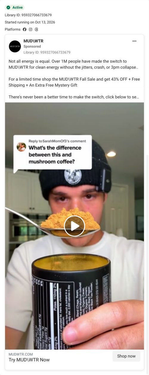
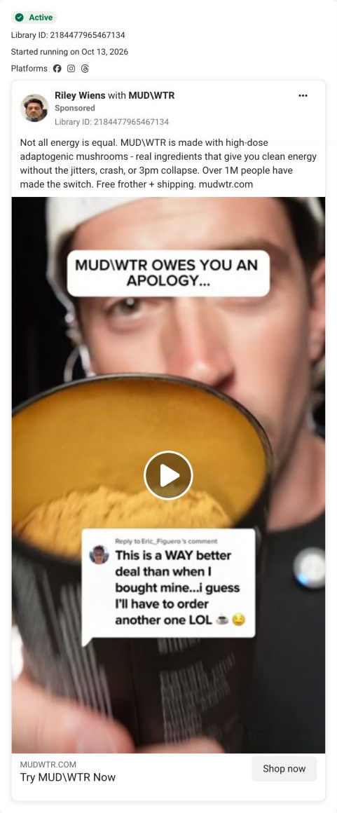
A brand-page video that replies to a viewer comment asking “What's the difference between this and mushroom coffee?” while a creator in a beanie holds a heaped spoon of MUDWTR powder over the tin. The copy announces a fall sale with 43% off, free shipping and a mystery gift, and it links to the Rise 2 campaign page.

A browser shopping-extension badge appears in the upper-right margin of this capture.

A reply to the mushroom-coffee comparison
The ad frames a lower-caffeine coffee swap around the afternoon crash, then presents 43% starter-kit savings and a free frother. The CTA leads to the Rise 2 starter-offer route, shared by several ads in this collection. Compare the creative with the destination and explore the other ads sharing this route.
- Brand
- MUDWTR
- Observed offer
- Advertised 43% off starter kits + free frother
- Creative angle
- Discount
- Page type
- Dedicated offer
- Ad format
- Video
- Listed start date
- Oct 13, 2026
- Captured
- Oct 19, 2026
- Library ID
- 959327066733679
- Destination
- mudwtr.com
Selected for its design and offer structure. Ad performance isn’t available in this collection.
What this ad does well
This ad starts with the exact question a shopper in this category is asking, which is the most direct way to meet someone at their level of awareness. Using a real comment makes the question feel common rather than planted, and the spoonful of powder held over the tin (nutrition panel visible) shows the product while the answer begins. The copy then gives a specific limited-time offer.
What's missing
The question is perfect, but the written answer never arrives: the copy skips straight to clean-energy claims and the sale, so anyone not listening still doesn't know the difference. If you build an ad on an FAQ, answer it in the first line of the copy in one plain sentence, then let the video add detail. For MUDWTR, the landing page's comparison table already has the material to draw from.
Beat by beat
- 0-3sA reply bubble asks how this differs from mushroom coffee while a creator holds a spoon of powder over the open tin.
It starts with the shopper's own question and shows the product as the answer begins.
- CopyThe text claims clean energy without the jitters or 3pm collapse, cites over 1M switchers, and announces a limited-time fall sale with 43% off, free shipping and a mystery gift.
It gives the offer and urgency, though not the answer to the question.
- HeadlineThe link card reads Try MUDWTR Now.
It's a plain call to action with no extra incentive in the headline.
The offer
A limited-time fall sale: 43% off, free shipping and an extra free mystery gift.
Where it sends people
It sends people to the Rise 2 campaign page, a long, focused landing page with a logo-only header, and one of 10 ads in the Fluid library that land there. The hero names the category (Super Functional Coffee Alternative) with a “Try it & Save 43%” button, a 30-day money-back guarantee line and four icon benefits framed as coffee without its drawbacks. That button and guarantee repeat after the product block, the comparison table and the review section, so every proof block ends in the same action. This is a good match for a what's-the-difference ad, because the comparison table (MUDWTR's column raised against two unnamed blends) answers the question directly. The 43% carries through, but the hero we captured shows no mystery gift, so the third part of the ad's offer goes quiet on arrival.
The page it sends people to: How MUDWTR's Rise 2 page ends every proof block with the same offer
MUDWTR's Rise 2 campaign page, a dark, long-form landing page with a logo-only header. It names the coffee-alternative category up top and repeats one 43% savings button with a guarantee line after each proof block. It's the destination for 10 ads in the Fluid library, mostly habit-switch videos and statics with a couple of creator cuts.
How the page is built
- 01Logo-only header
A black header with only the logo removes navigation so ad visitors stay on the offer.
- 02Hero
An overhead cup photo sits beside a rating with review and member counts, a category headline, the savings button, a guarantee and four benefit bullets, answering what this is and what it costs to try.
- 03Testimonial band and ticker
A creator quote with avatar and a scrolling strip of benefit words add an early human voice.
- 04Product block
A pack shot with ingredients sits next to a morning-ritual headline, flavor and feeling columns, a checklist of attributes and certifications, and the button again, answering what's in it and how it tastes.
- 05Founder video
An Our Founding Story card with a one-line origin and a Play button answers who's behind the brand.
- 06Comparison table
The product column is raised and outlined against two rival products with star ratings and four attribute rows, then the button, answering why this one over other blends.
- 07Creator carousel
A Loved By Creative Minds carousel pairs a large quote with portraits, answering who else drinks it.
- 08Customer proof
A Join The Movement headline, topic tabs filtering review cards, a carousel of UGC video thumbnails and the button again answer whether people like it.
- 09Ingredients grid
Eight cards with texture photos, benefit tags and one sentence each explain what every ingredient is there for.
- 10Product range
A Popular Products grid with status tags (new, popular, zero caffeine) shows the wider line.
- 11FAQ
A long accordion covers caffeine, sugar, sourcing, pregnancy, preparation and taste, answering the remaining objections.
- 12Brand story, retail and footer
Founding story, a partner-app perk and giving rows lead into retailer logos, a humorous ad video, journal cards, social photos, press logos, a newsletter and footer citations and disclaimer.
The first fixes we would make
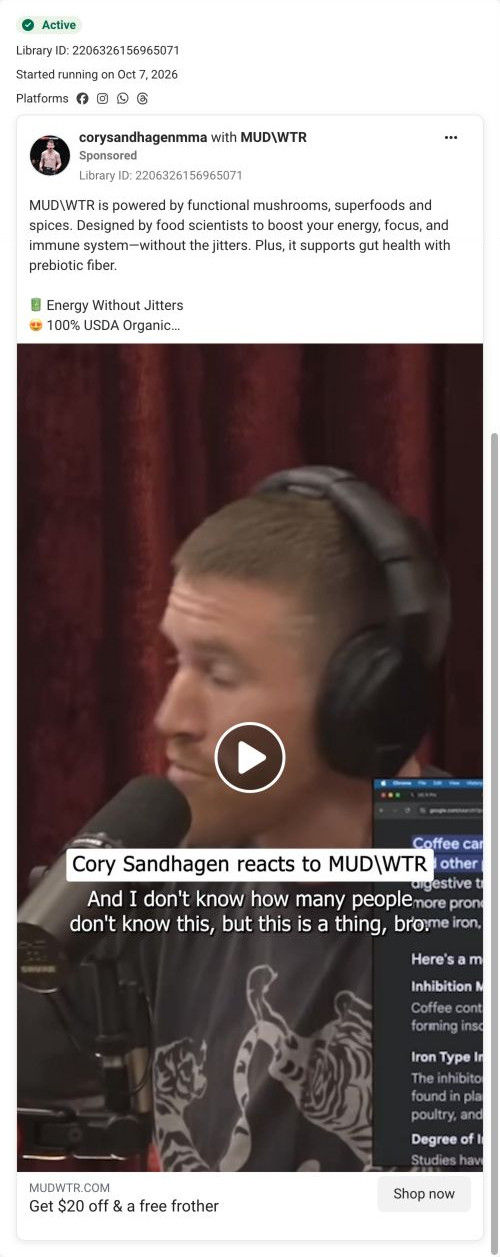
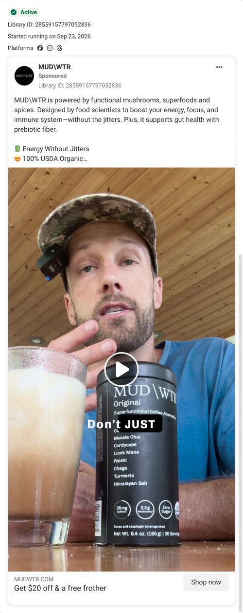
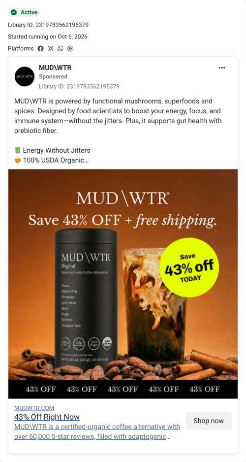
- Several ads that land here offer $20 off and a free frother, and the button says 43%. Rewrite those ads around 43% or route them to the classic Rise page, which leads with $20, so the number never changes between the ad and the page.
- The free frother and the mystery gift that some ads promise don't appear in the hero. Add a short line under the button listing what comes free, so the offer from the ad is confirmed on arrival.
Read the full breakdown of this page
Three hooks you could test
- Make the product the whole scene. “People keep asking how this is different. Here's the answer, scoop by scoop.”
- Call out the habit you're replacing. “If you already drink the other one, here's what you'd notice switching.”
- Turn the benefit into a picture people get in a second. “Same mug, same morning, very different label.”
What to borrow for your brand
- Turn your most common pre-purchase question into the hook by replying to a real comment that asks it.
- Answer the question in one plain sentence at the top of the copy, so the ad works with the sound off.
- Send FAQ-style ads to a page with a comparison table near the top, so the answer continues after the click.
One of 34 MUDWTR ads in the Fluid Inspiration Library, captured from the Meta Ad Library on Oct 19, 2026. We record that an ad ran publicly, not how it performed.