

Song Of Skin with MedicubeSponsored
Esc
How Medicube matched skin concerns to device modes in one video
A silent creator video from Song Of Skin with Medicube for the Booster Pro X2, running on Meta from Sep 29, 2026. It opens on a dig at clinic spending, then tiles concern close-ups beside the device mode for each one. No price appears. It sends people to the Booster Pro X2 product page.
Medicube
6 creatives lead here1 / 6

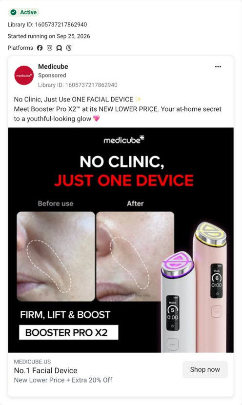


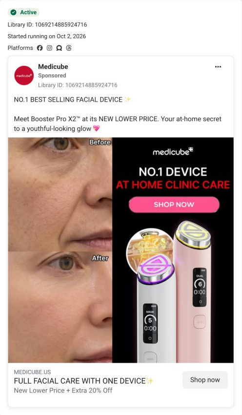
Booster Pro X2 product page
Page captured October 20, 2026. The current offer may differ from the original ad.

Song Of Skin
A tiled creator demonstration pairs pore, glow, volume and contour close-ups with labeled device modes. Feature, creator and price-led ads share a long device product page. The observed page shows pink and white choices, a $249 buy button, mode explanations, expert sections, comparisons and reviews. Compare the creative with the destination and explore the other ads sharing this route.
- Brand
- Medicube
- Observed offer
- Booster Pro X2; no price stated
- Creative angle
- Feature comparison
- Page type
- Product page
- Ad format
- Video · 0:28
- Listed start date
- Sep 29, 2026
- Captured
- Oct 20, 2026
- Library ID
- 1422643383165912
- Destination
- medicube.us
Selected for its design and offer structure. Ad performance isn’t available in this collection.
What this ad does well
The opening caption teases the viewer about spending on clinic treatments while the creator holds up the pink device, so the habit being replaced is clear before anything is explained. Then the grid does the heavy lifting: a close-up of the problem (PORES, GLOW, VOLUME, CONTOUR) sits next to the creator using the mode meant for it (AIR SHOT, BOOSTER, MC, DERMA SHOT), so a viewer can find their own concern in a glance. The rest of the video adds the newer features (dual mode, mask mode and the AI routine on the app) with short captions, and it all reads with the sound off, since the only audio is a ticking track. It closes on a one device, all skin needs card, which is a clean summary of the angle.
What's missing
The clinic comparison sets up a money argument and then never finishes it. There's no price, no before and after, and no reason to buy this week, so the viewer who was hooked by "spending on clinic treatments" has to go to the page to find out whether this is actually cheaper. The Booster Pro X2 page shows $249 in the buy button and has a tested-results carousel with before-and-after pairs, so both pieces already exist. If you make one like this, put the price on the end card right after the clinic line and drop in one before-and-after from your own results, so the comparison lands on a number and a picture.
Beat by beat
- 0-3sThe creator holds the pink Booster Pro X2 under a caption teasing viewers about clinic spending, followed by a meanwhile-me line.
It names an expensive habit the viewer already has and positions the device as the at-home swap.
- 3-12sA grid pairs close-ups of pores, dry lips, eye wrinkles and a jawline with clips of the creator using a labeled mode for each.
Each tile lets a viewer spot their own concern and see which mode the brand ties to it, without any voiceover.
- 12-22sCaptions introduce dual mode, mask mode and an AI-generated personalized routine on the app.
These are the newer features, so this beat gives existing device owners a reason to pay attention too.
- 22-28sCaptions explain that dual mode runs two modes at once and mask mode is meant to boost sheet-mask absorption, ending on a one device, all skin needs card.
It closes by restating the whole angle in a line the viewer can remember.
Where it sends people
The ad goes to the standard Booster Pro X2 product page, which on the persona's ladder is a product page rather than a focused landing page (it's one of 6 ads in the Fluid library that land there). The page does pick up this ad's promise well once you scroll: the modes overview and its full-width carousels give each mode its own slide with a pill tab bar, which mirrors the grid in the video. The gap is the order. A viewer who came for the clinic comparison meets color cards, add-ons and accordions first, and the upgrade banner, expert endorsements and tested results sit further down. Moving a short mode-by-concern strip and one before-and-after up near the buy box would put the ad's payoff where the click arrives.
The page it sends people to: How Medicube's Booster Pro X2 page explains a device mode by mode
Medicube's Booster Pro X2 page is a long device product page: a compact buy box with color cards and add-ons, then dark mode-by-mode carousels, expert quotes, tested results, routines, FAQ and reviews. Six Medicube ads in the Fluid library link here, covering before-and-after artwork, feature comparisons, a creator introduction and a price-led offer.
How the page is built
- 01Announcement bar and header
A referral-offer ticker and the store nav with a highlighted ambassador link show this is the brand's own shop.
- 02Buy box
A model holding the glowing device, color cards with prices and a red Add to cart with sale price and installments answer what it costs and which color to pick.
- 03Complete the set and details
Companion skincare with small Add buttons, a skin-type table and accordions for what's included, overview and clinical test answer what comes in the box and what pairs with it.
- 04Feature cards
Tall image cards cover the device lineup, a companion product, a sensor and the app, answering what's new at a glance.
- 05Hero banner
The product name, a ranking claim with a footnote, a tagline and spec chips restate what the device is after the buy box.
- 06Upgrade banner
A comparison headline against the previous model and a lineup of lit heads answer why to buy this version.
- 07Expert endorsements
Headshots beside highlighted quote cards answer whether professionals stand behind the device.
- 08Modes overview and carousels
A cutaway render and full-bleed slides with pill tabs walk through each mode, answering what each one does.
- 09Tested results carousel
Before-and-after pairs, result figures and a trial-source line show what the brand reports from its testing.
- 10How to layer and routines
Usage scenarios with chained mode chips, routine cards pairing the device with products and a video block answer how to fit it into your week.
- 11FAQ
Plus-toggle questions cover model differences, modes, the app and how to use the device.
- 12Reviews and footer
Ratings, a photo strip and reviews with skin profiles and video thumbnails answer whether people like you are happy with it, then a coupon signup closes the page.
The first fixes we would make
- The before-and-after ads promise at-home clinic care, but their payoff sits far below the buy box. Add one before-and-after pair to the gallery thumbnails, so those visitors see the result they clicked on right next to the price.
- For a device at this price, we didn't see a guarantee or return window near Add to cart. Put the return terms (or a trial period, if the brand offers one) on a line under the installment note.
Read the full breakdown of this page
Three hooks you could test
- Call out the habit you're replacing. “You're paying a clinic for something you could do on your couch.”
- Turn the benefit into a picture people get in a second. “Split the screen: your concern on the left, the setting that targets it on the right.”
- Sell the outcome. “One tool for pores, glow and contour, all before your coffee's ready.”
What to borrow for your brand
- Pair each customer problem with the exact product setting or variant meant for it in a tiled grid, so viewers find themselves in the frame without needing audio.
- Open with a caption that teases the viewer about what they currently spend on the alternative, then show your product as the meanwhile-me answer.
- End with a single summary card that restates the angle in a few words, so a viewer who skipped the middle still leaves with the point.
Transcript
Tick, tick, tick, tick, tick.
Text on screen
- You must be spending SS
- SS on clinic treatments...
- Meanwhile me:
- Meanwhile mer
- You must be spending S$
- SS on olinic treatments...
- PORES
- AIR SHOT
- GLOW
- BOOSTER
- VOLUME
- CONTOUR
- DERMA SHOT
- DUAL MODE
- 00:d
- MASK MODE
- AI MODE
- Today's Personalized Routine
- by Al
- 00:0
- generating
- BOOSTER MODE
- DERMA SHOT NUDE
- medicube*
- DUAL mode = can use two
- modes at the same time
- MASK moes boosts
- sheet mask
- essence absorption
- MASK mode = boosts
- ONE DEVICE
- ALL SKIN NEEDS
One of 28 Medicube ads in the Fluid Inspiration Library, captured from the Meta Ad Library on Oct 20, 2026. We record that an ad ran publicly, not how it performed.