How Maximus illustrated food noise in a single GLP-1 image
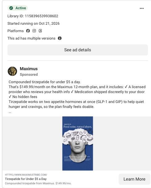
A Maximus static image that ran on Meta from October 21, 2026, in several versions. On a deep blue background, hand-drawn food doodles burst out of a torn-paper gap in a man's head under the headline "Food noise, turned down." The copy offers tirzepatide at $149.99/month, and the click goes to the food-noise landing page.

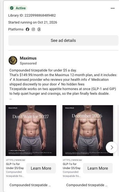
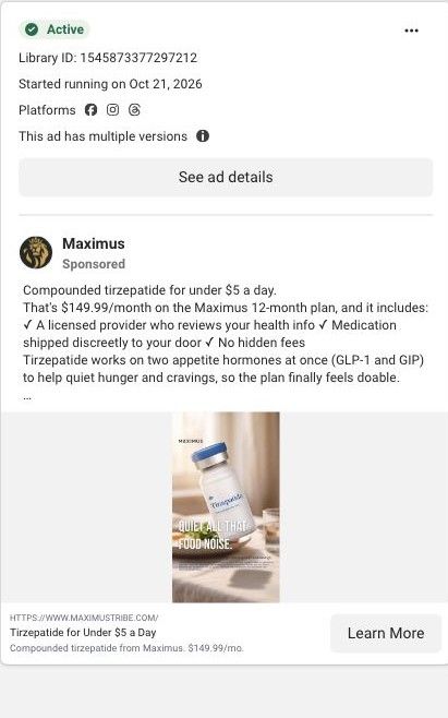
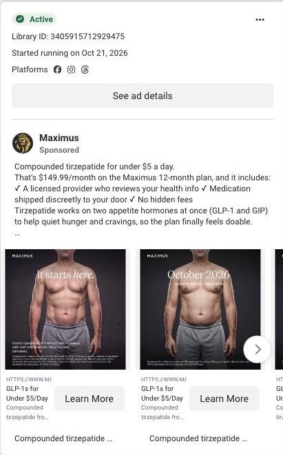
Active creative and exact outbound link observed in Meta Ad Library on October 22, 2026. The final destination was followed and its public rendered layout captured. This is a GLP-1 weight-management ad, not a sermorelin ad. Advertiser claims are retained as source material; creative activity does not establish performance. No personal, health or payment details were entered.
HTTPS://WWW.MAXIMUSTRIBE.COM/
A focused treatment hero continues into practitioner credentials, an expected-process timeline, offer details and FAQs. Compare the creative with the destination and explore the other ads sharing this route.
- Brand
- Maximus
- Observed offer
- HTTPS://WWW.MAXIMUSTRIBE.COM/
- Creative angle
- Problem / solution
- Page type
- Service landing
- Ad format
- Image
- Listed start date
- Oct 21, 2026
- Captured
- Oct 22, 2026
- Library ID
- 1158396539938602
- Destination
- page.maximustribe.com
Selected for its design and offer structure. Ad performance isn’t available in this collection.
What this ad does well
This is the strongest problem-first image in the set. The doodles of pizza, burgers and snacks spilling out of a man's head turn an abstract feeling into something you get in a second, and the headline names it in plain words. The blue background and editorial type make it stand out from the vial shots. Because the page is built around the same phrase, the click lands on a matching promise.
What's missing
The image names the problem well but stops there: no product, no price and no proof in the frame, so the copy has to do all the selling. That copy is the same price-led text used across the account and doesn't continue the food-noise idea. If you make one like this, write primary text that picks up the image (what the noise sounds like during a normal day) and attribute any claim about appetite to the brand. Add a small product shot in the corner so the viewer knows what's being offered.
Beat by beat
- ImageFood doodles burst from a torn-paper gap in a man's head on a deep blue background.
It turns a feeling into a picture the viewer gets instantly.
- Headline"Food noise, turned down" sits across the top.
It names the problem in the customer's own words and hints at the outcome.
- CopyThe primary text leads with under $5 a day and the $149.99 monthly plan.
It moves straight from the problem to the practical terms.
The offer
Compounded tirzepatide framed in the copy as under $5 a day, or $149.99/month on the 12-month plan.
Where it sends people
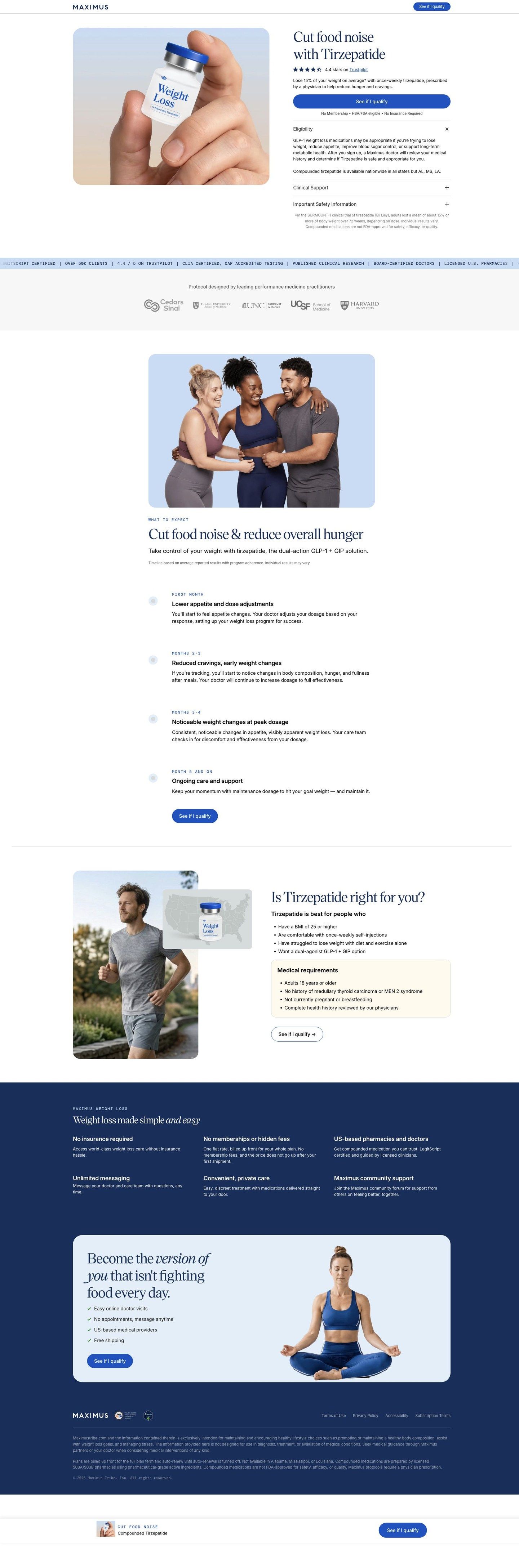
The ad sends people to a tirzepatide landing page built around food noise, which sits a step above a basic product page because it carries one problem from the hero down. The hero reads "Cut food noise with Tirzepatide" with a See if I qualify button, a Trustpilot rating and an eligibility accordion, then a practitioner credentials band, a what-to-expect timeline and the plan details. The phrase "food noise" carries from the ad to the hero, which is exactly the match you want. The page could go further by reusing the illustration or its blue in the hero so the visual memory carries too.
The page it sends people to: How the Maximus food-noise page sells a tirzepatide plan
A Maximus landing page for compounded tirzepatide, built around cutting food noise. It runs from a hero with an eligibility check through practitioner credentials, a treatment timeline, plan details and FAQs. Four of the 11 Maximus ads in the Fluid library send people here, mostly food-noise statics and dated physique carousels.
How the page is built
- 01Treatment hero and start CTA
A vial in hand beside "Cut food noise with Tirzepatide," a rating, the See if I qualify button and eligibility and safety accordions answer what this is and whether it's for me.
- 02Practitioner credentials
A ticker of claims like board-certified doctors and licensed pharmacies, plus a row of institution logos, answers who's behind it.
- 03Problem explanation and treatment positioning
A group photo and the line about the dual-action GLP-1 and GIP approach explain what the treatment is meant to do, as the page describes it.
- 04Treatment timeline
A month-by-month what-to-expect list answers what happens after I start.
- 05Plan and offer details
The plan and price section answers how much it costs and what's included.
- 06FAQs and safety information
Questions and safety details answer the remaining objections before someone starts.
The first fixes we would make
- The ads that land here lead with $149.99/month and under $5 a day, but the hero doesn't show a price. Put the monthly figure and the 12-month terms next to See if I qualify so the visitor confirms what they clicked for.
- The logo row says the protocol was designed by practitioners but doesn't name anyone. Add a named clinician with a credential and a photo near the logos so the trust claim points to a person.
Read the full breakdown of this page
Three hooks you could test
- Turn the benefit into a picture people get in a second. “Draw what the craving sounds like, then show it going quiet.”
- Lead with the uncomfortable problem. “Can't stop thinking about the next meal?”
- Sell the outcome. “A normal afternoon without the snack countdown.”
What to borrow for your brand
- Illustrate an invisible problem with simple doodles so the viewer recognizes it before reading a word.
- Use a background color that's different from the rest of your account so the problem ad stands apart.
- Match the ad's key phrase to the landing page headline so the click feels like the next page of the same idea.
One of 11 Maximus ads in the Fluid Inspiration Library, captured from the Meta Ad Library on Oct 22, 2026. We record that an ad ran publicly, not how it performed.