

Marek HealthSponsored
Esc
How Marek Health uses a symptom-and-cause table in a static ad
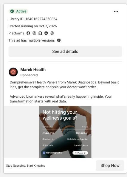
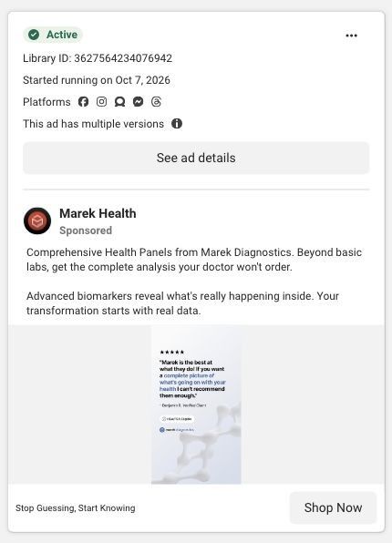
A vertical static from Marek Diagnostics showing a woman running, headlined "Not hitting your wellness goals?" A table pairs each symptom with a possible cause: always tired with high cortisol, stubborn fat with metabolic dysfunction, brittle nails with iron deficiency. A Get Tested button sits at the bottom, and the click lands on the total health panels collection.
Marek Health
6 creatives lead here1 / 6
General health · diagnostic collection
Native Meta creative and exact outbound link observed October 22, 2026. Redirects were followed to the captured public destination. These ads promote diagnostic testing, consultation or hormone care; they are broader-care examples. Advertiser claims are source material; activity does not establish performance. No personal, health or payment details were entered.
Stop Guessing, Start Knowing
A diagnostic collection organizes available lab panels into a browsable product grid with purchase-entry links. Compare the creative with the destination and explore the other ads sharing this route.
- Brand
- Marek Health
- Observed offer
- Stop Guessing, Start Knowing
- Creative angle
- Problem / solution
- Page type
- Collection page
- Ad format
- Image
- Listed start date
- Oct 7, 2026
- Captured
- Oct 22, 2026
- Library ID
- 1640162274350864
- Destination
- marekdiagnostics.com
Selected for its design and offer structure. Ad performance isn’t available in this collection.
What this ad does well
The symptom-and-cause table is the strongest idea in Marek's static set. It takes complaints the viewer already has (always tired, stubborn fat, brittle nails) and shows that each one might have a measurable cause, which is exactly the leap the ad wants people to make. The two-column layout reads in a second and makes the case for testing without a paragraph of copy. Putting it over a woman mid-run speaks to someone who's already putting in the work and not seeing it pay off.
What's missing
The table implies a cause for each symptom without saying how a test would confirm it, and nothing tells the viewer which panel checks those specific markers. That leaves a gap between "this might be why" and "buy this." There's also no price. If you make one like this, add a line under the table naming the panel that checks each cause and its price, and frame the causes as what the test looks for rather than as a diagnosis.
Beat by beat
- ImageA woman in leggings runs against a grey background.
It speaks to someone already working toward a goal and not seeing results.
- Headline"Not hitting your wellness goals?"
It names a frustration the active viewer recognizes.
- ImageA Symptom and Cause table pairs always tired with high cortisol, stubborn fat with metabolic dysfunction and brittle nails with iron deficiency.
It turns everyday complaints into possible causes that a test could look for.
- CTAA Get Tested button on the image and Shop Now under "Stop Guessing, Start Knowing."
It makes testing the obvious next step after reading the table.
Where it sends people
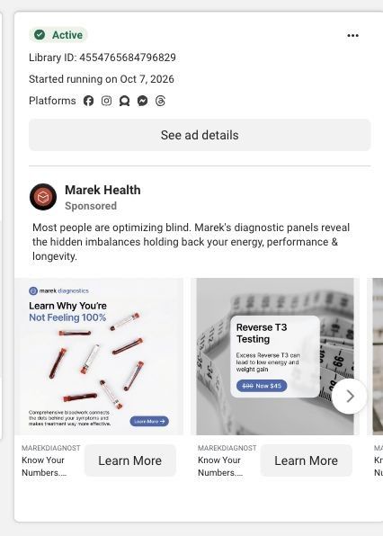
The ad sends people to the total health panels collection, which 6 of the 16 Marek ads in the Fluid library use. A collection page is low on the ladder, and here it drops the ad's best device: the symptom-to-cause pairing disappears, and the viewer sees panel tiers by biomarker count and price ($275 to $1,950). Someone who clicked because "always tired" caught their eye doesn't see cortisol or iron called out anywhere in the captured view. A landing page that repeats the table and puts the matching panel next to each row would carry this ad's logic through to the purchase.
The page it sends people to: How Marek Diagnostics lays out its total health panels
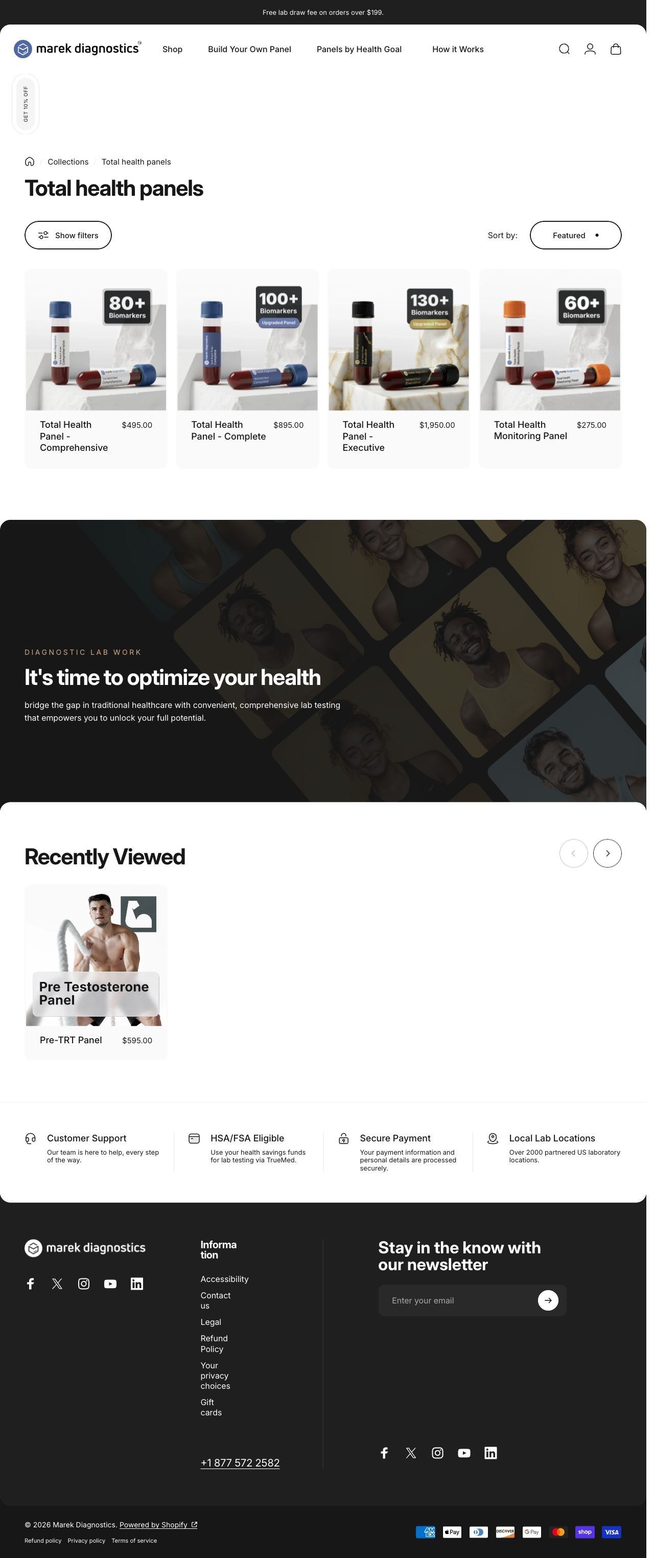
Marek Diagnostics' Total health panels collection shows its Total Health Panel tiers with biomarker badges and prices from $275 to $1,950, filters and a sort menu, then a dark "It's time to optimize your health" band. Six Marek ads in the Fluid library land here, mostly symptom-led statics plus a carousel, a review static and a gym testimonial.
How the page is built
- 01Collection heading and context
A free lab draw bar, the navigation, a Get 10% off side tab and the heading Total health panels tell the visitor what's here and that there's a first-order incentive.
- 02Category or filtering controls
Show filters and a Sort by Featured menu let the visitor narrow or reorder the panels.
- 03Diagnostic product grid
Cards for the Comprehensive, Complete, Executive and Monitoring panels show biomarker badges and prices from $275 to $1,950, answering 'what are my options and what do they cost?'
- 04Diagnostic lab work band
A dark band with a photo collage reads "It's time to optimize your health" and describes convenient, comprehensive lab testing, answering 'why test at all?'
- 05Testing and purchase information
The blueprint closes with testing and purchase information, which explains how ordering and the draw work.
The first fixes we would make
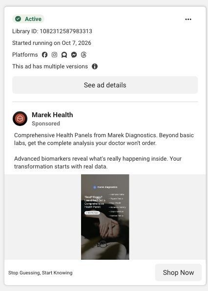
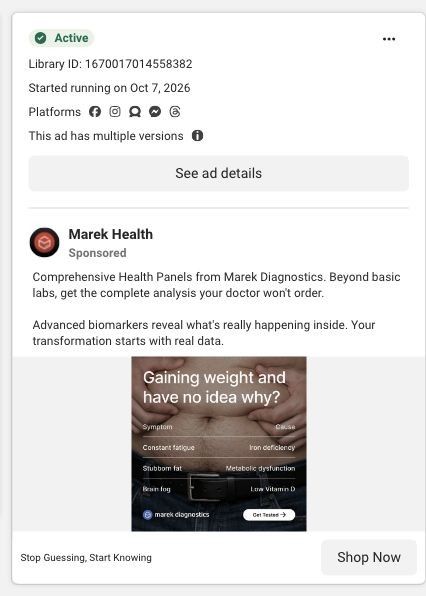
- Most of the ads landing here open on a symptom (tired, foggy, gaining weight, not hitting goals) and pair it with a possible cause, but the page never mentions symptoms. Add a short "what brought you here?" row above the grid that maps those symptoms to the tier that checks for them, so visitors from each ad find their answer.
- The tiers differ only by biomarker count and price on the cards. Add one line under each name saying what it adds, so the jump from $495 to $895 to $1,950 makes sense to a first-time buyer.
Read the full breakdown of this page
Three hooks you could test
- Lead with the uncomfortable problem. “Doing everything right and still stuck? Something might be off.”
- Turn the benefit into a picture people get in a second. “Your symptom on the left, what to test for on the right.”
- Sell the outcome. “Find the reason behind the plateau instead of trying another plan.”
What to borrow for your brand
- Build a two-column symptom-and-cause table on your static so the viewer connects their problem to your product in one glance.
- Frame each cause as something your product checks for, which keeps the claim accurate and still makes the case.
- Repeat the same table on the landing page with the matching product beside each row.
One of 16 Marek Health ads in the Fluid Inspiration Library, captured from the Meta Ad Library on Oct 22, 2026. We record that an ad ran publicly, not how it performed.