

Marek HealthSponsored
Esc
How Marek Health turns a normal lab result into the problem
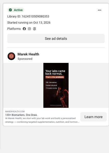
A vertical static image ad: a red-lit sprinter on black under the headline "Your labs came back normal. That is the problem." Three lines list 130+ biomarkers, a custom lab panel and a 1:1 results review. The link headline reads 130+ Biomarkers. One Draw., and the click lands on the Marek Health homepage.
Marek Health
4 creatives lead here1 / 4


Guided optimization · paid assessment entry
Native Meta creative and exact outbound link observed October 22, 2026. Redirects were followed to the captured public destination. These ads promote diagnostic testing, consultation or hormone care; they are broader-care examples. Advertiser claims are source material; activity does not establish performance. No personal, health or payment details were entered.

130+ Biomarkers. One Draw.
A care-program homepage presents a paid assessment, bloodwork-led positioning, treatment categories, program inclusions and client stories. Compare the creative with the destination and explore the other ads sharing this route.
- Brand
- Marek Health
- Observed offer
- 130+ Biomarkers. One Draw.
- Creative angle
- Problem / solution
- Page type
- Homepage
- Ad format
- Image
- Listed start date
- Oct 13, 2026
- Captured
- Oct 22, 2026
- Library ID
- 1624510509080353
- Destination
- marekhealth.com
Selected for its design and offer structure. Ad performance isn’t available in this collection.
What this ad does well
"Your labs came back normal" is a sharp opener because it speaks to the person who did the responsible thing, got tested, and still feels off. Flipping it with "That is the problem" creates a reason to keep reading. The three lines underneath answer "what's different here?" with specifics (130+ biomarkers, a custom panel, a 1:1 review) instead of adjectives. The link headline, "130+ Biomarkers. One Draw.," adds a convenience point in four words.
What's missing
The ad tells the viewer normal isn't good enough but never explains why, so the claim rests on attitude rather than reasoning. A short line on what a standard panel leaves out, or what "optimal" means compared with "normal," would make the argument stand up. There's also no price, and the homepage it links to leads with $299. If you make one like this, add one sentence of explanation under the headline and the starting price, so the viewer knows why and how much before they click.
Beat by beat
- ImageA sprinter, lit in red, drives forward on a black background.
It signals performance and intensity, setting up an audience that cares about results.
- Headline"Your labs came back normal. That is the problem."
It challenges a reassurance the viewer already has and makes them want the explanation.
- ImageThree lines: 130+ biomarkers, custom lab panel, 1:1 results review.
It lists concrete differences instead of broad promises.
- CTALearn more under "130+ Biomarkers. One Draw."
It adds convenience to the depth claim and invites a low-commitment click.
Where it sends people
The ad lands on the Marek Health homepage, one of four Marek ads in the Fluid library that go there. The homepage is the weakest rung on the ladder, but its hero carries a related promise ("Precision health, built on your bloodwork"), mentions custom lab panels and a licensed provider, and shows $299 To Get Started. The 130+ biomarker figure from the ad doesn't appear in the captured hero, and neither does the 1:1 results review, so the viewer loses the specifics that made the ad stand out. A focused page that opens on the "normal isn't the goal" argument and repeats those three lines would pick up where the ad leaves off.
The page it sends people to: How Marek Health's homepage sells bloodwork-first care
The Marek Health homepage opens on "Precision health, built on your bloodwork," a Get started button, a Trustpilot rating and a stats row ending in $299 To Get Started, then moves into featured therapies. Four Marek ads in the Fluid library land here: two creator videos, a lab-method expert explainer and a normal-labs static.
How the page is built
- 01Care-program hero
"Precision health, built on your bloodwork," a subhead naming lab panels, a coach and a provider, a Get started button, a Trustpilot rating and a stats row answer 'what is this, is it legit and what does it cost to start?'
- 02Treatment categories
Featured therapies cards for an advanced weight loss program and testosterone hormone therapy, with a Browse all link, answer 'what can you actually treat?'
- 03Testing and assessment process
The blueprint lists the testing and assessment process next, the section that explains how bloodwork leads to a plan.
- 04Program inclusions and entry offer
The blueprint then covers program inclusions and the entry offer, which answers 'what does the $299 get me?'
- 05Client stories and supporting information
Client stories and supporting information follow in the blueprint, answering 'has this worked for people like me?' in customers' words.
- 06FAQs and final CTA
The page closes with FAQs and a final call to action, catching remaining objections before a last chance to start.
The first fixes we would make
- The $299 figure appears in the hero without saying what it includes, and one of the ads landing here shows that the assessment also requires a minimum lab panel purchase. Put a single line under the stats row that says what $299 covers and what labs cost on top, so visitors aren't surprised later.
- Four quite different ads (a GLP-1 creator, a root-cause explainer, a lab-method lesson and a normal-labs static) all land on the same hero. Build focused landing pages for the biggest angles, starting with a GLP-1 page that opens on "start with the data first," so each ad's promise is the first thing its viewer sees.
Read the full breakdown of this page
Three hooks you could test
- Lead with the uncomfortable problem. “Told you're fine, but you don't feel fine?”
- Call out the habit you're replacing. “A yearly checkup tells you you're not sick. It doesn't tell you much else.”
- Sell the outcome. “Get the full picture from one appointment, then a plan built from it.”
What to borrow for your brand
- Open with a reassurance your customer has heard and then flip it, so the headline creates a question they want answered.
- List three concrete inclusions under the headline instead of benefit adjectives.
- Add one line of reasoning to any contrarian headline, so the claim has something to stand on.
One of 16 Marek Health ads in the Fluid Inspiration Library, captured from the Meta Ad Library on Oct 22, 2026. We record that an ad ran publicly, not how it performed.