

Marek HealthSponsored
Esc
How Marek Health sells testosterone care in a 7-second animation
A 7-second animated video with no voiceover. A Marek-branded testosterone cypionate vial floats over dark fabric under the line "For men serious about their strength," with callouts for expert medical oversight, delivery to your door and HSA & FSA eligibility. The link headline reads Your Hormones. Your Protocol. Your Gains., and it lands on the sign-up page.
Marek Health
1 creative lead here1 / 1
Guided optimization · onboarding entry
Native Meta creative and exact outbound link observed October 22, 2026. Redirects were followed to the captured public destination. These ads promote diagnostic testing, consultation or hormone care; they are broader-care examples. Advertiser claims are source material; activity does not establish performance. No personal, health or payment details were entered.
Your Hormones. Your Protocol. Your Gains.
A public onboarding entry introduces the care process and the first step toward an assessment. Compare the creative with the destination and explore the other ads sharing this route.
- Brand
- Marek Health
- Observed offer
- Your Hormones. Your Protocol. Your Gains.
- Creative angle
- Animated offer
- Page type
- Consultation entry
- Ad format
- Video · 0:07
- Listed start date
- Oct 14, 2026
- Captured
- Oct 22, 2026
- Library ID
- 1084699430841835
- Destination
- marekhealth.com
Selected for its design and offer structure. Ad performance isn’t available in this collection.
What this ad does well
This is the persona's "make the product the whole scene" idea done with a single object. The vial, with Marek's branding on the label, tells the viewer exactly what category this is in half a second, and the dark fabric makes it feel premium without any extra copy. The callouts answer three practical objections fast: who's overseeing this, how it gets to me and whether I can use my HSA or FSA. The headline calls out a specific person, men who care about strength, which is sharper than talking to everyone.
What's missing
At 7 seconds, the ad shows a prescription product without explaining the process that comes before it. The copy mentions bloodwork and medical guidance, but the video itself never says you'd be tested first or that eligibility is up to a provider. That matters because the click lands on an account form asking for date of birth and contact details, so the viewer goes from a product shot straight to paperwork. If you make one like this, add a frame that shows the first step (test, then provider review) and the starting price, so the viewer knows what they're signing up for.
Beat by beat
- 0-2sThe Marek Health logo and "For men serious about their strength" appear over dark rippled fabric.
It names the audience before anything else, so the right viewer stops.
- 2-5sA testosterone cypionate vial floats into frame with "Expert Medical Oversight" and "Delivered To Your Door" beside it.
It shows the product and answers who oversees it and how it arrives.
- 5-7s"HSA & FSA Eligible" appears as the vial settles.
It removes a cost objection for viewers with pre-tax health accounts.
The offer
No price appears. The value is framed through medical oversight, home delivery and HSA/FSA eligibility.
Where it sends people
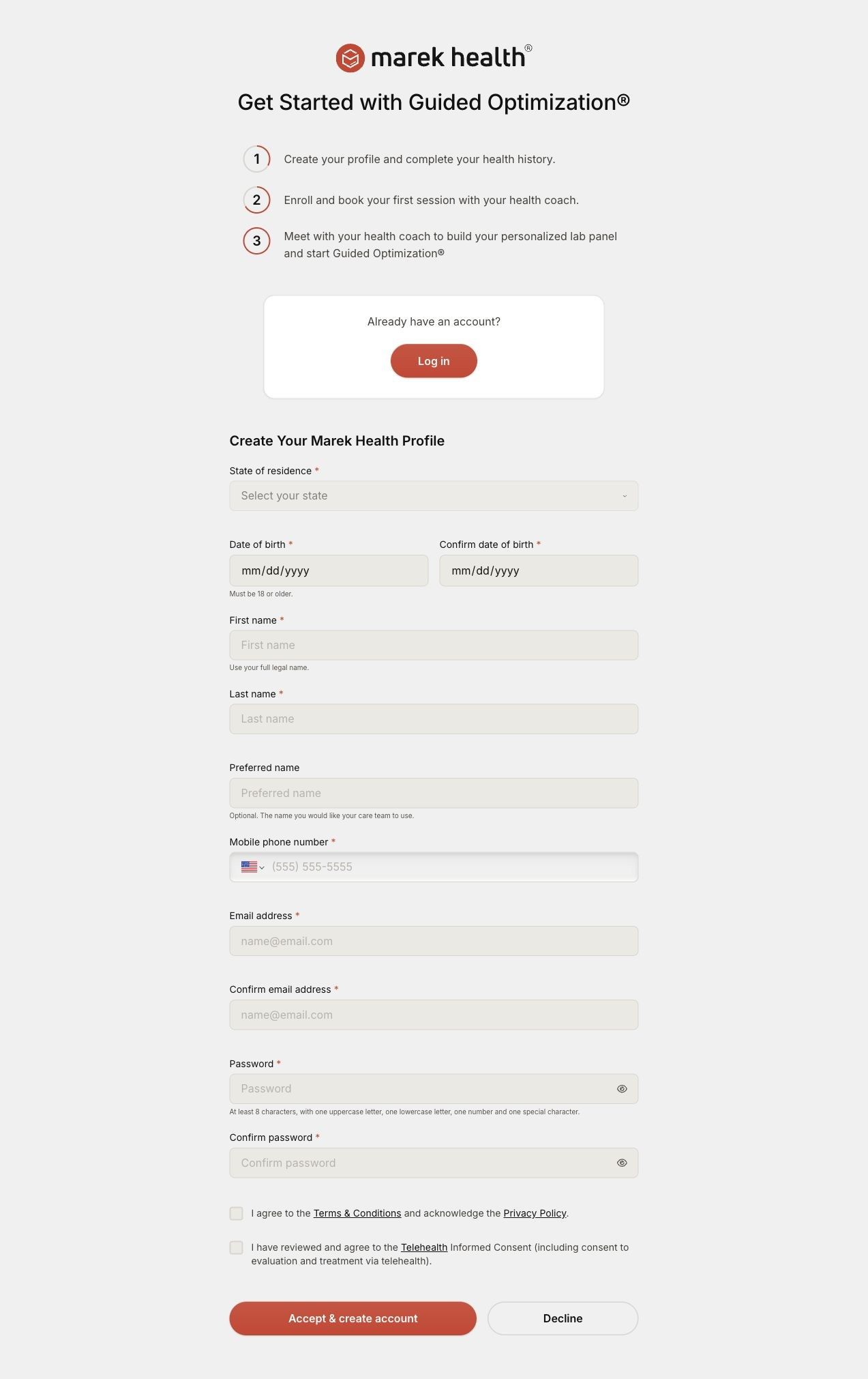
The ad sends people to Marek Health's sign-up page, the only Marek ad in the Fluid library that lands there. This page is a direct onboarding entry: "Get Started with Guided Optimization®," a numbered list of steps (create your profile, book a session with a health coach, build a personalized lab panel) and then a profile form asking for state, date of birth, name, phone, email and a password. The steps are a smart touch, since they explain the process the ad left out. What's missing is any price or offer above the form, so a viewer who came from a 7-second product shot is asked for personal details before learning what it costs. Putting the $299 starting price and what it includes above the form would close that gap.
The page it sends people to: How Marek Health starts Guided Optimization with a profile form
Marek Health's sign-up page: a short onboarding entry headed "Get Started with Guided Optimization®," with a numbered list of steps, a log-in box for returning clients and a Create Your Marek Health Profile form. One Marek ad in the Fluid library lands here, a 7-second animation of a testosterone vial with oversight and delivery callouts.
How the page is built
- 01Onboarding introduction
The Marek Health logo and "Get Started with Guided Optimization®" tell the visitor they're starting the program, not browsing.
- 02Numbered steps
A short numbered list explains the path from profile to coach session to a personalized lab panel, answering 'what happens after I sign up?'
- 03Returning client log-in
An "Already have an account?" card with a Log in button routes existing clients away from the form.
- 04Initial information or selection controls
The Create Your Marek Health Profile form asks for state, date of birth, name, phone, email and password, with notes like the 18-or-older requirement.
- 05Care process and privacy information
The blueprint closes with care-process and privacy information, answering 'what happens to my details?'
The first fixes we would make
- There's no price anywhere above the form, so a visitor who came from a short ad is asked for personal details before learning what Guided Optimization costs. Put the $299 starting price and what it includes directly under the headline.
- Nothing on the page reassures the visitor that the program is right for them before they commit, no reviews, provider credentials or results disclaimers near the top. Add one short trust line beside the steps, like the HSA/FSA eligibility and Trustpilot rating the homepage already shows.
Read the full breakdown of this page
Three hooks you could test
- Make the product the whole scene. “One product, one dark backdrop, three lines that answer the first three questions.”
- Turn the benefit into a picture people get in a second. “Show the box arriving at the door, then the provider who signed off on it.”
- Sell the outcome. “For people serious about training: a plan built from your own numbers.”
What to borrow for your brand
- Put your product alone on a textured dark background and add short callouts, so a 7-second slot answers the top objections without a voiceover.
- Call out a specific audience in the opening line ("for men serious about their strength") instead of speaking to everyone.
- If you send short ads straight to a sign-up form, show the price and the steps above the first field so the commitment is clear.
Transcript
There's no speech in this video. The on-screen text and music carry the message.
Text on screen
- marek health®
- FOR MEN SERIOUS ABOUT
- THEIR STRENGTH
- Expert Medical
- Oversight
- marek
- Delivered To
- Your Door
- Eligible
- @ marek
- Testosterone
One of 16 Marek Health ads in the Fluid Inspiration Library, captured from the Meta Ad Library on Oct 22, 2026. We record that an ad ran publicly, not how it performed.