

Lume DeodorantSponsored
Esc
How Lume sells a feeling in eight silent seconds
An 8-second Lume video with no voiceover. A woman in a sports bra and leggings stands in a gym locker room under a caption saying her days of feeling self-conscious about how she smells are over, followed by Lume packaging. The headline offers over 30% off plus 2 free items, linking to the starter-pack page.
Lume
60 creatives lead here1 / 60


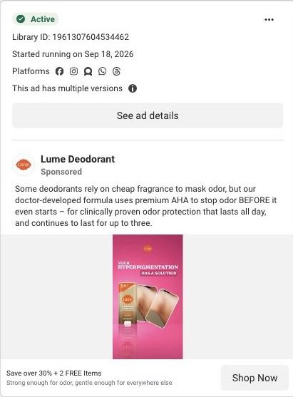
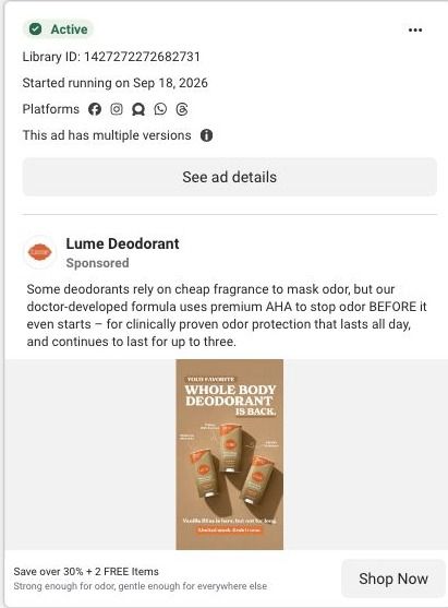
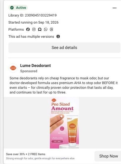


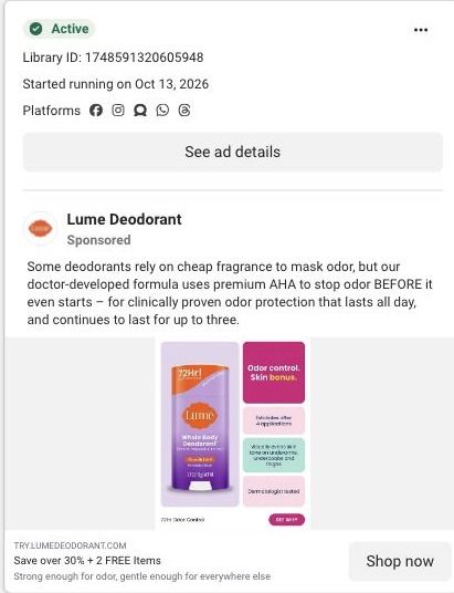
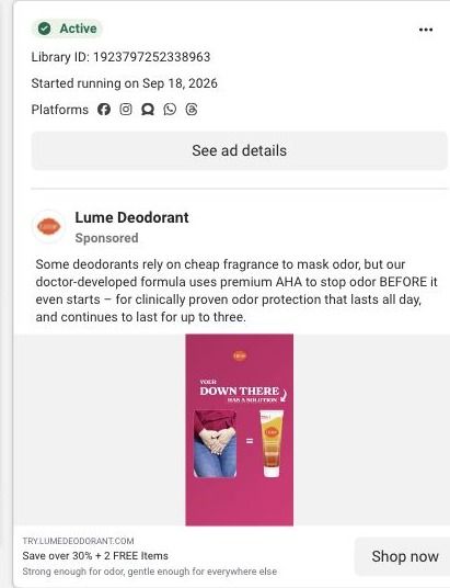

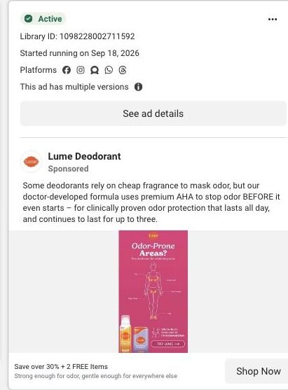

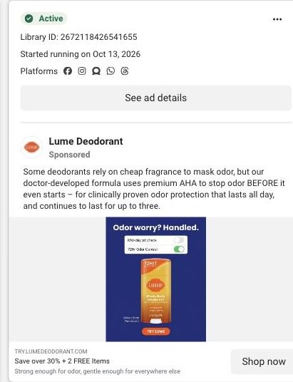


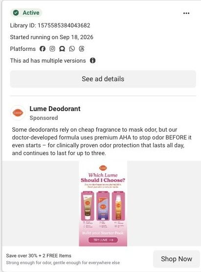

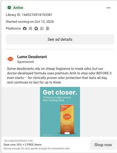
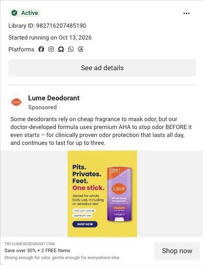
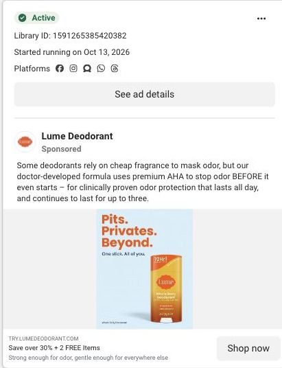
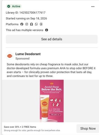
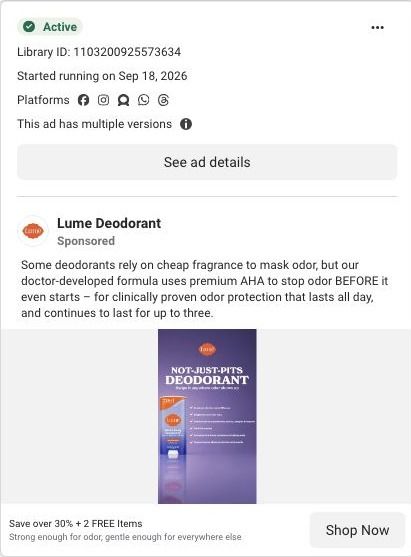

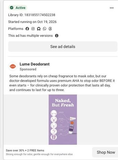
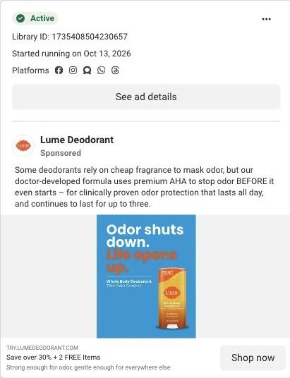
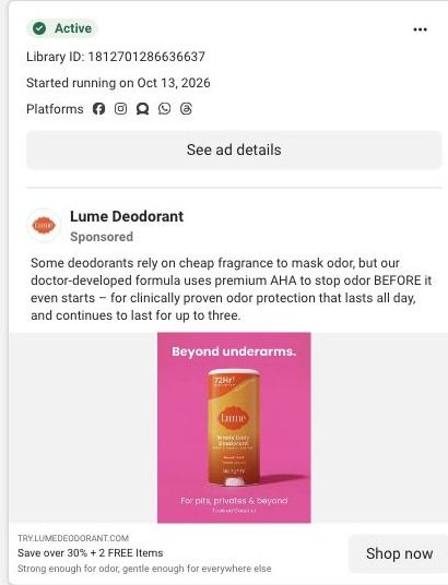
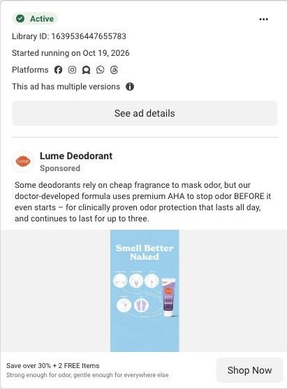

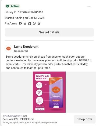
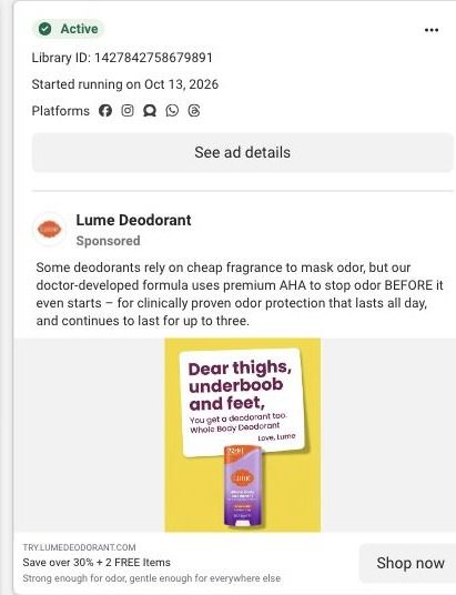
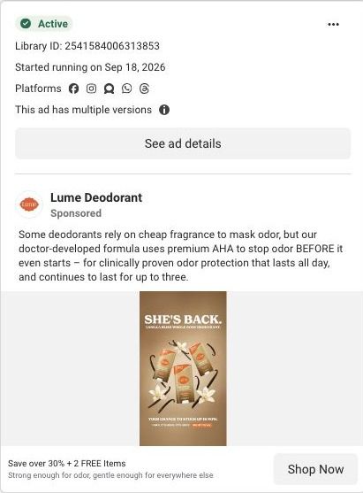
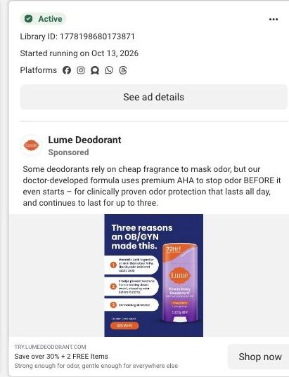
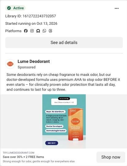


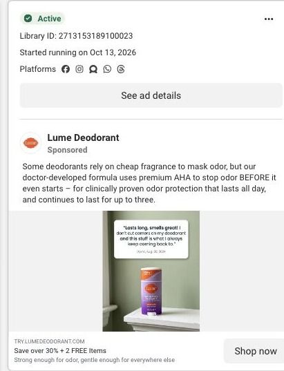

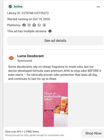




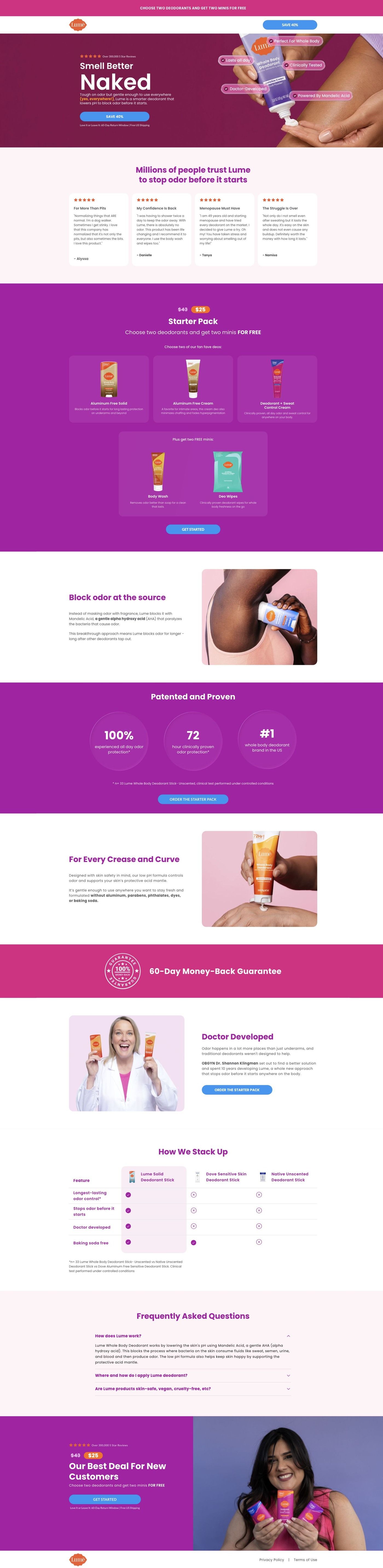
Lume · Smell Better Naked
Public page captured October 22, 2026. Promotional sheets, chat, extension overlays and sticky cart bars were removed from the static reference; page layout and copy were preserved. No account, personal, health or payment details were supplied. Quiz captures show the observed entry screen, not the complete consultation.
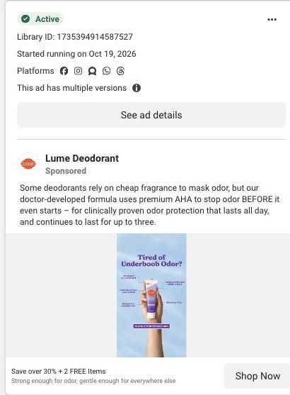
Save over 30% + 2 FREE Items
Visual reference: Self-conscious days are over · creator story. Creator stories, price objections and product stills converge on a long-form $25 starter-pack offer. Reviews, product education, founder credibility and a comparison table lead to the kit builder. Compare the creative with the destination and explore the other ads sharing this route.
- Brand
- Lume
- Observed offer
- Starter-pack savings or product offer; original ad and destination terms apply
- Creative angle
- Creator stories
- Page type
- Starter-pack offer
- Ad format
- Video · 0:08
- Listed start date
- Oct 19, 2026
- Captured
- Oct 22, 2026
- Library ID
- 1815902666415850
- Destination
- try.lumedeodorant.com
Selected for its design and offer structure. Ad performance isn’t available in this collection.
What this ad does well
The caption sells an outcome people feel rather than a feature, and it does it with a little story: she doesn't know it yet, which makes you want to see what happens next. The gym locker room sets up sweat and body odor without anyone having to say it, so the ad stays tasteful on a personal topic. At eight seconds it asks almost nothing of the viewer, and the headline carries the concrete part (over 30% off plus 2 free items) while the video carries the emotion.
What's missing
The video never says what the product is or where it goes, so a viewer who reads the caption and keeps scrolling learns nothing about Lume. The packaging shots come at the end and go by quickly. If you make one like this, put the product in her hand earlier and add one line on screen that names where it's used (the packaging itself says pits, privates and beyond), so the caption's promise attaches to a specific product before the clip ends.
Beat by beat
- 0-3sA woman stands in a gym locker room, adjusting her sports bra, as the caption begins.
The setting implies a sweaty moment without anyone naming it.
- 3-6sThe full caption reads: she doesn't know it yet, but her days of feeling self-conscious about how she smells are over.
It sells a feeling the viewer may share and sets up a small story.
- 6-8sCuts to Lume whole body packaging, including the Smooth Cream.
It reveals the answer to the caption's setup, though briefly.
The offer
The headline offers over 30% off plus 2 free items with a Shop now button. The video itself has no offer.
Where it sends people
The ad goes to Lume's starter-pack landing page, a focused offer page rather than the homepage. Because the video says so little about the product, the page has to do most of the explaining, and it's built for that: the customer stories section's review cards speak to the same feeling the caption sells, and the whole-body use section answers where it goes. The announcement header's savings CTA matches the headline offer. A hero line that echoes the caption's 'self-conscious' feeling would make the hand-off from ad to page feel continuous.
The page it sends people to: How Lume's Smell Better Naked page sells a $25 starter pack
Lume's Smell Better Naked page is a long-form sales page for a $25 starter pack. It moves from a benefit hero through reviews, the offer, ingredient education, study proof, founder story and a comparison table, then repeats the offer. It's where 60 Lume ads in the Fluid library point, mostly creator stories, savings offers and product benefits.
How the page is built
- 01Announcement and header
A simple logo header with a savings CTA keeps the discount visible and gives the visitor nowhere else to go.
- 02Split hero
A reviews eyebrow, a large benefit headline, body copy and a CTA sit beside a product-use image, answering "what is this and why would I want it?"
- 03Customer stories
Review cards with stars and short quotes answer "do people like me actually use this?" before any price appears.
- 04Starter-pack offer
Price treatment, product choices, free-gift tiles and a CTA answer "what do I get and what does it cost?"
- 05Ingredient mechanism
An image and an explanation of a highlighted ingredient answer "how is this supposed to work?" in Lume's own terms.
- 06Study proof
Prominent study metrics with a methodology footnote answer "is there evidence behind the claim?"
- 07Whole-body use
An application illustration and reassurance copy answer "is it okay to use this beyond my underarms?"
- 08Founder story
A portrait and origin explanation with a CTA answer "who's behind this and why should I trust them?"
- 09Comparison table
A highlighted Lume column against alternatives answers "why this instead of what I use now?"
- 10FAQ and repeated offer
An accordion handles the last objections, then the starter-pack offer repeats above the policy footer so the decision and the button sit together.
The first fixes we would make
- Many of the ads that land here lead with a specific use ("For Boobs That Run Hot"), but the hero speaks to the whole body and the matching reassurance sits much further down in the whole-body section. Send each ad headline to a hero that repeats it (Lume already runs a hero variant on another URL) so the visitor sees their problem in the first screen.
- The blueprint shows no guarantee anywhere on this page, while Lume's sweat-control page has one. Put the guarantee inside the starter-pack panel and again by the final offer, since that's exactly where a first-time buyer hesitates.
Read the full breakdown of this page
Three hooks you could test
- Sell the outcome. “She doesn't know it yet, but she's about to stop thinking about this for good.”
- Show a specific moment of use. “Post-workout, locker room, and for once she isn't checking.”
- Lead with the uncomfortable problem. “Ever skip the after-gym errand because you're not sure how you smell?”
What to borrow for your brand
- Write the caption as a tiny story about the customer ('she doesn't know it yet') so the outcome feels like something about to happen.
- Pick a setting that implies the problem (a locker room for sweat) so you don't have to say anything uncomfortable out loud.
- Keep a silent cut under ten seconds and put the concrete offer in the headline so the creative only has to carry the feeling.
Transcript
There's no speech in this video. The on-screen text and music carry the message.
Text on screen
- She doesn't know it yet, but her
- days of feeling self-conscious
- about how she smells are over
- Whole Body
- Deodorant
- Sweat Control
- IOR PITS, PRIVATES & BEYOND
- Soft Powder
- Smooth Cream
- 3.00Z (85g) NET WT
One of 100 Lume ads in the Fluid Inspiration Library, captured from the Meta Ad Library on Oct 22, 2026. We record that an ad ran publicly, not how it performed.