

Lume DeodorantSponsored
Esc
How Lume used a sarcastic split screen to compare deodorants
A short, silent Lume comparison video that ran on Meta from Oct 20, 2026. A black-and-pink split screen pits ordinary deodorant against Lume under a sarcastic headline, with a woman sniffing her armpit in a car on one side and a woman applying spray at the gym on the other. It links to a starter-pack landing page.
Lume
11 creatives lead here1 / 11


Lume · Cream-leg hero variant
Public page captured October 22, 2026. Promotional sheets, chat, extension overlays and sticky cart bars were removed from the static reference; page layout and copy were preserved. No account, personal, health or payment details were supplied. Quiz captures show the observed entry screen, not the complete consultation.
Save over 30% + 2 FREE Items
Visual reference: Ordinary deodorant vs. Lume. The ad’s /test-1 route redirected to the cream-leg hero experiment, Variant B, during capture. Compare its hero with the primary Smell Better Naked page; both repeat the starter-pack offer and link to the kit builder. Compare the creative with the destination and explore the other ads sharing this route.
- Brand
- Lume
- Observed offer
- Starter-pack savings or product offer; original ad and destination terms apply
- Creative angle
- Creator stories
- Page type
- Starter-pack offer
- Ad format
- Video · 0:12
- Listed start date
- Oct 20, 2026
- Captured
- Oct 22, 2026
- Library ID
- 1430527661758255
- Destination
- get.lumedeodorant.com
Selected for its design and offer structure. Ad performance isn’t available in this collection.
What this ad does well
The sarcastic headline (regular deodorant is definitely giving you maximum confidence) does the setup with a wink, and the car clip underneath, a woman pulling away from her own armpit, makes the problem obvious without a word of voiceover. The two columns then line up point for point: apply two or three times a day against once, armpits only against everywhere, and still worried about BO against all-day confidence. Because each row answers the one across from it, a viewer can read it in a few seconds with the sound off. It's a format any brand can build from stock clips and a template.
What's missing
Every row on the Lume side is a claim with nothing behind it on screen. The ad says apply once daily and stops odor before it starts, and the viewer has no reason to believe either beyond the checkmark. There's also no offer in the video, so the over-30% headline sits only in the link. If you make one like this, add a final frame with one piece of proof (a study note or a customer line) and the starter-pack price, so the comparison ends on a reason to believe and a reason to tap.
Beat by beat
- 0-3sA sarcastic headline over a black-and-pink split, with a woman recoiling from her own armpit in a car.
The joke and the reaction shot name the problem instantly and make the viewer smile instead of cringe.
- 3-9sOrdinary deodorant gets red Xs (reapplying, armpits only, doesn't block odor) while Lume gets green checks.
Matching each row to its opposite lets the viewer compare at a glance without any audio.
- 9-12sThe rows hold on screen while a woman applies spray at the gym on the Lume side.
It leaves the full comparison up long enough to read and pairs it with an active, confident image.
The offer
No offer in the video itself; the link headline offers over 30% off plus 2 free items.
Where it sends people
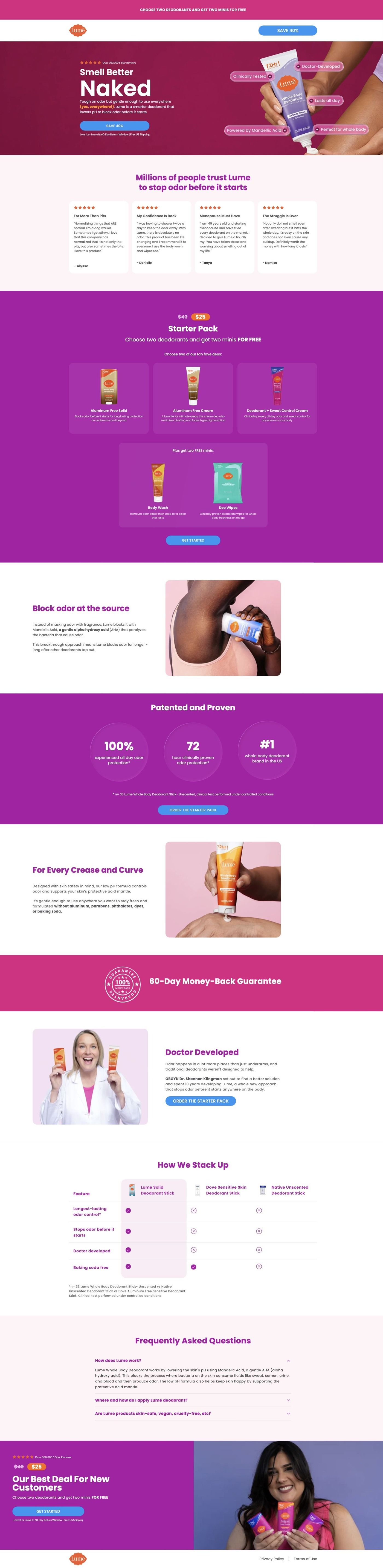
The ad goes to a focused starter-pack landing page (the cream-application hero variant), not a homepage. It's one of 11 Lume ads in the Fluid library that land on this page. This one has the cleanest handoff of the batch, because the page has its own comparison table that picks up exactly where the split screen leaves off, and the proof metrics with a study footnote supply the evidence the ad's checkmarks skip. The comparison table sits low on the page, after the offer and ingredient sections. For traffic from this ad, a compact version of it near the hero would keep the thread going.
The page it sends people to: How Lume tests a new hero on its starter-pack landing page
This is a variant of Lume's starter-pack landing page, served as Variant B of a cream-leg hero experiment when its ad route redirected during capture. It keeps the same reviews, offer, ingredient, proof, founder and comparison sequence with a new product-application hero. Eleven Lume ads in the Fluid library point here, mostly savings offers and creator stories.
How the page is built
- 01Announcement and header
A minimal logo header and announcement bar keep the visitor on the offer with no store navigation.
- 02Split hero with benefit labels
A product application image with benefit labels overlaid on the product answers "what does this do?" in a single look.
- 03Customer reviews
Review cards answer "do real customers like it?" before any price appears.
- 04Starter-pack offer
Product and gift tiles answer "what's in the pack and what's free?"
- 05Ingredient mechanism
An explanation with a supporting image answers "how is this supposed to work?" in Lume's terms.
- 06Proof metrics
Study metrics with a footnote answer "is there evidence behind the claims?"
- 07Whole-body use and founder
Usage reassurance and founder credibility, combined in one stretch, answer "can I use it everywhere, and who stands behind it?"
- 08Comparison table
Lume against alternatives answers "why switch from what I use now?"
- 09FAQ and final offer
The FAQ handles last objections and the offer repeats so the button follows the answers.
The first fixes we would make
- Every ad that lands here uses the saving over 30% plus two free items headline, but the variant hero leads with benefit labels on the product rather than the offer. Put the savings and the free items in the hero line or a badge on the image, so the first screen confirms what the ad promised.
- Like the main starter-pack page, this variant shows no guarantee in the blueprint. Add one inside the starter-pack panel and beside the final offer, where first-time buyers hesitate.
Read the full breakdown of this page
Three hooks you could test
- Call out the habit you're replacing. “Reapplying by lunch? That's your current product telling you something.”
- Turn the benefit into a picture people get in a second. “Two columns: what you use now, and what you'd use instead.”
- Lead with the uncomfortable problem. “Sniffing yourself in the car isn't a personality trait.”
What to borrow for your brand
- Use a sarcastic headline about the old product to set up the comparison, so the ad opens on a joke instead of a lecture.
- Line up the two columns row for row, with each claim answering the one across from it, so the comparison reads in seconds with no sound.
- Put a reaction shot under the old-product column so the problem is something the viewer sees, not just reads.
Transcript
There's no speech in this video. The on-screen text and music carry the message.
Text on screen
- That regular deodorant
- is definitelygiving you
- maximum confidence.
- ORDINARY
- DEODORANT
- LUME
- X Apply 2-3x daily
- X only works on
- armpits
- Doesn't BLOCK odor
- X Still worried about
- BO popping up
- Applyonce daily
- (no reapplication
- necessary)
- Works EVERYWHERE
- (underboob, vulva,
- feet & pits)
- Stops odor BEFORE
- it even starts
- All day confidence
- X Doesn't BLOCK odor
- necessary
- Apply once daily
- Still worried about
One of 100 Lume ads in the Fluid Inspiration Library, captured from the Meta Ad Library on Oct 22, 2026. We record that an ad ran publicly, not how it performed.