

Lume DeodorantSponsored
Esc
How Lume tests a new hero on its starter-pack landing page
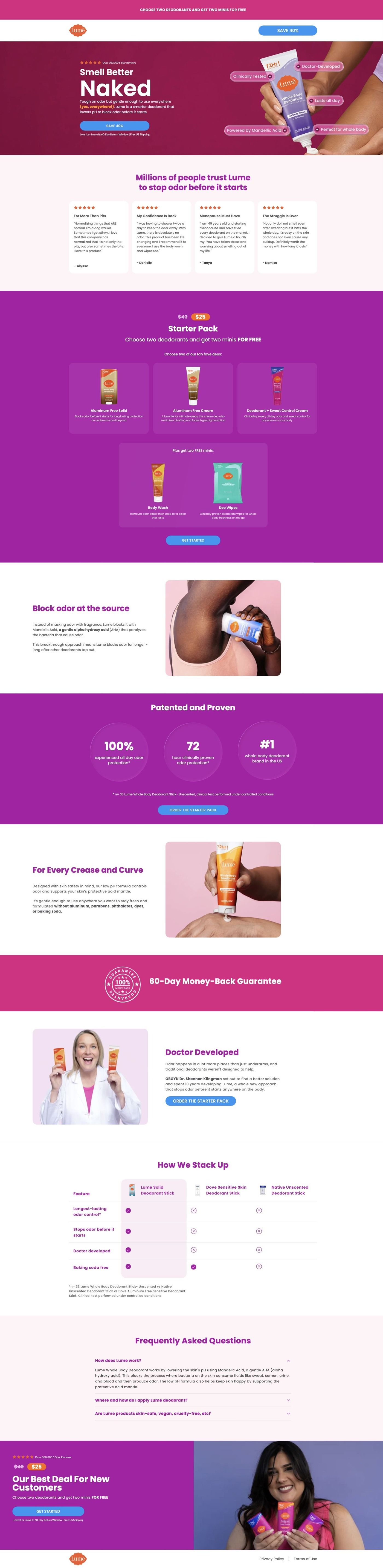
This is a variant of Lume's starter-pack landing page, served as Variant B of a cream-leg hero experiment when its ad route redirected during capture. It keeps the same reviews, offer, ingredient, proof, founder and comparison sequence with a new product-application hero. Eleven Lume ads in the Fluid library point here, mostly savings offers and creator stories.
Lume
11 creatives lead here1 / 11


Lume · Cream-leg hero variant
Public page captured October 22, 2026. Promotional sheets, chat, extension overlays and sticky cart bars were removed from the static reference; page layout and copy were preserved. No account, personal, health or payment details were supplied. Quiz captures show the observed entry screen, not the complete consultation.
Lume · Cream-leg hero variant
This is a variant of Lume's starter-pack landing page, served as Variant B of a cream-leg hero experiment when its ad route redirected during capture. It keeps the same reviews, offer, ingredient, proof, founder and comparison sequence with a new product-application hero. Eleven Lume ads in the Fluid library point here, mostly savings offers and creator stories.
- Brand
- Lume
- Page type
- Starter-pack offer
- Ads leading here
- 11
- Captured
- Oct 22, 2026
- Destination
- get.lumedeodorant.com
Selected for its design and offer structure. Ad performance isn’t available in this collection.
What this page does well
The interesting part is that Lume tests the hero and leaves everything else alone. The ad route redirects into the experiment, so the same ads can feed different first screens while the reviews, starter-pack offer, ingredient mechanism, proof metrics, founder credibility and comparison table stay constant. This variant's hero uses a large product application image with benefit labels overlaid on the product itself, which turns the claims into something you take in at a glance instead of reading a paragraph. Below the hero, customer review cards come before the starter-pack offer with its product and gift tiles, so proof still arrives before the price.
How the page is built
- 01Announcement and header
A minimal logo header and announcement bar keep the visitor on the offer with no store navigation.
- 02Split hero with benefit labels
A product application image with benefit labels overlaid on the product answers "what does this do?" in a single look.
- 03Customer reviews
Review cards answer "do real customers like it?" before any price appears.
- 04Starter-pack offer
Product and gift tiles answer "what's in the pack and what's free?"
- 05Ingredient mechanism
An explanation with a supporting image answers "how is this supposed to work?" in Lume's terms.
- 06Proof metrics
Study metrics with a footnote answer "is there evidence behind the claims?"
- 07Whole-body use and founder
Usage reassurance and founder credibility, combined in one stretch, answer "can I use it everywhere, and who stands behind it?"
- 08Comparison table
Lume against alternatives answers "why switch from what I use now?"
- 09FAQ and final offer
The FAQ handles last objections and the offer repeats so the button follows the answers.
What's missing, in the order we'd fix it
- Every ad that lands here uses the saving over 30% plus two free items headline, but the variant hero leads with benefit labels on the product rather than the offer. Put the savings and the free items in the hero line or a badge on the image, so the first screen confirms what the ad promised.
- Like the main starter-pack page, this variant shows no guarantee in the blueprint. Add one inside the starter-pack panel and beside the final offer, where first-time buyers hesitate.
- Whole-body use and the founder story share one stretch of the page, which crowds two different reassurances together. Give each its own short section so the founder's origin story doesn't get lost under usage copy.
How the ads set it up
Eleven Lume ads in the Fluid library point here, and all of them run under the saving over 30% plus two free items headline, a mix of offer-led videos, creator stories and one education video. The page carries the offer through in the starter-pack panel with its gift tiles, but the hero itself is about the product application and its labeled benefits, so the savings promise waits until after the reviews. Because these ads go through a test route, the same click can land on different heroes, and keeping the offer visible in every variant's first screen would make sure none of them drop the thread.
What to borrow for your brand
- Point your ads at a test route that redirects to hero variants, so you can change the first screen without changing the ads or the rest of the page.
- Overlay short benefit labels directly on the product image in the hero, so visitors take in the claims in one glance.
- Keep everything below the hero identical across variants, so any difference you see comes from the hero alone.
Ads that send people here
- How Lume turns a price complaint into a starter-pack offer
- How Lume sold its starter pack with one price and a product list
- How Lume answered a $78 price objection with an open box
- How Lume opened a deodorant ad on an awkward moment everyone knows
- How Lume turned a packed bag into a reason to switch deodorant
- How Lume sold a $25 starter pack by stacking the free extras
- How Lume asked one question to make backup deodorant feel wrong
- How Lume used a sarcastic split screen to compare deodorants
- How Lume showed its whole starter pack in one bathroom haul
- How Lume answered the 'just shower' comment in a video ad
- How Lume turned a body-area checklist into a split-screen ad
Captured from get.lumedeodorant.com in October 2026 for the Fluid Inspiration Library. Offers and prices change; this is what the page showed when we captured it.