How Lemme Play turns a music app screen into an ad
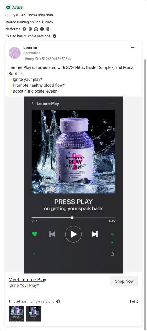
A static image ad for Lemme Play that ran on Meta from Sep 1, 2026, in two versions. The image copies a music app's now-playing screen, with the Play bottle as the album art and a line about pressing play on getting your spark back. The copy lists ingredients. There's no offer. It links to the Play landing page.

Captured while scrolling the public page. The page reflects the offer visible on October 20, 2026; it may differ from the original ad.
Meet Lemme Play
An ingredient-led checklist introduces the intimacy and blood-flow benefits advertised for Lemme Play. The recorded CTA points to the Play-specific landing URL. Compare the creative with the destination and explore the other ads sharing this route.
- Brand
- Lemme
- Observed offer
- Lemme Play; no price or discount stated
- Creative angle
- Product benefits
- Page type
- Product landing
- Ad format
- Image
- Listed start date
- Sep 1, 2026
- Captured
- Oct 20, 2026
- Library ID
- 4512689415652644
- Destination
- lemmelive.com
Selected for its design and offer structure. Ad performance isn’t available in this collection.
What this ad does well
The music-player mockup is a smart use of the product name. Calling a gummy Play and then showing a screen with a big play button makes the pun land without explanation, and the familiar interface looks native in a feed full of screenshots. The line “Press play on getting your spark back” names the outcome the ad is after in plain words, softer than a problem question but still clear. The splash photo used as album art gives the bottle a premium, lit-up look.
What's missing
The concept is clever, but the viewer has to decode it before they understand the product. Nothing on the image says what Play is for beyond the spark line, and the copy only lists ingredients and starred claims, so the ad depends on the viewer already knowing what an intimacy gummy is. There's also no proof and no offer. If you make one like this, put a short benefit line on the progress bar or track title, and use the second line for the subscription saving the landing page leads with.
Beat by beat
- ImageA dark music-app screen titled Lemme Play shows the bottle in a water splash as the album art, with a progress bar and playback controls.
The familiar interface turns the product name into a visual pun and looks native in a phone feed.
- HeadlineThe track title reads Press Play, with a subline about getting your spark back.
The subline names the outcome in everyday words, so the pun connects to a reason to care.
- CopyThe primary text says Play is formulated with S7 Nitric Oxide Complex and maca root and lists three starred claims.
The ingredient names give a curious viewer something specific behind the playful image.
- CTAThe link card reads Meet Lemme Play with the tagline Ignite Your Play and a Shop Now button.
The card repeats the product name so the click goes to a page about this one product.
Where it sends people
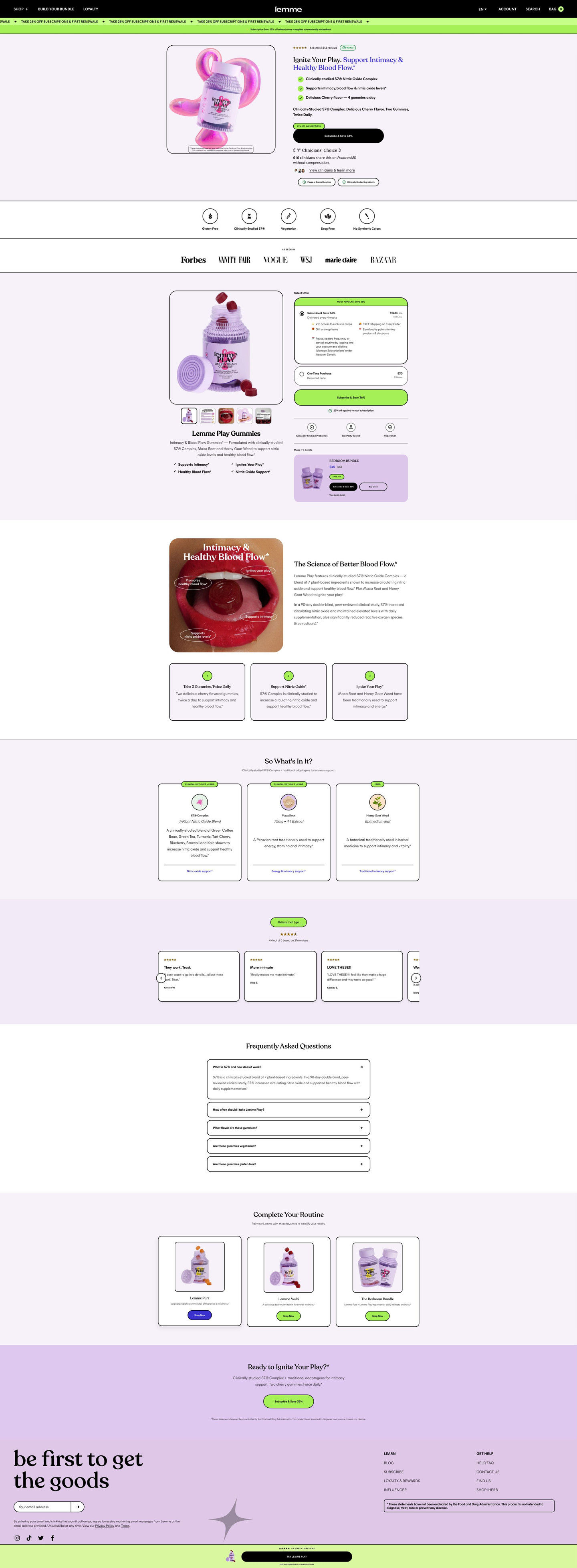
The ad sends people to the Play landing page, a focused product page rather than the homepage. The page answers what the ad leaves vague: a mechanism section explains the formula and a study, and the “So What's In It?” cards give each ingredient a dose line and a short description. The playful music theme doesn't carry over, though, so the visitor moves from a pun to a standard supplement layout. The hero's Subscribe & Save button introduces an offer the ad never set up.
The page it sends people to: How Lemme's Play landing page sells an intimacy gummy by subscription
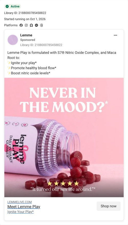
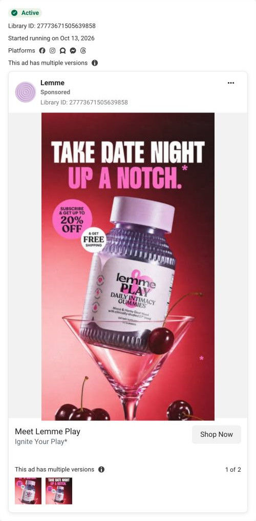
Lemme's landing page for Play, its daily intimacy gummy. It's a focused product lander with a subscribe button in the hero, a full offer selector, a mechanism section, ingredient cards, reviews and an FAQ, closing on the hero promise as a question. 4 Lemme ads in the library send people here, from a mood question to a date-night offer.
How the page is built
- 01Announcement ticker
A scrolling subscription-discount line with a note that the discount is applied automatically, answering whether there's a deal and whether you need a code.
- 02Hero
A framed product render beside a verified star rating, a two-tone headline, check bullets, a Subscribe & Save button, a clinicians' endorsement and links to studies and ingredients, answering what this is and why to trust it.
- 03Attribute and press strips
Line icons for free-from claims and an As seen in row of press logos, answering whether it fits your diet and whether anyone credible has covered it.
- 04Buy box
A gallery with benefit checks beside a Select offer panel with a pre-selected subscription, a one-time card, trust icons and a bundle card, answering how to buy and what you save.
- 05Mechanism
A close-up image with benefit labels, two paragraphs on the formula and a study, and numbered cards on how to take it and what it does, answering how the brand says it works.
- 06Ingredients
The “So What's In It?” cards with an illustration, name, dose line and description for each ingredient, answering what's inside and how much.
- 07Review carousel
A “Believe the Hype” label, a rating summary and short review cards, answering whether other buyers liked it.
- 08FAQ
A centered stack of accordions with the first open, answering the remaining questions before purchase.
- 09Cross-sell
“Complete Your Routine” cards for other products and a bundle, offering a way to raise the order.
- 10Closing CTA band
The hero promise restated as a question with a Subscribe & Save button and a disclaimer, giving a last chance to act.
- 11Footer and sticky bar
A newsletter signup, links and disclaimer, plus a sticky bar with a thumbnail, rating and Try button, keeping the purchase in reach while scrolling.
The first fixes we would make
- The page leans on brand claims and short reviews but never shows a timeline. Add a what-to-expect strip (first night, first week, first month, as reported by customers) near the mechanism section, so the reader knows when to judge it.
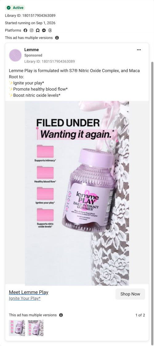
- The ads' playful hooks (a music player, desktop folders, a date-night cocktail) don't appear on the page. Reuse one of those visuals in the hero or mechanism section, so the visitor sees the idea that made them click.
Read the full breakdown of this page
Three hooks you could test
- Turn the benefit into a picture people get in a second. “Your favorite app, but the song is your evening routine.”
- Sell the outcome. “Press play on nights that feel like they used to.”
- Show a specific moment of use. “Two gummies before dinner, then the playlist.”
What to borrow for your brand
- Turn your product's name into a familiar interface (a music player, a text thread, a notes app) so the joke and the brand land in the same moment.
- Use the interface's own text fields, like the track title and artist, to carry the headline and the outcome.
- Pair a playful format with one plain outcome line, so the viewer gets the pun and the reason to care.
One of 25 Lemme ads in the Fluid Inspiration Library, captured from the Meta Ad Library on Oct 20, 2026. We record that an ad ran publicly, not how it performed.