How IM8 boiled its trust story down to three words
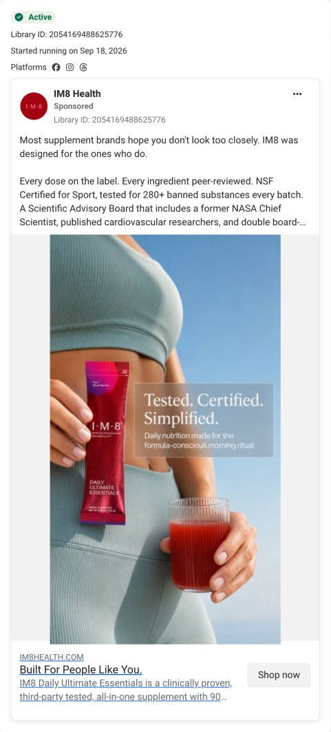
A static image ad from IM8 with a cropped photo of a woman in sage activewear holding a sachet and a glass against blue sky, under a tested, certified, simplified headline. The caption is IM8's skeptic message about the label, testing and advisory board. No price appears, and it links to the Read the evidence page.

Captured October 20, 2026. Advertiser health claims are shown for design research. Video examples are still frames.

Tested. Certified. Simplified.
A cropped lifestyle photograph puts a sachet and drink beside a concise trust message. Compare the creative with the destination and explore the other ads sharing this route.
- Brand
- IM8
- Observed offer
- No price or discount stated in the captured ad text
- Creative angle
- Evidence & trust
- Page type
- Campaign landing
- Ad format
- Image
- Listed start date
- Sep 18, 2026
- Captured
- Oct 20, 2026
- Library ID
- 2054169488625776
- Destination
- im8health.com
Selected for its design and offer structure. Ad performance isn’t available in this collection.
What this ad does well
Three words in the image summarize the whole caption: tested and certified carry the proof, simplified carries the convenience. The photo shows the product in hand next to the finished drink, a real-life frame rather than a studio still. The subline (daily nutrition made for the formula-conscious morning ritual) quietly names the audience. Paired with the caption's specifics (every dose on the label, NSF Certified for Sport, 280+ banned substances tested every batch), it gives a careful buyer both a feeling and facts.
What's missing
Tested and certified are claims any supplement brand can make, so the image alone doesn't show what sets IM8's testing apart; the specifics live only in the caption. There's also no reason to act today. If you make one like this, put one concrete detail in the image (the certification mark, the banned-substance count) so the three words have evidence beside them, and add the first-order offer to the headline under the image.
Beat by beat
- ImageA woman in sage activewear holds a sachet and a glass, with tested, certified, simplified on a frosted panel.
Three words carry the proof and convenience story at a glance.
- HeadlineBuilt For People Like You, with a Shop now button.
It asks the viewer to see themselves as the formula-conscious buyer.
- CopyThe shared skeptic caption, ending on do your homework, then decide.
It gives scrutinizers specific things to check, then hands them the decision.
Where it sends people
The ad links to the Read the evidence page, which carries the trust story the image summarizes. Evidence tabs cover the trial, every dose, testing and the team, a numbered verification checklist tells readers how to check each claim, and a supply-chain row names each partner from formulation to delivery. For a viewer who clicked on tested and certified, that's exactly the depth they'd want. The hero, though, opens on the co-founder with the product rather than the testing, so a certification line on the first screen would make the handoff tighter.
The page it sends people to: How IM8's evidence page turns skepticism into a checklist
IM8's Read the evidence campaign page, an evidence-first landing page. It opens by naming claims buyers distrust, then covers the trial, testing, team, cost math and dose comparisons, plus a verification checklist, before an embedded buy box, guarantee and skeptic FAQ. 3 of the 23 IM8 ads in the library send people here, all built on the same skeptic caption.
How the page is built
- 01Announcement bar and hero
A welcome-offer line, then the co-founder photo, a headline contrasting reading the label with reading the evidence and an offer button, answer what is this and why should I believe it.
- 02Expert ticker
Scrolling chips of the people who developed or trust it answer who's behind the formula.
- 03Problem section
Three cards that pick apart common industry claims answer why this should be different.
- 04Evidence tabs
Tabs for the trial, every dose, testing and the team answer what exactly the proof is.
- 05Cost math and results
A table pricing six key ingredients bought separately and four trial stat tiles answer is it worth the money.
- 06Clinician reviews
Disclosure-framed clinician cards with benefit filters answer what do doctors say.
- 07Founder letter
A signed note from the co-founder answers why the brand exists.
- 08Verification checklist
Numbered rows, each a step to verify a claim, answer how can I check this myself.
- 09Positioning and athlete proof
A band about building for people who check research and three athlete cards answer who uses it.
- 10Supply chain and advisory board
Partner step cards from formulation to delivery and an advisor grid answer where it's made and who checks it.
- 11Embedded buy box
Subscription cards with the longer plan pre-selected, perks, the free kit and certification labels answer how much and which plan.
- 12Proof, guarantee and skeptic FAQ
Creator videos, a dose table against a leading greens powder, third-party reviews, a guarantee card and Questions a Skeptic Would Ask close out the page.
The first fixes we would make
- The hero leads with the celebrity co-founder, which sits oddly on a page for people who don't take brands at their word. Test a hero built around the label or the certification instead, so the first screen makes the evidence argument the ads promised.
- The buy box arrives late, after the checklist, supply chain and advisory board. Add a compact plan selector or offer reminder right after the evidence tabs for visitors who are convinced early.
Read the full breakdown of this page
Three hooks you could test
- Turn the benefit into a picture people get in a second. “Tested. Certified. One step.”
- Lead with the uncomfortable problem. “Not sure what's actually in your supplements? Here's every dose.”
- Show a specific moment of use. “Sachet in one hand, glass in the other, done before you leave the house.”
What to borrow for your brand
- Reduce your trust story to three words on the image and let the caption carry the specifics.
- Shoot the product in hand next to the finished drink for a frame that feels like real life.
- Name the audience in the image subline (the formula-conscious buyer) so the right people stop.
One of 23 IM8 ads in the Fluid Inspiration Library, captured from the Meta Ad Library on Oct 20, 2026. We record that an ad ran publicly, not how it performed.