How IM8's skeptics page answers doubt before it asks for the sale
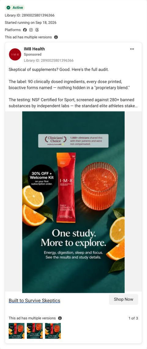
IM8's campaign page for supplement skeptics. It names past disappointments, then answers each with label transparency, ingredient-form detail, a broken-promise grid, a receipt-style cost card and clinician reviews before a late subscription buy box and an objection FAQ. One of the 23 IM8 ads in the library sends people here, a skeptic-audit static.

Captured October 20, 2026. Advertiser health claims are shown for design research. Video examples are still frames.

IM8 · Built for supplement skeptics
IM8's campaign page for supplement skeptics. It names past disappointments, then answers each with label transparency, ingredient-form detail, a broken-promise grid, a receipt-style cost card and clinician reviews before a late subscription buy box and an objection FAQ. One of the 23 IM8 ads in the library sends people here, a skeptic-audit static.
- Brand
- IM8
- Page type
- Campaign landing
- Ads leading here
- 1
- Captured
- Oct 20, 2026
- Destination
- im8health.com
Selected for its design and offer structure. Ad performance isn’t available in this collection.
What this page does well
The page talks to a doubtful reader the whole way down. The pain-recognition section (You Already Know the Playbook) describes past letdowns in three long cards, then a reframe band recasts skepticism as a filter and offers a See every dose button. The ingredient-forms section is unusually specific, with numbered ingredient cards and a Cheap Forms vs. table setting what most brands use against what IM8 uses and why it matters. The Supplement Graveyard grid pairs quoted promises with what actually happened and closes on a line that lets readers qualify themselves, and the receipt-style cost card puts the plan price under a struck-through total right before the reviews.
How the page is built
- 01Header and hero
A welcome-kit flat-lay with struck-through values beside a headline on why supplements fail and a subscribe-and-gifts button answer what is this and why is it different.
- 02Get-started strip and expert ticker
A Get Started button showing the subscription saving and scrolling expert chips answer who's behind it.
- 03Pain recognition
Three cards describing past disappointments and a strip of proof figures answer do they understand my problem.
- 04Reframe band
A headline recasting skepticism as a filter, label and testing paragraphs and a See every dose button answer why should I trust this one.
- 05Expert verification
Three portrait cards with quoted endorsements answer who vouches for it.
- 06Deep-dive tabs
Tabs for the label, forms, organ systems and testing answer what exactly is in it.
- 07Ingredient forms and comparison
Numbered ingredient cards and a Cheap Forms vs. table answer is the quality actually better.
- 08Broken-promise grid
Quoted industry promises over what actually happened answer how is this not more of the same.
- 09Cost breakdown
A receipt-style card listing separate supplements, a struck total and the plan price answers is it worth the money.
- 10Clinician reviews
Disclosure-framed clinician cards with benefit filters answer what do doctors say.
- 11Buy box
A pre-selected larger plan with perks and a gift-kit row, plus a What You'll Feel card, answer how much and which plan.
- 12FAQ and closing band
Objection-style questions and a closing Try it risk-free button handle the last doubts before the footer.
What's missing, in the order we'd fix it
- The buy box comes late on a long page, after a long run of argument. Add a compact plan reminder right after the cost breakdown, where the reader has just seen the price case.
- The hero leads with the welcome-kit flat-lay, while the ad that lands here promised an audit of the label, testing and trial. Test a hero that opens on the label or the trial results, and keep the kit for the buy box.
- Make sure each proof figure under the pain cards carries its source right beside it, since this audience will look for it and won't hunt for a footnote.
How the ads set it up
The single ad that lands here opens with skeptical of supplements? Good, and it sets this page up almost perfectly: the hero names why past supplements failed, and the reframe band, deep-dive tabs and ingredient forms deliver the audit the caption promised. The ad's 30% off plus welcome kit sticker is picked up by the hero's gift flat-lay and the subscription saving on the Get Started button. The study the image teased (one study, more to explore) shows up as proof figures and tabs rather than a dedicated trial section.
What to borrow for your brand
- Name your reader's past disappointments in their words before you make any claim.
- Show ingredient forms side by side with what most brands use, plus a why-it-matters column.
- Use a receipt-style card that strikes through the buy-separately total and puts your price under it, right before reviews.
Ads that send people here
Captured from im8health.com in October 2026 for the Fluid Inspiration Library. Offers and prices change; this is what the page showed when we captured it.