How IM8 fronts its quiz entry page with a physician
The entry screen of IM8's Foundation Quiz fronted by Dr. Amy Shah, a single card on a cream background with no site navigation. Her name, credentials and portrait sit beside a timed start button, a results preview and expert reviews. One of the 23 IM8 ads in the library sends people here, a doctor-hosted quiz invitation.

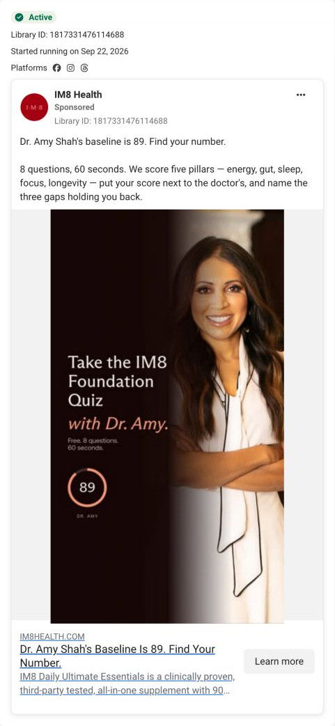
Captured October 20, 2026. Advertiser health claims are shown for design research. Video examples are still frames. Public quiz entry only; no health questions answered.
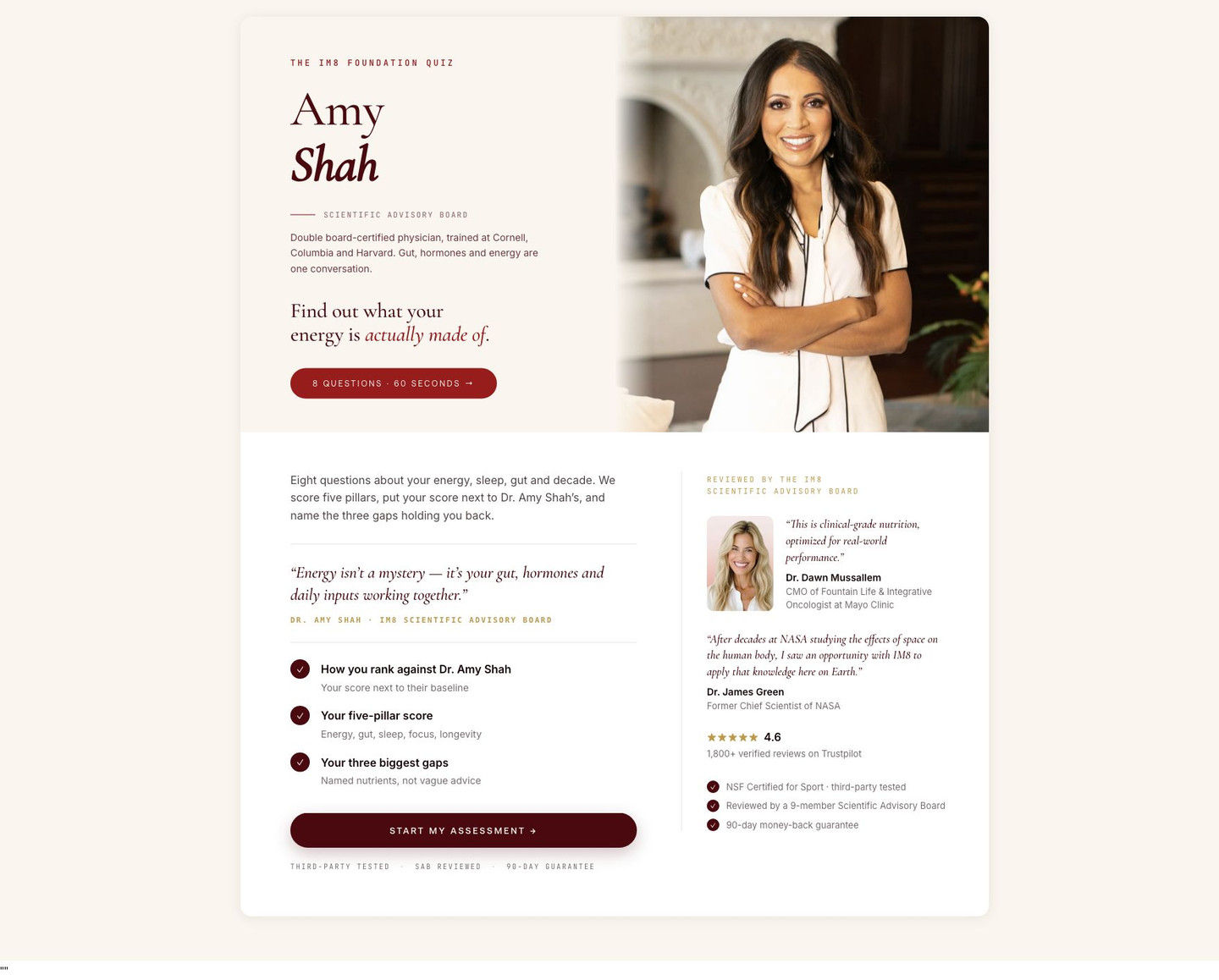
IM8 · Foundation Quiz · Amy Shah
The entry screen of IM8's Foundation Quiz fronted by Dr. Amy Shah, a single card on a cream background with no site navigation. Her name, credentials and portrait sit beside a timed start button, a results preview and expert reviews. One of the 23 IM8 ads in the library sends people here, a doctor-hosted quiz invitation.
- Brand
- IM8
- Page type
- Quiz entry
- Ads leading here
- 1
- Captured
- Oct 20, 2026
- Destination
- im8health.com
Selected for its design and offer structure. Ad performance isn’t available in this collection.
What this page does well
Her name is the headline, set in large serif with an advisory-board label and a two-line credential bio, which gives the quiz authority before a single question. The pill CTA states the question count and time, lowering the cost of starting, and three check items preview exactly what comes back (a ranking against her, a pillar score, your biggest gaps). A side column with two expert quotes, a review-platform rating and three trust checks sits beside the start button instead of below the fold. With no header or footer, there's nothing to click except Start assessment.
How the page is built
- 01Entry card, top half
The quiz name, Dr. Shah's name, an advisory-board label, credentials, a promise headline and a timed start pill, beside her portrait, answer who's running this and how long it takes.
- 02Lower left
A paragraph on what the quiz measures, her pull quote, three result previews and a Start assessment button answer what do I get.
- 03Lower right
Advisory-board quotes, a review rating and three trust checks answer can I trust it.
- 04Page chrome
No header, footer or navigation, so the card is the only thing on the page.
What's missing, in the order we'd fix it
- The card doesn't say what happens after the score, such as a recommendation or an offer. Add a line under the results preview so the quiz feels like the start of a plan.
- The ad's hook is a comparison (her 89 against your number), but the card frames results as a ranking and a pillar score. Show her 89 ring beside an empty one on the card so the ad's visual carries straight through.
- Only the entry screen was captured. If the quiz asks for an email before results, say so on this card and explain what you'll send.
How the ads set it up
The ad that lands here, a portrait of Dr. Amy Shah with her 89 score and free, 8 questions, 60 seconds, sets the card up well. Her name and portrait lead the card, the start button repeats the question count and time, and the three result previews match the ad's promise of a score, a comparison with the doctor and your top gaps. The card's credential bio adds the context the ad image left out.
What to borrow for your brand
- Make the quiz host's name the headline and put a short credential bio right under it.
- State the question count and time on the start button itself.
- Keep expert quotes and a rating in a side column next to the start button so trust is visible at the moment of decision.
Ads that send people here
Captured from im8health.com in October 2026 for the Fluid Inspiration Library. Offers and prices change; this is what the page showed when we captured it.