How Hims's Testosterone Support page splits product and intake
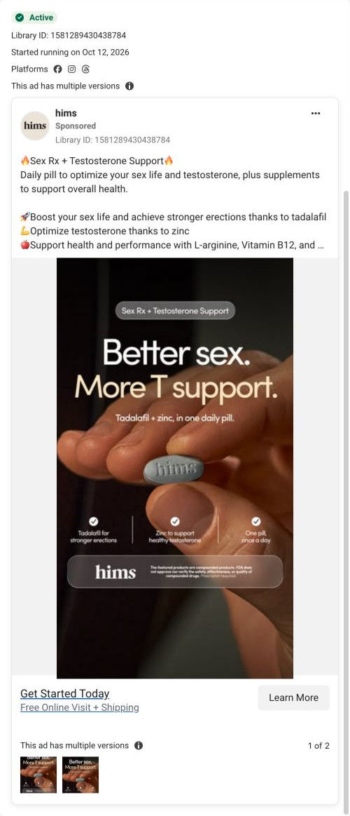
Hims's Sex Rx + Testosterone Support consultation page: a split hero with the product name as headline and the first intake question beside it, two more prompts, then options, a benefit band, FAQ and how-it-works. One ad in the Fluid library sends people here, a product-benefit static reading “Better sex. More T support.”

Captured while scrolling the public page. Opening prompts are shown without answering health questions. A browser shopping-extension badge may appear in the right margin.
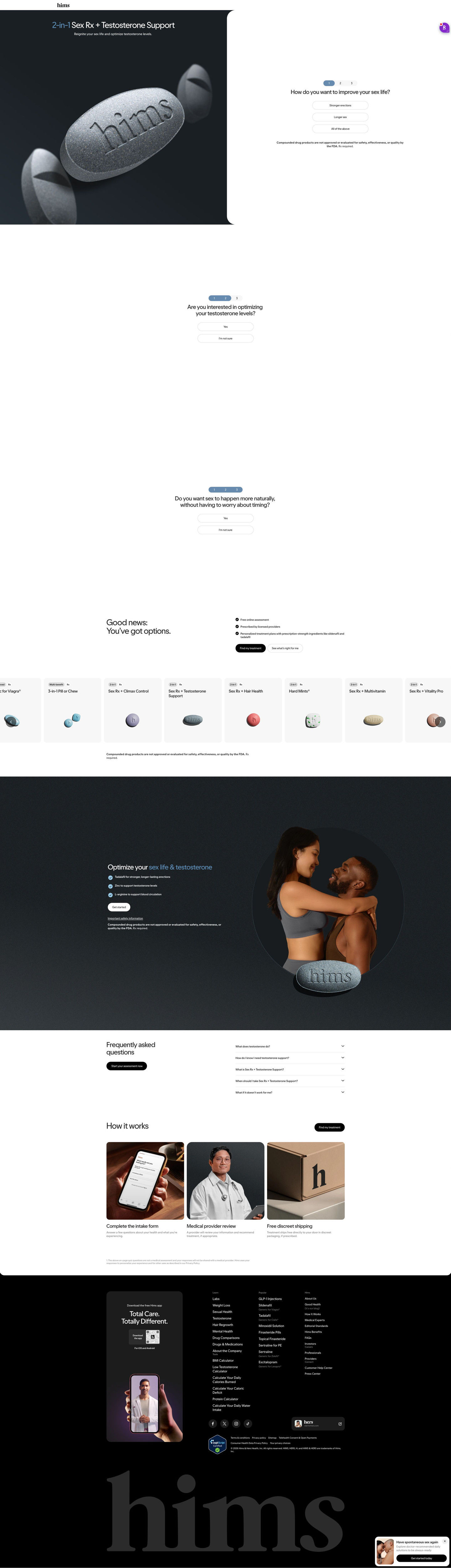
Hims · Sex Rx + Testosterone Support
Hims's Sex Rx + Testosterone Support consultation page: a split hero with the product name as headline and the first intake question beside it, two more prompts, then options, a benefit band, FAQ and how-it-works. One ad in the Fluid library sends people here, a product-benefit static reading “Better sex. More T support.”
- Brand
- Hims
- Page type
- Consultation entry
- Ads leading here
- 1
- Captured
- Oct 20, 2026
- Destination
- hims.com
Selected for its design and offer structure. Ad performance isn’t available in this collection.
What this page does well
The split hero is clear about both jobs: the left side shows the product name and a macro shot of the pill, and the right side starts the consultation with one tap. Because the headline is the exact product name from the ad, nobody wonders if they're in the right place. The dark benefit band repeats the three ingredient bullets the ad used, alongside a couple photo, so the claims and the mood come back together. The FAQ and how-it-works cards then handle process questions before the footer.
How the page is built
- 01Header
A logo-only header with no navigation keeps the visitor on the offer.
- 02Split hero
The product name, a one-line promise and a macro pill shot sit beside the first question, answering what this is and how to start.
- 03Prompt two
A single yes-or-not-sure question keeps the intake moving with one tap.
- 04Prompt three
A second yes-or-not-sure question completes the short intake.
- 05Options summary
A good-news headline and three process points answer whether this is online, licensed and personalized.
- 06Treatment carousel
Product cards with format tags answer what other options exist.
- 07Benefit band
Three checked ingredient bullets and a couple photo answer what each ingredient is for, as the page describes it.
- 08FAQ
Five accordions beside a start-assessment button answer practical questions.
- 09How it works
Three photo cards (intake, provider, shipping) answer what happens after the questions.
- 10Footer
An app card, link columns and a certification badge close the page.
What's missing, in the order we'd fix it
- The page has no customer reviews or testimonials. Add a short review carousel after the benefit band so the claims have voices behind them.
- No price appears in the captured sections. Put a monthly or per-dose price on the treatment card for this product.
- The one-line hero promise is broad, like the ad's headline. Name one specific moment (being ready without planning) in the sub line so the visitor feels called out.
How the ads set it up
The one ad that lands here is a static with a pill held to camera, the headline “Better sex. More T support.” and three checks for tadalafil, zinc and one pill a day. The page's headline is the same product name, and its benefit band repeats the same three ingredient points, so the hand-off is about as tight as it gets. The ad's free online visit shows up in the good-news block as a free online assessment. The only gap is proof, which neither the ad nor the page supplies.
What to borrow for your brand
- Use the exact product name from the ad as the page headline so visitors know instantly they're in the right place.
- Split the hero between the product (name, promise, image) and the first one-tap question.
- Repeat the ad's ingredient checks in a benefit band further down so the claims return when visitors are deciding.
Ads that send people here
Captured from hims.com in October 2026 for the Fluid Inspiration Library. Offers and prices change; this is what the page showed when we captured it.