How Hims's “made for you” hair page sells before it asks
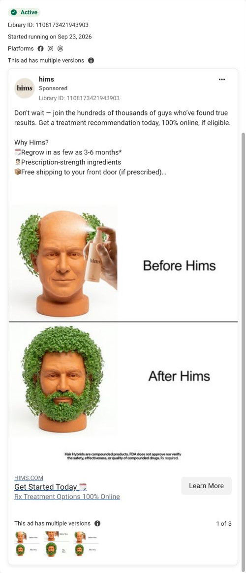
A Hims hair-treatment landing page on a comparison-named route that reads as a sales page first: no question in the hero, just “Hair loss treatment made for you” with three check claims and two buttons. Format cards, before/after reviews, how-it-works and FAQ follow. One ad in the Fluid library sends people here, the planter-head before/after static.

Captured while scrolling the public page. Opening prompts are shown without answering health questions. A browser shopping-extension badge may appear in the right margin.
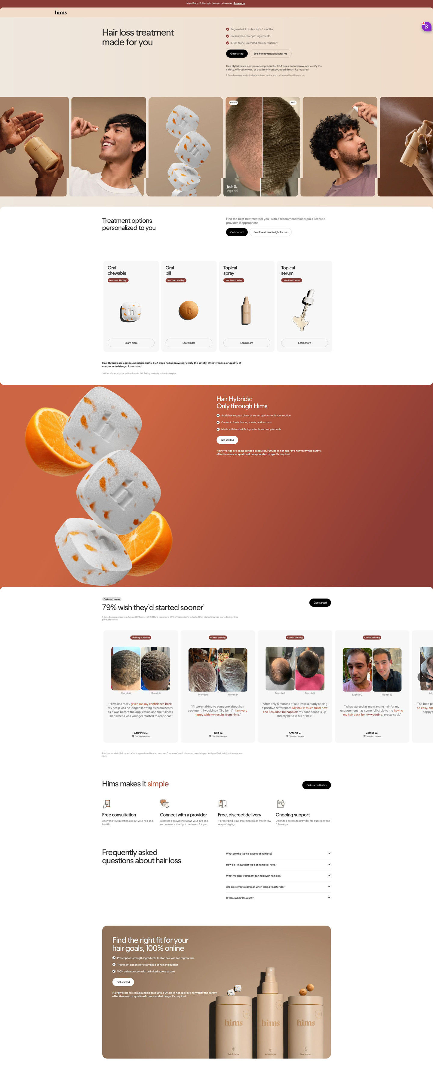
Hims · Hair-treatment comparison route
A Hims hair-treatment landing page on a comparison-named route that reads as a sales page first: no question in the hero, just “Hair loss treatment made for you” with three check claims and two buttons. Format cards, before/after reviews, how-it-works and FAQ follow. One ad in the Fluid library sends people here, the planter-head before/after static.
- Brand
- Hims
- Page type
- Consultation entry
- Ads leading here
- 1
- Captured
- Oct 20, 2026
- Destination
- hims.com
Selected for its design and offer structure. Ad performance isn’t available in this collection.
What this page does well
The two buttons side by side, Get Started and a softer see-if-it's-right option, show up throughout the page, which gives unsure visitors a lower-pressure path. The format cards carry per-day price tags, framing cost daily instead of monthly. The before/after review section opens on a customer-survey headline and month-labeled photo pairs with a highlighted phrase in each quote, which is real proof for traffic coming from a joke ad. The page ends on a rounded closing panel that restates the checks and asks once more.
How the page is built
- 01Announcement bar
A new-price line with a link answers whether there's a reason to look now.
- 02Header
A logo-only header keeps the visitor on the page.
- 03Hero split
A made-for-you headline, three check claims and two buttons answer what this is and how to start.
- 04Image strip
Tall cards mixing lifestyle shots, product renders and a labeled before/after answer what it looks like in real life.
- 05Treatment options
Four format cards with per-day prices answer which version fits and what it costs.
- 06Product feature band
An only-through-Hims headline with three checks answers why get it here.
- 07Before/after reviews
Month-labeled photo pairs with highlighted quotes answer whether it works for people like me, as customers describe it.
- 08How it works
Four icon steps answer what happens after I click Get Started.
- 09FAQ
Five accordions answer practical questions.
- 10Closing CTA panel
A warm card with checks, Get Started and a product lineup asks once more.
What's missing, in the order we'd fix it
- Despite the route's name, there's no comparison on the page against other treatments or doing nothing. Add a short table near the format cards that shows what makes this different from shampoos or over-the-counter options.
- The intake sits behind Get Started, so visitors don't see how quick it is. Add a line under the buttons saying how many questions it takes.
- The playful tone of the planter-head ad disappears on arrival. A small visual nod in the image strip would make the click feel continuous for that traffic.
How the ads set it up
The one ad that lands here is the playful static of a terracotta planter head labeled Before Hims and After Hims, carrying the shared hair copy about regrowth in 3-6 months. The page drops the joke and goes straight to a sales layout, which suits the ad's biggest gap: it had no real proof, and this page has a labeled before/after in the image strip and a full review carousel. The 3-6 month timeline from the copy shows up in the hero check claims. The humor itself doesn't carry over, so visitors switch tone the moment they land.
What to borrow for your brand
- Pair a direct Get Started button with a softer see-if-it's-right button throughout the page for unsure visitors.
- Frame cost per day on each format card when the monthly number would feel heavy.
- Send a joke or concept ad to a page that's heavy on real proof, so attention from the joke meets evidence on arrival.
Ads that send people here
Captured from hims.com in October 2026 for the Fluid Inspiration Library. Offers and prices change; this is what the page showed when we captured it.