How Hims's refreshed Climax Control page handles five different ads | Fluid
Esc

How Hims's refreshed Climax Control page handles five different ads

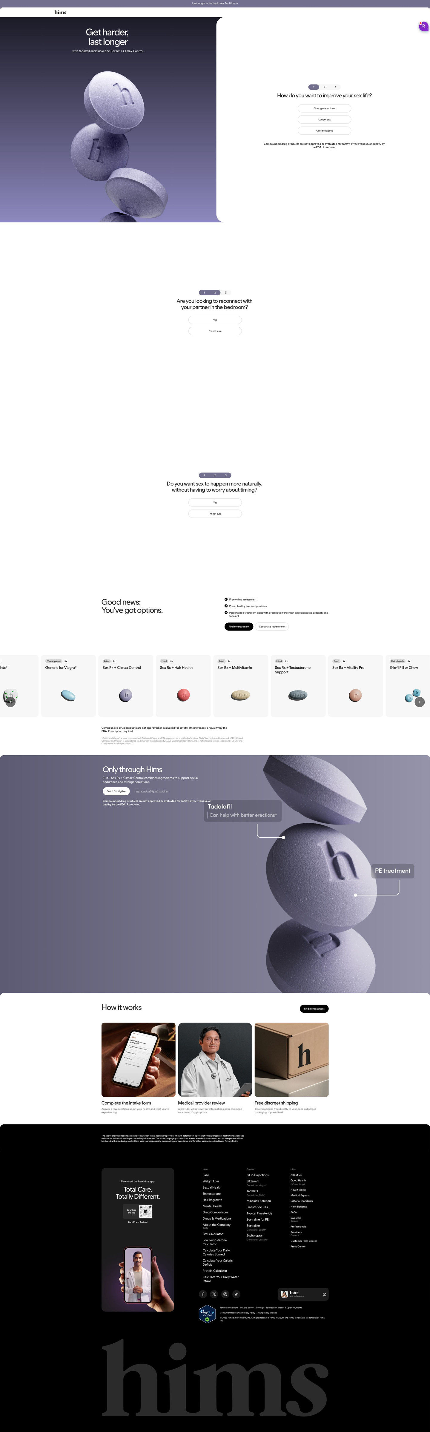
Hims's refreshed Climax Control consultation page, a focused entry page with the first of three questions beside a tablet render under “Get harder, last longer.” Options, a treatment carousel, a mechanism band and how-it-works follow. Five ads in the Fluid library send people here, mostly product-benefit statics and videos for the 2-in-1 pill plus a launch static for the 3-in-1.

Hims
5 creatives lead here1 / 5
Hims · Climax Control — refresh

Captured while scrolling the public page. Opening prompts are shown without answering health questions. A browser shopping-extension badge may appear in the right margin.

Hims: full page screenshot

Hims · Climax Control — refresh

Hims's refreshed Climax Control consultation page, a focused entry page with the first of three questions beside a tablet render under “Get harder, last longer.” Options, a treatment carousel, a mechanism band and how-it-works follow. Five ads in the Fluid library send people here, mostly product-benefit statics and videos for the 2-in-1 pill plus a launch static for the 3-in-1.

Brand
Hims
Page type
Consultation entry
Ads leading here
5
Captured
Oct 20, 2026
Destination
hims.com

Selected for its design and offer structure. Ad performance isn’t available in this collection.

What this page does well

With five different ads pointing here, the page stays on the shared promise: the headline repeats get harder and last longer, which almost every ad uses. The first question sits in the hero with a step counter showing there are only three, so the commitment is clear from the first tap. After the questions, the options block offers a direct and a guided button, and the treatment carousel lets people who skip the quiz browse formats. The mechanism band with labeled callouts naming each component pays off the 2-in-1 idea the ads lean on.

How the page is built

  1. 01
    Announcement bar and header

    One benefit line with a Try link and a logo-only header keep focus on the hero.

  2. 02
    Split hero

    A two-line benefit headline and stacked-tablet render beside the first question answer what this is and how to start.

  3. 03
    Questions two and three

    Yes / “I'm not sure” pairs on their own screens keep the intake low-commitment.

  4. 04
    Options intro

    A good-news headline, three check items and two buttons answer whether the process is easy and safe.

  5. 05
    Treatment carousel

    Grey cards with format and Rx tags answer which treatments are available.

  6. 06
    Mechanism band

    A purple panel with callouts naming each component answers what's in the combination.

  7. 07
    How it works

    Three photo cards (intake form, provider, shipping box) answer what happens after the questions.

  8. 08
    Footer

    An eligibility disclaimer, app card and link columns close the page.

What's missing, in the order we'd fix it

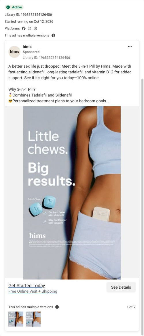
  1. The 3-in-1 launch ad lands here, but the new product only appears as a card in the carousel. Give launch traffic its own hero variant, or a short banner pointing to the new format.
  2. There's no proof on the page, while the ads lean on partner-voice stories. Add a short review carousel after the mechanism band so the page backs up what the ads describe.
  3. No price appears in the captured sections. A from-price on each carousel card would answer the cost question before the quiz ends.

How the ads set it up

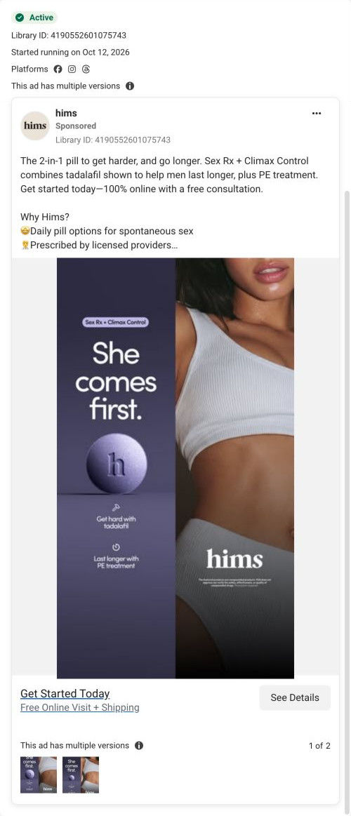
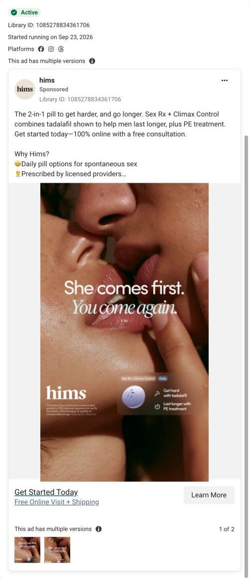
Five ads land here: the “She comes first” close-up and split-panel statics, the “Last longer” style partner videos (“My man can actually last now” and the longer testimonial) and the “Little chews. Big results.” launch static. The hero's get-harder, last-longer headline is the common thread, and the mechanism band picks up the tadalafil-plus-PE-treatment story most of them tell. The partner-voice videos don't have a matching voice on the page, and the 3-in-1 launch traffic has to find its product in the carousel. For a shared page, that's a sensible trade, but launch and story ads would each benefit from their own hero.

What to borrow for your brand

  • When several ads share one page, lead the hero with the promise they all have in common.
  • Show a step counter on the first question so visitors know the quiz is only three taps long.
  • Name each component of a combination product with labeled callouts on a large product render.

Ads that send people here

Captured from hims.com in October 2026 for the Fluid Inspiration Library. Offers and prices change; this is what the page showed when we captured it.