How Hims's at-home testosterone test page puts the test first | Fluid
Esc

How Hims's at-home testosterone test page puts the test first

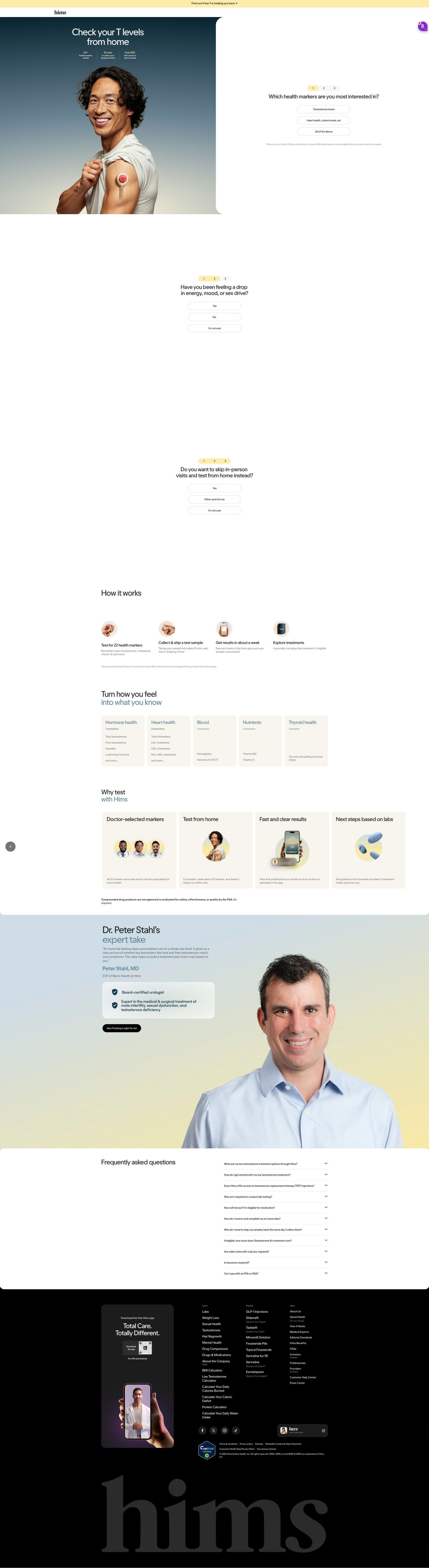
Hims's at-home testosterone test page, a test-first entry page with “Check your T levels from home,” a man wearing a collection device and three mini stats beside the first intake question. How-it-works, marker panels, an expert endorsement and FAQ follow. Two ads in the Fluid library send people here, both problem-led testosterone-check ads, one static and one video.

Hims
2 creatives lead here1 / 2
Hims · At-home testosterone test

Captured while scrolling the public page. Opening prompts are shown without answering health questions. A browser shopping-extension badge may appear in the right margin.

Hims: full page screenshot

Hims · At-home testosterone test

Hims's at-home testosterone test page, a test-first entry page with “Check your T levels from home,” a man wearing a collection device and three mini stats beside the first intake question. How-it-works, marker panels, an expert endorsement and FAQ follow. Two ads in the Fluid library send people here, both problem-led testosterone-check ads, one static and one video.

Brand
Hims
Page type
Consultation entry
Ads leading here
2
Captured
Oct 20, 2026
Destination
hims.com

Selected for its design and offer structure. Ad performance isn’t available in this collection.

What this page does well

The hero answers the three things a curious visitor wants to know (how many markers, how long collection takes, what it costs and when results come) in mini stats over the photo, while the first question starts on the other side. The second intake question names the symptoms the ads raised before any product detail appears, which makes the page feel like it heard the visitor. The four how-it-works steps, test, collect and ship, get results in the app, explore treatment, walk the process in order. The expert endorsement band ends with a low-pressure “see if testing is right” button.

How the page is built

  1. 01
    Announcement bar and header

    One line linking a symptom question to a CTA arrow and a logo-only header keep focus.

  2. 02
    Split hero

    A headline and three mini stats over the photo sit beside the first question, answering what the test is, what it costs and how to start.

  3. 03
    Intake questions two and three

    Questions about symptoms and testing from home, each with a not-sure option, answer whether this is right for me.

  4. 04
    How it works

    Four icon steps answer what happens from kit to treatment options.

  5. 05
    Marker panels

    Five cards by body system with marker counts answer what the test measures.

  6. 06
    Why test

    Four cream cards (doctor-selected markers, at-home testing, fast results, next steps) answer why test this way.

  7. 07
    Expert endorsement

    A doctor's quote with a credential card answers who stands behind the test.

  8. 08
    FAQ

    An accordion on treatment, lab testing, cost, insurance and HSA answers the remaining questions.

  9. 09
    Footer

    An app card, link columns and certifications close the page.

What's missing, in the order we'd fix it

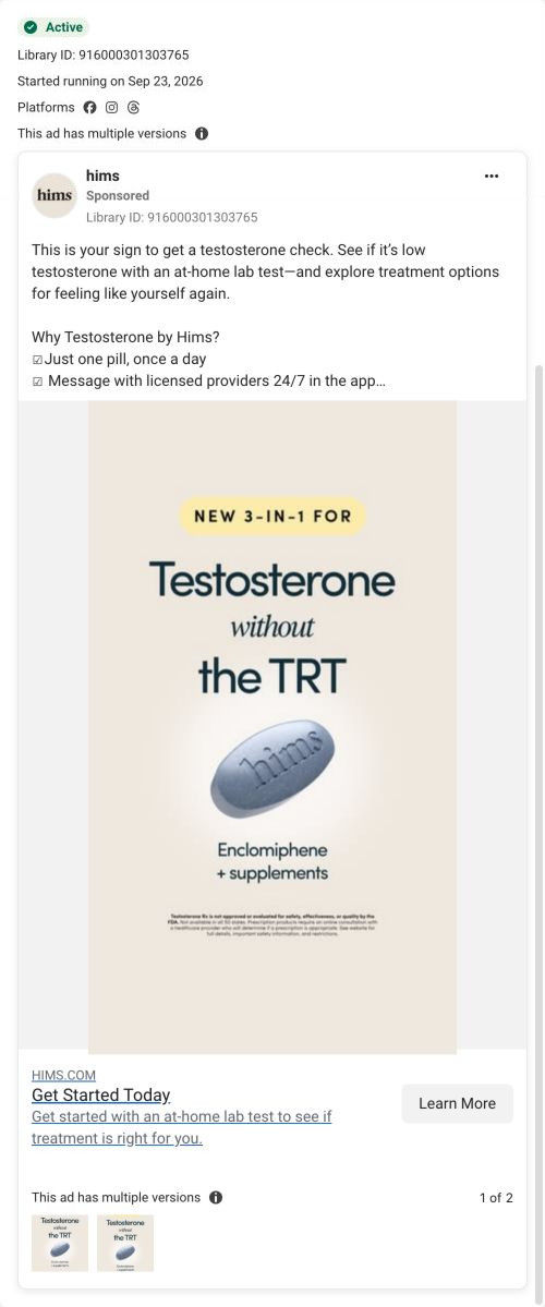
  1. One of the two ads that land here sells a new 3-in-1 pill in its image, but the page doesn't mention it until the visitor goes looking. Add a short band after how-it-works that shows the treatment options a test can lead to.
  2. There are no customer stories, only an expert quote. A short member story about what their results showed and what they did next would make the process feel personal.
  3. The page asks which markers interest the visitor first, which is a harder question than the ad's simple check prompt. Lead with the symptom question the ad raised and move the marker question second.

How the ads set it up

Two ads land here. The video's presenter explains a $69 at-home lab kit, sample return and provider review, and the page picks all of that up: the device in the hero photo, the price in the mini stats and the steps in how-it-works. The static's copy prompts a testosterone check too, but its image announces a new pill without TRT, and that product doesn't appear in the hero. So the page is a strong match for test-first creative and a weaker one for product-led creative.

What to borrow for your brand

  • Put three mini stats over the hero photo (what it measures, how long it takes, what it costs) so the key questions are answered before the scroll.
  • Make one intake question name the symptom the ad raised, so the page feels like a continuation.
  • Close an expert section with a low-pressure button (“see if it's right”) instead of a hard sell.

Ads that send people here

Captured from hims.com in October 2026 for the Fluid Inspiration Library. Offers and prices change; this is what the page showed when we captured it.