
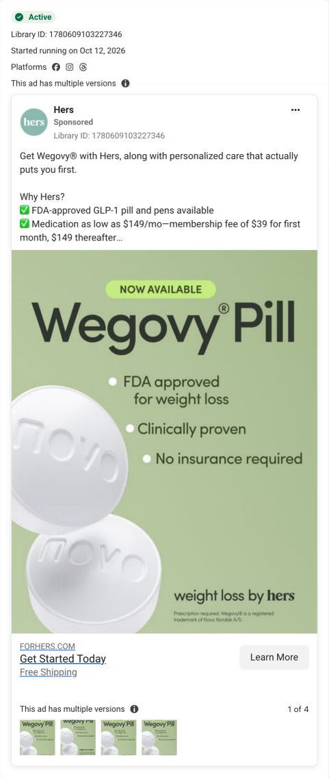
Get Wegovy® with Hers, along with personalized care that actually puts you first. Why Hers? ✅ FDA-approved GLP-1 pill and pens available ✅ Medication as low as $149/mo—membership fee of $39 for first month, $149 thereafter ✅ 100% online No guesswork. Just real weight loss with provider-led treatment plans. See if you qualify today. *$149/mo price includes medication only, if prescribed. An active Hers Weight Loss Membership is required ($39 for the first month, auto-renews at $149/month thereafter). Membership is billed separately and does not include or guarantee a prescription. Medication is not available without a membership. Membership fee is not included. Not available in all 50 states. Prescription required. Weight Loss by Hers is a holistic program that includes nutrition support, technological tools, and medications prescribed based on what your provider determines is medically appropriate and necessary for you. See website for full details, important safety information, and restrictions. Wegovy® is a registered trademark of Novo Nordisk A/S.
How Hers leads a Wegovy ad with a $39 first-month price
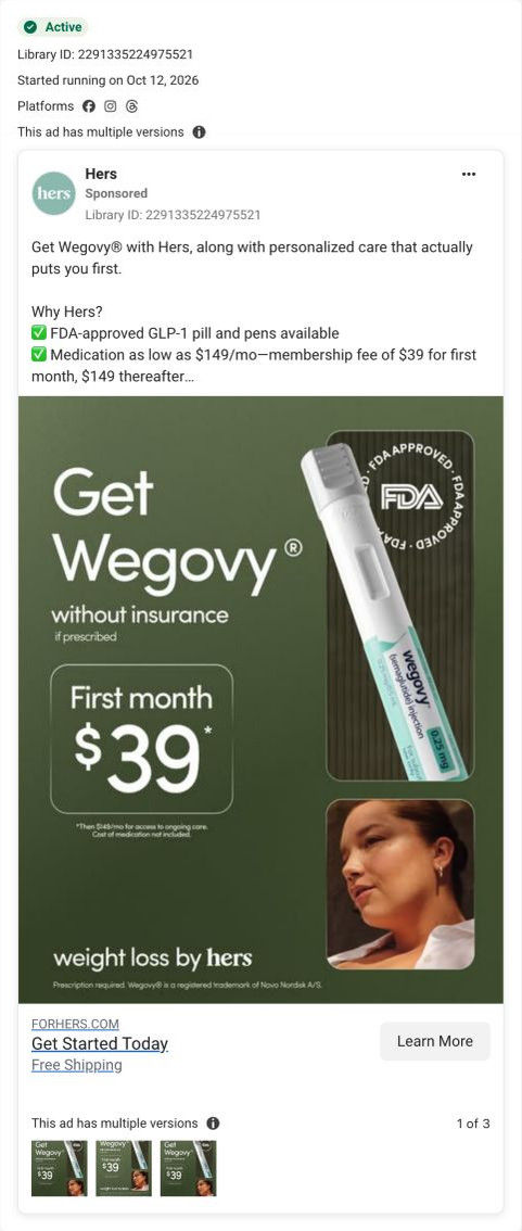
A weight loss by Hers static: the headline Get Wegovy without insurance, if prescribed, a boxed first month $39, an injection pen with an FDA-approved seal, and a woman's portrait. The fine print says $149/mo follows and medication isn't included. The copy lists medication from $149/mo, linking to the Hers Wegovy consultation page.
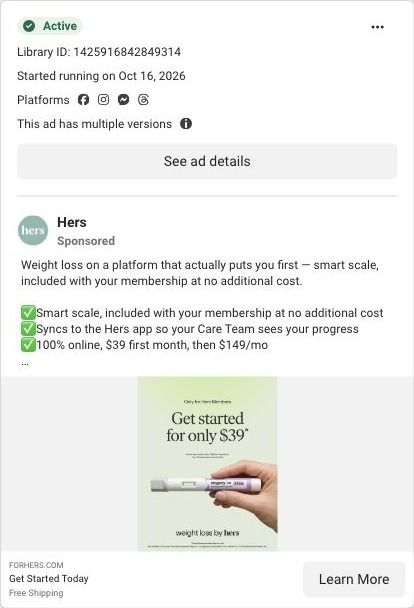
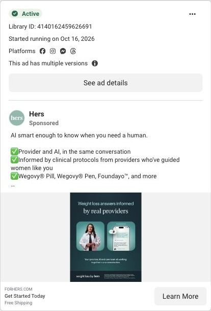
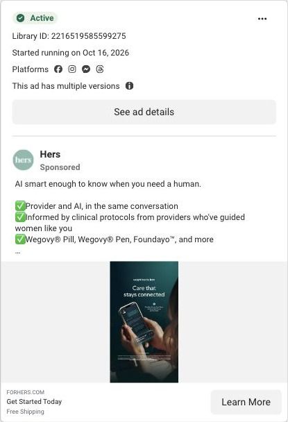
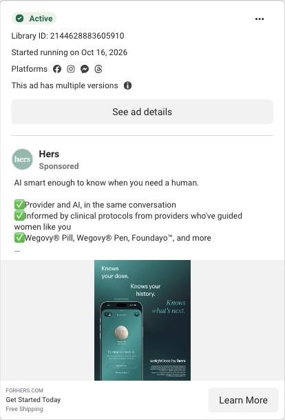
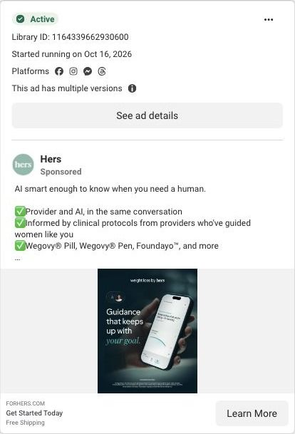
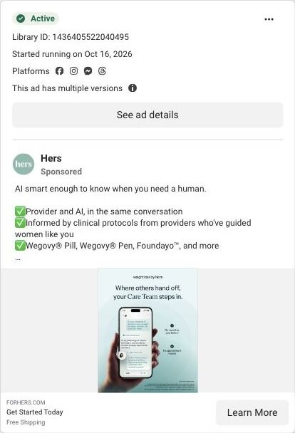
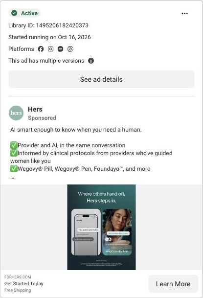
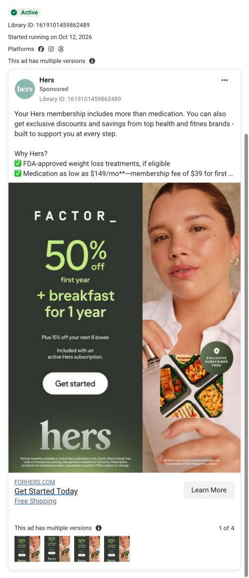

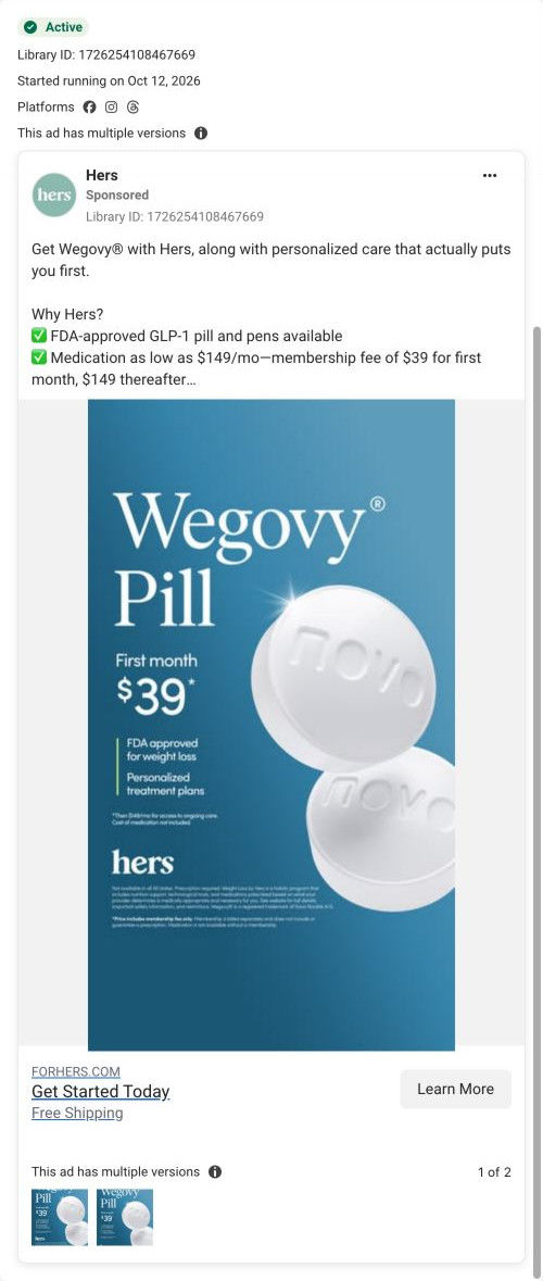
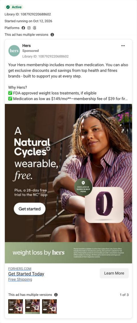
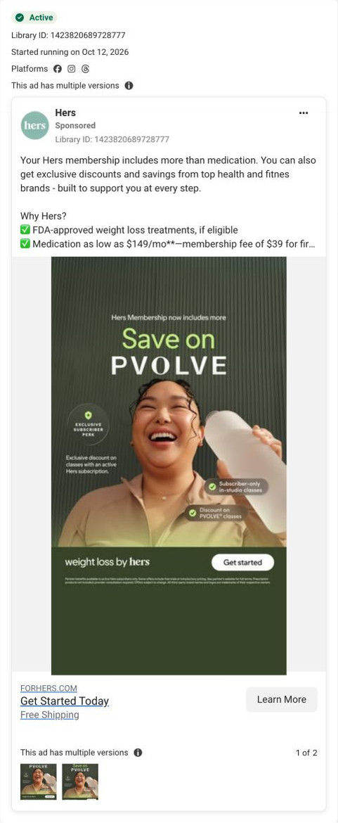




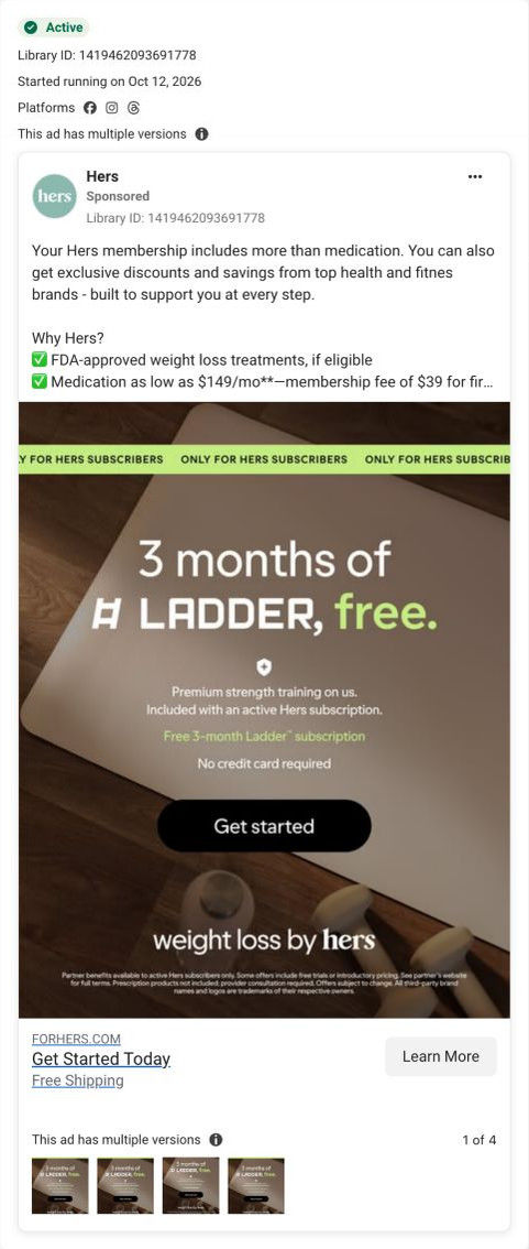

Captured while scrolling the public page. Opening prompts are shown without answering health questions. A browser shopping-extension badge may appear in the right margin.
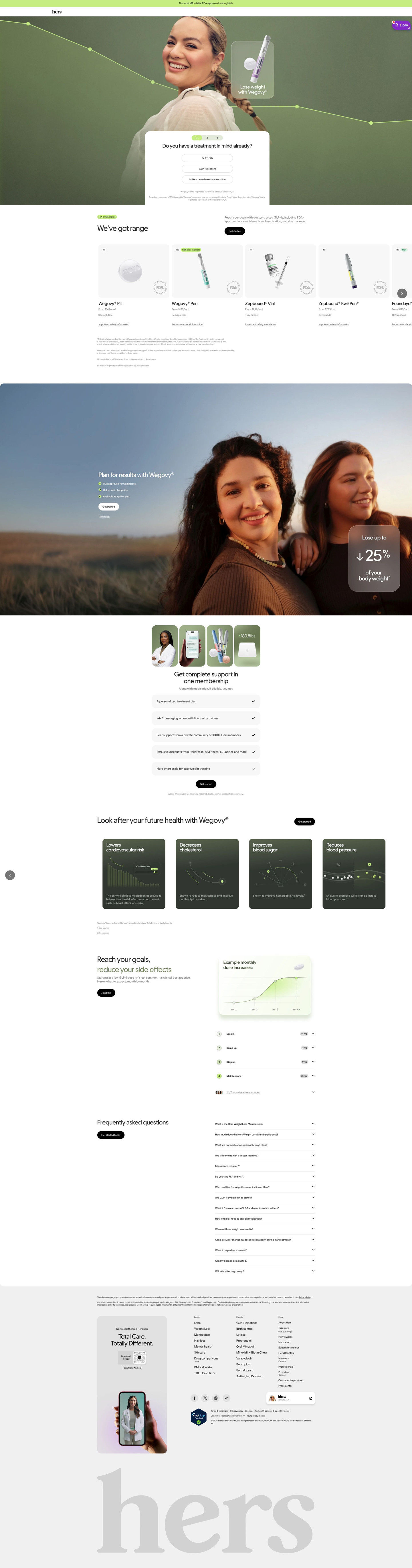
Get Wegovy with Hers
The ad combines a named-medication message with provider-led care and separately disclosed medication and membership prices. The recorded CTA points to the Wegovy-specific entry URL. Compare the creative with the destination and explore the other ads sharing this route.
- Brand
- Hers
- Observed offer
- Medication from $149/mo plus separate membership: $39 first month, then $149/mo; if prescribed
- Creative angle
- Price-led
- Page type
- Consultation entry
- Ad format
- Image
- Listed start date
- Oct 12, 2026
- Captured
- Oct 20, 2026
- Library ID
- 2291335224975521
- Destination
- forhers.com
Selected for its design and offer structure. Ad performance isn’t available in this collection.
What this ad does well
Price is the hook, and it's big: the boxed $39 is the largest element after the headline, so someone priced out by insurance knows the entry cost at a glance. The headline names the exact barrier (no insurance) next to a named medication, which speaks to people who've already looked into it. The pen and the FDA-approved seal answer what you'd actually get and whether it's legitimate. Hers ran several versions of this layout, which fits a price test.
What's missing
The $39 is the first month of membership, and the image's fine print says medication cost isn't included, so a viewer who only reads the big number may expect a lower total than they'll see. That gap between the headline price and the real monthly cost is the kind of thing that turns into drop-off at checkout and distrust afterward. If you make one like this, label the big number plainly on the image (first month of membership) and show the medication from-price beside it, so the click starts with accurate expectations.
Beat by beat
- ImageThe headline Get Wegovy without insurance with an if-prescribed qualifier, and a boxed first month $39 with fine print about $149/mo after and medication not included.
It leads with the cost barrier and a low entry price for viewers without coverage.
- ImageA Wegovy injection pen beside an FDA-approved seal and a portrait of a woman.
It shows the product and a trust mark, and adds a human face to a clinical offer.
- CopyGet Wegovy with personalized care, the Why Hers checklist with medication from $149/mo and membership fees, and a see-if-you-qualify line.
It discloses the full pricing structure and sets up the eligibility step.
The offer
A $39 first month of membership, then $149/month, with medication priced separately from $149/mo, if prescribed. The image frames $39 as the headline price and puts the conditions in fine print.
Where it sends people
The ad lands on the Hers Wegovy consultation page, a quiz-style entry with a hero intake card asking about treatment format. The announcement bar about affordability and the options carousel with a from-price per format both pick up the price story, and the FAQ covers membership, cost, insurance and HSA questions. Putting the membership-plus-medication math near the intake card would make the $39 promise feel honest at the first click. One of 53 ads in the Fluid library that land on this page.
The page it sends people to: How Hers starts its Wegovy consultation inside the page hero
Hers's Wegovy consultation page opens with the first intake question in a card over the hero, then scrolls through medication cards with "from" monthly prices, a results band, membership perks, a dosing schedule and a long FAQ. 53 ads in the Fluid library send people here, including price-led, food-noise, membership-value and creator-story ads.
How the page is built
- 01Announcement bar and header
A single line on affordability sits above a logo-only header, so the price question gets a nod before anything else and there's no navigation to wander off into.
- 02Hero with intake card
A full-bleed portrait with a descending line-graph overlay frames a centered card that asks whether the visitor already has a treatment in mind, answering "where do I start?" with three one-tap choices.
- 03Options carousel
Horizontal medication cards show the product, prescription and availability tags, a "from" monthly price and a safety link, answering "what are my options and what do they cost?" with pricing and eligibility fine print below.
- 04Results band
An outdoor photo of two women carries a headline, three check items and a frosted card with a large outcome figure, which is the page's main answer to "what could this look like for me?"
- 05Membership
A four-photo collage (provider, app, product, smart scale) sits over five check-row perks, answering "what am I paying the membership for?"
- 06Health-marker carousel
Dark cards pair data-visualization illustrations with short benefit claims and footnotes, covering what the page says treatment can involve beyond the scale.
- 07Dosing schedule
A chart of example monthly dose increases and a numbered four-step accordion with dose pills explain how treatment eases in, answering "what happens month to month?"
- 08FAQ
A long accordion covers membership, cost, options, visits, insurance, HSA, eligibility, switching and side effects, catching the practical objections that are left.
- 09Footer
Disclaimers, an app-download card with a QR code, a pharmacy certification badge and a sister-brand card close the page with trust signals and legal detail.
The first fixes we would make
- The membership fee is separate from the medication price, and that detail lives in fine print under the carousel. Put the combined monthly cost (medication plus membership) right under each "from" price, so a visitor who came from a price ad sees the number they'll actually pay before they start the intake.
- Creator-story ads send people here, but the page has no member stories or reviews to pick up that voice; the results band shows a single outcome figure instead. Add a short strip of member stories (with the same disclaimers Hers uses elsewhere) near the results band, so someone who clicked a creator's documentary finds people like that creator on the page.
Read the full breakdown of this page
Three hooks you could test
- Lead with the uncomfortable problem. “Insurance said no again?”
- Make the product the whole scene. “Here's exactly what month one costs.”
- Call out the habit you're replacing. “Stop calling your insurer to ask what's covered this year.”
What to borrow for your brand
- Put your entry price in a box as the biggest element after the headline, so price-sensitive viewers get the answer they're looking for.
- Name the barrier your price removes (no insurance, no contract, no device) in the headline, so the price has a reason to matter.
- Label exactly what the big number covers on the image itself, so the headline price and the real monthly cost don't surprise anyone after the click.
One of 125 Hers ads in the Fluid Inspiration Library, captured from the Meta Ad Library on Oct 20, 2026. We record that an ad ran publicly, not how it performed.