
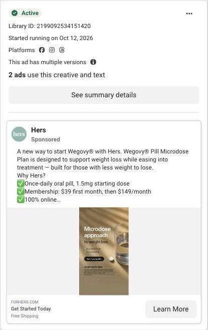
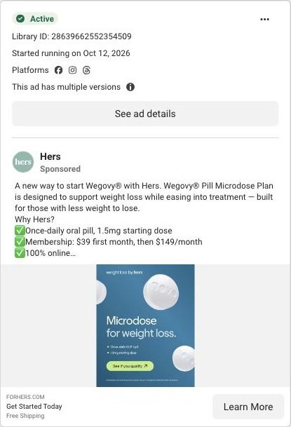
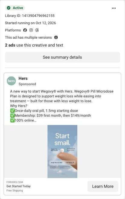
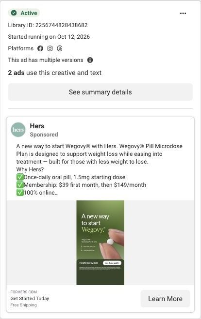
A new way to start Wegovy® with Hers. Wegovy® Pill Microdose Plan is designed to support weight loss while easing into treatment — built for those with less weight to lose. Why Hers? ✅ Once-daily oral pill, 1.5mg starting dose ✅ Membership: $39 first month, then $149/month ✅ 100% online See if you qualify. Wegovy® is a registered trademark of Novo Nordisk A/S. *Price includes membership fee only. Membership is billed separately and does not include or guarantee a prescription. Medication is not available without a membership. Wegovy® (semaglutide) is FDA-approved for weight loss when used as directed. Microdosing is off-label but may be prescribed by a provider if appropriate. Lower doses are unstudied for weight loss and may be less effective. Not available in all 50 states. Prescription required. Weight Loss by Hers is a holistic program that includes nutrition support, technological tools, and medications prescribed based on what your provider determines is medically appropriate and necessary for you. See website for full details, important safety information, and restrictions.
How Hers turns a slower GLP-1 start into a simple chart
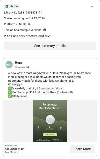
A Hers static ad on dark green: "For a slower start to treatment" above a pill on a rising line, three plan facts (a once-daily pill, built for those with less weight to lose, a 1.5mg starting dose) and a "See if you qualify" button. The copy offers a $39 first month and links to a lower-dose plan page.
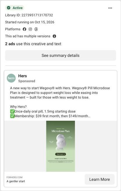
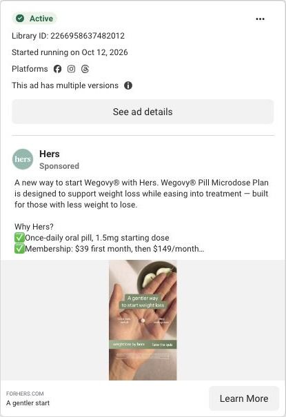
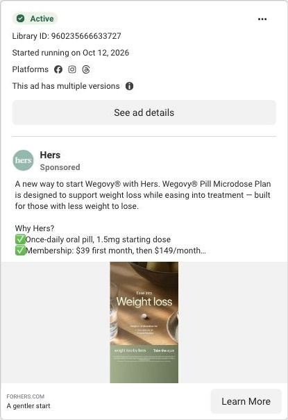
Public destination captured October 22, 2026. The reference retains the page layout and loaded imagery; shopping-extension UI is removed. Offers may change. No health answers were supplied.
Get Started Today
Visual reference: For a slower start. The modest-goal message has its own landing route, three soft-entry prompts and a plan comparison. Its final calls to action feed the same goal questionnaire as the broader weight-loss campaign. Compare the creative with the destination and explore the other ads sharing this route.
- Brand
- Hers
- Observed offer
- Membership $39 first month, then $149/mo; medication and eligibility terms apply
- Creative angle
- Product launch
- Page type
- Consultation entry
- Ad format
- Image
- Listed start date
- Oct 12, 2026
- Captured
- Oct 22, 2026
- Library ID
- 928319403473171
- Destination
- forhers.com
Selected for its design and offer structure. Ad performance isn’t available in this collection.
What this ad does well
This is the most complete of Hers' microdose statics. The rising line under the pill turns "slower start" into a picture of a gradual ramp, and the three facts underneath answer what it is, who it's for and how much, so the viewer gets the whole idea without opening the copy. Naming the audience in the image (those with less weight to lose) is the detail most of the other versions leave out.
What's missing
The facts are clear but cool; there's no line that makes the viewer feel her own situation, and the image doesn't mention the price. If you make one like this, keep the chart and the three facts, and add one short line in the customer's voice at the top ("just a few stubborn pounds" is right there on the landing page) plus the first-month price near the button. That gives the ad a person and a reason to act alongside the explanation.
Beat by beat
- ImageA pill sits on a gently rising line on dark green, with three icon facts and a "See if you qualify" button.
The ramp visual makes a slower start easy to picture, and the facts answer the first questions in place.
- Headline"For a slower start to treatment" on the image, with "Get Started Today" as the ad headline.
It speaks to someone hesitant about starting at full strength.
- CopyThe copy repeats the plan details, the $39 first month and 100% online care, with "Free Shipping" in the description.
It adds the price and logistics the image leaves out.
The offer
The copy lists a membership at $39 for the first month, then $149/month, and its fine print says the price covers the membership only, doesn't include or guarantee a prescription, and that microdosing is off-label and lower doses are unstudied for weight loss. Hers frames it as a low-commitment way in rather than a discount. The ad's description line adds free shipping.
Where it sends people
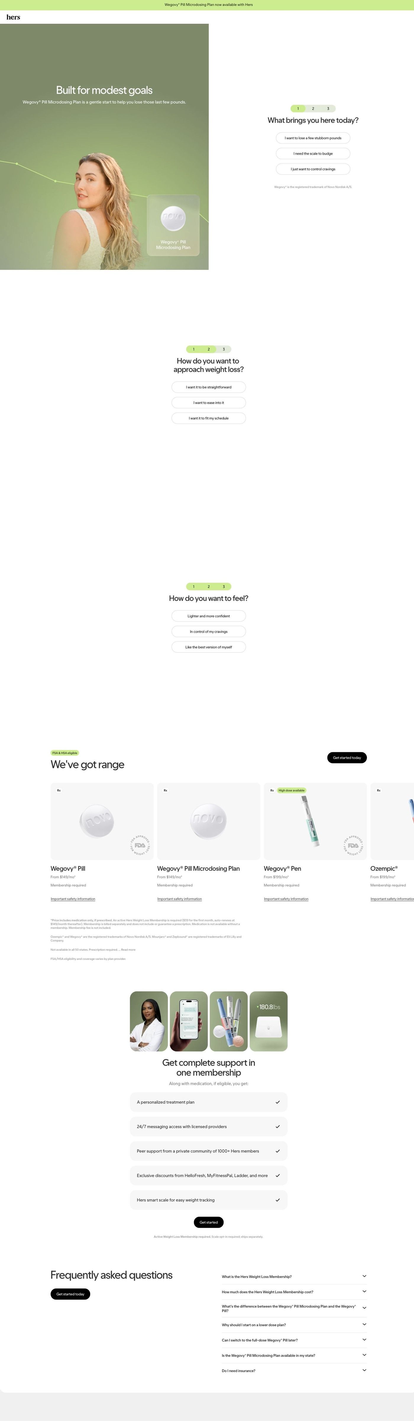
The click lands on a dedicated lower-dose plan page, one of 9 ads in the Fluid library that point there, which sits between a focused landing page and a quiz. Under a "Wegovy Pill Microdosing Plan now available with Hers" bar, the hero headline reads "Built for modest goals" beside a short tap-to-answer intake ("What brings you here today?" with answers like losing a few stubborn pounds), followed by more soft questions, a "We've got range" row of treatment cards with starting prices, a membership checklist and an FAQ that includes why to start on a lower dose. The page's hero also uses a soft rising line behind the model, so this ad's chart carries straight into the first screen, and the FAQ's lower-dose question answers the "why slower?" this ad raises.
The page it sends people to: How Hers gives its lower-dose Wegovy plan its own landing page
Hers's landing page for the Wegovy Pill Microdosing Plan leads with "Built for modest goals", then asks three soft prompts about why the visitor is here, how they want to approach it and how they want to feel, before a plan carousel, membership perks and a plan-specific FAQ. 9 ads in the Fluid library send people here, all launch ads.
How the page is built
- 01Announcement bar and header
A green bar announces that the Wegovy Pill Microdosing Plan is now available with Hers, above a logo-only header, so the launch news is the first thing a visitor reads.
- 02Hero with first prompt
A portrait with a line-graph overlay and a pill product card carries the modest-goals headline, beside a three-step indicator and the question "What brings you here today?" with three answers in the visitor's words.
- 03Approach prompt
A second question asks how the visitor wants to approach weight loss, answering "will this fit how I want to do it?" with three pill choices.
- 04Feeling prompt
A third question asks how the visitor wants to feel, closing the intake on the outcome they picture rather than a medical detail.
- 05Plan carousel
An FSA and HSA eligible tag and a Get started today button sit above cards for the Wegovy Pill, the Microdosing Plan, the Wegovy Pen and Ozempic, each with a "from" monthly price, a membership-required note and a safety link.
- 06Pricing fine print
Small print under the cards explains that prices cover medication only and that a separate membership is required, answering the cost question in full for anyone who reads it.
- 07Membership
A four-photo collage over five check rows (treatment plan, provider messaging, member community, partner discounts, smart scale) answers "what comes with the membership?"
- 08FAQ
Seven accordions cover the membership, its cost, the difference from the full-dose pill, why start lower, switching later, state availability and insurance, with a Get started today button beside them.
The first fixes we would make
- There's no proof on the page: no member stories, no provider explaining who the lower-dose plan is for, nothing beyond the collage photos. Add a short provider note or a few member stories from people with modest goals right after the plan carousel, attributed and with the usual disclaimers, so the visitor sees someone like them before they commit.
- The page's own FAQ asks how the Microdosing Plan differs from the Wegovy Pill, which tells you visitors need that comparison, yet the carousel shows the two as similar-looking cards. Put a small side-by-side table of the two plans (dose approach, monthly price, who each is for) above the FAQ, so the answer is visible instead of hidden in an accordion.
Read the full breakdown of this page
Three hooks you could test
- Turn the benefit into a picture people get in a second. “A slow ramp, not a cliff.”
- Lead with the uncomfortable problem. “Nervous about starting too strong? Start lower.”
- Sell the outcome. “A gradual start for the goal you actually have.”
What to borrow for your brand
- Use a simple line or ramp graphic to show a gradual start or gradual result without numbers.
- Put three short facts in the image (what it is, who it's for, how much) so the ad stands on its own without the copy.
- Reuse the landing page's main visual motif in the ad so the click feels continuous.
One of 125 Hers ads in the Fluid Inspiration Library, captured from the Meta Ad Library on Oct 22, 2026. We record that an ad ran publicly, not how it performed.