
Learn 5x more about your health, plus get an Action Plan to help improve key areas. For less than $1/day: ✅ 130+ health signals tested ✅ Check for 1,000+ conditions* ✅Access to 24/7 provider messaging ✅Provider-led Action Plan Start testing with Labs by Hers. Not available in Hawaii. Eligibility and provider order required. Doctor developed insights and action plans include recommendations that encourage you to take action that may help improve your health. Lab results alone are not intended to diagnose, treat, or cure any condition. A provider will reach out about critical results and plans include access to 24/7 provider messaging. *Biomarkers track core biological pathways and while not diagnostic on their own, testing can help inform a provider about the underlying physiologic shifts that are associated with a very wide range of conditions.
How Hers Labs leads with a monthly price in a single-image ad
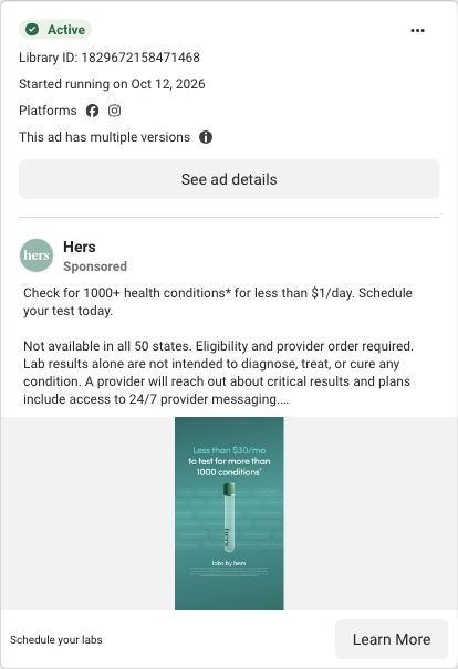
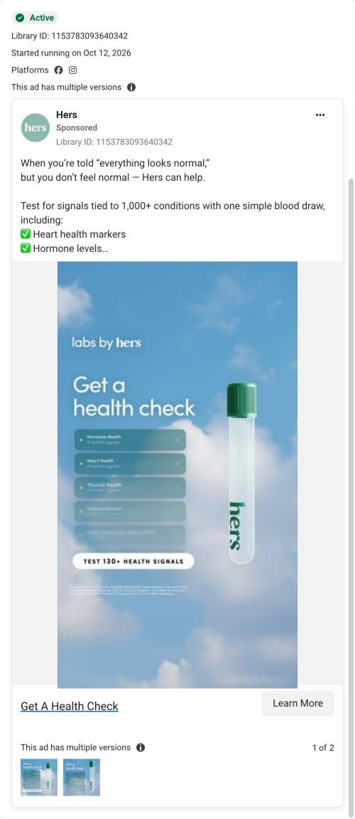
A static image ad from Hers: one test tube on a teal background with faint condition names behind it, under the line "Less than $30/mo to test for more than 1000 conditions." The angle is price. The headline says "Schedule your labs." It sends people to the long Labs by Hers service page.
Public destination captured October 22, 2026. The reference retains the page layout and loaded imagery; shopping-extension UI is removed. Offers may change. No health answers were supplied.

Schedule your labs
Visual reference: Less than $30 per month. The long testing page explains health signals, an Action Plan and pricing. Its Start testing CTA goes directly to an Account → Profile → Checkout entry that asks for email. Compare the creative with the destination and explore the other ads sharing this route.
- Brand
- Hers
- Observed offer
- Labs testing advertised for less than $1/day; eligibility and provider order required
- Creative angle
- Price-led
- Page type
- Service landing
- Ad format
- Image
- Listed start date
- Oct 12, 2026
- Captured
- Oct 22, 2026
- Library ID
- 1829672158471468
- Destination
- forhers.com
Selected for its design and offer structure. Ad performance isn’t available in this collection.
What this ad does well
Hers makes the product the whole scene here: one branded test tube, centered, with nothing competing for attention. The price line is the biggest text in the frame, so a viewer gets the offer in about a second. The faint list of condition names in the background is a nice touch, because it suggests breadth without making anyone read it. The copy keeps it short and repeats the price as less than $1 a day, which gives two ways to hear the same number.
What's missing
There's no problem in this ad, only a price, so the viewer has to decide on their own why they'd want lab testing in the first place. "More than 1000 conditions" also carries an asterisk and a long footnote, which makes the biggest claim the least sturdy one. If you make one like this, pair the price with a reason, such as feeling off after being told you're fine, so the number lands on someone who already cares. A second line on what you get after testing, like the action plan, would give the price something to buy.
Beat by beat
- ImageA single branded test tube on teal with faint condition names behind it and the line "Less than $30/mo to test for more than 1000 conditions."
It makes price and product the only things in the frame, so the offer reads instantly.
- Headline"Schedule your labs" with a Learn More button.
It tells the viewer the next action is booking, not reading.
- CopyOne line repeating the 1000+ conditions claim at under $1 a day, then eligibility, availability and result disclaimers.
It restates the price in a daily frame and sets expectations about who can order.
The offer
The image frames testing as less than $30 a month and the copy as less than $1 a day, with eligibility and a provider order required.
Where it sends people
It lands on the Labs by Hers service page, which 8 ads in the Fluid library send people to. The page is a focused service landing page rather than a homepage, so it's a step up the ladder, though not a quiz. It opens on a broad hero about testing for signals of many conditions, then a stat strip with markers tested, tests per year and cost per day, and later a comparison table against routine labwork. Every Start testing button goes straight to an account and checkout entry that asks for an email. The stat strip's cost-per-day figure picks up this ad's price promise right under the hero, which is the match a price-led ad needs.
The page it sends people to: How Hers explains provider-ordered lab testing on one long page
Hers's Labs page is a long service page for provider-ordered lab testing. It shows the service through app-style UI cards over photos, then stacks a stat strip, how it works, coverage, a comparison with routine labwork, experts, proof and FAQs, all ending in Start testing. 8 ads in the Fluid library send people here, including education, price-led and problem-led ads.
How the page is built
- 01Header
A logo, anchor links to what's tested, how it works, the action plan and screening, and a Log in link let visitors jump straight to their question.
- 02Hero
A full-bleed photo with a floating metric chip, a headline about testing for signals of many conditions and a small Start testing button set up the broad promise.
- 03Stat strip
Three short stats (markers tested, tests per year, cost per day) answer "how much do I get, and what does it cost?" before any explanation.
- 04How it works
Three numbered cards with UI mocks show booking, results and an action plan, answering "what actually happens?"
- 05Coverage grid
Eight tiles, one per body system, list marker names, answering "what's tested?" for visitors who want detail.
- 06Early-indicator split
A tall card lists condition names in large serif type beside an "out of range" phone card, showing the kinds of signals the page says the tests look for.
- 07Action plan
Category tabs (exercise, nutrition, sleep, habits) and a recommendation card answer "what do I do with my results?"
- 08Comparison table
The service is set against routine labwork across about eleven rows of checks, answering "why not just use my annual bloodwork?"
- 09Add-on screening
A teal panel with a body silhouette and floating chips introduces an optional screening, with three feature tiles on adding it, breadth and frequency.
- 10Experts carousel
Doctor portraits with roles, specialties and short bios answer "who's behind this?"
- 11Bento proof grid
Tiles mix a customer-count stat, a satisfaction stat, provider follow-ups and in-app content, gathering the page's proof in one place.
- 12FAQ and closing hero
Six accordions cover who it's for, the process, the in-person visit, what's tested, video visits and insurance, before a dark closing photo with a results dashboard and a final Start testing button.
The first fixes we would make
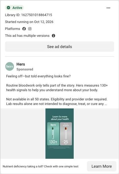
- The problem-led ad about nutrient deficiency lands on a hero about signals for many conditions, and the specific concern only shows up lower, in the coverage grid. Give that ad its own variant hero, or link it to the grid with the relevant body-system tile highlighted, so the visitor who clicked about one worry sees it answered first.
- The bento grid carries stats (a customer count and a satisfaction figure) but no customer voices about the experience itself. Add a few short member quotes about booking the draw and reading results, so the visitor hears from someone who's done it, not just a number.
Read the full breakdown of this page
Three hooks you could test
- Make the product the whole scene. “One tube. Everything your yearly checkup leaves out.”
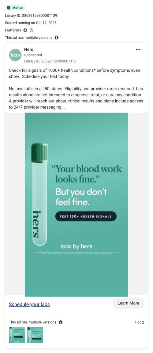
- Lead with the uncomfortable problem. “Told everything's normal, but still don't feel like yourself?”
- Sell the outcome. “Know what's going on in your body for less than your coffee habit.”
What to borrow for your brand
- Put one product shot on a solid brand color with the price as the largest text, so the offer reads at a glance in the feed.
- Fill the background with faint, unreadable text (ingredient names, use cases) to suggest breadth without asking anyone to read it.
- Give the price two frames, monthly in the image and daily in the copy, so it registers with both kinds of shoppers.
One of 125 Hers ads in the Fluid Inspiration Library, captured from the Meta Ad Library on Oct 22, 2026. We record that an ad ran publicly, not how it performed.