
Stop hair loss in its tracks and see thicker, fuller in 3-6 months* with minoxidil. Take the hair quiz and get started today. Why Hers? ✅ Range of treatment options tailored to your hair needs ✅ Treatment options made with minoxidil—an ingredient shown to regrow hair in 3-6* months ✅ Personalized treatment plans starting at $35/month with a 5 month plan, paid upfront in full** Hair Blends are compounded products and have not been approved or evaluated for safety, effectiveness, or quality by the FDA. Prescription products require an online consultation with a healthcare provider who will determine if a prescription is appropriate. See website for full details, restrictions, and important safety information. *Based on studies of oral minoxidil up to 2.5 mg per day at various doses. **The actual price to the customer will depend on the product and subscription plan purchased.
How Hers sells a hair-loss chewable with a short outcome headline
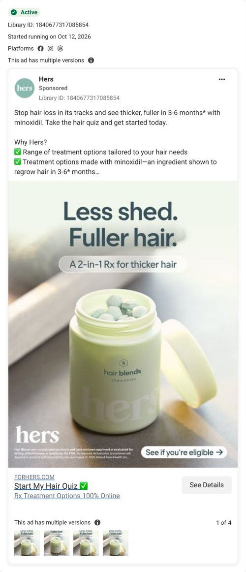
A Hers static ad for Hair Blends chewables: an open jar of pale green chews under the headline “Less shed. Fuller hair.” The copy adds a minoxidil timing claim and plans from $35/month on a five-month plan paid upfront, then sends people to a hair-loss consultation page that opens on a tap-to-answer quiz.

Captured while scrolling the public page. Opening prompts are shown without answering health questions. A browser shopping-extension badge may appear in the right margin.
Start My Hair Quiz
A hair-loss problem and regrowth-timing claim introduce a quiz invitation and an upfront-paid treatment-plan offer. The recorded CTA points to the hair-loss entry URL. Compare the creative with the destination and explore the other ads sharing this route.
- Brand
- Hers
- Observed offer
- Hair plans from $35/mo on a 5-month plan paid upfront; price varies by product and plan
- Creative angle
- Price-led
- Page type
- Consultation entry
- Ad format
- Image
- Listed start date
- Oct 12, 2026
- Captured
- Oct 20, 2026
- Library ID
- 1840677317085854
- Destination
- forhers.com
Selected for its design and offer structure. Ad performance isn’t available in this collection.
What this ad does well
Hers puts the outcome first and keeps it short enough to read mid-scroll, with a subline calling the product a 2-in-1 Rx for thicker hair. The product is the whole scene (a jar of chews with the lid off), so you know the format before you read a word, which matters when most people picture hair-loss treatment as a messy topical. The copy stacks its reasons in a checklist and footnotes each claim, including the note that Hair Blends are compounded and haven't been evaluated by the FDA, so the fine print lives in the caption instead of crowding the image. The eligibility button on the image and the hair-quiz link headline describe the same small next step, so the click doesn't feel like a purchase.
What's missing
The image carries a promise but no problem and no proof: there's no thinning part, no brush full of hair, and no customer, so the viewer has to bring the reason to care. The price is also doing more work than it shows, since the $35/month figure depends on a five-month plan paid upfront, and the page it lands on doesn't show a price at all. If you make one like this, put the recognizable problem on the image (one line about shedding in the shower or the brush) and pair the price with its commitment in plain words, so the quiz doesn't end in a surprise. A before-and-after crop from the page's review carousel would give the image the proof it's missing.
Beat by beat
- ImageAn open jar of Hair Blends chewables on a soft green background under the outcome headline, with a 2-in-1 Rx subline and an eligibility button.
It shows the product format and the desired result in one glance, before any copy is read.
- CopyA shedding-and-regrowth promise with a minoxidil timing claim, then a checklist of tailored options, the ingredient and the $35/month plan, each footnoted.
The checklist answers what it is, what's in it and what it costs, while the footnotes carry the compounding and pricing conditions.
- HeadlineThe link headline invites the viewer to start a hair quiz, with a line saying Rx options are fully online.
It frames the click as a quiz rather than a checkout, which lowers the commitment of tapping.
The offer
Plans start at $35/month on a five-month plan paid upfront in full, and the footnote says the actual price depends on the product and plan. It's framed as a starting price inside a checklist, not as a discount.
Where it sends people
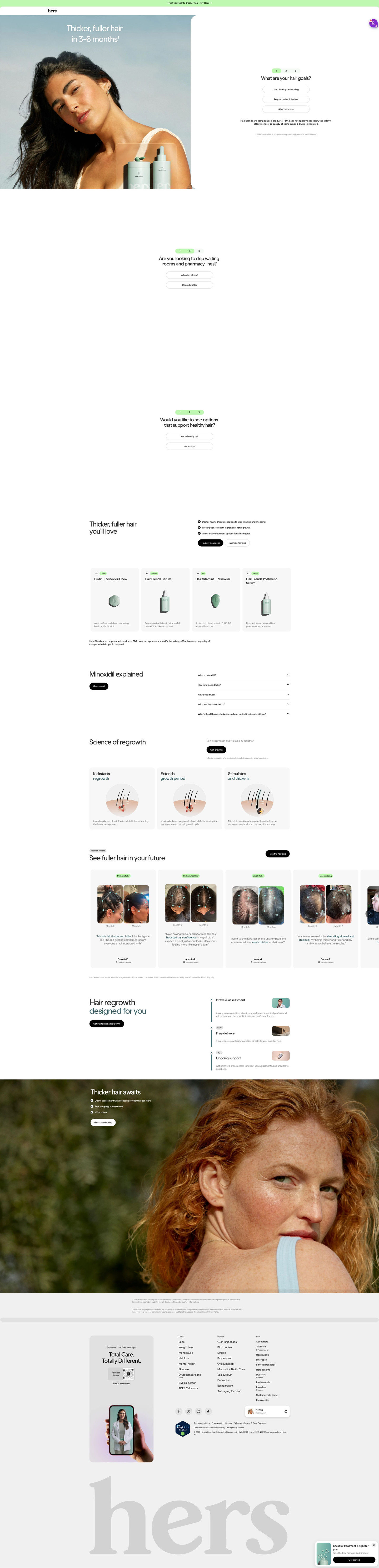
The ad lands on a focused hair-loss consultation page, close to the top of the persona's ladder because the quiz starts right in the hero with a goals question and one-tap answers. That picks up the ad's quiz promise immediately, and the page backs the outcome headline with a treatment lineup (chew, serum, pill), an ingredient FAQ, a mechanism explainer and a before-and-after carousel. The gap is price: the ad leads with $35/month, but the page sells the process and lineup and saves price for after the intake, so a price-led click meets no number until later. One of 37 ads in the Fluid library that land on this page.
The page it sends people to: How Hers turns its hair-loss page hero into a three-question intake
Hers's hair-loss consultation page starts the intake in the hero with a hair-goals question and two more one-tap prompts, then covers the treatment lineup, ingredient FAQs, before-and-after reviews and a three-step care timeline. 37 ads in the Fluid library send people here, including creator stories, problem-led videos and price-led ads.
How the page is built
- 01Announcement bar and header
One short invitation line with an arrow sits above a logo-only header, pointing straight at the consultation.
- 02Hero with first question
An outcome headline over a full-height portrait sits beside a step indicator and the hair-goals question with three pill answers, answering "what do I do first?" with a single tap.
- 03Intake steps 2 and 3
A convenience question about skipping waiting rooms and an interest question, each with two pill answers, keep the visitor moving before any health detail comes up.
- 04Value summary
Three check bullets (provider-made plans, ingredients, once-a-day options) and two buttons, Find my treatment and Take free quiz, answer "why do this online?"
- 05Treatment lineup
Four product cards with Rx and format tags (chew, serum, pill) and a one-line formula description answer "what would I actually take?"
- 06Ingredient explainer
Five FAQ accordions cover what the ingredient is, timing, how it works, side effects and oral versus topical, catching the questions a careful buyer asks before starting.
- 07Mechanism explainer
Three cards with illustrated cross-sections and a footnoted timeframe line show how the page says treatment works on the scalp.
- 08Before-and-after carousel
A Featured review tag, month-labeled photo pairs, quotes with bolded phrases, names and verified tags answer "has this worked for someone like me?" in customers' own words, with disclaimers.
- 09Process timeline
A vertical three-step timeline (intake and assessment, delivery, ongoing support) with small photos explains how remote care works from start to finish.
- 10Closing band
A full-bleed portrait with three check bullets (online assessment, free shipping if prescribed, fully online) and a Get started today button restates the easy path one last time.
- 11Footer
Legal footnotes, an app-download card, condition and treatment link columns, a certification badge and a floating quiz-prompt card close the page.
The first fixes we would make
- Price-led ads land here, yet the page shows no price; the ads' monthly figure is tied to a five-month plan paid upfront. Show the price with those plan terms in the value summary, so the visitor who clicked for the price knows what the commitment looks like before the intake rather than after it.
- The before-and-after carousel is the page's strongest match for the creator-story ads, and it sits well below the treatment lineup and two explainers. Move a single before-and-after card or a short review strip up to sit right after the intake prompts, so people who came for a real person's result see one early.
Read the full breakdown of this page
Three hooks you could test
- Lead with the uncomfortable problem. “More hair in the drain than on your head lately?”
- Make the product the whole scene. “This little jar replaced the five bottles on my bathroom shelf.”
- Sell the outcome. “Fewer strands on your sweater, more on your head.”
What to borrow for your brand
- Write a headline of two short outcome phrases and put the product format (chew, pill, serum) in the subline, so the viewer gets the result and the form in one read.
- Put a soft next step like checking eligibility on the image itself and repeat it in the link headline, so the image and the button promise the same action.
- Move every condition (compounding, plan length, price variation) into footnoted copy under the image, so the creative stays clean while the terms are still disclosed.
One of 125 Hers ads in the Fluid Inspiration Library, captured from the Meta Ad Library on Oct 20, 2026. We record that an ad ran publicly, not how it performed.