How Comfrt runs a simple studio static for its Signature Hoodie
A static studio photo of a blonde model in Comfrt's cream Signature Hoodie and matching sweatpants against a gray background. The copy says your next go-to layer is waiting, the link headline names the Signature Hoodie, and Comfrt ran multiple color versions. There's no discount. The click opens the Signature Hoodie product page on the Bone color.

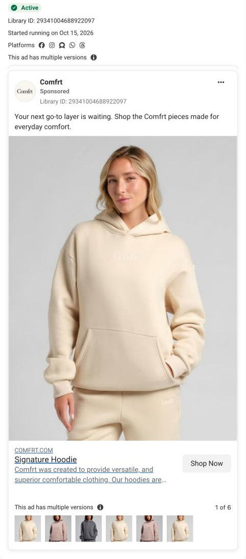
Native screenshot captured from the public Meta Ad Library. Destination captured while scrolling on October 20, 2026; current offers and default variants may differ from the original creative.
Your everyday cream hoodie
A blonde model wears a cream hoodie against a gray studio background. A studio hoodie ad leads directly to the Signature Hoodie page, with the observed Bone option, fit controls, bundle merchandising and reviews. Compare the creative with the destination and explore the other ads sharing this route.
- Brand
- Comfrt
- Observed offer
- Signature Hoodie; no discount stated in primary copy
- Creative angle
- Everyday comfort
- Page type
- Product page
- Ad format
- Image
- Listed start date
- Oct 15, 2026
- Captured
- Oct 20, 2026
- Library ID
- 29341004688922097
- Destination
- comfrt.com
Selected for its design and offer structure. Ad performance isn’t available in this collection.
What this ad does well
This is a clean, product-first ad: one model, one hoodie and a neutral background, so color and fit are the only things to look at. The link goes straight to the Bone variant, which means the page opens on the exact hoodie in the photo, something several other Comfrt ads miss. The version thumbnails show Comfrt ran this layout in other colors too, an easy way to give each colorway its own ad. It's the only ad in the library pointing to this page, and it ran on Meta from October 15, 2026.
What's missing
The copy could describe almost any hoodie. Everyday comfort and next go-to layer don't tell the viewer what's different about the Signature Hoodie, who it's for or why to buy now, and there's no price or offer even though the page shows a deal. If you make one like this, write one specific line about the product (the fit, the fabric weight, a phrase reviewers keep using) and put the sale price on the image, so the clean photo comes with a reason.
Beat by beat
- ImageA blonde model in a cream Signature Hoodie and matching sweatpants stands against a plain gray studio wall.
A neutral setup puts all the attention on the hoodie's color and fit.
- HeadlineThe link headline reads Signature Hoodie, with a short brand description and Shop Now.
Naming the exact product tells the viewer what they'll find when they tap.
- CopyThe copy says your next go-to layer is waiting and invites shoppers to the pieces made for everyday comfort.
It positions the hoodie as an everyday staple rather than a one-off purchase.
The offer
No discount stated in the ad; the copy invites shoppers to find their next go-to layer.
Where it sends people
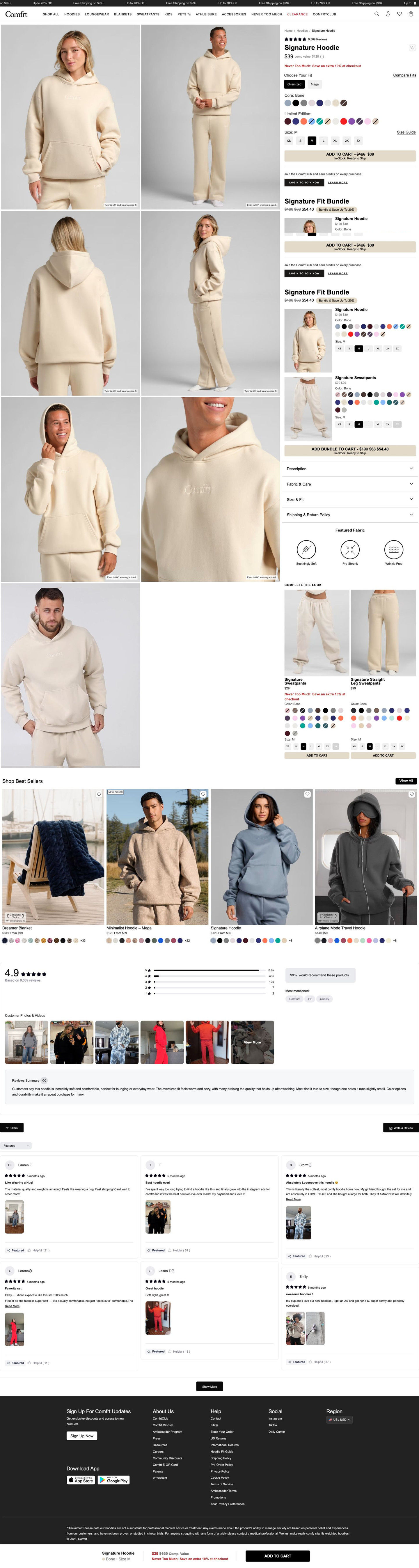
The click lands on the Signature Hoodie product page with the Bone variant selected, the best version of a product-page landing because the shopper sees the exact item from the ad. The page backs it up with on-model photos captioned with height and size, a price against a comp value with a red extra-discount line, a fit toggle with a compare-fits link, and a matching-set bundle block under Add to Cart. Reviews with a customer photo strip and a sticky Add to Cart bar follow. The page does more selling than the ad does, so lifting its deal and a review phrase into the ad would close that gap.
The page it sends people to: How Comfrt's Signature Hoodie page answers fit and sells bundles
Comfrt's Signature Hoodie product page: a photo grid of on-model shots captioned with height and size, a buy column with comp-value pricing, a red extra-savings line, a fit toggle and bundle blocks, then best sellers and photo-heavy reviews. One ad in the Fluid library lands here, a cream studio static linked straight to the Bone color.
How the page is built
- 01Announcement ticker and header
Shipping-threshold and sale lines above a mega nav set the deal context.
- 02Photo grid
On-model photos of men and women, each captioned with height and size worn, answer how it fits on different bodies.
- 03Buy column
Rating, comp-value price, a red extra-savings line, a fit toggle, core and limited swatches, sizes and Add to Cart answer what it costs and which fit, color and size to choose.
- 04Bundle blocks
A compact bundle card and an expanded matching-set bundle with per-item swatches and sizes answer whether to buy the full set.
- 05Details
Four accordions and a Featured Fabric row answer fabric, care, fit and shipping questions.
- 06Complete the look
Two matching bottoms with their own Add to Cart raise the order.
- 07Best sellers
Four lifestyle cards with badges and swatch counts give undecided shoppers another route.
- 08Reviews
Rating, distribution bars, a would-recommend box, chips, customer photos and video and an AI summary answer whether buyers are happy.
- 09Footer and sticky bar
A sticky bar with color, size, price, the extra-savings line and Add to Cart keeps buying one tap away.
The first fixes we would make
- The page has a deal (comp value plus an extra discount at checkout) that the ad never mentions. Carry the deal into the ad, so the static gives shoppers a reason to tap and the page confirms it.
- Two bundle blocks stack under Add to Cart, a compact card and then an expanded matching set, which can read as the same choice twice. Keep one, with the matching set preselected in the shopper's chosen color.
Read the full breakdown of this page
Three hooks you could test
- Sell the outcome. “The hoodie you'll reach for every single morning.”
- Lead with the uncomfortable problem. “Tired of hoodies that look worn out after a month?”
- Show a specific moment of use. “First thing on after a shower, last thing off before bed.”
What to borrow for your brand
- Link color-specific ads to the exact variant so the page opens on what the ad showed.
- Run one simple studio layout per colorway to give each color its own ad.
- Bring the page's best selling points, the deal and a review line, into the ad copy.
One of 38 Comfrt ads in the Fluid Inspiration Library, captured from the Meta Ad Library on Oct 20, 2026. We record that an ad ran publicly, not how it performed.