

ComfrtSponsored
Esc
What Comfrt's homepage does with Early Black Friday code traffic
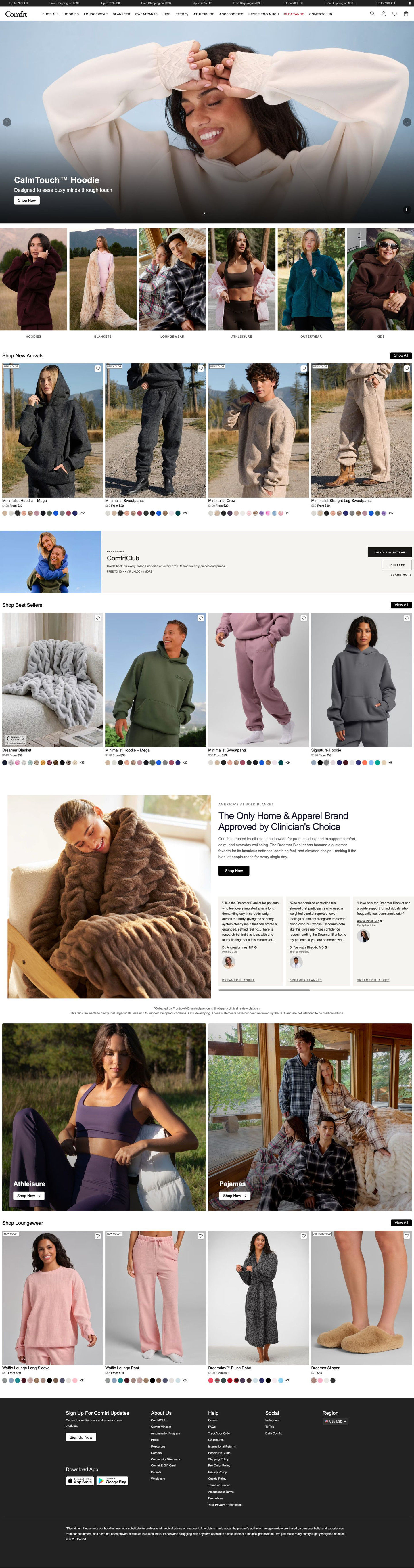
Comfrt's homepage, reached when the EARLYACCESS discount link redirects: a hero carousel, category tiles, product grids with struck-through prices, a membership band and a clinician quote carousel. Three ads in the Fluid library land here, all promoting the Early Black Friday code: a snake-print reveal, a leaf-camo flat lay and a flannel gift video.
Comfrt
3 creatives lead here1 / 3


Early Access → Comfrt homepage
Native screenshot captured from the public Meta Ad Library. Destination captured while scrolling on October 20, 2026; current offers and default variants may differ from the original creative.
Early Access → Comfrt homepage
Comfrt's homepage, reached when the EARLYACCESS discount link redirects: a hero carousel, category tiles, product grids with struck-through prices, a membership band and a clinician quote carousel. Three ads in the Fluid library land here, all promoting the Early Black Friday code: a snake-print reveal, a leaf-camo flat lay and a flannel gift video.
- Brand
- Comfrt
- Page type
- Homepage
- Ads leading here
- 3
- Captured
- Oct 20, 2026
- Destination
- comfrt.com
Selected for its design and offer structure. Ad performance isn’t available in this collection.
What this page does well
As a store front, the homepage merchandises fast. A full-width hero carousel leads into six tall category tiles, then a new-arrivals grid where every card shows a struck-through and from-price plus a swatch row with a count of extra colors, so sale depth and range show without a click. A membership band between the first two grids sets a paid tier and a free join side by side, with perks like credit back, early access and member pricing. Lower down, a clinician endorsement split pairs the best-selling item with a carousel of quote cards (name, credential and headshot) and a disclaimer note, which gives the store an extra layer of credibility.
How the page is built
- 01Announcement ticker
A scrolling sale and free-shipping-threshold line with a pause control is the only place the sale shows on arrival.
- 02Header
A long category nav with clearance in red and the membership club last answers where everything is.
- 03Hero carousel
A full-width lifestyle photo with a product name, one-line promise and Shop Now answers what Comfrt sells.
- 04Category tiles
Six tall lifestyle photos with labels route shoppers to the category they came for.
- 05New arrivals grid
Four cards with new-color tags, struck-through prices and swatches answer what's new and what it costs.
- 06Membership band
A paid tier and a free join with perks answer whether there's more value in signing up.
- 07Best sellers grid
The same card pattern, with a clinician-choice badge on the top item, answers what other people buy.
- 08Clinician endorsement split
A large best-seller photo with a headline and a carousel of clinician quote cards plus a disclaimer adds outside voices to the brand.
- 09Category banners
Two large side-by-side photos with Shop Now give two more entry points.
- 10Loungewear grid
More cards with new-color and just-dropped tags keep merchandising going.
- 11Footer
A newsletter sign-up, app badges, link columns and a region selector close the page.
What's missing, in the order we'd fix it
- The EARLYACCESS code isn't restated anywhere visible. Add a banner at the top with the code, its condition (18% off orders $95+, excludes blankets) and a one-tap apply.
- Each ad features one product (snake print, leaf camo, flannel pajamas) that the homepage doesn't open on. Send each ad to the matching collection or bundle with the code applied, and keep the homepage for broad ads.
- The ticker and the ads describe the sale differently (up to 70% off versus 18% off $95+). Make the page's sale line match the ad's offer so shoppers know which deal they're getting.
How the ads set it up
Three ads land here, each with the same copy (18% off orders $95+ with code EARLYACCESS, excluding blankets) but different creative: a creator revealing an onyx snake-print set, a nine-second leaf-camo flat lay and a creator pitching flannel pajamas as a gift for him, complete with an on-screen bundle. The homepage picks up none of those specifics. There's no code banner, no snake print or camo at the top, and no flannel or gift message, so each viewer has to remember the code and hunt for the product they saw.
What to borrow for your brand
- Show struck-through and from-prices plus a swatch row with an extra-colors count on every grid card.
- Place a membership band between two product grids with a paid tier and a free join side by side.
- Pair a best-selling item with a carousel of expert quote cards (name, credential, headshot) and a clear disclaimer.
Ads that send people here
- How Comfrt paired a snake-print reveal with an early-access code
- How Comfrt announced Early Black Friday with a short camo flat lay
- How Comfrt pitched flannel pajamas to gift buyers with a creator
Captured from comfrt.com in October 2026 for the Fluid Inspiration Library. Offers and prices change; this is what the page showed when we captured it.