

BuoySponsored
Esc
How Buoy let a creator's migraine story carry an electrolyte ad
A 47-second Buoy creator video that ran on Meta from October 14, 2026. Filmed at home, a creator opens with the caption "Chronic migraines ruining your life?" and says she squeezes Buoy into everything she drinks. She shows how clear the liquid is, describes her own change in symptoms and mentions 35% off for life, linking to the support page.
Buoy
6 creatives lead here1 / 6
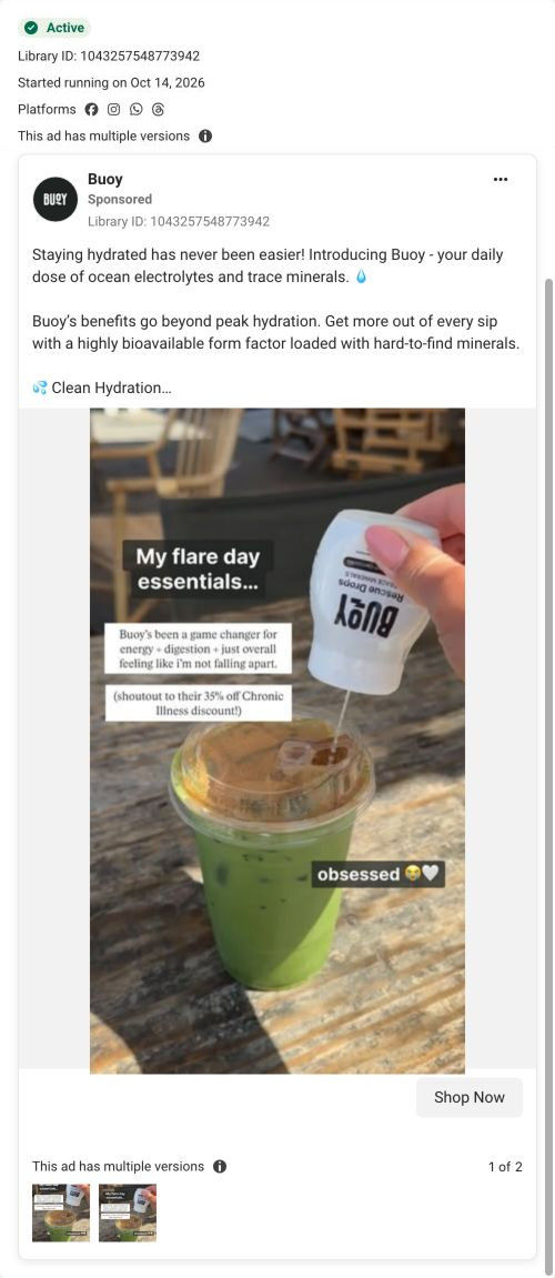
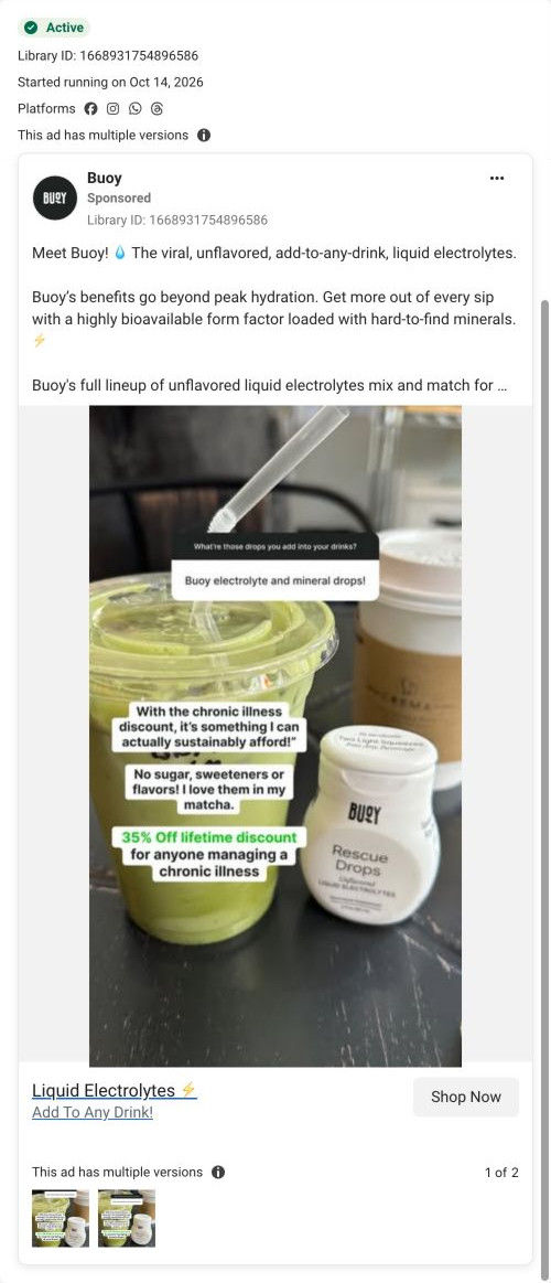

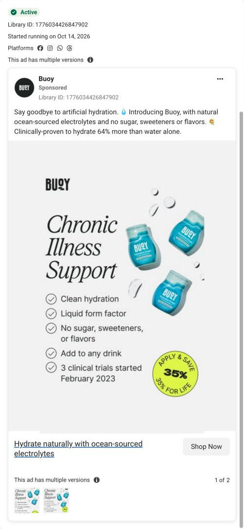
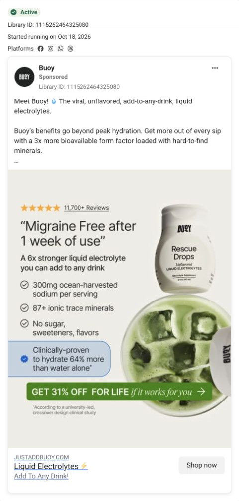
Chronic Illness Support offer

Hydrate naturally with ocean-sourced electrolytes
The ad leads with ocean-sourced ingredients and an advertised hydration comparison rather than a price-led offer. The CTA routes to Buoy’s Chronic Illness Support page, including when the ad uses a broader product message. Compare the creative with the destination and explore the other ads sharing this route.
- Brand
- Buoy
- Observed offer
- No price or discount stated in the captured ad
- Creative angle
- Product benefits
- Page type
- Dedicated offer
- Ad format
- Video · 0:47
- Listed start date
- Oct 14, 2026
- Captured
- Oct 19, 2026
- Library ID
- 1839563337197849
- Destination
- justaddbuoy.com
Selected for its design and offer structure. Ad performance isn’t available in this collection.
What this ad does well
The caption asks a direct question that the right viewer answers yes to immediately. She opens by holding up the pills she used to reach for, which is a visual of the habit being replaced. She shows the liquid is clear and explains it's unflavored with only electrolytes and trace minerals, so the demo answers the taste question. The video then cuts to the program page on screen with 35% off for life and free shipping, which previews exactly where the click goes.
What's missing
She says her migraine symptoms dropped from several times a week to barely ever, which is a strong personal claim with no label saying results vary. There's no other proof in the video. If you make one like this, add a short on-screen note that this is her experience and pair it with one wider proof point from the brand, such as the review count, so the story isn't standing alone.
Beat by beat
- 0-5sThe caption reads Chronic migraines ruining your life? as she holds up pain-relief packets.
It asks a yes-or-no question and shows the habit she's replacing.
- 5-20sShe says she started squeezing it into every drink and stopped reaching for those packets, in her experience.
It tells the before and after in her own words.
- 20-32sShe shows the clear liquid and says it's unflavored with only electrolytes and trace minerals.
The demo answers what it tastes like and what's in it.
- 32-47sScreens of the Lifetime Chronic Illness Discount page show 35% off for life and free U.S. shipping.
It previews the offer and the page the click opens.
The offer
The creator mentions 35% off for life for anyone with a chronic illness, and the video shows the program page with free U.S. shipping.
Where it sends people
The ad sends people to Buoy's Chronic Illness Support page, a focused landing page built around one audience and one offer, which is a strong rung on the landing-page ladder. Its hero reads "Get 35% Off For Life" under a Chronic Illness Support Program badge and a 4.7/5 rating from 12,248 reviews, with free shipping, a 30-day guarantee and an Approval in 2 minutes button, followed by a timeline of product standards, an FAQ, condition-tagged creator videos, best sellers and a reviews wall. The video shows this very page in its last seconds, so the visitor lands somewhere they've already seen. That's as close a match as an ad can get.
The page it sends people to: How Buoy turned a lifetime discount into a chronic illness program
Buoy's Chronic Illness Support page frames a lifetime 35% discount as a program with quick approval, then backs it with product standards, an FAQ, condition-tagged creator videos, best sellers, a donation callout and a reviews wall. Six of the 10 Buoy ads in the Fluid library send people here, mostly migraine and chronic illness creator videos and benefit statics.
How the page is built
- 01Header
Menu, Shop All, logo, account and cart with no announcement bar keep the focus on the program.
- 02Hero
A 4.7/5 rating from 12,248 reviews, the program badge, the 35% for life headline, three perks and the approval button answer what's the offer and how do I get it.
- 03Standards timeline
A study-based hydration claim, clinical study and third-party test links and six standards (no sugar or sweeteners, no unnecessary additives, third-party tested and more) answer is this product safe for my sensitivities, as the brand describes it.
- 04FAQ with video
A pour video beside accordions on conditions supported, what to expect, ingredients avoided and commitment answer the program questions.
- 05Creator carousel
"We didn't just go viral, we found our community" with videos tagged by condition answers does anyone like me use this.
- 06Best sellers
Three product cards that each restate the discount and use a Shop your discount link answer which product should I start with.
- 07Donation callout
Three nonprofit logos and a line about donating with every order answer what does this brand stand for.
- 08Reviews wall
A two-column wall of text reviews with product thumbnails answers what do other customers say.
- 09Footer
Support, socials, a disclaimer and an email signup with a first-order offer close the page.
The first fixes we would make
- Several ads that land here quote 31% (the review-led static and the matcha Q&A copy), while the hero says 35%. Align every ad to 35% for life, or add a line explaining the difference, so visitors don't wonder which deal is real.
- The approval step is promised in two minutes, but the page doesn't say what you'll be asked or whether you need proof of a diagnosis. Add one sentence under the button explaining the application so people with privacy worries aren't put off.
Read the full breakdown of this page
Three hooks you could test
- Lead with the uncomfortable problem. “Another day planned around a headache?”
- Call out the habit you're replacing. “I used to keep a stash of these everywhere. Now I keep this.”
- Show a specific moment of use. “Watch me add it to my water. You can't even see it.”
What to borrow for your brand
- Have the creator hold up the product she used before, so the switch is visible in the first seconds.
- Show the landing page on screen at the end of the video so the click feels familiar.
- Demo the product's look or texture on camera to answer the taste question without saying it.
Transcript
To all my girlies who have like a 1000000 of these lying around because your headache symptoms are so frequent and your migraines are so bad that if you don't address it right away, you will get physically ill and it will ruin your day, have you tried an electrolyte? I started squeezing this into everything that I drink throughout the day, and I swear to you, as soon as I started doing that, I stopped reaching for stuff like this. I like this one because it's a liquid, it's unflavored. You can see that it's literally clear. There's nothing in here except for electrolytes and trace minerals. I went from experiencing migraine symptoms 2 to 5 times a week to barely ever, just because I'm supplementing with electrolytes, because I wasn't getting enough just from water alone. But we also offers 35% off for life for anyone who struggles with a chronic illness. If you're like me and you get headache and migraine symptoms all the time, trust me, try Bowie.
Text on screen
- CHRONIC MIGRAINES
- RUINING YOUR LIFE?
- THIS changed mine
- Drops
- DANT
- "My #1 migraine reliever"
- Purposely unflavored
- Electrolytes
- Trace minerals
- ELEKEN HOOVER
- Hydration Drops
- BUOY
- *TRACE MENERALS
- justaddbuoy.com
- LIFETIME CHRONIC ILLNESS DISCOUNT
- Invest In You with 35%
- Off Chronte iness support
- 35% Off for life
- While it won tux everying, tue
- with chronic illnesses say Bu
- of people
- u're
- managing a condition, you'
- lifetime discount.
- V Free U.S.
- V 30-Day N
- V Try 100%
- Off
- Chronic illness support
- While it won tux everyting, trousands of people
- you're
- managing a condition, you
- Apply In
- V Free U.S
- ing
- While it won tux everyting, thousands of people
- with chronic illnesses say P
- If you're
- managing a condition, y
- our
One of 10 Buoy ads in the Fluid Inspiration Library, captured from the Meta Ad Library on Oct 19, 2026. We record that an ad ran publicly, not how it performed.