

Bio.meSponsored
Esc
How Bio.me turned a compliment comment into a fiber ad
A 48-second comment-reply video for Bio.me. A creator answers a viewer saying she's literally glowing, explains she'd focused on protein and water while ignoring fiber, then covers 7g per scoop and how she takes it. The copy reads Consistency Looks Good. No price. It ran on Meta from Sep 18, 2026 and links to the product page.
Bio.me
18 creatives lead here1 / 18
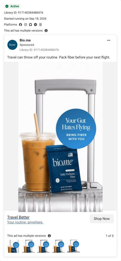
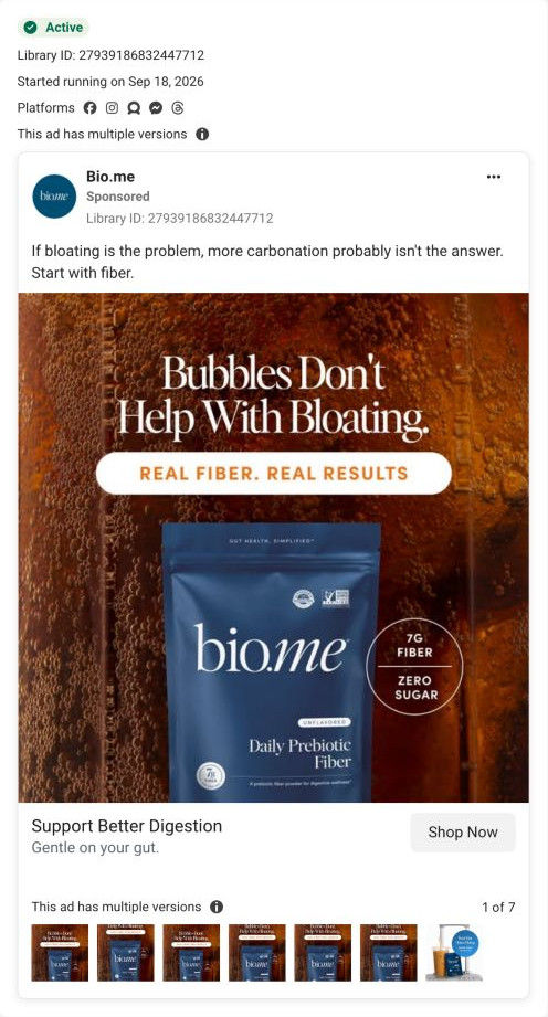
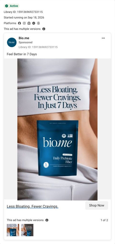
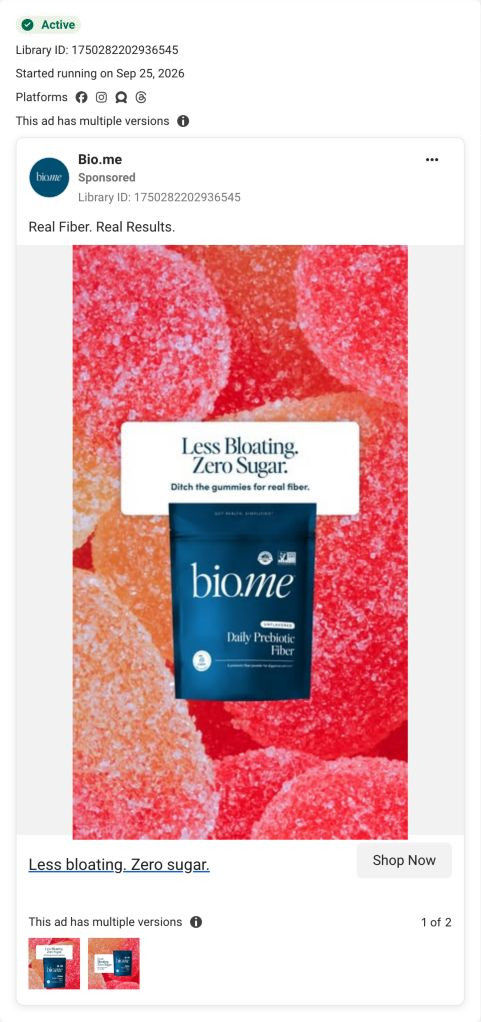


Bio.me · Daily Prebiotic Fiber
Advertiser benefit claims are shown as advertising examples. The landing page was captured on October 20, 2026 and may show a different offer from the ad.
Consistency Looks Good
A comment-reply overlay asks about the creator’s appearance, while the copy links the story to consistency with daily habits. Compare the creative with the destination and explore the other ads sharing this route.
- Brand
- Bio.me
- Observed offer
- Consistency and daily fiber routine; no discount stated
- Creative angle
- Creator stories
- Page type
- Product page
- Ad format
- Video · 0:48
- Listed start date
- Sep 18, 2026
- Captured
- Oct 20, 2026
- Library ID
- 3444266149078178
- Destination
- bio.me
Selected for its design and offer structure. Ad performance isn’t available in this collection.
What this ad does well
The compliment hook is aspirational and native to the feed: a comment overlay asking what she's doing, because she's glowing. Her answer connects to habits the viewer probably already has (upping protein, drinking more water) and positions fiber as the one she was ignoring, which makes it feel like a missing piece rather than a new regimen. The body carries the same concrete details as her other Bio.me ads in the library, with 7g per scoop, a spinach comparison and a once-a-day routine.
What's missing
The hook promises an appearance story and the body doesn't pay it off. After the glowing question, the script moves into the same fiber facts as her other ads, with only a passing claim about skin, so the viewer who stayed for the secret gets a general explainer. If you make one like this, either answer the hook directly with what she does each morning, or pick a hook the body actually answers. The copy's consistency angle is a good bridge, so put that line on screen.
Beat by beat
- 0-4sA comment overlay says she's literally glowing and asks what she's doing.
The compliment promises a secret the viewer wants to hear.
- 4-12sShe says she'd been focused on protein and water but was ignoring fiber.
It ties fiber to habits the viewer already has.
- 12-22sShe says it's a prebiotic that feeds good gut bacteria and supports gut health, skin and sleep.
It gives a reason to care, attributed to her.
- 22-38sShe covers two ingredients, 7g per scoop and a 10-cups-of-spinach comparison, with no fillers.
The specifics give the claim some substance.
- 38-48sShe mixes it into coffee, water or a smoothie once a day and closes with this is your sign to start.
It shows a simple habit and ends on a soft call to action.
Where it sends people
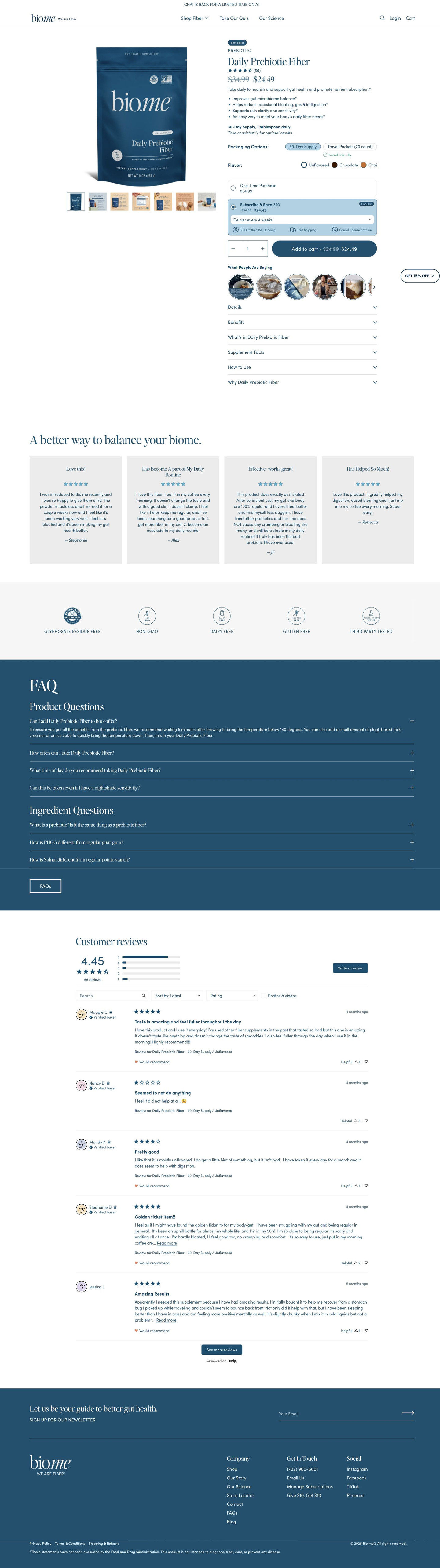
It sends people to the Daily Prebiotic Fiber product page, which sits on the weakest rung of the landing-page ladder (a standard product page rather than a page built around one problem, or the quiz Bio.me already links in its header). The buy box bullets include a skin claim, which loosely picks up the glow hook, and the round customer videos under Add to cart match the comment-reply style. The consistency idea in the copy has a natural home in the pre-selected Subscribe & Save card. Saying it there in the ad's words (stay consistent, delivered every month) would tie the click to the subscription.
The page it sends people to: How Bio.me's Daily Prebiotic Fiber page sells a subscription
Bio.me's Daily Prebiotic Fiber product page is short and subscription-first: the buy box carries the price, flavors, a pre-selected Subscribe & Save card and customer videos, with reviews, trust icons and an FAQ below. 18 ads in the Fluid library send people here, from Chai launch statics and habit-switch images to creator stories and comment replies.
How the page is built
- 01Announcement bar
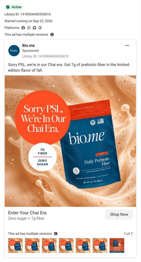
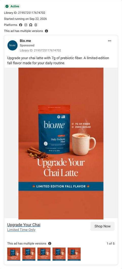
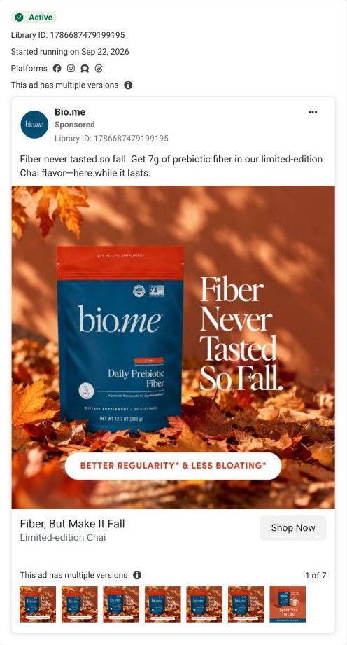
A single limited-time line about the seasonal Chai flavor answers whether there's anything new worth buying now.
- 02Buy box
A pack shot with a gallery of infographic, lifestyle and supplement-facts images sits beside the badge, rating, price, a one-line promise, benefit bullets, a dosage line and the packaging and flavor selectors, answering what it is, what it costs and which version to pick.
- 03Purchase options
A one-time card and a pre-selected Subscribe & Save card with a delivery dropdown and perk icons answer how to save and whether a subscription locks you in.
- 04Customer videos
A row of round UGC thumbnails titled What people are saying sits directly under Add to cart and answers whether real people use it.
- 05Buy-column accordions
Details, benefits, ingredients, supplement facts, how to use and why this product answer the label reader's questions without making the page longer.
- 06Review highlight
A headline and quote cards with titles, stars and first names answer whether it works for people like the buyer, in customers' words.
- 07Trust strip
Line icons for residue free, non-GMO, dairy free, gluten free and third-party tested answer whether it's clean and safe to try.
- 08FAQ
Product and ingredient questions on a brand-color band handle the remaining objections before checkout.
- 09Full reviews
An average rating, distribution bars, search, sort and filters let a careful buyer dig into the reviews.
- 10Newsletter and footer
A newsletter band and the footer with the supplement disclaimer catch visitors who aren't ready to buy.
The first fixes we would make
- Many of the ads sell a specific flavor or format (Chai, Chocolate, travel packets), but the observed page opens on the Unflavored 30-day pouch. Link each ad to its matching variant so the selector and main image already show what the click promised.
- Several ads lead with bloating, while the page's opening promise is broad gut health. Build a bloating landing page, or route those ads into the quiz Bio.me already links in its header, so the page starts on the problem the ad named.
Read the full breakdown of this page
Three hooks you could test
- Sell the outcome. “Everyone asks what changed. It's one small habit I stopped skipping.”
- Call out the habit you're replacing. “You track protein and water. Here's the one you're forgetting.”
- Show a specific moment of use. “Here's exactly what goes in my coffee before I leave the house.”
What to borrow for your brand
- Use a compliment comment as the hook, then make sure the body answers it directly.
- Place your product next to habits the viewer already has (protein, water) so it reads as the missing piece.
- Tie a consistency message in the ad to the subscription card on the landing page.
Transcript
I've been super focused on upping my protein and drinking more water. I was totally ignoring fiber, which is actually wild because it affects everything in your body. This is a prebiotic fiber. So it feeds your good gut bacteria, but also supports your overall gut health, skin and even your sleep. On top of that, bio needs daily pre-broad fiber is made with 2 clinically proven ingredients with 7 grams of fiber in every single scoop. That's like 10 cups of spinach. There's no fillers, no weird additives, just gentle fiber that actually works. And won't we be feeling bloated? I mix it into my coffee. my water, even a smoothie once a day, and that's it. If you've ignored your fiber until now, this is your time to start. Your gut? Well, thank you.
Text on screen
- Reply to Marisol 23's comment
- Girl, you're literally glowing
- what are you doing??
- biome
- I've been super focused on upping my protein
- Daily Prebioti:
- Reply to Marisol.23's comment
- bioma
- and drinking more water
- Daily Prebiotic
- but I was totally ignoring fiber
- Fiber
- biame
- which is actually wild
- This is a prebiotic fiber,
- so it feeds your good gut bacteria
- Daily Preblok
- Daily Predicat
- but also supports your
- Daily Prebiotk
- skin, and even your sleep.
- Dally Prebixie
- Dally Prehi
- On top of that, Bio.me's Daily
- Daily Prebion
- Prebiotic Fiber
- is made with two clinically proven ingredients
- with 7 grams of fiber in every singie scoop
- Daily Prebici
- with 7 grams of fiber in every single scoop
- Daily Problak l
- That's like 10 cups of spinach.
- Daily Prebinis
- There's no fillers, no weird additives.
- just gentle fiber that actually works.
- It won't leave you feeling bloated.
- I mix it into my coffee, my water.
- even a smoothie
- Once a day and that's it.
- If you've ignored your fiber until now.
One of 20 Bio.me ads in the Fluid Inspiration Library, captured from the Meta Ad Library on Oct 20, 2026. We record that an ad ran publicly, not how it performed.