What this ad does well
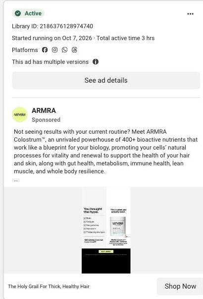
The split layout makes the argument in one glance. On the left, products a hair-focused shopper has probably already tried are listed and crossed out under You bought the hype, and on the right the jar sits under This is what you actually need, so the viewer sees their own cabinet before they see ARMRA. That's the call-out-the-habit concept in static form. The copy then opens with a question (not seeing results with your current routine?) and gives a number: the copy says 79% of ARMRA users reported thicker hair, with a footnote describing an open-label survey of 60 participants over three months.
What's missing
The ad is built for a hair shopper and then sends them to the general unflavored jar product page instead of the hair-focused landing page ARMRA runs for this same copy. That page opens with hair, so it's the natural next step, while the product page opens with the jar and a configurator. The image is also dense for a static, with small text along the bottom that's hard to read in a feed. If you make one like this, keep the crossed-out list and the single answer, cut everything else from the image, and send it to the page that continues the hair story.
Beat by beat
- Image
A split layout: on the left, a crossed-out list of hair products under a bold You bought the hype; on the right, the ARMRA jar under This is what you actually need.The viewer recognizes their own past purchases before the product appears, which makes the switch feel personal.
- Headline
The Holy Grail For Thick, Healthy Hair.It names the outcome the shopper wants in the line closest to the Shop Now button.
- Copy
Opens with a question about not seeing results from your current routine, then states that 79% of ARMRA users reported thicker hair, with a footnoted open-label survey of 60 participants over three months.A specific number with its qualifier gives the crossed-out list a reason to believe the alternative.
The offer
The image, headline and copy don't mention an offer. ARMRA was advertising 30% off a first subscription order (exclusions and recurring terms apply) at the time, and it isn't used here.
Where it sends people
This one sends hair shoppers to the unflavored jar product page, the general page rather than the hair-focused landing page ARMRA runs for the same copy. The product page does include a results block with large metrics and qualification text, which is where a thicker-hair figure belongs, but it sits after the buy box, accordions and product cards, and the page doesn't open on hair. On the landing-page ladder that's the weaker choice. Pointing this static at ARMRA's stronger, thicker hair page, which opens with a hair-focused hero and proof, would keep the crossed-out-products argument going.
The page it sends people to: How ARMRA builds its colostrum jar product page for ad traffic
This is ARMRA's product page for the Unflavored Colostrum Jar. A buy box with size, flavor, subscription and one-time choices leads into results, routine, a supplement-cost comparison, sourcing education and reviews. 21 ARMRA ads in the Fluid library link here, mostly creator stories, plus offer-led and education ads.
How the page is built
- 01
Announcement and navigationThe announcement strip, store navigation and breadcrumb tell visitors where they are and surface the current offer.
- 02
Buy boxThe gallery sits beside rating, product name, benefit copy, size and flavor selectors, subscription and one-time choices, quantity and the purchase button, answering what it is, what it costs and how to buy.
- 03
Product accordions and add-onsProduct-information accordions and complementary-product cards answer detailed questions and offer related items for a bigger order.
- 04
Results blockLarge metrics with qualification text answer whether people report results, with the claims presented as ARMRA's study findings.
- 05
Usage routineA routine with supporting imagery answers how someone actually takes it day to day.
- 06
Routine cost comparisonA comparison against a supplement routine answers whether the price is worth it compared with what a shopper might already buy.
- 07
Benefit map and sourcing educationA whole-body benefit map and sourcing and technology education answer what ARMRA says the product does and where it comes from.
- 08
Ingredient carouselA carousel of ingredient categories answers what's inside, in a visual form that's easy to scan.
- 09
Reviews and disclaimersCustomer reviews, disclaimers and the footer answer what other buyers say and close out the page.
The first fixes we would make
- 21 captured ads land on this same page, from creator stories about transformation to gut health and hair headlines, but the buy box speaks to every visitor the same way. Build angle-specific landing pages (ARMRA already has gut, hair and aging versions elsewhere) and route each ad headline to the page that opens on its promise.
- The cost comparison and the reviews both sit well below the buy box, so a shopper weighing the price at the button doesn't see either. Pull a one-line version of the routine comparison and the review rating right under the purchase button.
Read the full breakdown of this page
Three hooks you could test
- Call out the habit you're replacing. “Your bathroom cabinet is full of things that didn't work.”
- Lead with the uncomfortable problem. “Still finding more hair in the drain than you'd like?”
- Turn the benefit into a picture people get in a second. “Five bottles out, one jar in.”
What to borrow for your brand
- Build a two-column static: the alternatives your buyer already tried, crossed out, next to your product as the single answer.
- Put a specific, qualified number in the first lines of the copy and keep the qualifier (who, how many, how long) in the footnote right below it.
- Send problem-specific creative to the landing page built for that problem, not the default product page.
One of 40 ARMRA ads in the Fluid Inspiration Library, captured from the Meta Ad Library on Oct 22, 2026. We record that an ad ran publicly, not how it performed.