What this ad does well
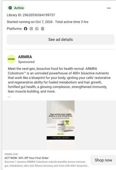
The image headline is clear and makes one claim: everything you're doing for your health, in one product. That's a simple idea to picture, and the minimal set keeps attention on the jar. This ad also does the best job in the batch of setting up the page: the link description promises seven reasons ARMRA says colostrum covers (immune, gut, metabolism, skin, hair, recovery), and the click lands on exactly that page. The ad headline, "ACT NOW: 30% Off Your First Order," gives a reason to act that most of ARMRA's other ads leave out.
What's missing
The ad promises to replace a routine but never shows the routine it replaces. A viewer has to picture their own shelf of supplements to feel the point, and many won't. The copy then goes back to broad language (powerhouse, regenerative, transformation) without one specific problem to anchor it. If you make one like this, put the old routine in the picture (the bottles, the pills, the monthly cost) beside the single jar, and make the 30% off terms clear so 'act now' has something solid behind it.
Beat by beat
- Image
One ARMRA jar on a bright, minimal set, under the line that a whole-body routine is one whole food, with a 30% off sticker and a star-rating bar.It makes a single simplification promise and keeps the frame clean so nothing competes with it.
- Headline
"ACT NOW: 30% Off Your First Order" sits under the image with a link description promising seven reasons.It gives a reason to click today and tells people exactly what kind of page they'll land on.
- Copy
The copy lists the benefits ARMRA claims for colostrum and points to 20,000+ five-star reviews.It's meant to back up the 'one food covers it' claim with breadth and social proof.
The offer
The ad headline leads with 30% off the first order, and the image repeats it on a sticker. At capture, the advertised offer applied to a first subscription order, with exclusions and recurring terms that the ad doesn't spell out.
Where it sends people
The ad lands on ARMRA's seven-reasons page, an educational landing page and one of 10 ads in the Fluid library that land there. The page opens on a split benefit hero with a portrait and CTA, then a trust bar, numbered reasons with repeated CTAs, an embedded offer with size, flavor and purchase choices, proof metrics and an FAQ. The match is strong here because the link description promised seven reasons and the page delivers them in order, with a CTA after each. The gap is the 'one food replaces your routine' claim: nothing in the blueprint compares ARMRA with the routine it replaces, and the cost comparison ARMRA uses on its product page would fit well here.
The page it sends people to: How ARMRA uses a 7 reasons listicle as a landing page
ARMRA's 7 reasons page is a numbered educational landing page. A split benefit hero leads into numbered reasons with repeated CTAs, then an embedded product offer, proof metrics and an FAQ. 10 ARMRA ads in the Fluid library link here, mixing creator stories, personal results, product-benefit statics and "ACT NOW: 30% Off Your First Order" offer ads.
How the page is built
- 01
Campaign header and offer stripA compact header with an offer strip answers whether there's a deal right now and keeps the store navigation out of the way.
- 02
Split benefit heroA portrait beside explanatory copy and a CTA answers what this page is about and gives an early way to act.
- 03
Trust bar and benefit navigationA trust bar and short benefit navigation answer whether the brand is credible and let readers jump to the reason they care about.
- 04
Numbered reasonsNumbered reasons alternate images and explanations with repeated CTAs, answering why someone should consider colostrum, in ARMRA's words.
- 05
Embedded product offerSize, flavor and purchase choices answer what to buy and let the visitor check out on this page.
- 06
Proof metrics and offer promptsProof metrics and repeated offer prompts answer whether other people report results and remind the reader of the deal.
- 07
FAQ and footerAn FAQ and the brand and newsletter footer answer the last practical questions and capture readers who still aren't ready.
The first fixes we would make
- The page carries a lot of ad angles at once (creator transformation stories, an aging-themed static and first-order discount ads), and the hero speaks to all of them the same way. Reorder or swap the opening reason based on the ad, so an aging ad opens on the aging reason and an offer ad opens on the deal.
- Proof metrics come after the embedded offer, so the reader sees the price before the strongest evidence. Move a short version of the metrics into the trust bar near the top, keeping the qualification text attached.
Read the full breakdown of this page
Three hooks you could test
- Call out the habit you're replacing. “Seven bottles on your counter. What if it were one?”
- Turn the benefit into a picture people get in a second. “Your whole supplement shelf, in one jar.”
- Sell the outcome. “A simpler morning: one scoop, and you're done.”
What to borrow for your brand
- Use the link description to tell people exactly what kind of page they're about to see, then make sure the page delivers it.
- If your claim is 'one product instead of many,' show the many in the picture so the simplification is visible.
- Put the first-order discount in the ad headline when the image is doing the explaining.
One of 40 ARMRA ads in the Fluid Inspiration Library, captured from the Meta Ad Library on Oct 22, 2026. We record that an ad ran publicly, not how it performed.