What this ad does well
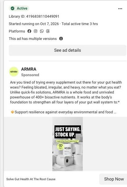
It's funny, and the joke does the explaining. Toilet paper plus 'stock up' tells you the gut benefit ARMRA is implying in about a second, without a single nutrient name, which is exactly how a benefit should turn into a picture. The copy then opens on a problem people recognize: tired of trying every supplement, bloated, irregular and heavy no matter what they eat. That pairing (a joke that stops the scroll, then a problem that makes it personal) is stronger than most of ARMRA's other statics.
What's missing
The ad has the problem and the hook but no proof. Everything after the opening question is ARMRA's claims about the gut wall, and the only evidence is the 20,000+ five-star reviews line, which isn't about gut health specifically. 'Stock up' also hints at buying more without making it easy: the ad doesn't mention a larger size or bundle. If you make one like this, add one attributed gut-health review to the image or copy, and send the click to the larger size or subscription option so 'stock up' means something on the page.
Beat by beat
- Image
A black-and-white pile of toilet paper rolls with an ARMRA jar in the middle, a bold 'Just saying. Stock up.' headline, a bathroom-humor tag and a 30% off sticker.The joke implies the gut benefit instantly and makes the ad stand out from clean product shots.
- Headline
"Solve Gut Health At The Root Cause" sits beside the Shop Now button.It turns the joke into a promise, framed as ARMRA's claim about how the product works.
- Copy
The copy asks if you're tired of trying every supplement, names bloating and irregularity, and lists what ARMRA says it does for the gut wall.It makes the problem personal before explaining the product, which is the order skeptical buyers need.
The offer
A 30% off sticker sits on the image. At capture, ARMRA's advertised offer was 30% off a first subscription order, with exclusions and recurring terms, and the copy itself never explains those terms.
Where it sends people
The ad sends people to the unflavored jar product page, the page 21 of the ARMRA ads in the Fluid library land on. That's a basic product page rather than a page built for one problem: the buy box (size, flavor, subscription or one-time purchase) comes first, followed by product accordions, a results block with large metrics and qualification text, a usage routine, a supplement-routine cost comparison, a whole-body benefit map, sourcing education, an ingredient carousel and reviews. For a gut-specific ad, that's a general page: nothing in the opening screen picks up the bloating and irregularity the ad named, and the buy box doesn't reflect the 'stock up' joke. Preselecting the larger size or subscription for this ad, and moving a gut-health review up near the buy box, would make the click feel like a continuation.
The page it sends people to: How ARMRA builds its colostrum jar product page for ad traffic
This is ARMRA's product page for the Unflavored Colostrum Jar. A buy box with size, flavor, subscription and one-time choices leads into results, routine, a supplement-cost comparison, sourcing education and reviews. 21 ARMRA ads in the Fluid library link here, mostly creator stories, plus offer-led and education ads.
How the page is built
- 01
Announcement and navigationThe announcement strip, store navigation and breadcrumb tell visitors where they are and surface the current offer.
- 02
Buy boxThe gallery sits beside rating, product name, benefit copy, size and flavor selectors, subscription and one-time choices, quantity and the purchase button, answering what it is, what it costs and how to buy.
- 03
Product accordions and add-onsProduct-information accordions and complementary-product cards answer detailed questions and offer related items for a bigger order.
- 04
Results blockLarge metrics with qualification text answer whether people report results, with the claims presented as ARMRA's study findings.
- 05
Usage routineA routine with supporting imagery answers how someone actually takes it day to day.
- 06
Routine cost comparisonA comparison against a supplement routine answers whether the price is worth it compared with what a shopper might already buy.
- 07
Benefit map and sourcing educationA whole-body benefit map and sourcing and technology education answer what ARMRA says the product does and where it comes from.
- 08
Ingredient carouselA carousel of ingredient categories answers what's inside, in a visual form that's easy to scan.
- 09
Reviews and disclaimersCustomer reviews, disclaimers and the footer answer what other buyers say and close out the page.
The first fixes we would make
- 21 captured ads land on this same page, from creator stories about transformation to gut health and hair headlines, but the buy box speaks to every visitor the same way. Build angle-specific landing pages (ARMRA already has gut, hair and aging versions elsewhere) and route each ad headline to the page that opens on its promise.
- The cost comparison and the reviews both sit well below the buy box, so a shopper weighing the price at the button doesn't see either. Pull a one-line version of the routine comparison and the review rating right under the purchase button.
Read the full breakdown of this page
Three hooks you could test
- Lead with the uncomfortable problem. “Bloated after every meal, no matter what you cut out?”
- Turn the benefit into a picture people get in a second. “You're going to need more of these. (Points at the toilet paper.)”
- Call out the habit you're replacing. “Stop rotating through a new gut supplement every month.”
What to borrow for your brand
- Pick a household object that implies your benefit without saying it, and build the whole image around it.
- Pair a joke in the image with a sincere problem statement in the copy, so the ad is both noticeable and personal.
- When your hook says 'stock up,' send the click to a larger size, bundle or subscription that's already selected.
One of 40 ARMRA ads in the Fluid Inspiration Library, captured from the Meta Ad Library on Oct 22, 2026. We record that an ad ran publicly, not how it performed.