What this ad does well
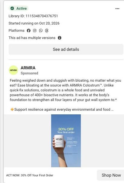
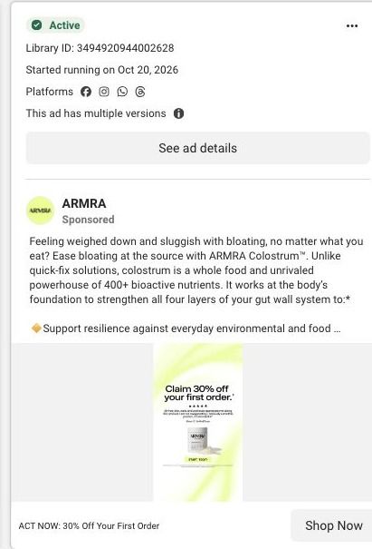
This version puts the product in the hero spot instead of the offer alone: the jar held up against open sky reads as clean and confident, and the 30% OFF line sits above it in large type. Small callouts beside the jar give the eye something beyond a price. The copy carries the problem (bloating, feeling weighed down) and a qualified number, an 86% figure it attributes to an open-label survey of 60 participants. Running it alongside the lime offer static, with the same copy, lets ARMRA compare a product-forward image against an offer-forward one.
What's missing
The benefit callouts are too small to read in a feed, so in practice the image is a jar and a discount. A viewer who doesn't already know ARMRA doesn't learn what it's for until they expand the copy. If you make one like this, cut the callouts to a single large line naming the problem (the copy's bloating lead is right there) and say the discount is on a first subscription order. The held-up product shot is worth keeping, since it's the clearest part of the image.
Beat by beat
- Image
A hand holds the ARMRA jar up against a blue sky, with 30% OFF Your first order in large type above and small benefit callouts to the side.The product and the offer read together at thumbnail size, so the viewer sees both what it is and what it costs to start.
- Headline
ACT NOW: 30% Off Your First Order.Repeating the discount beside the button adds urgency to the click.
- Copy
Opens on feeling weighed down and sluggish with bloating, then cites a footnoted 86% figure from an open-label survey of 60 participants.The copy supplies the problem and a qualified proof point the image doesn't have room for.
The offer
The offer leads: 30% off your first order on the image and ACT NOW: 30% Off Your First Order in the headline. ARMRA's terms describe it as a first-order subscription offer with exclusions and recurring terms, which isn't spelled out in the large type.
Where it sends people
Like the lime offer static, this one lands on the 7 reasons educational page, one of 10 ARMRA ads in the Fluid library that go there. The offer strip in the compact campaign header confirms a deal the moment the page loads, and the proof metrics and repeated offer prompts further down keep it in view. The full product configurator is embedded below the numbered reasons, so a shopper who came ready to buy has some reading to scroll past first. If you run offer statics, point them at the offer section of the page, or at a version of it with the embedded offer near the top.
The page it sends people to: How ARMRA uses a 7 reasons listicle as a landing page
ARMRA's 7 reasons page is a numbered educational landing page. A split benefit hero leads into numbered reasons with repeated CTAs, then an embedded product offer, proof metrics and an FAQ. 10 ARMRA ads in the Fluid library link here, mixing creator stories, personal results, product-benefit statics and "ACT NOW: 30% Off Your First Order" offer ads.
How the page is built
- 01
Campaign header and offer stripA compact header with an offer strip answers whether there's a deal right now and keeps the store navigation out of the way.
- 02
Split benefit heroA portrait beside explanatory copy and a CTA answers what this page is about and gives an early way to act.
- 03
Trust bar and benefit navigationA trust bar and short benefit navigation answer whether the brand is credible and let readers jump to the reason they care about.
- 04
Numbered reasonsNumbered reasons alternate images and explanations with repeated CTAs, answering why someone should consider colostrum, in ARMRA's words.
- 05
Embedded product offerSize, flavor and purchase choices answer what to buy and let the visitor check out on this page.
- 06
Proof metrics and offer promptsProof metrics and repeated offer prompts answer whether other people report results and remind the reader of the deal.
- 07
FAQ and footerAn FAQ and the brand and newsletter footer answer the last practical questions and capture readers who still aren't ready.
The first fixes we would make
- The page carries a lot of ad angles at once (creator transformation stories, an aging-themed static and first-order discount ads), and the hero speaks to all of them the same way. Reorder or swap the opening reason based on the ad, so an aging ad opens on the aging reason and an offer ad opens on the deal.
- Proof metrics come after the embedded offer, so the reader sees the price before the strongest evidence. Move a short version of the metrics into the trust bar near the top, keeping the qualification text attached.
Read the full breakdown of this page
Three hooks you could test
- Make the product the whole scene. “One jar, held up to the light. That's the whole routine.”
- Turn the benefit into a picture people get in a second. “Your entire morning routine fits in one hand.”
- Lead with the uncomfortable problem. “Tired of feeling weighed down after meals?”
What to borrow for your brand
- Shoot the product held up against a clean background so it reads at thumbnail size, and put the offer in the largest type above it.
- Run two static versions of the same offer, one product-forward and one offer-forward, with identical copy, so the image is the only variable.
- Replace several small callouts with one large line, because a feed viewer will only read one.
One of 40 ARMRA ads in the Fluid Inspiration Library, captured from the Meta Ad Library on Oct 22, 2026. We record that an ad ran publicly, not how it performed.