How AG1's Next Gen product page sells above and teaches below | Fluid
Esc

How AG1's Next Gen product page sells above and teaches below

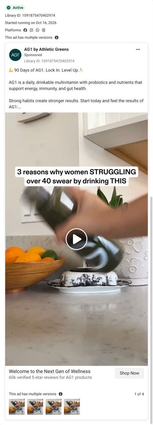
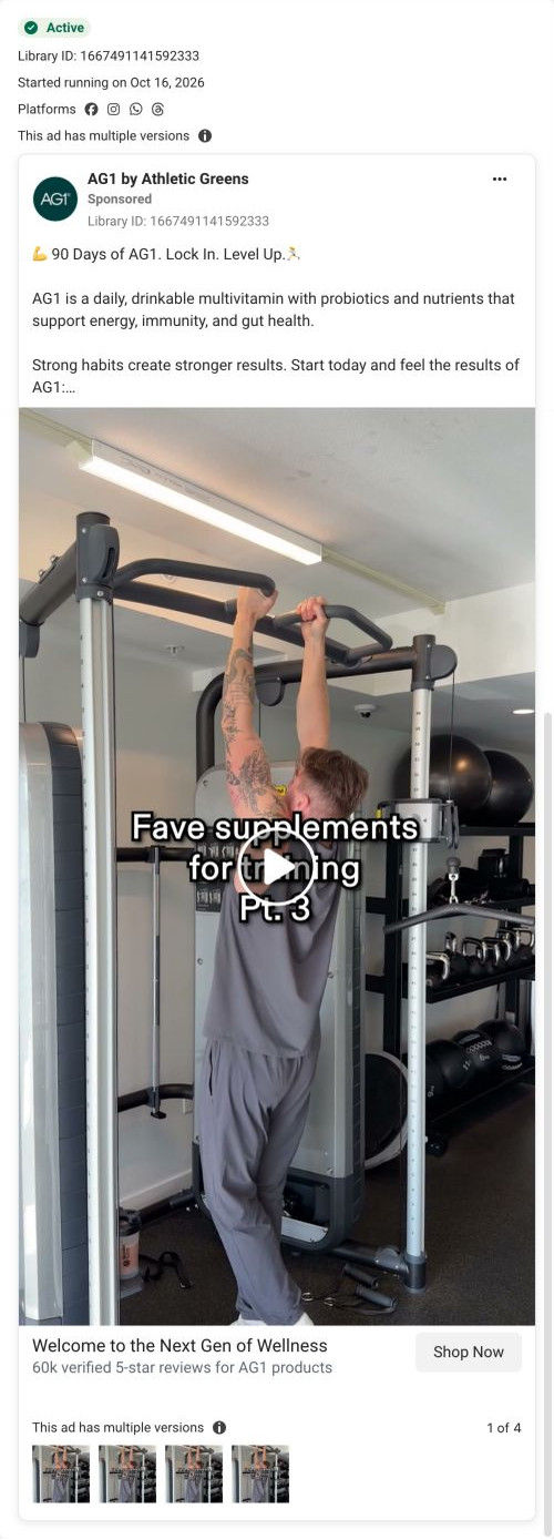
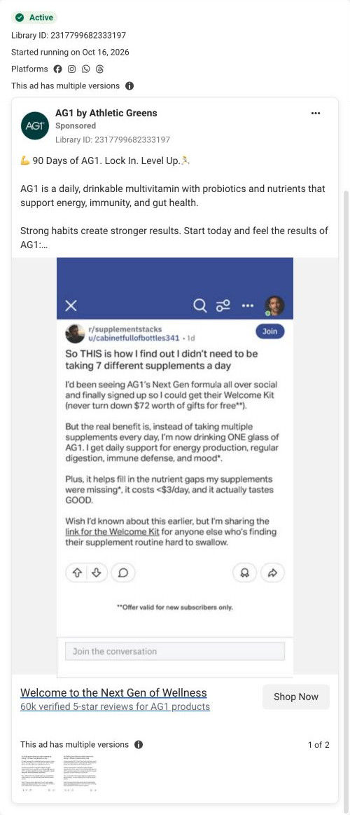
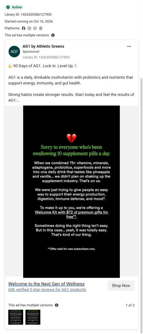
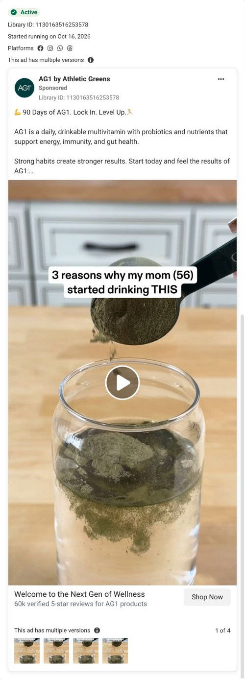
AG1's Next Gen product page lets the buy box carry the welcome-kit offer and uses everything below it to educate: a category comparison table, per-scoop nutrition, an ingredient carousel, study results, reviews and FAQ. Six education ads in the Fluid library land here, most headlined "90 Days of AG1. Lock In. Level Up."

AG1
6 creatives lead here1 / 6
AG1 Next Gen product page

A browser shopping-extension badge appears in the upper-right margin of this capture.

AG1: full page screenshot

AG1 Next Gen product page

AG1's Next Gen product page lets the buy box carry the welcome-kit offer and uses everything below it to educate: a category comparison table, per-scoop nutrition, an ingredient carousel, study results, reviews and FAQ. Six education ads in the Fluid library land here, most headlined "90 Days of AG1. Lock In. Level Up."

Brand
AG1
Page type
Product page
Ads leading here
6
Captured
Oct 19, 2026
Destination
drinkag1.com

Selected for its design and offer structure. Ad performance isn’t available in this collection.

What this page does well

The buy box does a lot of work in one column. The welcome kit appears as three thumbnails inside the pre-selected longer-supply card, with the kit named in the card header, and a What to expect carousel of timed milestone cards turns results into a timeline before the shopper scrolls on. A bright upsell card pitches the premium version by listing only what it adds, which is a tidy way to offer an upgrade without derailing the sale. Below the buy box, the first section is a comparison of the product against multivitamins, probiotics and greens across seven nutrient categories, so visitors who clicked an education ad get the teaching right away.

How the page is built

  1. 01
    Ticker bar and header

    A scrolling highlights strip sits above the header and breadcrumb.

  2. 02
    Buy box gallery

    The main image carries a ranking badge, a + Free welcome kit overlay and two trust chips, answering what do I get and can I trust it.

  3. 03
    Buy box plans

    The longer supply is pre-selected under a Best Value plus free-kit header with per-serving price and kit thumbnails, answering which plan should I choose.

  4. 04
    Buy-column proof

    A subscription-includes box and a Why They Love customer video carousel add proof at the decision point.

  5. 05
    Upsell and details

    A premium upsell card, five accordions, a What to expect milestone carousel and testing badges, answering when will I notice something.

  6. 06
    Comparison table

    The product is set against multivitamins, probiotics and greens across seven nutrient categories, answering why this instead of what I already take.

  7. 07
    Per-scoop nutrition

    An eight-row nutrition table and supplement-facts button sit beside a scoop photo.

  8. 08
    Ingredient carousel

    Large ingredient photo cards with one-line descriptions, then free-of and certification columns.

  9. 09
    Study results

    Three large stat blocks with a footnote, answering is there research behind it.

  10. 10
    Reviews

    A count headline and three written review cards.

  11. 11
    FAQ and blog

    Ten accordions and a blog carousel handle remaining questions.

  12. 12
    Footer

    Link columns, newsletter, socials, disclaimers and footnotes.

What's missing, in the order we'd fix it

  1. All six ads take an education angle, but the visitor lands on a plan choice before any teaching. Send these ads to a lander that sets up the need first (AG1's gummies parent lander puts a problem paragraph ahead of the buy box) and keep this page for shoppers who are ready.
  2. Written reviews sit near the bottom, after the study results. Pull the review count and two or three quotes up beside the What to expect carousel, so the timeline and the proof sit together.

How the ads set it up

Five of the six ads run "90 Days of AG1. Lock In. Level Up.", and the page lines up with that through the pre-selected longer supply and the What to expect milestone cards in the buy column. The first section after the buy box is the comparison against three categories the copy claims the product replaces, which gives education-minded visitors something to read straight away. The gap is that they meet a plan choice before that teaching, so the page asks for the sale slightly ahead of the ads' tone.

What to borrow for your brand

  • Show a free kit as item thumbnails inside the pre-selected plan card, with the kit named in the card header.
  • Put a What to expect carousel of timed milestones in the buy column, so results read as a timeline before the shopper scrolls.
  • Pitch a premium upgrade in a small card that lists only what it adds, so the upsell doesn't compete with the main sale.

Ads that send people here

Captured from drinkag1.com in October 2026 for the Fluid Inspiration Library. Offers and prices change; this is what the page showed when we captured it.