How AG1 speaks to parents on a dedicated gummies lander
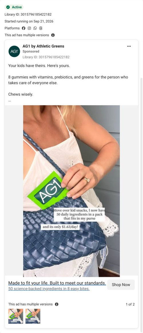
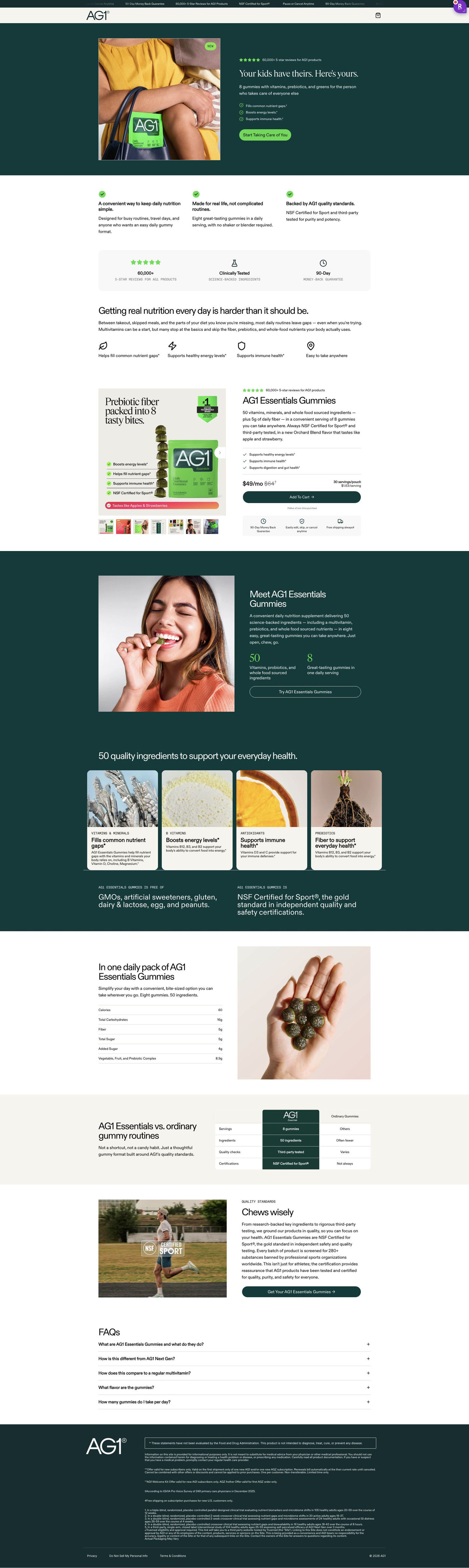
This short AG1 Gummies lander speaks to parents. The hero addresses the caregiver directly, value props and a problem paragraph set up the need, then an embedded buy box, ingredient cards, nutrition, a comparison with ordinary gummies and quality proof make the case. One image ad in the Fluid library lands here: "Your kids have theirs. Here's yours."

A browser shopping-extension badge appears in the upper-right margin of this capture.
Gummies for the person caring for everyone
This short AG1 Gummies lander speaks to parents. The hero addresses the caregiver directly, value props and a problem paragraph set up the need, then an embedded buy box, ingredient cards, nutrition, a comparison with ordinary gummies and quality proof make the case. One image ad in the Fluid library lands here: "Your kids have theirs. Here's yours."
- Brand
- AG1
- Page type
- Audience-specific page
- Ads leading here
- 1
- Captured
- Oct 19, 2026
- Destination
- try.drinkag1.com
Selected for its design and offer structure. Ad performance isn’t available in this collection.
What this page does well
The hero picks up the ad's contrast in its first line, setting the product against what parents already buy for their kids, over a photo of the pouch in a parent's bag. A problem section about daily nutrition being harder than it should be comes before the buy box, so the price only appears after the need is set up. The buy box leads with an infographic image (headline, ranking badge, benefit checklist, flavor banner), so the gallery does the selling, and the price shows a struck-through value with servings and per-serving cost. The header is cut to logo and cart, and a trust ticker at the top runs the money-back guarantee, review count, sport certification and pause-or-cancel terms before the visitor reads anything else.
How the page is built
- 01Trust ticker and header
A strip of short assurances above a logo-and-cart header answers can I trust this, while keeping visitors on the lander.
- 02Hero
A photo of the pouch in a parent's bag sits beside an audience headline, three benefits and a CTA, answering is this for me.
- 03Value props
Three columns cover convenience, a real-life format and quality standards.
- 04Stat bar
Review count, a testing label and a money-back guarantee in one panel answer whether it's backed by anything and whether it's safe to try.
- 05Problem statement
A headline about daily nutrition being harder than it should be names the gaps in busy routines, answering why do I need this.
- 06Buy box
An infographic gallery sits beside a struck-through price with per-serving cost, Add to cart and three perks, answering what does it cost.
- 07Product intro
A photo of someone eating a gummy sits beside two big-number stats (ingredient count, gummies per serving).
- 08Ingredient cards
Four ingredient cards and free-of and certification statements answer what's in it.
- 09Nutrition panel
A simple nutrition table beside the daily serving in a palm.
- 10Comparison
A small table sets the brand against ordinary gummies, answering why not the cheap ones.
- 11Quality standards
An athlete photo with a certification overlay and a CTA close the case.
- 12FAQ and footer
Five accordions, then disclaimers, offer fine print and study footnotes.
What's missing, in the order we'd fix it
- There are no written reviews on the page, only a review count in the ticker and stat bar. Add three reviews from parents right after the buy box, because a parent wants to hear from someone in the same situation.
- The buy box sells one plan, with no larger supply or second pack. Offer a longer supply with a per-serving saving, so a parent who's convinced can buy for a few months at once.
How the ads set it up
The ad sets the product against what parents already buy for their kids, and the hero repeats that same contrast in its first line, so the click lands on exactly the idea in the ad. The photo of the pouch in a parent's bag keeps the audience visible without a single kids-themed graphic. With no site navigation, every CTA on the page leads back to the one buy box, which keeps the visitor's attention on the decision the ad started.
What to borrow for your brand
- Set your product against what the audience already buys for someone else, and use that same contrast in the ad and the hero's first line.
- Put a short problem section ahead of the buy box, so the price shows up only after the reader has agreed they have the problem.
- Strip the header to logo and cart on an audience lander, so every button leads to the one buy box.
Ads that send people here
Captured from try.drinkag1.com in October 2026 for the Fluid Inspiration Library. Offers and prices change; this is what the page showed when we captured it.