

Shawn Johnson East with AG1 by Athletic GreensSponsored
Esc
How AG1's gummies ad pits one tasty pack against a handful of pills
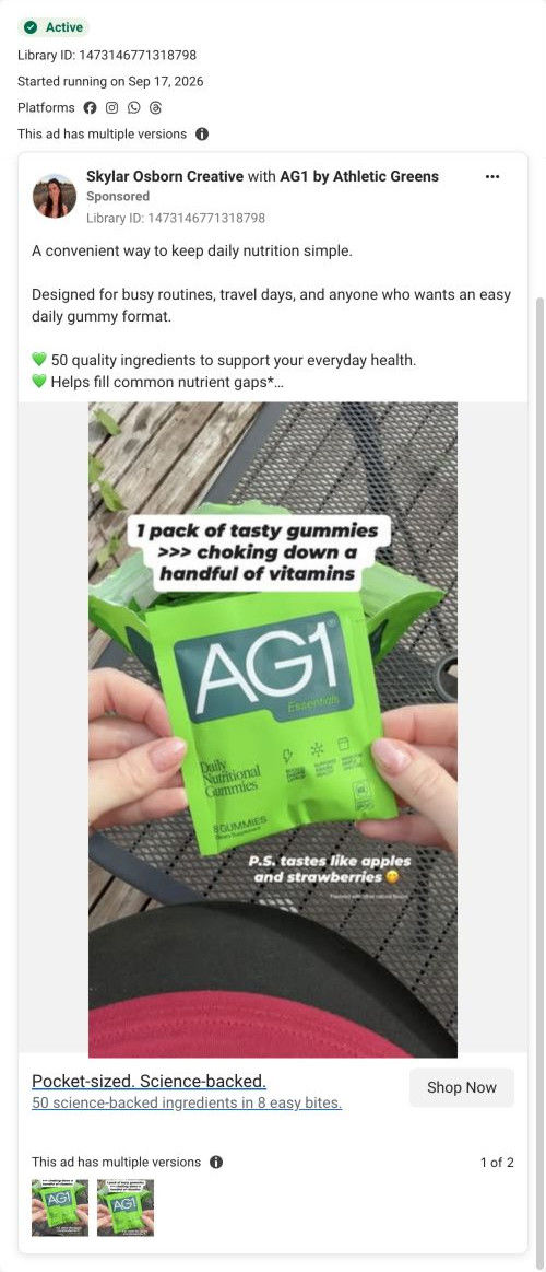
A static creator post from Skylar Osborn Creative, run with AG1. She holds a single AG1 Essentials pack toward the camera under a meme-style caption comparing tasty gummies to choking down a handful of vitamins, with a taste note below. The copy pitches convenience for busy days at $1.63 per serving and links to the gummies product page.
AG1
11 creatives lead here1 / 11


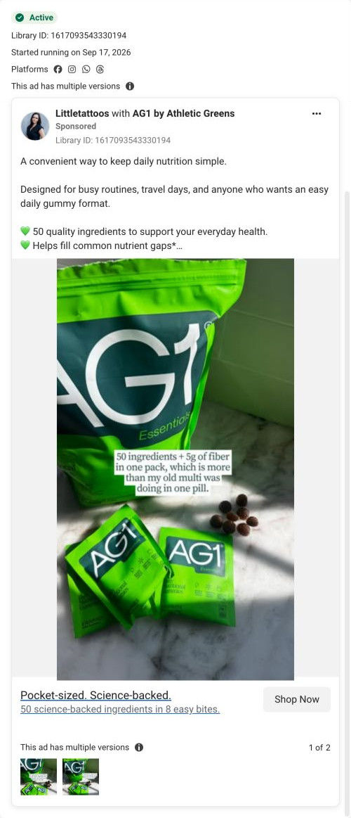
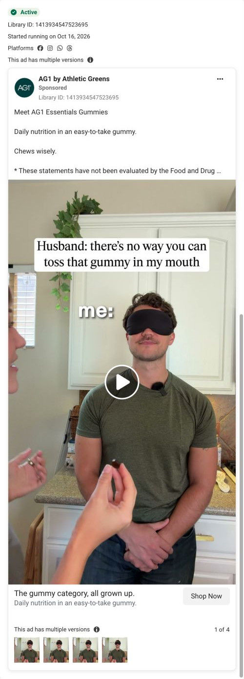
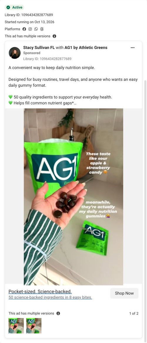
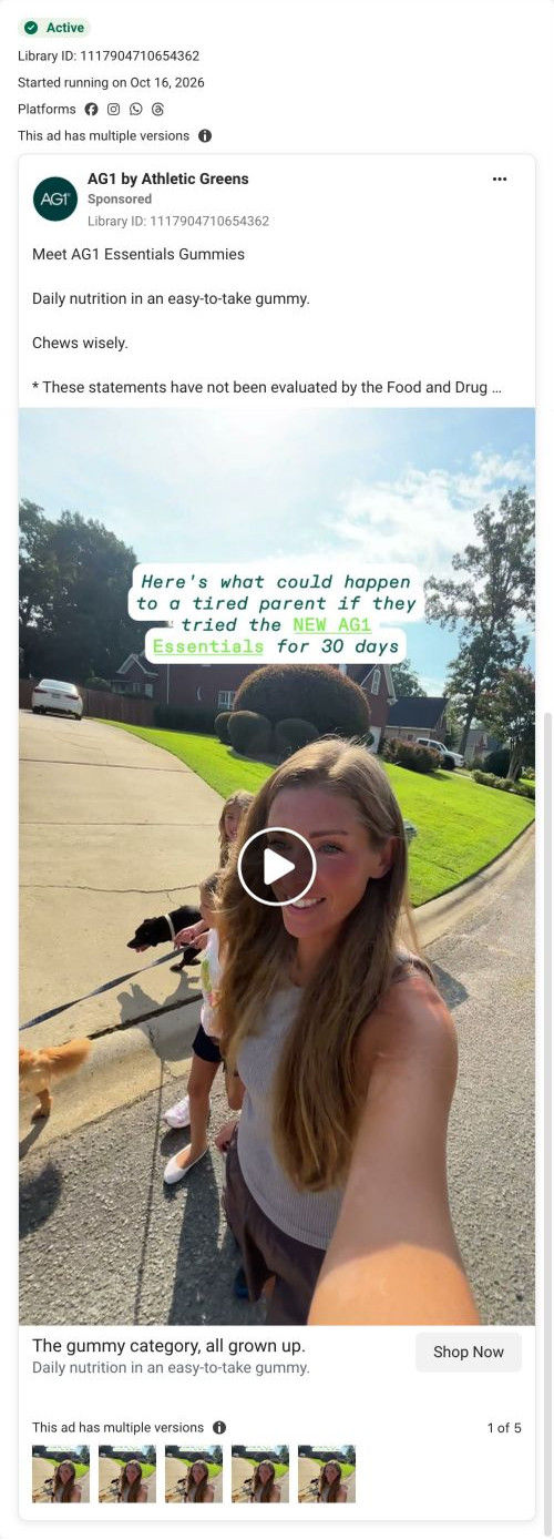
AG1 Essentials Gummies
A browser shopping-extension badge appears in the upper-right margin of this capture.

Pocket-sized. Science-backed.
The ad presents gummies as a portable option for busy routines and travel days, with an advertised cost per serving. The CTA goes directly to the AG1 Essentials gummies product URL. Compare the creative with the destination and explore the other ads sharing this route.
- Brand
- AG1
- Observed offer
- AG1 Essentials gummies — advertised at $1.63 per serving
- Creative angle
- Creator-led
- Page type
- Product page
- Ad format
- Image
- Listed start date
- Sep 17, 2026
- Captured
- Oct 19, 2026
- Library ID
- 1473146771318798
- Destination
- drinkag1.com
Selected for its design and offer structure. Ad performance isn’t available in this collection.
What this ad does well
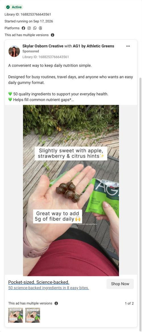
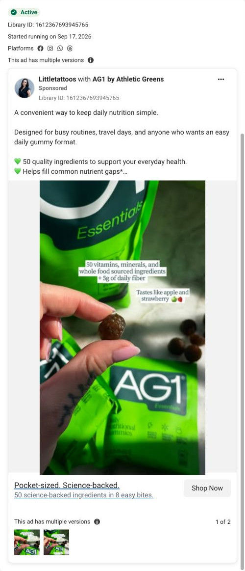
This is the clearest problem in AG1's gummies set: the caption names the chore people already dislike, swallowing a handful of vitamins, and puts the pack against it with the >>> format people know from social posts. The pouch held up in two hands fills the middle of the frame, so the brand is unmistakable. A small P.S. caption answers taste (apples and strawberries) without crowding the main line, which reads like a creator adding a thought.
What's missing
The comparison wins attention, but there's no proof that the pack replaces what's in that handful, and no reason to act today. The copy repeats the general Essentials text and leaves the $1.63 price for people who expand it. If you make one like this, add one proof point to the image (the ingredient count, or a nod to the replace-the-stack table on the page) and give a first-order reason to try it now.
Beat by beat
- ImageTwo hands hold an AG1 Essentials pack toward the camera on an outdoor table.
It puts the single-serve pack front and center so the format is obvious.
- ImageCaption: "1 pack of tasty gummies >>> choking down a handful of vitamins."
It frames the product against a chore the viewer already knows and dislikes.
- ImageA smaller caption adds that it tastes like apples and strawberries.
It handles the taste objection as a casual P.S.
- CopyThe standard Essentials text: 50 ingredients, NSF Certified for Sport, easy to take anywhere and $1.63 per serving.
It supplies the claims and price the image leaves out.
The offer
The copy prices AG1 Essentials gummies at $1.63 per serving, with no discount or gift.
Where it sends people
Shop Now goes to the AG1 Essentials gummies product page, where 11 of the AG1 ads in our library land. It's a full product page rather than a page built around the pills problem, but it has the right pieces: a Replace the Stack table totals the monthly cost of separate supplements against the one product, and the infographic grid includes a flavor tile. The trouble is order. The table sits below the buy box, flavor band and accordions, so the visitor who clicked for "no more handful of pills" has to scroll to see that argument made.
The page it sends people to: How AG1's gummies product page lets the gallery do the selling
AG1's Essentials Gummies product page pairs a left-column grid of infographic tiles with a right-column plan selector, then adds a flavor band, a replace-the-stack cost table, creator videos, reviews, ingredients and quality proof. Eleven ads in the Fluid library send people here, eight of them creator-led and headlined "Pocket-sized. Science-backed."
How the page is built
- 01Announcement ticker
A scrolling line promotes other product launches above the page.
- 02Infographic gallery
A large tile with benefit checks and a flavor ribbon sits above six tiles covering flavor, nutrition, cost, ingredients and lifestyle, answering what is this and why should I care.
- 03Plan selector and cart
Two supply-length plan cards, the longer pre-selected with per-serving cost, sit above Add to Cart, a Buy Once link and four subscription perks, answering what's the best way to buy.
- 04Buy-column accordions
Accordions cover what it is, who it's for, benefits, how to use and quality, with a testing badge and HSA/FSA strip, answering the detail questions without leaving the buy box.
- 05Flavor band
A bright full-width block pairs a product-and-fruit image with a large headline about taste, answering will I actually like eating these.
- 06Replace the Stack table
The product column is set against separate supplement categories with a monthly cost for each and a total, answering is this worth the price.
- 07Creator videos
Three vertical video cards with first names sit beside a rating line, answering what do real people say about it.
- 08Review carousel
Three short written reviews add a second layer of customer proof.
- 09Ingredients
A dark band of ingredient cards ends with excluded allergens and additives and two certification statements, answering what's in it and what isn't.
- 10Routine steps
Three photo cards show opening the pack, eating and taking it anywhere, answering how does this fit my day.
- 11Nutrition and quality
A nutrition table and an athlete photo with a certification overlay answer whether the quality holds up.
- 12FAQ, blog and footer
Accordions compare formats and cover flavor and serving count, followed by article cards and the footer.
The first fixes we would make
- The announcement ticker promotes other product launches, which pulls a visitor who came for gummies toward something else on the first screen. Use that line for the gummies offer or guarantee instead.
- Two launch ads frame the gummies against other gummies, but the page only compares formats inside an FAQ accordion. Add a small table against ordinary gummies after the flavor band (AG1 already uses one on its gummies landers) so that comparison is visible.
Read the full breakdown of this page
Three hooks you could test
- Call out the habit you're replacing. “Your handful of morning pills, replaced by one small pack.”
- Lead with the uncomfortable problem. “Gagging on vitamins every morning? There's an easier way.”
- Turn the benefit into a picture people get in a second. “Seven pill bottles on one side, one pack on the other.”
What to borrow for your brand
- Use the >>> comparison format to put your product against the specific chore it replaces, written the way a creator would caption it.
- Add a small P.S. caption to handle one objection, like taste, without crowding the main line.
- Have the creator hold the single-serve pack toward the lens so portability is shown, not described.
One of 65 AG1 ads in the Fluid Inspiration Library, captured from the Meta Ad Library on Oct 19, 2026. We record that an ad ran publicly, not how it performed.