Careclarkbsn with The Absorption CompanySponsored
Esc
How The Absorption Company opens a berberine ad on chin hair
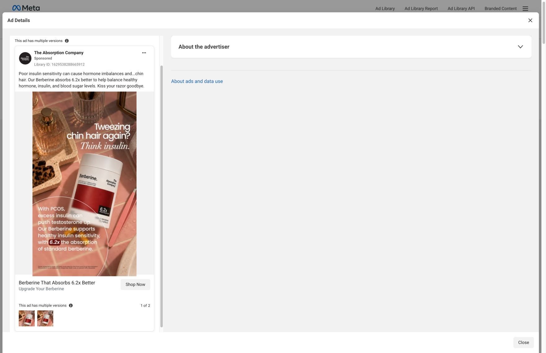
A static image of a pink vanity (tweezers, perfume, the red Berberine bottle) under the headline 'Tweezing chin hair again? Think insulin.' Body text links PCOS, insulin and testosterone, as the ad claims, then gives the 6.2x absorption figure. There's no discount. It sends people to the best-berberine landing page.
The Absorption Company
30 creatives lead here1 / 30
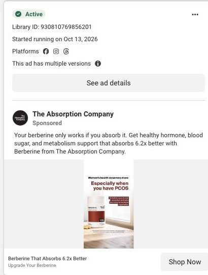
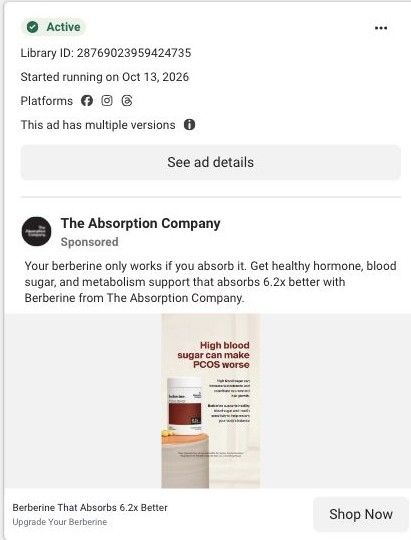
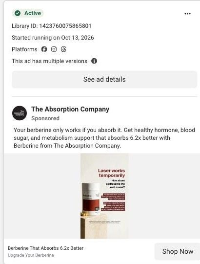
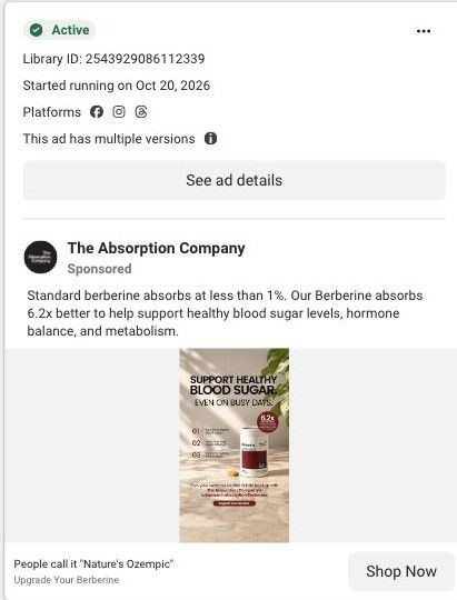
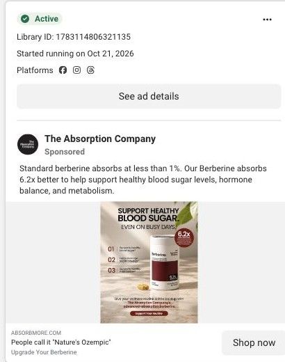
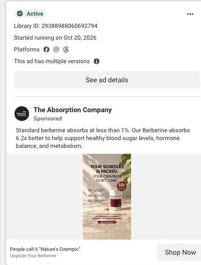
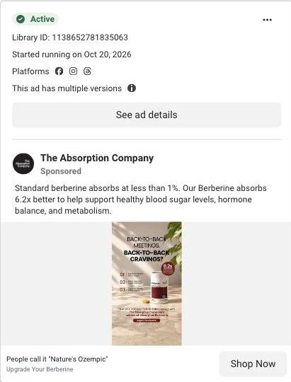
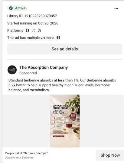
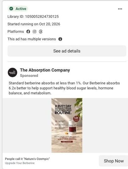
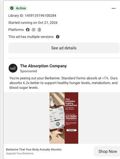
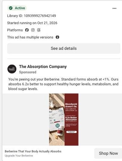
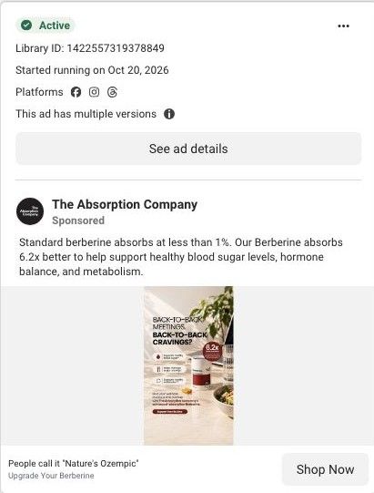
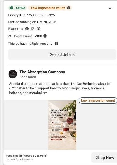
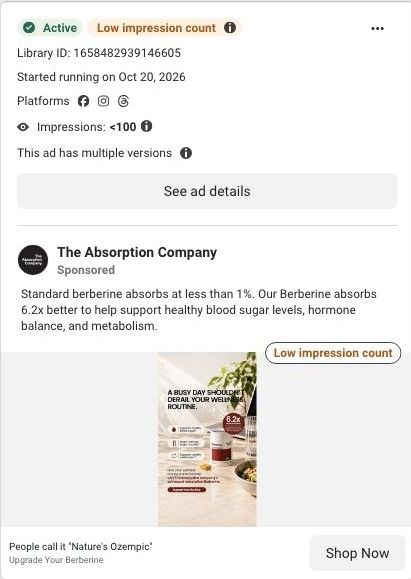
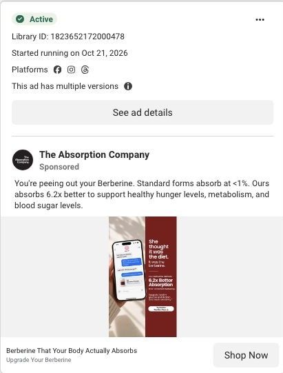
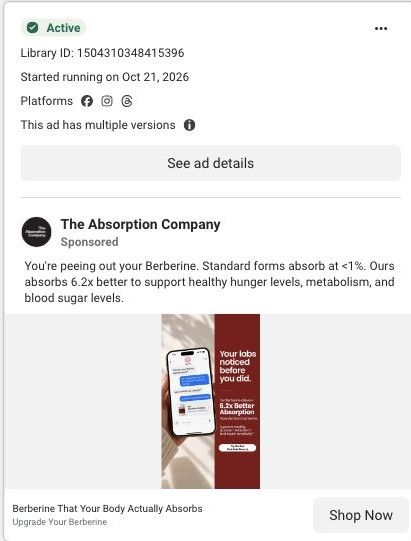
The best berberine · absorption landing page
Captured directly from Meta and the linked page on October 20, 2026. Live offers may change.

Berberine That Absorbs 6.2x Better
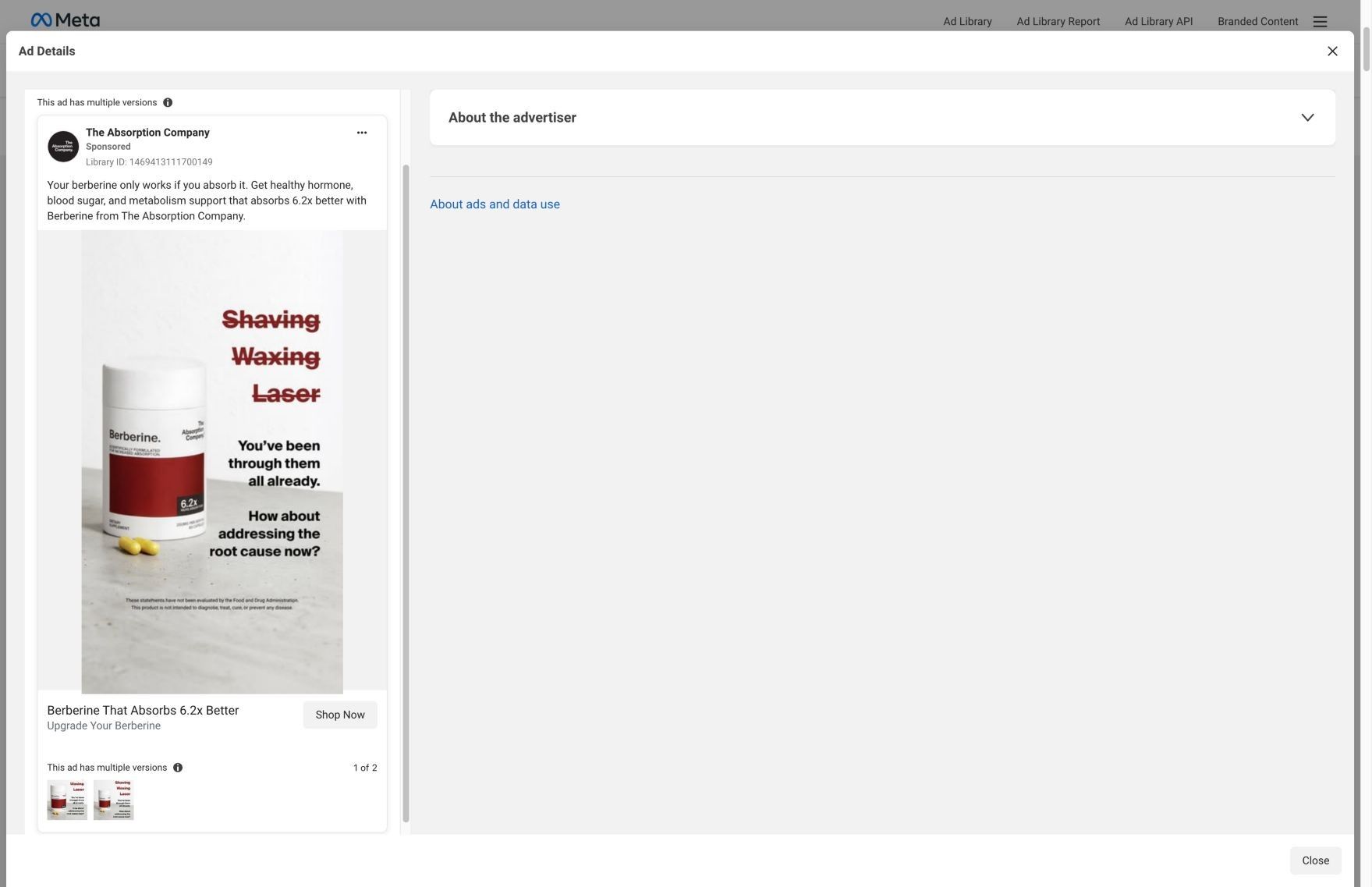
A pink berberine product scene opens with a specific chin-hair objection. A mechanism-led opening continues through benefit cards, creator testimonials, comparisons, and purchase plans. Compare the creative with the destination and explore the other ads sharing this route.
- Brand
- The Absorption Company
- Observed offer
- Berberine That Absorbs 6.2x Better
- Creative angle
- Problem / solution
- Page type
- Product landing
- Ad format
- Image
- Listed start date
- Oct 13, 2026
- Captured
- Oct 20, 2026
- Library ID
- 1629538288665912
- Destination
- absorbmore.com
Selected for its design and offer structure. Ad performance isn’t available in this collection.
What this ad does well
This is one of the most specific problems in The Absorption Company's ads: a private, slightly embarrassing habit the target viewer will recognize instantly. The props do the storytelling, since tweezers on a vanity say 'chin hair' before you read a word. The headline then pivots fast with 'Think insulin,' and the body text walks through the ad's chain of cause (PCOS, excess insulin, testosterone) before landing on the absorption claim. The copy's sign-off, 'Kiss your razor goodbye,' keeps the tone light on a sensitive subject.
What's missing
The ad jumps from a symptom to a supplement, and its only proof is the 6.2x absorption figure, which speaks to how the berberine absorbs, not to what the person tweezing would notice. It also links to the general best-berberine page instead of the brand's PCOS stack page, so a very specific hook lands on a broader argument. If you make one like this, send it to a page that opens on the same problem, add an attributed customer quote about that symptom, and make sure the copy describes what the product claims instead of promising a fix.
Beat by beat
- ImageA pink tiled vanity with perfume, a hair clip and tweezers around the red Berberine bottle, marked '6.2x.'
Familiar bathroom props name the problem visually, so the viewer recognizes herself before reading.
- Headline'Tweezing chin hair again? Think insulin.' sits across the top of the image.
A question about a private habit stops the right viewer, and the second line reframes it around blood sugar, as the brand tells it.
- CopyThe image text says excess insulin with PCOS can push testosterone up, and the post says the berberine absorbs 6.2x better and ends with 'Kiss your razor goodbye.'
Walking through the ad's cause-and-effect gives the supplement a reason to be the answer.
The offer
No discount. 'Berberine That Absorbs 6.2x Better' and 'Upgrade Your Berberine' frame it as a better version of something the viewer may already take.
Where it sends people
It links to the best-berberine page, a focused landing page that's much better than a product page for this kind of ad. The blueprint builds its case on absorption: 'More Absorption, More Benefits,' the FenuMat breakdown, a comparison against every other berberine, batch testing, a clinician section and switching stories. None of the listed sections pick up chin hair or PCOS, though, so the hook that earned the click disappears after it. The brand already has a PCOS landing page in the Fluid library with a symptom selector, which would carry this ad's promise further. Thirty ads point to the best-berberine page.
The page it sends people to: How The Absorption Company sells berberine with a buyer's guide page
A long berberine landing page styled as a 2026 buyer's guide, built around the brand's claim that its FenuMat coating puts 6.2x more berberine in your blood. 30 Absorption Company ads in the Fluid library link here, mostly 6.2x absorption statics, "Nature's Ozempic" lifestyle statics and creator testimonial videos.
How the page is built
- 01Buyer's guide hero
States the absorption promise, shows the crossed-out price and guarantee, and pictures the claim with a blood-level bar chart, answering what this is and why this berberine.
- 02Benefit cards and stat tiles
Lists the appetite, energy, blood sugar and weight claims with stat tiles and a customer quote, answering what you'd buy berberine for.
- 03Why absorption matters
Argues you can't feel a capsule that never reaches your blood, answering why other berberine may have done nothing for you.
- 04FenuMat explainer
Breaks the delivery system into fenugreek fiber coating, surviving stomach acid and a 12-hour release, answering how the product claims to work.
- 05Comparison table
Puts The Absorption Company against every other berberine in a tinted two-column table, answering why this one over a cheaper bottle.
- 06Batch testing
Claims every batch is tested while most brands don't test, answering whether the product is what the label says.
- 07Co-founder story
Pairs a founder portrait with why they started the company, answering who is behind the brand.
- 08Clinician proof
Says 780 clinicians share the company on FrontrowMD without compensation, answering whether professionals stand behind it.
- 09Switching story
Describes what changes when you switch from standard berberine, answering what you can expect after ordering.
- 10Purchase block
Restates the absorption promise beside the berberine plans, answering how to buy and at what price.
- 11FAQ
An accordion of pre-purchase objections, answering the last questions that stop someone from ordering.
The first fixes we would make
- The "Nature's Ozempic" statics land on a hero about absorption, so those visitors arrive expecting an appetite story and get a bioavailability lesson first. Build a hero variant for that traffic that leads with appetite and cravings (the brand already wrote one on its curb-cravings version of this page) and keep everything below it the same.
- Several ads are tagged audience-specific, but the page speaks to everyone. Add a short line or block near the hero that names who the ad was talking to, so a visitor sees their situation reflected before the mechanism explainer starts.
Read the full breakdown of this page
Three hooks you could test
- Lead with the uncomfortable problem. “Still dealing with [embarrassing symptom] every single morning?”
- Make the product the whole scene. “Put your product on the bathroom counter, right next to the tool it's meant to replace.”
- Turn the benefit into a picture people get in a second. “Picture the tweezers going back in the drawer for good.”
What to borrow for your brand
- Open on a private, specific habit your buyer has but rarely talks about, and let props in the photo name it before the headline does.
- Follow a symptom question with a two-word reframe ('Think insulin') that points to the cause your product addresses, as you can support it.
- Send a symptom-led ad to a page that opens on that same symptom so the hook keeps paying off after the click.
One of 188 The Absorption Company ads in the Fluid Inspiration Library, captured from the Meta Ad Library on Oct 20, 2026. We record that an ad ran publicly, not how it performed.