Mary Welch Fox Design with The Absorption CompanySponsored
Esc
How The Absorption Company puts a money-back guarantee on a static
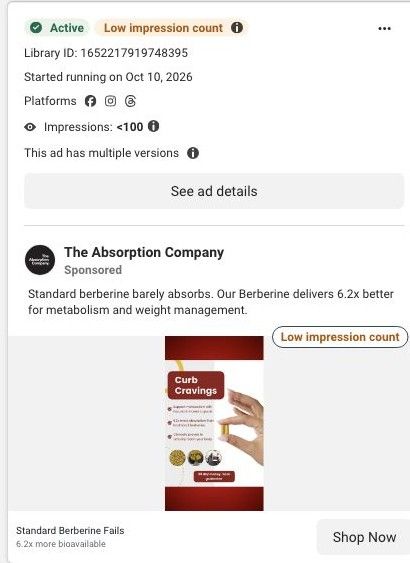
A static ad for The Absorption Company's Berberine in red and white: a "Curb Cravings" title, three checkmark claims including 6.2x more absorption than traditional berberine, a hand holding two yellow capsules and a 30-day money-back guarantee badge. It ran on Meta from October 10, 2026 and links to the berberine product page.
The Absorption Company
33 creatives lead here1 / 33
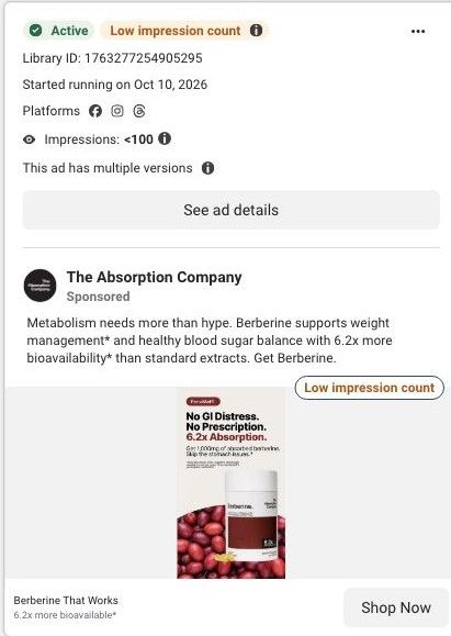
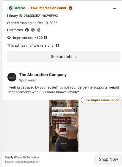
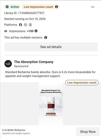
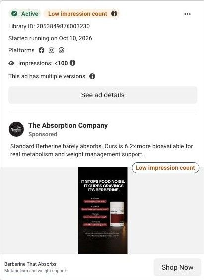
Berberine · product offer
Active ad and exact outbound link observed in Meta Ad Library on October 22, 2026. The page image and section source are the existing October 20 capture of this destination. Offers and product selections may change. Selection reflects creative and page structure; performance is not available.

Standard Berberine Fails
Curb Cravings · red-and-white berberine guarantee card. The product gallery and subscription selector are followed by benefits, FAQs, complementary products, and proof sections. Compare the creative with the destination and explore the other ads sharing this route.
- Brand
- The Absorption Company
- Observed offer
- Standard Berberine Fails
- Creative angle
- Product education
- Page type
- Product page
- Ad format
- Image
- Listed start date
- Oct 10, 2026
- Captured
- Oct 22, 2026
- Library ID
- 1652217919748395
- Destination
- absorbmore.com
Selected for its design and offer structure. Ad performance isn’t available in this collection.
What this ad does well
The guarantee is right on the image, and that's exactly the right reassurance for a supplement buyer who's been burned before. The hand holding two capsules shows the dose plainly, which answers "how many do I take?" without words. The three checkmarks are short and include the comparison that matters ("6.2x more absorption than traditional berberine"), and the link headline, "Standard Berberine Fails," names an enemy the brand can keep returning to.
What's missing
"Curb Cravings" is the ad's only nod to a problem, and it's generic; there's no moment, person or result that makes it feel real, and the three small circular photos don't add information. There's also a grammar slip ("two plant-based capsule") that undercuts the clean claims. If you make one like this, keep the guarantee badge and the capsule hand, but replace the circles with a single customer quote and swap the title for a specific craving moment, such as the after-dinner sweet tooth. Fix the copy before it runs.
Beat by beat
- Headline"Curb Cravings" in white on a dark red box, framed by red bands top and bottom.
It names the main reason people buy berberine in two words.
- ClaimsThree checkmarks: metabolism support with two plant-based capsules, 6.2x more absorption than traditional berberine, and a claim it's clinically proven to reach your body.
They give the product's difference and dose in a quick scan.
- ImageA manicured hand holds two yellow capsules, with three small round photos below the claims.
Showing the actual dose makes the routine feel simple.
- BadgeA "30 day money-back guarantee" badge at the bottom.
It removes the risk of trying, which matters most to people who've tried berberine before.
The offer
A 30-day money-back guarantee shown as a badge on the creative. No discount is shown.
Where it sends people
The link goes to the standard Berberine product page with a subscription plan selected in the URL, which is the basic-product-page rung (one of 33 ads to this page in the library). It opens on the gallery and "Berberine: Daily Metabolic Support," the 3, 2 and 1 Month Supply options, "Why Our Berberine Works Better," "How Berberine Transforms Your Wellness Over Time," "Backed by Experts," "Pairs Well With" and customer reviews. The "Standard Berberine Fails" headline sets up a comparison that this page doesn't open with; the visitor gets plan choices first and "Why Our Berberine Works Better" lower down. The best-berberine landing page leads with the comparison against every other berberine, which is a better follow-up to this ad's promise.
The page it sends people to: Inside The Absorption Company's berberine product page and plan picker
The Absorption Company's standard berberine product page, with a gallery, a stat strip, a three-plan subscription picker with free gifts, benefits, an over-time section, expert proof, cross-sells and reviews. 33 Absorption Company ads in the Fluid library link here, mostly creator testimonial videos built on the 6.2x absorption headline.
How the page is built
- 01Gallery and title
Shows the bottle and breakdown images beside the product name and rating, answering what this is and whether people like it.
- 02Stat strip and claims
Lists the dose, absorption and GI-comfort claims in four tiles, answering why this berberine over another.
- 03Plan picker
Offers 3, 2 and 1 month supplies with savings, gifts and the guarantee, answering how much it costs and which option is the best value.
- 04Why it works better
Pairs a lifestyle photo with six benefit tiles and a customer quote, answering what the product is claimed to do.
- 05Over-time section
Lays out what the brand says changes over time, answering when someone should expect to notice anything.
- 06Expert proof
Shows expert backing, answering whether professionals vouch for it.
- 07Pairs Well With
Suggests complementary products, answering what else to add and raising order size.
- 08Customer reviews
Collects buyer reviews, answering what people like you say after trying it.
The first fixes we would make
- Creator testimonial videos send traffic here, but the page has no creator or video testimonial section, so the person who convinced the visitor disappears at the click. Add a strip of short creator clips (the WLP-1 page already has this format) right under the plan picker.
- Customer reviews sit at the very bottom. Pull three short reviews that speak to cravings and energy up beside the benefit tiles, so proof shows up while the visitor is still deciding.
Read the full breakdown of this page
Three hooks you could test
- Lead with the uncomfortable problem. “Raiding the freezer for ice cream every night after dinner?”
- Make the product the whole scene. “Two capsules in your hand and a 30-day guarantee. That's the whole pitch.”
- Call out the habit you're replacing. “Your current supplement might be the reason nothing's changed.”
What to borrow for your brand
- Put your guarantee on the static as a badge, not just on the product page, when your buyers have tried and quit the category before.
- Show the real daily dose in a hand so people understand the routine without reading.
- Name a simple enemy in the link headline ("Standard X fails") and make sure the landing page opens with that same comparison.
One of 188 The Absorption Company ads in the Fluid Inspiration Library, captured from the Meta Ad Library on Oct 22, 2026. We record that an ad ran publicly, not how it performed.