Careclarkbsn with The Absorption CompanySponsored
Esc
How The Absorption Company pitches berberine for busy days
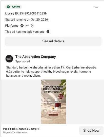
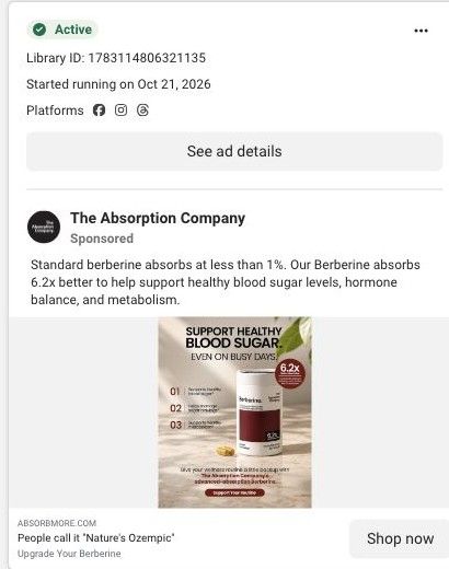
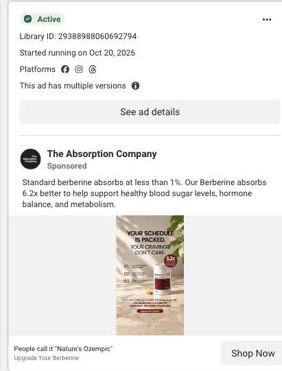
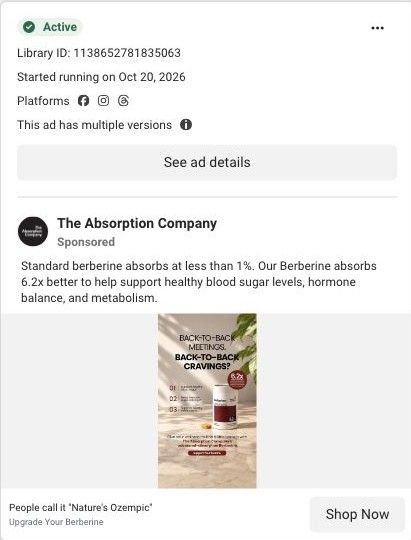
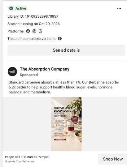
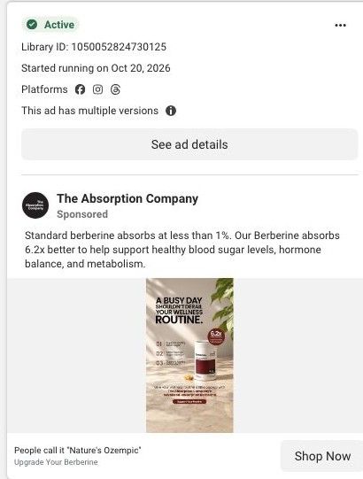
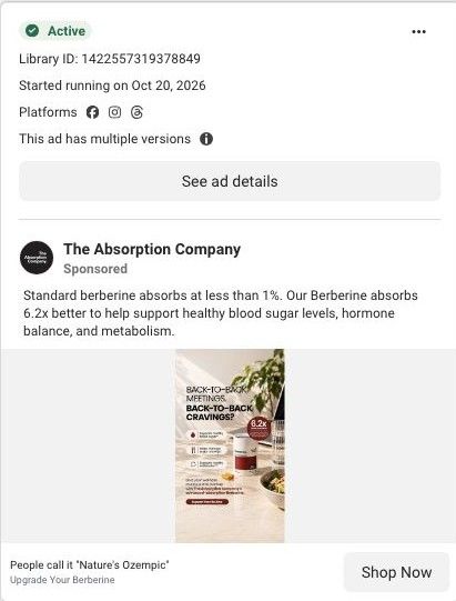
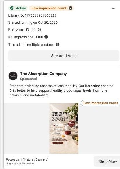
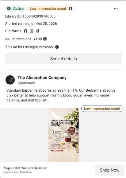
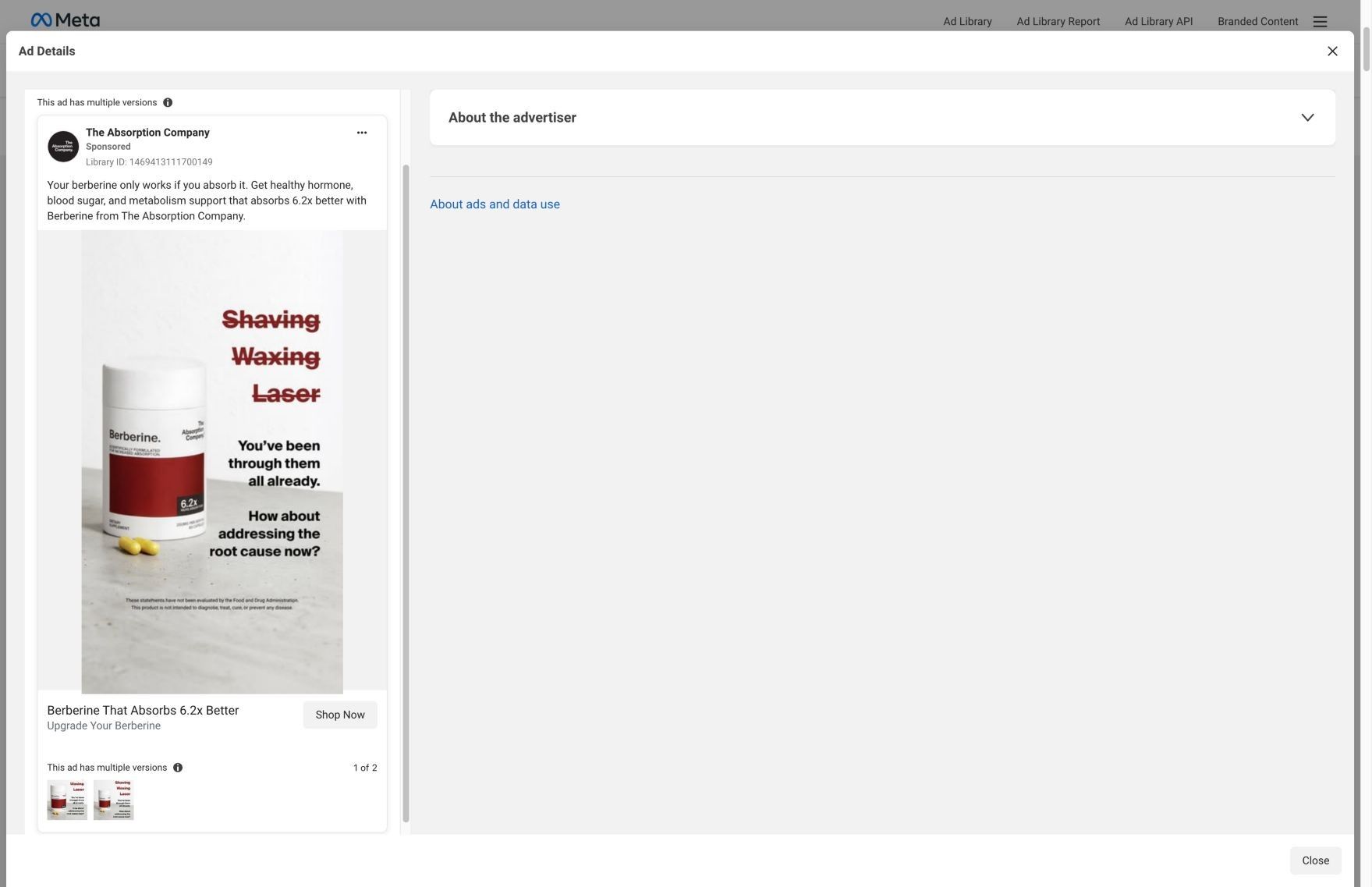
A neutral-toned static headlined "Support healthy blood sugar. Even on busy days," with a numbered three-point list, the Berberine canister with a red 6.2x badge, and a button. The copy contrasts standard berberine absorbing at less than 1% with this one's 6.2x claim and links to a focused best-berberine landing page.
The Absorption Company
30 creatives lead here1 / 30
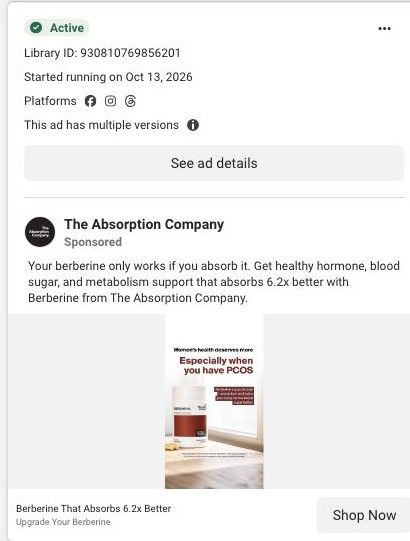
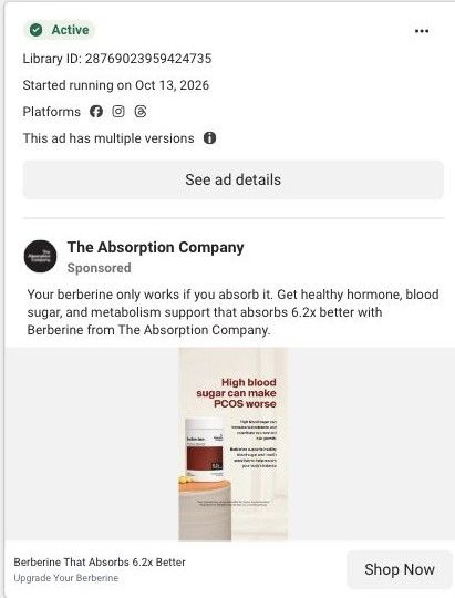
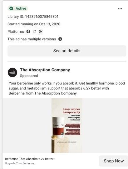
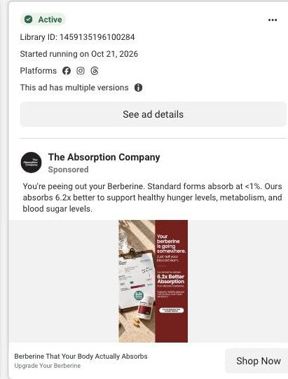
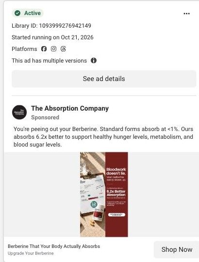
The best berberine · absorption landing page
Active ad and exact outbound link observed in Meta Ad Library on October 22, 2026. The page image and section source are the existing October 20 capture of this destination. Offers and product selections may change. Selection reflects creative and page structure; performance is not available.

People call it "Nature's Ozempic"
Even on busy days · berberine checklist. A mechanism-led opening continues through benefit cards, creator testimonials, comparisons, and purchase plans. Compare the creative with the destination and explore the other ads sharing this route.
- Brand
- The Absorption Company
- Observed offer
- People call it "Nature's Ozempic"
- Creative angle
- Lifestyle positioning
- Page type
- Product landing
- Ad format
- Image
- Listed start date
- Oct 20, 2026
- Captured
- Oct 22, 2026
- Library ID
- 2543929086112339
- Destination
- absorbmore.com
Selected for its design and offer structure. Ad performance isn’t available in this collection.
What this ad does well
The busy-days line speaks to a real constraint (no time to think about it) and promises the product fits into that day. The numbered list makes the benefits easy to scan, and the 6.2x badge on the canister puts the brand's main difference right on the product. The copy sets up a clear contrast, less than 1% for standard berberine versus 6.2x for this one, which gives the viewer a simple reason to switch. The Absorption Company ran several versions of this static on Meta from October 20, 2026, and it lands on a focused landing page rather than a product grid.
What's missing
Nothing in the image shows a busy day, so the headline's promise stays abstract (a desk, a commute or a school run would make it real). The ad headline also leans on a nickname, saying people call it Nature's Ozempic, without saying who, which borrows a drug's reputation instead of the brand's own proof. If you make one like this, picture the busy moment the headline describes, and swap borrowed nicknames for something you can back, like your batch testing or clinician count.
Beat by beat
- ImageA marble surface with plant shadows, the headline about supporting healthy blood sugar even on busy days, and a numbered 01-03 list.
It frames the product as something that fits into a hectic routine and lists the benefits in a scannable way.
- ImageThe Berberine canister with a red 6.2x badge, a short line of copy and a button.
It puts the brand's main difference on the product itself.
- CopyThe text says standard berberine absorbs at less than 1% and that this one absorbs 6.2x better.
It gives a simple before-and-after contrast that justifies switching.
- HeadlineA line saying people call it Nature's Ozempic, with Upgrade Your Berberine underneath.
It tries to borrow the familiarity of a well-known drug name.
Where it sends people
The ad goes to the best-berberine landing page, one of 30 ads in the Fluid library sent there, which is a focused landing page and stronger than a basic product page. It opens on the best berberine being the one that actually absorbs, then explains absorption, the FenuMat coating, compares the brand against every other berberine, covers batch testing, the co-founders, 780 clinicians on FrontrowMD, switching and FAQs. The less-than-1% versus 6.2x contrast in the copy lines up with the page's absorption argument, but the busy-days framing doesn't appear. A short how-to-take-it note near the top would connect the two.
The page it sends people to: How The Absorption Company sells berberine with a buyer's guide page
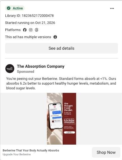
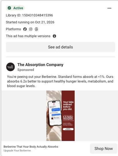
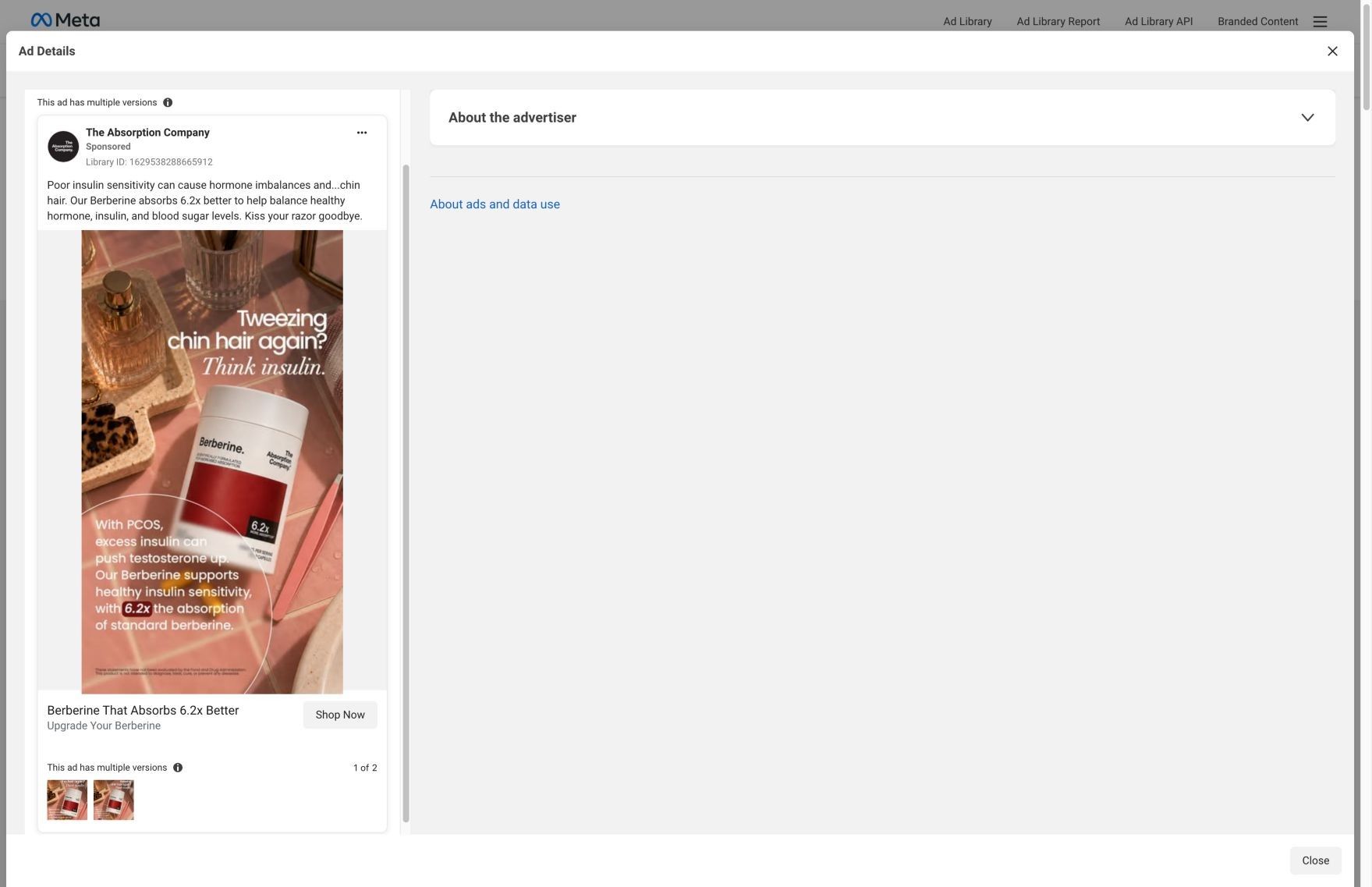
A long berberine landing page styled as a 2026 buyer's guide, built around the brand's claim that its FenuMat coating puts 6.2x more berberine in your blood. 30 Absorption Company ads in the Fluid library link here, mostly 6.2x absorption statics, "Nature's Ozempic" lifestyle statics and creator testimonial videos.
How the page is built
- 01Buyer's guide hero
States the absorption promise, shows the crossed-out price and guarantee, and pictures the claim with a blood-level bar chart, answering what this is and why this berberine.
- 02Benefit cards and stat tiles
Lists the appetite, energy, blood sugar and weight claims with stat tiles and a customer quote, answering what you'd buy berberine for.
- 03Why absorption matters
Argues you can't feel a capsule that never reaches your blood, answering why other berberine may have done nothing for you.
- 04FenuMat explainer
Breaks the delivery system into fenugreek fiber coating, surviving stomach acid and a 12-hour release, answering how the product claims to work.
- 05Comparison table
Puts The Absorption Company against every other berberine in a tinted two-column table, answering why this one over a cheaper bottle.
- 06Batch testing
Claims every batch is tested while most brands don't test, answering whether the product is what the label says.
- 07Co-founder story
Pairs a founder portrait with why they started the company, answering who is behind the brand.
- 08Clinician proof
Says 780 clinicians share the company on FrontrowMD without compensation, answering whether professionals stand behind it.
- 09Switching story
Describes what changes when you switch from standard berberine, answering what you can expect after ordering.
- 10Purchase block
Restates the absorption promise beside the berberine plans, answering how to buy and at what price.
- 11FAQ
An accordion of pre-purchase objections, answering the last questions that stop someone from ordering.
The first fixes we would make
- The "Nature's Ozempic" statics land on a hero about absorption, so those visitors arrive expecting an appetite story and get a bioavailability lesson first. Build a hero variant for that traffic that leads with appetite and cravings (the brand already wrote one on its curb-cravings version of this page) and keep everything below it the same.
- Several ads are tagged audience-specific, but the page speaks to everyone. Add a short line or block near the hero that names who the ad was talking to, so a visitor sees their situation reflected before the mechanism explainer starts.
Read the full breakdown of this page
Three hooks you could test
- Show a specific moment of use. “Two capsules before the school run, then you don't think about it again.”
- Sell the outcome. “Steady through the busiest day of your week.”
- Turn the benefit into a picture people get in a second. “Less than 1% versus six times more. Same bottle size.”
What to borrow for your brand
- Write a headline around the constraint your buyer lives with (busy days, no time) and promise the product fits inside it.
- Put your single most important number as a badge on the product shot.
- Use a two-number contrast in the copy (theirs versus yours) to make the switch argument in one sentence.
One of 188 The Absorption Company ads in the Fluid Inspiration Library, captured from the Meta Ad Library on Oct 22, 2026. We record that an ad ran publicly, not how it performed.