How Smooche's bestsellers collection carries a sale with card tags
Smooche's bestsellers collection page: a photo-strip banner with the collection title, a three-item trust strip, then a four-column grid of product cards whose corner tags carry the sale, with bundles and accessories mixed in. 1 ad in the Fluid library lands here, a humor graphic with a dictionary definition of no-brainer and a Secret Sale.

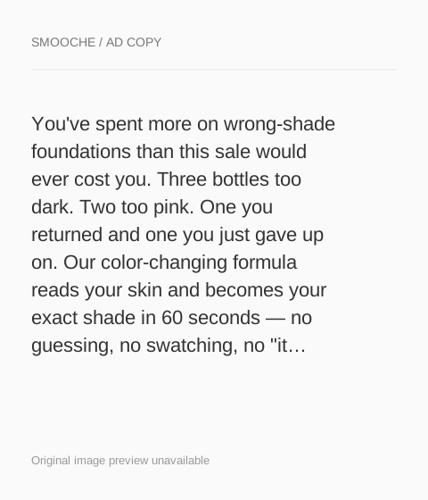
The current destination was captured on October 20, 2026. Video references show captured frames. Page offers may differ from the original ad.
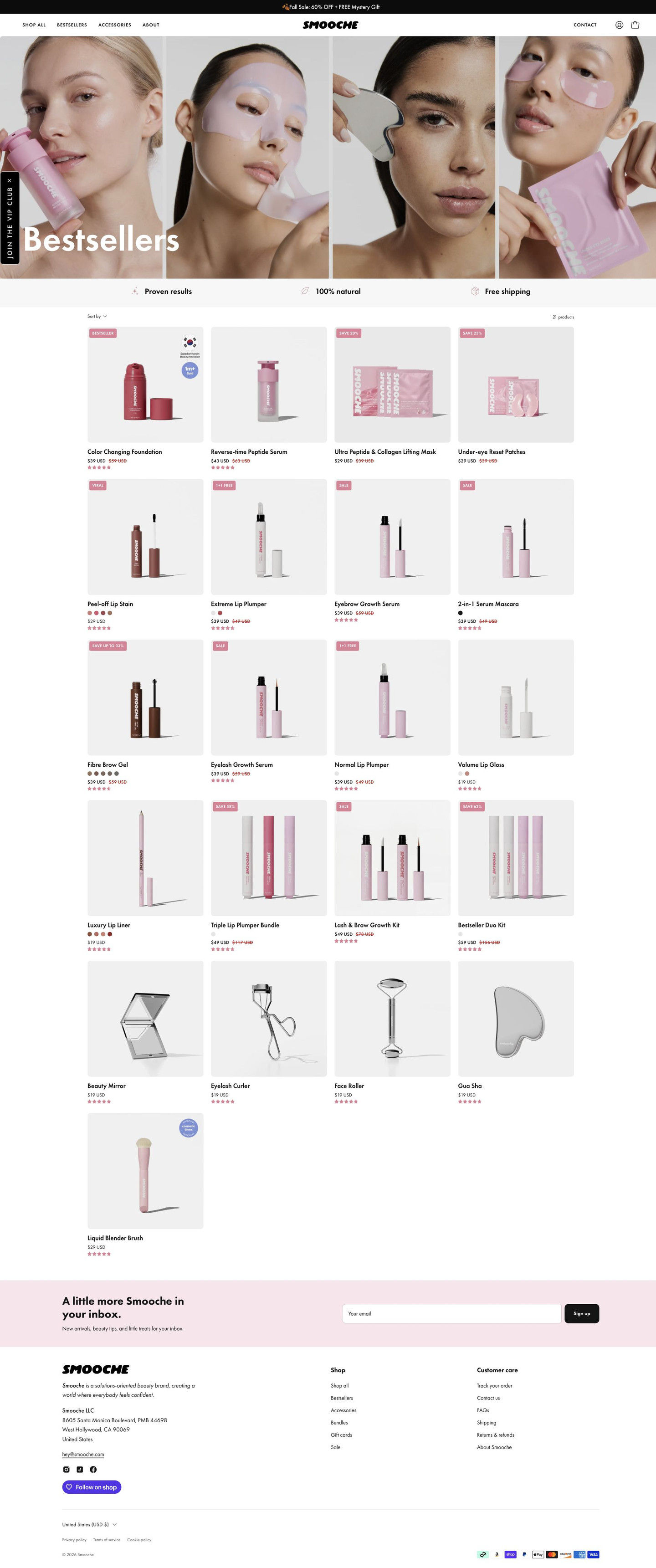
Smooche · Bestsellers collection
Smooche's bestsellers collection page: a photo-strip banner with the collection title, a three-item trust strip, then a four-column grid of product cards whose corner tags carry the sale, with bundles and accessories mixed in. 1 ad in the Fluid library lands here, a humor graphic with a dictionary definition of no-brainer and a Secret Sale.
- Brand
- Smooche
- Page type
- Collection page
- Ads leading here
- 1
- Captured
- Oct 20, 2026
- Destination
- smooche.com
Selected for its design and offer structure. Ad performance isn’t available in this collection.
What this page does well
Each card carries its own reason to click: corner tags vary between percent-off, buy-one-get-one, Viral and Bestseller, with an occasional award sticker, instead of one banner announcing a sale. Bundles and kits sit in the grid next to their single-item components with struck-through totals, which invites a browser to compare and trade up. Low-priced tools and accessories at the end of the grid work as add-ons. The trust strip near the top (results, natural, free shipping) answers three quick questions before the shopper starts browsing.
How the page is built
- 01Announcement bar and header
One sale line with a free mystery-gift mention and the store header answer whether there's an offer today.
- 02Collection banner
Four close-up beauty photos with the collection title overlaid answer what kind of products this is.
- 03Trust strip
Three icon-and-label items (results, natural, free shipping) answer basic trust questions before browsing.
- 04Product grid
A sort dropdown and four columns of cards with corner tags, prices, color dots and star ratings answer what's popular and what's on sale.
- 05Grid continuation
Bundles and kits mixed with single items, then lower-priced tools and accessories, answer what else to add.
- 06Newsletter and footer
A newsletter band and the store footer with currency selector and payment icons close the page.
What's missing, in the order we'd fix it
- The ad sells one foundation, and this page makes the shopper find it again in a grid. Send single-product ads to that product's page, or pin the foundation as a large first card here with the ad's shade-match claim beside it.
- The ad's sale is a specific Secret Sale with a deadline, and the page carries it only in the announcement bar and card tags. Add a short sale banner above the grid that names the offer and the deadline, so the visitor confirms she's in the right place.
- The trust strip's results item is vague on its own. Replace it with something specific the shopper can check, like the star rating and review count shown on the cards.
How the ads set it up
The only ad captured for this page is the dictionary no-brainer graphic, which sells the foundation with the same Secret Sale copy as Smooche's apology-letter ad. The announcement bar and card tags keep the sale visible, but the page doesn't feature the foundation or its shade-match promise above the grid. A visitor who tapped on a joke about one product lands on a catalog, which is the weakest kind of hand-off in the persona's ladder.
What to borrow for your brand
- Vary corner tags on collection cards (percent-off, buy-one-get-one, Viral, Bestseller), so each product carries its own reason to click.
- Place bundles next to their single-item components with struck-through totals, so browsers can compare and trade up.
- End the grid with low-priced accessories, so shoppers have easy add-ons before checkout.
Ads that send people here
Captured from smooche.com in October 2026 for the Fluid Inspiration Library. Offers and prices change; this is what the page showed when we captured it.