How Ritual gives Synbiotic+ a seasonal reason with a notebook list
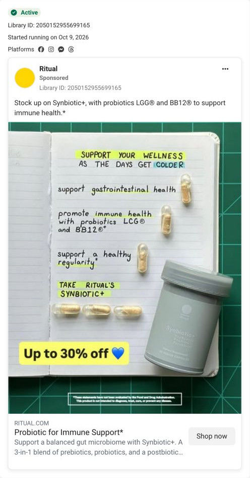
A Ritual static styled as a handwritten notebook page: “Support your wellness as the days get colder,” then a checklist of the ad's claims (gut health, immune health with probiotics LGG and BB12, regularity) with a capsule beside each line and a Synbiotic+ jar. An up to 30% off badge sits below. It links to the Synbiotic+ product page.

Page captured October 20, 2026. The current offer may differ from the original ad.

Support your wellness as the days get colder
A calendar-style checklist and Synbiotic+ jar give the advertised immune-support message a colder-weather context, with an “Up to 30% off” overlay. Compare the creative with the destination and explore the other ads sharing this route.
- Brand
- Ritual
- Observed offer
- Up to 30% off shown in the creative
- Creative angle
- Seasonal offers
- Page type
- Product page
- Ad format
- Image
- Listed start date
- Oct 9, 2026
- Captured
- Oct 20, 2026
- Library ID
- 2050152955699165
- Destination
- ritual.com
Selected for its design and offer structure. Ad performance isn’t available in this collection.
What this ad does well
Ritual ties an always-available product to a moment on the calendar, which gives the viewer a reason to buy this week. The notebook format looks like someone's own planning page, with highlighter marks, capital letters and a capsule laid beside each line like a checkmark, so the benefits read as a personal list rather than a label. The copy's stock-up framing pairs with the 30% badge to make a bigger order feel sensible. It's also a cheap, repeatable format: change the headline and the list for any season or occasion.
What's missing
Colder days set the moment, but the ad doesn't say what the viewer is worried about in that moment, and the immune-support claim is the brand's own with no proof beside it. The 30% badge has no end date either, so the stock-up push has no deadline. If you make one like this, open on the specific seasonal situation your customer recognizes (travel, a packed calendar), keep the claims clearly attributed, and give the offer a real end date or a multi-unit price.
Beat by beat
- ImageAn open notebook on a green cutting mat with a highlighted handwritten headline about supporting wellness as the days get colder.
The handmade look stands out in a feed of polished product shots, and the season gives a reason to act now.
- ImageThree handwritten lines list the claimed benefits, each with a capsule laid beside it, ending on Take Ritual's Synbiotic+.
Capsules as checkmarks turn the benefits into a to-do list with the product as the final step.
- ImageThe Synbiotic+ jar sits on the page beside an Up to 30% off badge.
The offer arrives at the end of the list, where the viewer has just read the reasons.
- CopyThe caption invites viewers to stock up on Synbiotic+, naming probiotics LGG and BB12 for immune health, as the ad claims.
Stock up frames the discount as a reason to buy more than one jar.
The offer
Up to 30% off, shown in a yellow badge, with copy that invites viewers to stock up. The stock-up framing nudges toward more than one jar.
Where it sends people
The ad links to the Synbiotic+ product page, a standard product page, and one piece of it lines up well: a yellow buy-more-save-more strip sits right under Add to Cart, which is exactly where a viewer told to stock up would look. The announcement bar repeats a percent-off sale line, and the Supports checklist gives the general benefits. What the page doesn't carry is the season; there's no colder-weather framing anywhere in the blueprint, so the ad's reason to buy now disappears after the click. A seasonal line in the announcement bar or above the buy-more strip would keep it. 3 ads in the library send people here.
The page it sends people to: How Ritual's Synbiotic+ page lets traceability do the persuading
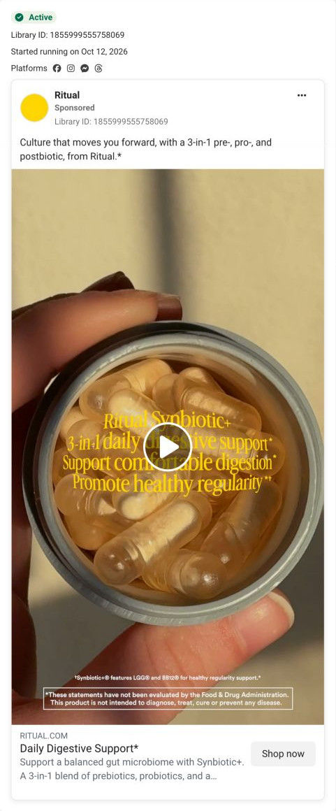
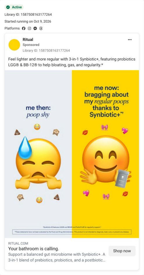
Ritual's Synbiotic+ product page is a restrained page with the buy column on the left and images on the right, where traceability and science credentials do most of the persuading below the buy box. 3 ads in the library send people here: an open-jar benefit video, a poop-shy emoji meme and a colder-weather notebook checklist with up to 30% off.
How the page is built
- 01Announcement bar
A percent-off line with a Shop Now link answers whether there's a sale on.
- 02Buy box
The product name, a strain-count badge, four Supports checks, sale and struck-through price, Add to Cart, a guarantee and shipping line and an HSA/FSA line sit beside an image carousel, answering what it does and what it costs.
- 03Offers and details
A buy-more-save-more strip, a membership card, a Buy Once link and accordions for supplement facts, how to use, traceability and the study answer how to pay less and what's inside.
- 04Trust ticker
A scrolling row of attributes (vegan, non-GMO, no synthetic colorants, traceable, third-party tested) answers how it's made.
- 05Product showcase
A large, airy section with a single capsule image and a headline about the future of the category sets the brand's point of view.
- 06Traceable ingredients
Three cards, one per component, each with a spec table and a study-dosing note, answer where the ingredients come from and why those amounts.
- 07Cross-sell
A You May Also Like row of four product cards on yellow offers a next product.
- 08FAQ
Accordions on fit, purchase options, testing, packaging, what to expect and pregnancy, with a See All FAQs link, handle the remaining doubts.
- 09Scientific advisory board
Four headshot cards with names, credentials and roles answer who stands behind the formula.
- 10Reviews, newsletter and footer
An average rating, distribution bars, topic chips and a review list, followed by the email signup and footer, answer what other buyers think.
The first fixes we would make
- The emoji meme sends people here with a joke, and the page has no trace of that tone, so the jump from meme to spec sheet is abrupt. Add one light line in the buy box or the showcase section that picks up the ad's voice before the science takes over.
- The seasonal ad sells colder-weather immune support, but nothing on the page mentions the season, so the reason to buy now disappears after the click. Add a seasonal line to the announcement bar or above the buy-more-save-more strip while that ad is running.
Read the full breakdown of this page
Three hooks you could test
- Show a specific moment of use. “What's in my bag for every flight this winter.”
- Turn the benefit into a picture people get in a second. “My cold-weather checklist, in capsule form.”
- Sell the outcome. “Head into winter with your routine already set.”
What to borrow for your brand
- Write your benefits as a handwritten list in a real notebook and lay the product beside each line, which makes a claim list feel personal.
- Tie an evergreen product to a date on the calendar (a season, a holiday, a back-to-school week), so there's a reason to buy now.
- Pair a stock-up message with a multi-unit saving on the landing page, so the ad's nudge has somewhere to land.
One of 20 Ritual ads in the Fluid Inspiration Library, captured from the Meta Ad Library on Oct 20, 2026. We record that an ad ran publicly, not how it performed.