

ProseSponsored
Esc
How Prose sells custom haircare to women growing out their grays
A 45-second creator testimonial from a woman who stopped coloring her hair and found her grays drier and duller. She walks through Prose's quiz, shows her custom conditioner and a before-and-after, and closes on 60% off a first subscription order. Shop now opens the haircare consultation.
Prose
64 creatives lead here1 / 64
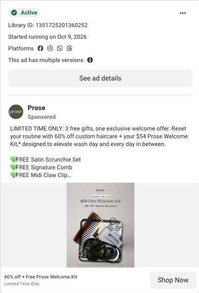


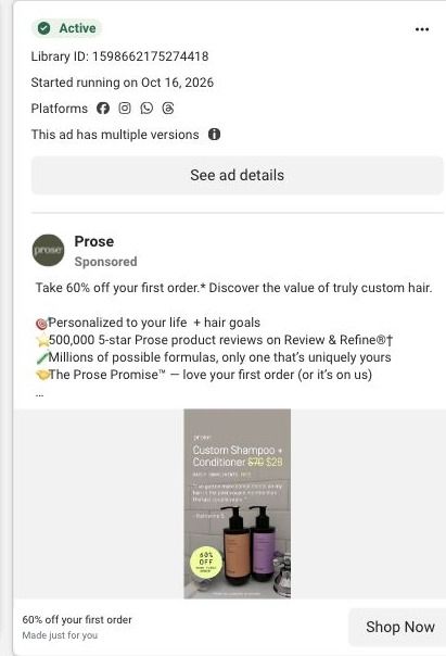


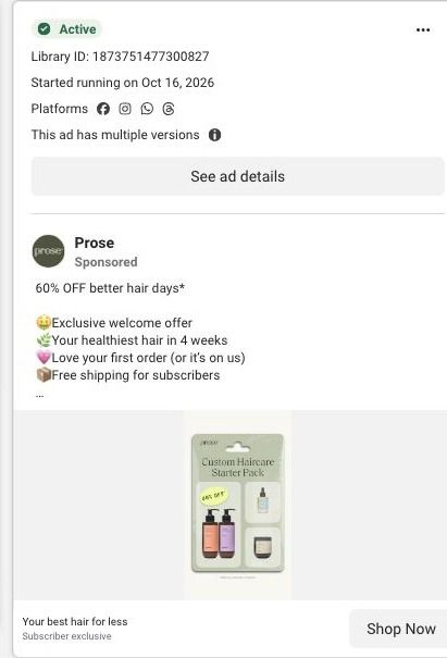

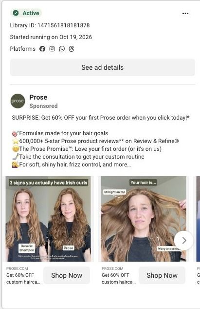













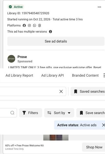


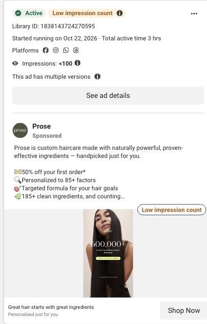
Prose · Haircare consultation
Public page captured October 22, 2026. Promotional sheets, chat, extension overlays and sticky cart bars were removed from the static reference; page layout and copy were preserved. No account, personal, health or payment details were supplied. Quiz captures show the observed entry screen, not the complete consultation.
Get 60% OFF custom haircare from Prose
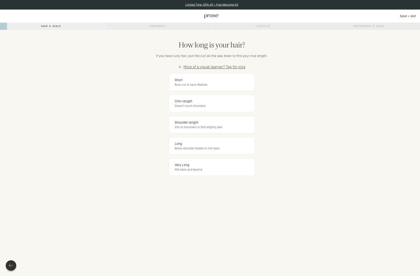
Visual reference: Growing out my grays · testimonial. Most selected ads go directly into the haircare consultation. The first-question URL redirects to a hair-length choice, with visible progress stages and a visual guide. No consultation answers were entered. Compare the creative with the destination and explore the other ads sharing this route.
- Brand
- Prose
- Observed offer
- Advertised custom haircare offer; subscription and gift conditions apply
- Creative angle
- Creator stories
- Page type
- Quiz entry
- Ad format
- Video · 0:45
- Listed start date
- Oct 21, 2026
- Captured
- Oct 22, 2026
- Library ID
- 2084857129128658
- Destination
- prose.com
Selected for its design and offer structure. Ad performance isn’t available in this collection.
What this ad does well
Prose's ad opens on long gray hair being brushed in a kitchen, with a caption that sounds like a confession rather than a pitch, and it names a moment a specific viewer knows well: you stop coloring and your hair suddenly feels different. The creator explains the change in plain words (drier, less shine, no idea what it needs), so the problem lands within the first ten seconds. Then the ad shows the mechanism instead of just claiming it: quiz screens about texture and density roll past while she says the questions covered things like scalp hydration and the weather where she lives. That sequence makes the word custom feel earned, and the closing line, "Your grays deserve this," speaks to the same viewer the hook picked out.
What's missing
The biggest gap is that the opening frame already shows soft, healthy-looking gray hair, so the dry, dull hair she describes never appears on camera until a small before-and-after near the end. A viewer who's living with brittle grays doesn't see their own hair in the first seconds, and the payoff loses its contrast. If you make one like this, open on a close-up of the problem (frizzy, dull ends in harsh light) and save the brushed, shiny version for after the quiz. It's also worth saying the subscription condition out loud near the 60% off line, since the copy only covers it in a footnote.
Beat by beat
- 0-3sLong gray hair is brushed on camera under a caption calling growing out her grays her best hair decision.
It stops women in the same transition by showing hair that looks like theirs and a decision they've already made.
- 3-12sShe explains that once she stopped coloring, her hair felt drier, lost its shine and she didn't know what it needed.
This names the problem in the viewer's own words, so the product arrives as an answer to something they already feel.
- 12-25sQuiz screens on texture and density appear while she says the questions covered scalp hydration and local weather.
Showing the actual questions explains how the formula gets personal, which is the claim the whole ad rests on.
- 25-38sHer custom conditioner appears, she says it targets hydration, shine and scalp balance, and a before-and-after illustration runs with a disclaimer.
The named formula and the side-by-side give the viewer something concrete to picture after the quiz.
- 38-45sShe invites viewers to take the free quiz for 60% off their first order.
The close tells people the next step is a quiz, which matches where the button sends them.
The offer
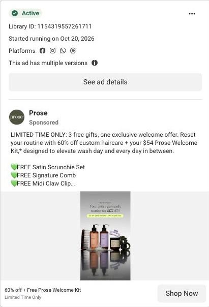
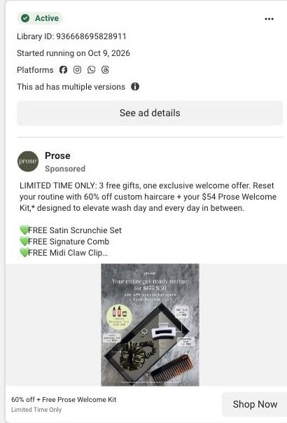
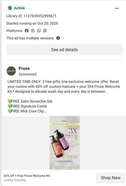
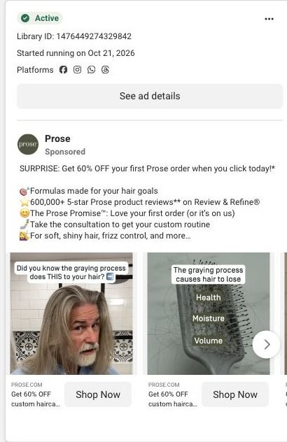
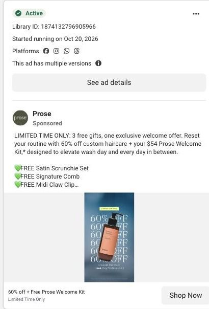
The copy leads with a surprise 60% off a first Prose order, with the subscription condition and cancel-anytime terms in a footnote, plus the Prose Promise that you love your first order or it's on them.
Where it sends people
The ad sends people straight into Prose's haircare consultation, which sits on the strongest rung of the landing-page ladder: a quiz instead of a homepage or a basic product page. The entry screen we captured is compact, with a promotion strip, the logo and a save-and-exit control, then progress navigation that names the consultation stages and a single hair-length question with explanatory copy, an optional visual guide and large stacked choices. That's a good fit for a testimonial built around the quiz, because the viewer has just watched the creator answer these same kinds of questions. The gap is the opening: the ad promises a formula for grays, but the consultation starts with hair length and nothing on the entry screen speaks to gray or color-free hair. A first question about whether you've stopped coloring (or a line in the promotion strip for grays) would pick up the ad's promise on arrival.
The page it sends people to: How Prose starts its haircare quiz with one hair-length question
This is the first screen of Prose's haircare consultation: a slim promotion strip, a progress bar that names the consultation stages, and one hair-length question with large stacked choices and an optional visual guide. It's the destination for 64 ads in the Fluid library, mostly creator videos about curls and waves plus 60%-off offer ads.
How the page is built
- 01Promotion strip and header
A compact promotion strip sits above the logo and a save/exit control, so the offer stays visible and the visitor knows they can step out without losing their place.
- 02Progress stages
The consultation stages are named across the top, which answers "how much of this is there?" before the first tap.
- 03Hair-length question
One question with short explanatory copy, an optional visual guide and large stacked choices answers "what do I do here?" and makes the first answer easy to give.
- 04Back control
A back control lets people change an earlier answer, and the later consultation questions continue past what we captured.
The first fixes we would make
- Apart from the promotion strip, the entry screen doesn't restate what the visitor gets when they finish. Add one line under the progress stages that names the result (a formula built from these answers, plus the first-order offer the ads promised), so the effort of answering is tied to a reward.
- There's no proof on this screen, even though most of the ads sending people here are creator stories. A small strip with a customer quote or a still of a creator from the ads would carry that trust into the quiz without adding another step.
Read the full breakdown of this page
Three hooks you could test
- Lead with the uncomfortable problem. “Stopped coloring and now your hair feels like straw?”
- Sell the outcome. “Grays that look soft and shiny instead of wiry.”
- Show a specific moment of use. “First wash after going gray, and my brush finally glides.”
What to borrow for your brand
- Pick a life transition your customer goes through (going gray, a new baby, a move to hard water) and let a creator describe what changed in her own words before the product appears.
- Show two or three real quiz screens on camera while the creator explains why each question matters, so personalization reads as a process instead of a buzzword.
- Close with a line addressed to the exact person the hook called out, which keeps the ad feeling like a recommendation from someone in the same spot.
Transcript
Growing out, my grace was the best decision I've made for my hair, but I wish I'd known this sooner. When I stopped coloring, my hair changed. It felt different, drier, less shine, and I didn't know what it needed. My grays were completely different than the hair I had when I was younger. Then I found the solution, pros. I took their frequence, which pointed out factors of my hair health. I'd never thought about, like my scalp hydration and the weather where I live. Then they built custom products based specifically on my answers. My formula was designed for hydration, shine, and scalp balance. And after just one wash I could feel the difference. My hair was softer, shinier, and stronger. Take the free quiz today and get 60% off your 1st order. Your grays deserve this.
Text on screen
- Growing out my grays was
- the best decision
- I've made for my hair...
- but I wish I'd known THIS sooner
- When I stopped coloring,
- my hair changed
- It felt different
- drier, less shine
- and I didn't know
- what it needed
- My grays were
- completely different
- than the hair I had
- when I was younger
- Then I found the solution:
- 1:26
- I took their free quiz
- Back
- prose
- We're excited to get started on
- your lair consultation.
- well ask a sier of question to site undestard on
- which pointed out
- factors of my hair health
- What's your natural, untreated,
- air-dried hair texture?
- Tree 38
- TuDe 48
- I'd never thought about
- How dense is your hair?
- Very dense
- Medium or not sure
- I con see a little skin
- Low density
- 1 nave a wide part
- Like my scalp hydration
- and the weather where I live
- Then, they built
- custom products
- based specifically
One of 93 Prose ads in the Fluid Inspiration Library, captured from the Meta Ad Library on Oct 22, 2026. We record that an ad ran publicly, not how it performed.