

OSEASponsored
Esc
How OSEA launched a vanilla body butter with a dry-skin Q&A static
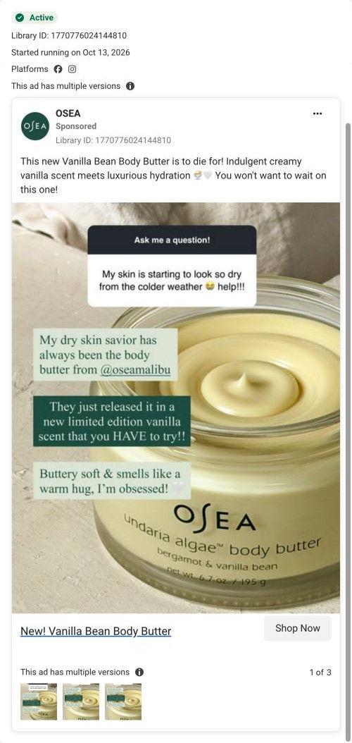
A static Meta ad for OSEA's new limited-edition Bergamot & Vanilla Bean Undaria Algae Body Butter. Over a close-up of the open jar, an Instagram-style question box complains about skin looking dry in colder weather, and text answers call the body butter a dry-skin savior that now comes in a vanilla scent. The link goes to the product page.
OSEA
3 creatives lead here1 / 3

Bergamot & Vanilla Bean Body Butter
New! Vanilla Bean Body Butter
The ad introduces the vanilla scent through sensory language and the familiar Undaria Algae Body Butter product. The CTA leads directly to the Bergamot Vanilla Bean body-butter product page. Compare the creative with the destination and explore the other ads sharing this route.
- Brand
- OSEA
- Observed offer
- Bergamot Vanilla Bean Undaria Algae Body Butter
- Creative angle
- Product launch
- Page type
- Product page
- Ad format
- Image
- Listed start date
- Oct 13, 2026
- Captured
- Oct 19, 2026
- Library ID
- 1770776024144810
- Destination
- oseamalibu.com
Selected for its design and offer structure. Ad performance isn’t available in this collection.
What this ad does well
This is the only OSEA ad in the set that opens on a problem, and it's a sharp one: a story-style question about skin looking dry as the weather turns cold. Dressing it up as an Ask me a question! box makes it look like a real exchange, so the answer reads as a recommendation rather than a claim. The answers then stack the reasons in order: the regular butter is the speaker's go-to for dry skin, there's a new limited vanilla scent, and it's "Buttery soft & smells like a warm hug." The jar's whipped texture fills the background. OSEA ran several versions from October 13, 2026.
What's missing
Nobody is named, so the Q&A feels like a creator post without a creator. A real handle or face on the answer would make it proof instead of styling. The ad also gives no price and no specifics about the hydration it promises in the copy. Put a real customer or creator on the answer box, and add one concrete detail from the product page (a result or the price) so the reader has something to weigh.
Beat by beat
- ImageAn Ask me a question! box reads that skin is starting to look so dry from the colder weather, over a close-up of the open jar.
It opens on a seasonal problem the viewer may be feeling right now.
- ImageGreen and white text boxes answer that the body butter is a dry-skin savior, now in a limited vanilla scent, buttery soft and smelling like a warm hug.
It answers the problem with the product, adds launch news and gives the scent a feeling.
- CopyThe copy calls it to die for, pairs creamy vanilla scent with luxurious hydration and says you won't want to wait.
It repeats the scent and hydration benefits and adds light urgency.
- HeadlineNew! Vanilla Bean Body Butter.
It names the launch plainly for anyone skimming the link card.
The offer
No price or discount. The only nudge is launch urgency, a limited-edition scent you won't want to wait on.
Where it sends people
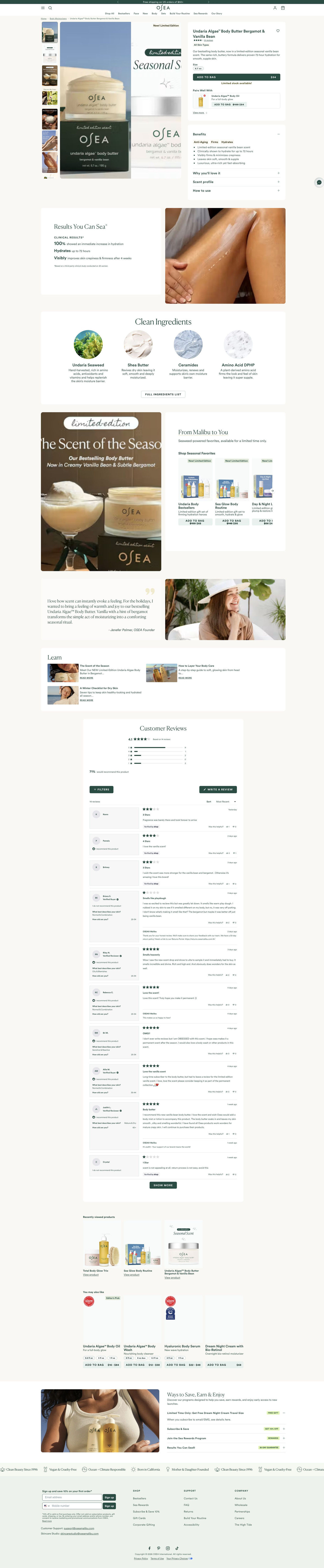
The ad goes to the vanilla bean body butter's product page, a product-focused page that follows through on the launch. The main image carries a New Limited Edition tag, a limited-stock line sits under Add to Bag, and a results card lists claims with a study footnote, which is the proof the ad doesn't have. The dry-skin problem the ad opens on isn't the headline of the page, though, so the visitor has to read the benefits accordion to see it addressed.
The page it sends people to: How OSEA's limited-edition body butter page uses scarcity
OSEA's product page for the limited-edition Bergamot & Vanilla Bean Body Butter: a buy card with a limited-stock line and a Pairs Well With add-on, then benefits, results, clean ingredients, a seasonal collection, a founder note, reviews and a ways-to-save section. Three OSEA ads in the Fluid library send people here, all product-launch ads for the new scent.
How the page is built
- 01Announcement bar and header
A shipping-threshold line and category links tell shoppers how much to spend for free shipping.
- 02Buy box
Thumbnails, a main image tagged New Limited Edition, rating, skin-type label, size chip, Add to Bag with price, a limited-stock line and a Pairs Well With add-on answer what it is, what it costs and why buy now.
- 03Benefits card
Accordions for benefits, why you'll love it, scent profile and how to use answer what it does and how it smells.
- 04Results split
A punny headline and a clinical results list with a study footnote beside an application photo answer whether it does what it claims, as the brand reports.
- 05Clean ingredients
Four circular ingredient photos with short roles and a full-list button answer what's inside.
- 06Seasonal collection
A campaign image beside a carousel of limited-edition gift sets with struck-through prices raises order size.
- 07Founder note
A quote and portrait explain why the new version was made.
- 08Learn
Three blog article rows give curious shoppers more to read.
- 09Customer reviews
An average, distribution bars, a would-recommend line, filters and reviews with skin type, age range and brand replies answer whether people like them are happy.
- 10Recently viewed and recommendations
Recently viewed items and a You May Also Like row with award badges suggest the next product.
- 11Ways to save
An accordion lists the free gift, subscribe discount, rewards and guarantee, each with a colored tag.
- 12Values ticker and footer
Brand values with icons, then email and SMS sign-ups with a first-order discount catch shoppers who leave.
The first fixes we would make
- The guarantee and subscribe discount sit in the ways-to-save section near the very bottom. Add a one-line guarantee and the subscribe option right under Add to Bag, where people decide.
- The results card with its study footnote is the strongest proof on the page, and it's below the benefits accordion. Pull one result up into the buy card so proof sits next to the price.
Read the full breakdown of this page
Three hooks you could test
- Lead with the uncomfortable problem. “Skin getting dry and tight now that it's cold out?”
- Turn the benefit into a picture people get in a second. “Buttery soft skin that smells like a warm hug.”
- Show a specific moment of use. “Right out of a hot shower, before the cold hits.”
What to borrow for your brand
- Style a common customer question as a story Q&A box so the answer reads as advice, not an ad.
- Open a seasonal launch on the seasonal problem the product solves.
- Put a real name or face on the answer so the styling turns into proof.
One of 8 OSEA ads in the Fluid Inspiration Library, captured from the Meta Ad Library on Oct 19, 2026. We record that an ad ran publicly, not how it performed.